Do ceilings have to be white?
 |
||||||
| You might have seen that so called ‘designer paint’ has been in the news recently, as the British paint brand Farrow & Ball has just been sold to a Danish company for £500 million. This prompted a couple of articles voicing some strong opinions on the brand, with both Lawrence Llewelyn-Bowen in the Daily Mail and The Telegraph’s Shane Watson calling time on the brand’s long reign as the go to choice for the tasteful elite. The quintessentially English paint brand started in the 1940s and has enjoyed enormous success, so much so that if someone were to ask you to name a posh paint brand, you’d probably say Farrow & Ball without having to think too much about it. The company’s marketing was so successful that for decades you only had to mention their name (or one of their quirkily named paint colours) and people would instantly think your home was stylish. But it seems their reign is over, as both Lawrence and Shane are less than kind in their pieces. They both claim that the paint is difficult to apply and Lawrence says that their famously muted colour palette, intended to recreate the faded colours seen in our grand old country houses, is a mistake, and that the original colours were much more vibrant and daring. Lawrence has this to say: Upstairs in their mansions, the [Georgians] were all about ruby red and cobalt blue, imperial yellow and iridescent violet. Downstairs, where the servants lurked, the walls were daubed with anything that was left over - what were known as 'estate colours'. The paint was slapped on and left to fade for a couple of centuries. It was this worn-out mishmash that Farrow & Ball misinterpreted as the palette of Olde England, and sold to us under the banner of good taste |
||||||
| So, the colour palette might not be to everyone’s taste, but isn’t the paint itself better, which is why it’s more expensive? You would expect so, but I’m not so sure that it is. I’ve had plenty of decorators tell me that they hate working with Farrow and Ball paint as it needs at least one extra coat and can leave brush marks behind if not applied carefully. I’ve even heard of some decorators upping their prices to account for the extra work involved.
This is what Shane Watson had to say on the subject in The Telegraph: For decades, all over the UK painters have been scratching their heads mystified as they gaze into a litre of something that looks a lot like magnolia but goes by the name of Lime White and costs almost twice as much And Lawrence adds: We never used Farrow & Ball paints on my BBC interior design show, Changing Rooms... we were working against the clock, and we didn't have time for the finicky fussiness of paints that had to be coaxed carefully onto the brush |
||||||
| Over the years I’ve used and experimented with many different paint brands, and have found my favourites, and also found some that don’t work so well. My own personal experience of using Farrow and Ball paint has left me feeling that I generally agree with it’s critics and I try to avoid it wherever possible. Years ago, when I was painting my son’s room in F & B Drawing Room Blue, I found that the paint was looking streaky and the roller was leaving application marks which couldn’t be painted out. I phoned Farrow and Ball, who were very helpful, but told me I would have to paint the whole room using a brush only. I did this (I had more time on my hands back then) and it worked, but it was very laborious and I was glad I wasn’t paying a decorator to do it. I also came across similar problems with the Downpipe Family Bathroom as the walls had been newly plastered and needed a primer. I bought the recommended Farrow and Ball primer and all instructions were followed, but the paint still left streaky marks and even peeled off in some places, revealing the plaster. I’ve also found that the paint marks easily, and can be very difficult to get an even finish if you try to paint over the marks, so it’s not ideal for a busy household. |
||||||
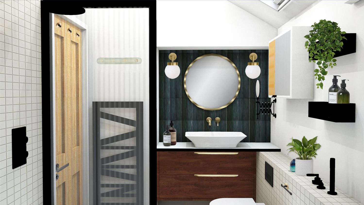
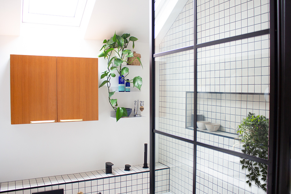
So, considering the trouble I’ve experienced, is designer paint really just an expensive version of any other brand of paint but with more hype and clever marketing? I think it really depends on the particular brand of paint you opt for. The good designer paint brands cover well, give a real depth of colour you can’t find anywhere else and could actually save you money as you’ll need fewer coats, so one tin will stretch much further. When I was working on my recent Mid Century bathroom project (which I wrote about here) I chose a durable, washable off white from my favourite paint brand, the Little Greene Paint Company. In the middle of the work being done, I received a panicked call from the decorator telling me that there wouldn’t be enough paint to finish the job, as he was used to cheaper brands which didn’t cover so well. I knew that this particular brand of paint provided great coverage, and that I’d bought enough paint, and reassured him. Everything was fine of course, and the clients now have a paint finish tough enough to withstand moisture and family life. |
||||||
 |
||||||
| the finished Mid Century bathroom | ||||||
|
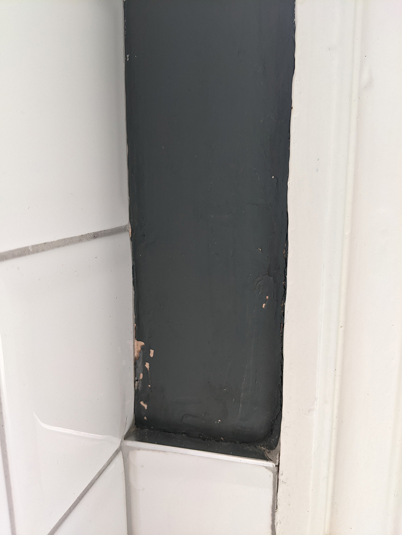
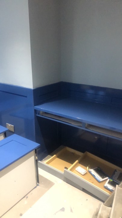
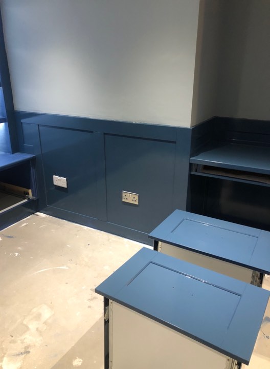
The more ‘everyday’ brands of paint are thinner in consistency than Little Greene, which makes them harder to apply, and you also spend more time cleaning up as they splash more. But the main selling point for the designer brands seems to be their colour palettes. Have you ever looked at the vast array of colours available from your local DIY store and been completely overwhelmed? There are so many shades within each colour that it’s almost impossible to choose from them. If you opt for a designer paint, you’ll get an edited version of the on trend and most used colours, as the brands have done (almost) all the hard work for you. They spend a lot on researching trends, so they know that when customers are looking for that special shade of blue it will be available in this year’s colour card. There’s also the argument that the colours themselves are actually deeper and more reflective than a standard paint brand. Those of you who’ve fallen in love with a designer paint colour and then tried to find something similar in the less expensive brands ranges will know that the exact shade is very hard to match. Designer paint brands not only have the perfect colour edit on their cards, those colours have lots more pigment than in the cheaper ranges, and are made using natural pigments (rather than synthetic dyes) which produces a real depth of colour. Have you ever looked at a wall and felt you could just dive in? No? Maybe that’s just me, but the less expensive brands just can’t give you that same enveloping feeling. Whilst we’re on the subject of colour matching, many of us try to make our budgets stretch further by having the designer paint colours matched and mixed up by a cheaper brand. You can see why - at £91.50 for a 5 litre tin of Little Greene paint, versus £26 for 5 litres of Dulux emulsion, the costs can soon add up. I have had clients mix up paints and then had problems when the colour just doesn't match (this is more pronounced with the darker paint shades, because the darker colour requires more pigment). Here’s an example - you can really see the colour difference between the first and second pictures, and the poor client had to change the paint after it had been applied to her cabinetry: |
||||||
|
||||||
|
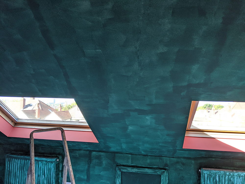
So, I don’t advise that anyone get the colours mixed - if you love that colour, there’s a reason for it, and a close (or not so close) match just won’t have the same effect. Go for the colour you actually want, and you’ll have forgotten about the extra cost in a couple of months. It does tend to be the darker colours that cause more problems, and in my experience, most brands struggle to achieve good coverage with their darker colours. If you followed my progress on instagram last year when I was decorating my office (which you can see here) you’ll know that it took 4 coats to go from an off white to a very rich and dark green, and I ran out of paint twice during the process! It was worth it though, just to get that perfect dark shade of green that sits somewhere between teal and forest green. However much pigment is in the paint, it will always take more paint to go from light to dark, so try to factor that in when buying your paint and working out quantities. |
||||||
|
||||||
|
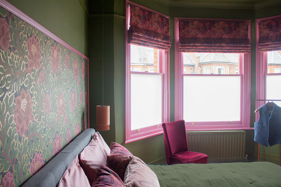
There’s another reason why the good paint brands are worth paying for. The heavily pigmented colours of designer paints also react very well to the available light in the room. Have you ever noticed that the colour of a room decorated in a designer paint changes subtly throughout the day as the sun moves around in the sky? Or that the effect of electric light can change the colours’ appearance quite dramatically? This is something you just don’t get with an off the shelf brand. The colour appears flatter and has less strength, making the whole room less pleasing to look at, and crucially, it doesn’t feel the same. Interestingly, Farrow and Ball eventually changed its paint formula to make it easier to apply after continued criticism from interior designers and decorators over the years. They had tried to make their paint more eco friendly in 2010 by removing their oil based finishes and replacing them with water based ones, but the colours produced by the water based paints were not the same strength. So in 2017 they added 20% more pigment to improve the opacity of the colour, and the paint did improve, but I think by that stage their reputation had been damaged. If your decorator is refusing to use Farrow and Ball then it’s already too late in my opinion, and it might be better to explore another paint brand. There have been times when I just couldn’t find the right shade for my projects outside of the Farrow and Ball colour charts - again, they have spent time choosing some gorgeous colours for their colour cards - so I have selected from the range but have made sure to tell both the clients and the decorator what to expect from the paint. My ‘Banchaland’ project was based around the Farrow & Ball colour Bancha, which was perfect for the room, and try as I might, I couldn’t find another shade which was just right. |
||||||
 |
||||||
|
So, I’m not saying that you should steer clear of all designer paint, or that all expensive paint brands are worth the extra cost, but I would say that it pays to do some research and speak to your decorator or designer to get some advice before buying. There are many paint brands out there, and it’s just as important to get the right paint finish and composition as it is to choose the perfect shade for your walls. If you’d like to read more of the Farrow & Ball articles I quoted, you can find them here: |
Welcome to the design blog, where you'll see posts about anything from the projects we are working on, to the latest fabric and wallpaper collections, and all things interiors related. We love colour, pattern, architecture and old buildings, and we love to share our finds with you.
Happy reading!