Online interior design from a client's perspective
 |
|
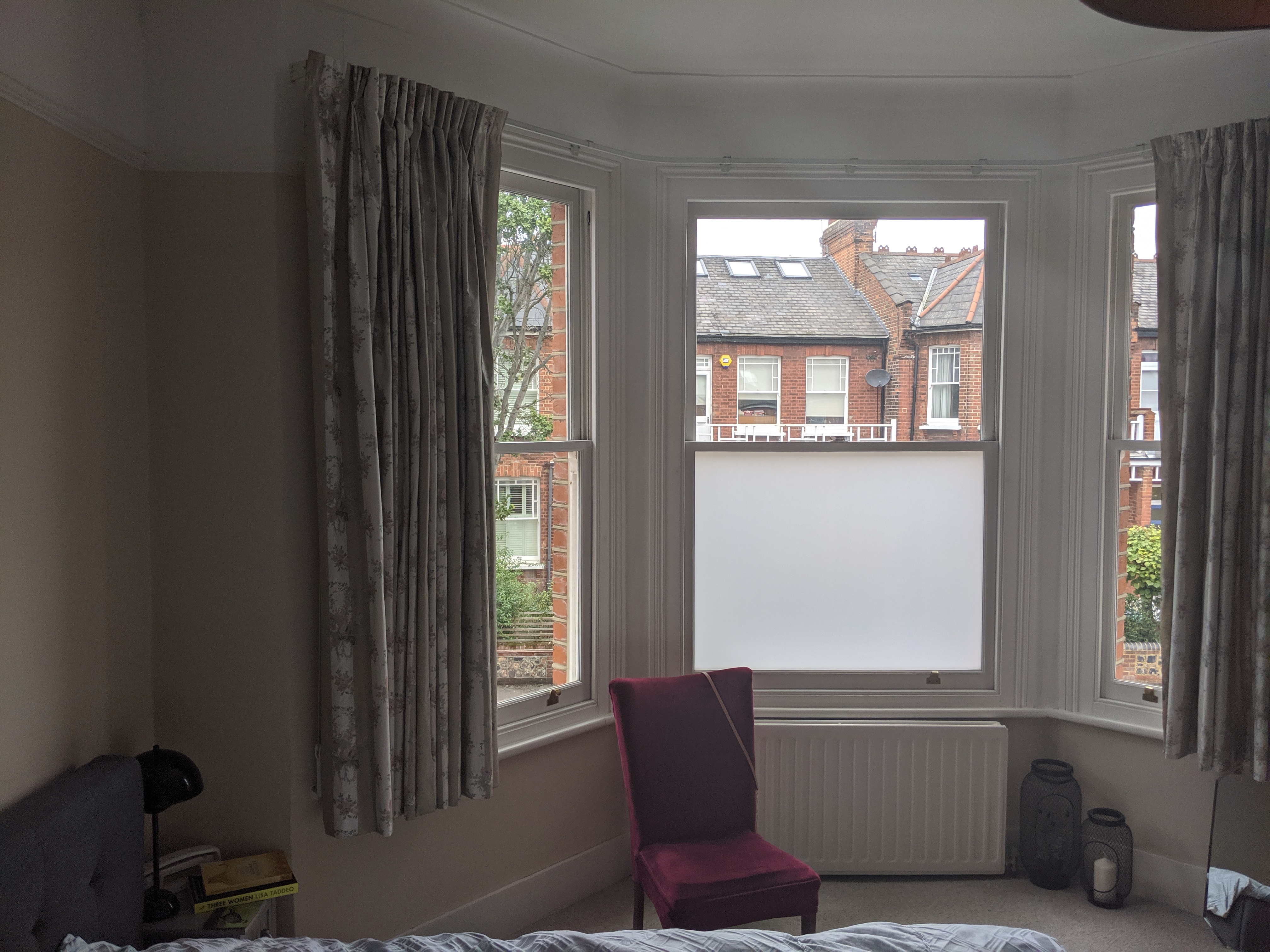
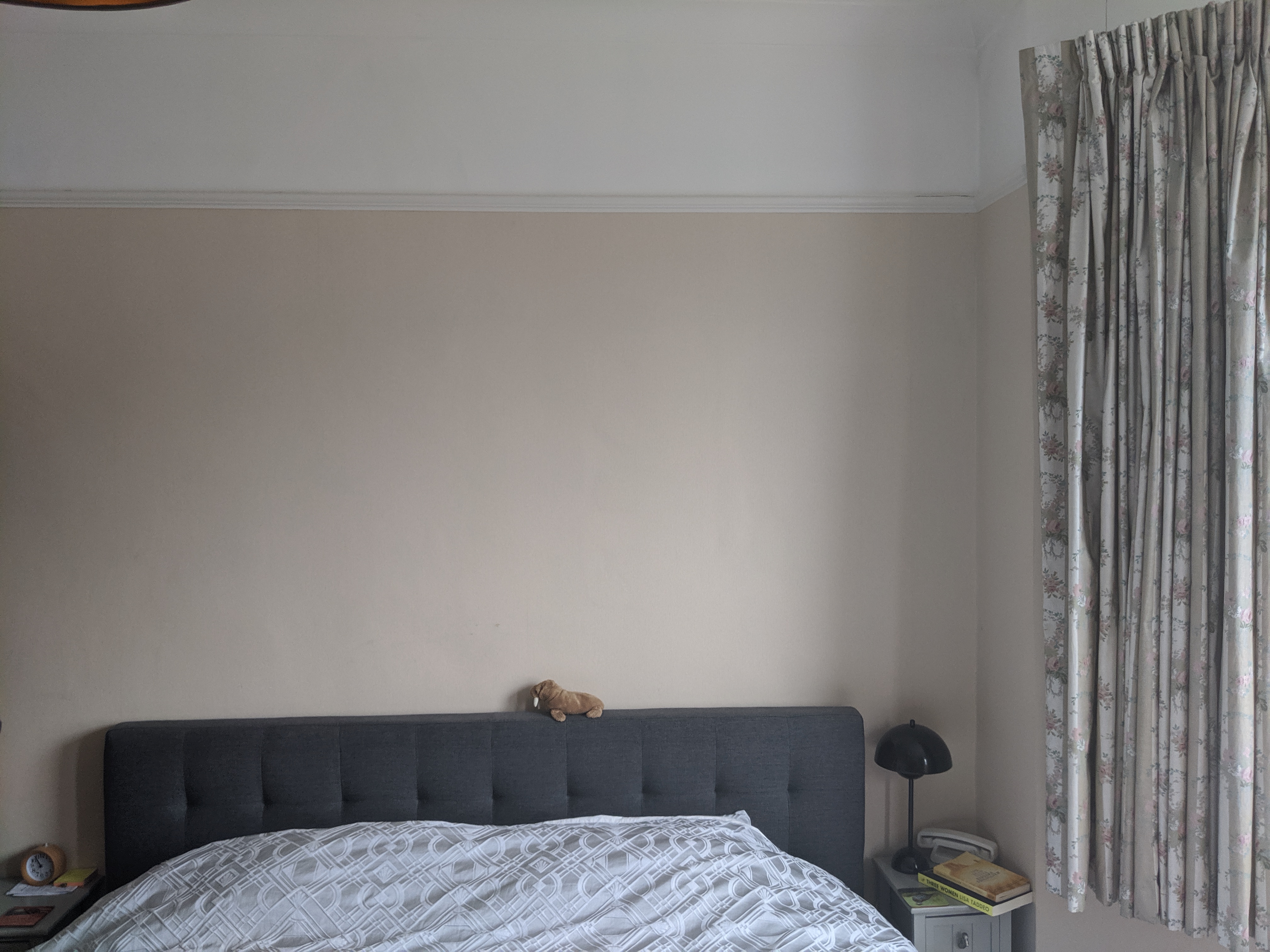
This month I want to share a project with you which I absolutely loved working on. It’s actually finished, so not technically a work in progress, but I will be putting the finished photos up on my website in the next couple of weeks so I thought I’d share the process with you and give you some background to it. I’ve worked with these clients before, on the Pink and Teal Reception Rooms, so I already knew that they loved colour and were open to lots of new ideas when it came to decorating. They asked me for help with their main bedroom, which hadn’t been touched at all since they’d moved in, and as the house was previously owned by the proverbial little old lady, the decor was a bit dated, to say the least. Here’s what the room looked like when I saw it for the first time: |
 |
 |
 |
|
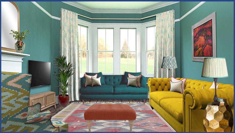
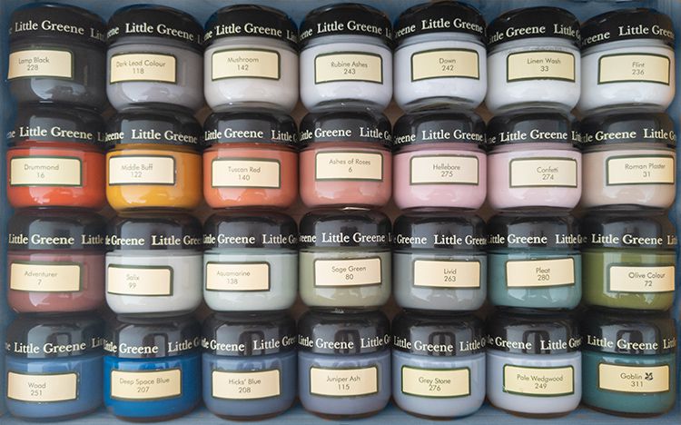
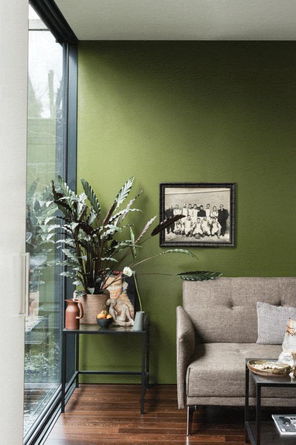
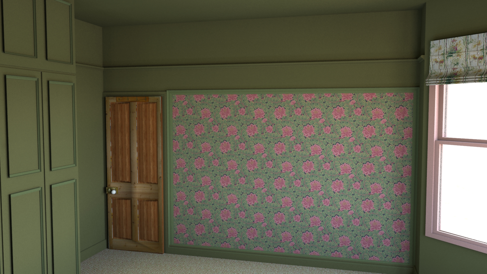
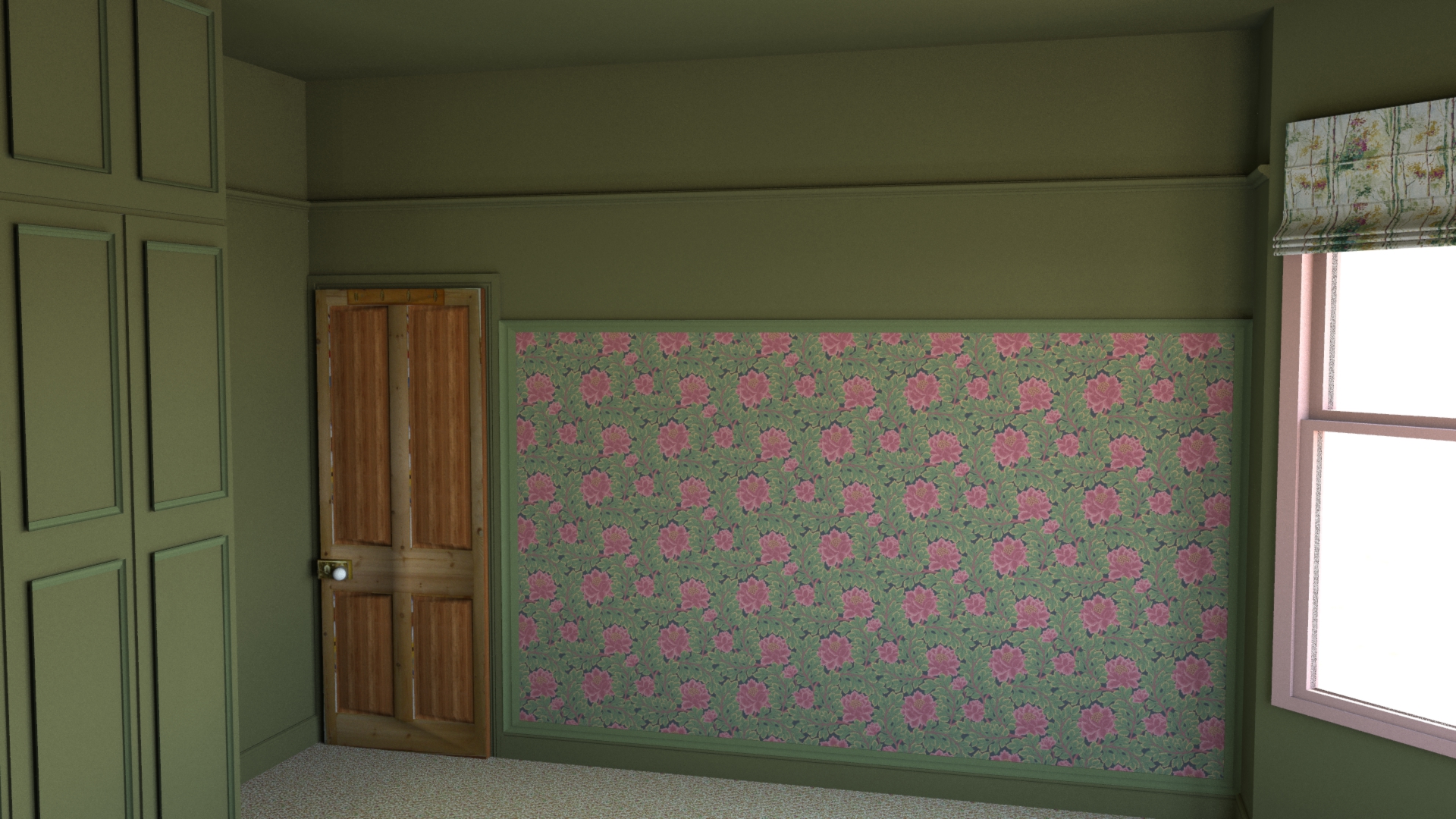
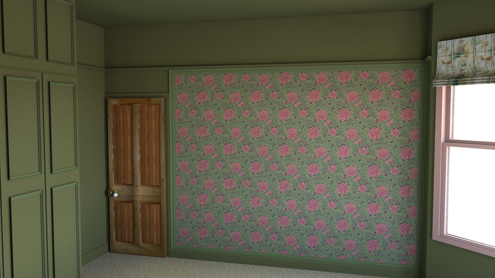
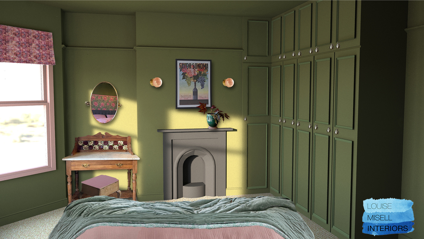
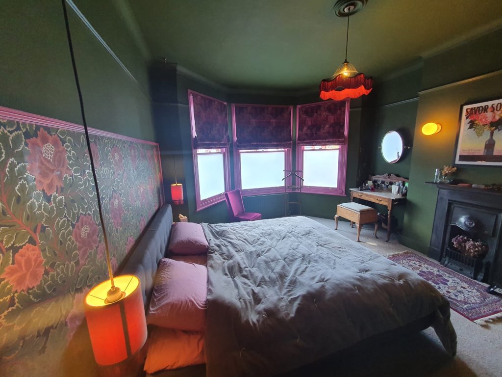
Those curtains were quite something, and the peach coloured walls have been out of fashion for so long that they are actually coming back into fashion! The brief was fairly simple - they wanted a warm, cosy, inviting room that they could relax in. Everything you’d want from a bedroom really. They wanted to embrace the period features in the room, such as the beautiful original fireplace and the bay window with its wooden sashes. They also wanted a touch of luxury, and for the decor to have a cocooning effect with the feeling of a gentlemen’s dressing room. The Mid Century style bed was fairly new, so it was staying, and they also wanted to keep the wall lights and the carpet, but everything else was up for a change. From the discussion of ideas we had during our initial phone call (the house is in London so we did everything virtually), I came up with two main design directions for them to choose from. I loved the Mid Century styling of the bed, and that got me thinking about the luxury of the Mid Century designs common in Palm Springs California, with its mix of strong and pastel colours and heavy use of foliage in wallpaper and fabric prints. The other concept I came up with was what I called ‘Modern Victorian’, which draws from the dark, heavy rooms popular in the Victorian era, but with the twist of added glamour and a modern, less cluttered feel. In order to help my clients see what ideas I had in my head, I created a Pinterest board with images for them to look at. If you’d like to have a look, you can see it here: https://www.pinterest.co.uk/louise_m_interiors/c-t-master-bedroom/ I sent the clients the two design concepts, so that they could discuss and decide which one they preferred. They came back to me pretty quickly and firmly with the Modern Victorian idea, which they loved, so that’s the one I developed. During our phone call, we’d also discussed a possible colour for the walls. As the room is North West facing (so gets a cooler light in the morning, stronger sunlight in the afternoon, and is generally not light and bright) we needed a colour which would be warm, and balance the harsher sunlight later in the day. We also wanted a colour which would embrace and give a cocooning effect, so I thought that a strong green with a yellow tone such as Farrow & Ball’s Bancha would be perfect. |
|
|
|
The Farrow and Ball website describes the colour as ‘a Mid Century modern green, perfect for those who want to embrace stronger colour, it creates rooms that feel calm and serene’. Just what we needed, and luckily the clients loved it too! I thought if we were going to use a statement colour, we should really go for it and use it on all walls, the woodwork and the ceiling. The ceiling in this period property is quite high, so it could take the effect of being visually lowered by the darker paint colour, whilst also adding to the cocooning feel we wanted. The clients were initially a bit scared of painting the ceiling in such a strong colour (we are all so used to ceilings being white) but they now tell me that it was the best decision they made! So we had a design concept and a wall colour - what next? The next big issue for the couple were the ugly melamine 1970s built in wardrobes. |
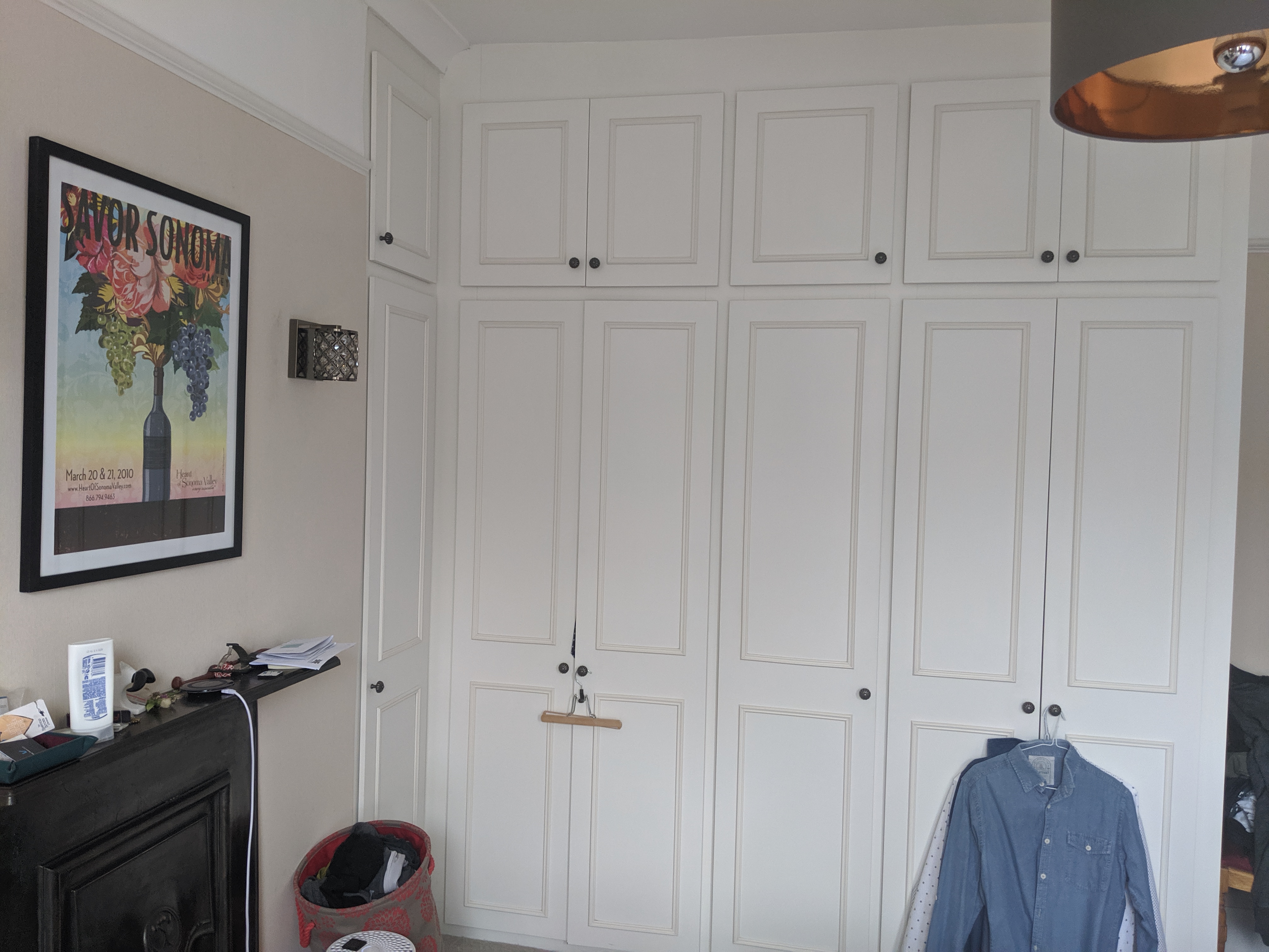 |
|
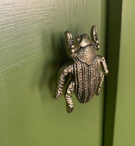
They were large and dominated the room, and I felt they really dated the decor. But because they were so large, they provided a whole lot of useful storage, so we had to think about the best way to replace them. We discussed having a carpenter build some bespoke storage either side of the fireplace, but we would then lose the alcoves and the amount of useable hanging space would be drastically reduced. I thought the best (and most cost effective solution) would be to keep the wardrobes and try to ‘hide’ them by painting them the same colour as the walls. I also found some glam brass beetle handles to replace the plain round ones. The clients say that the wardrobes have gone from hideous to looking like bespoke built in ones, which would have cost thousands to have made, and they are beyond pleased with them. |
|
|
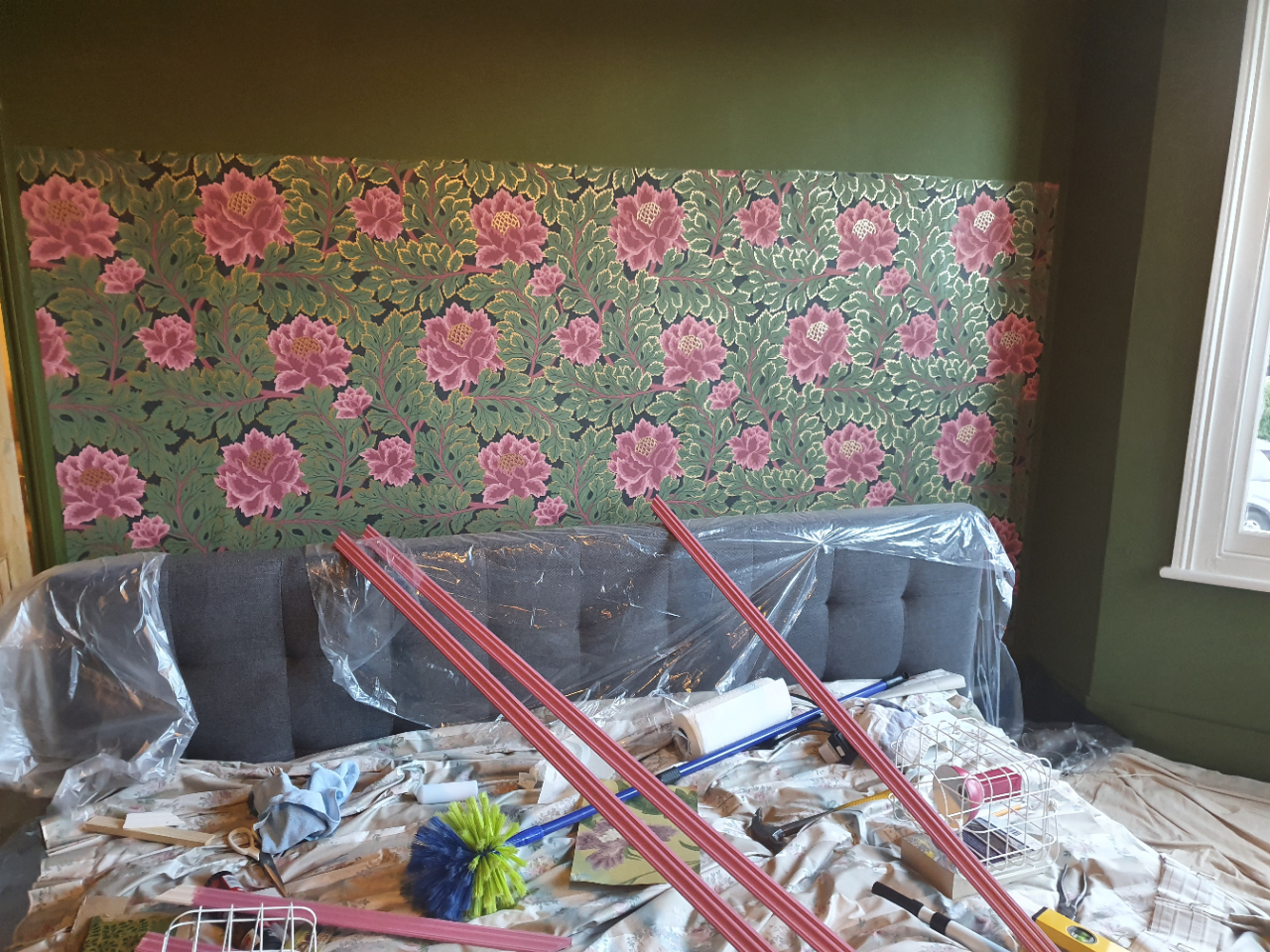
| I felt from the beginning that the room could take a bold wallpaper, but I didn’t want to use it all around the room as it could easily be too much pattern for a bedroom, and might not be so restful. I had the idea of placing the wallpaper on a section of wall, surrounded by wooden moulding or beading to finish it off. It made sense to me that the wallpaper should go behind the bed, so that it would have the effect of extending the headboard and making the bed feel more luxurious and inviting. The clients loved this idea, and we played around with the exact height and positioning of the wallpaper until we were happy. |
 |
 |
 |
|
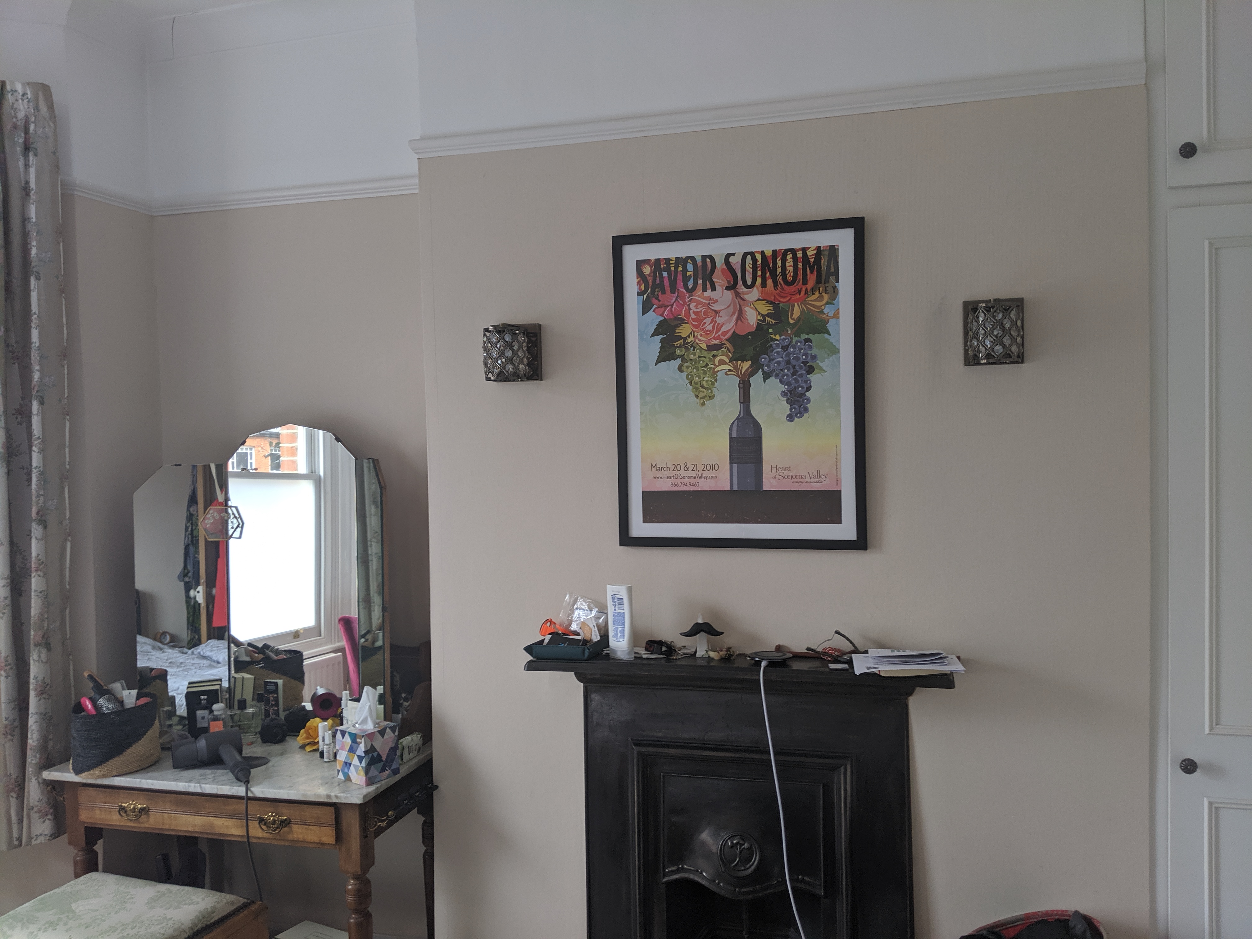
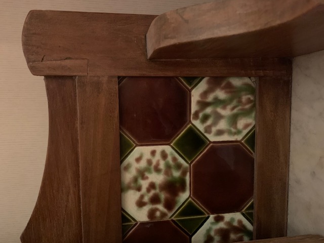
Once the wallpaper was sorted, it was time for me to source the new items for the room. Since we’d decided on the Modern Victorian look, it became clear to all of us that we should keep the client’s original dressing table, which had a gorgeous marble top and brass detailing. It’s actually an old washstand, and had some beautiful tiling which was being hidden by a large mirror. |
 |
|
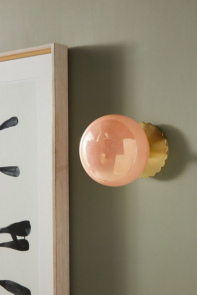
So we decided to remove the existing mirror and add a new mirror on the wall above, so that the piece could still work as a dressing table. I also sourced three foxed mirrors to go on the wall by the door, to add some interest to that corner. Even though the clients had said they wanted to keep the wall lights either side of the fireplace, I felt strongly that they didn’t work with the look of the rest of the room, so I found these stunning ones in a pearlised peach finish with a brushed brass fitting - very glam. |
|
|
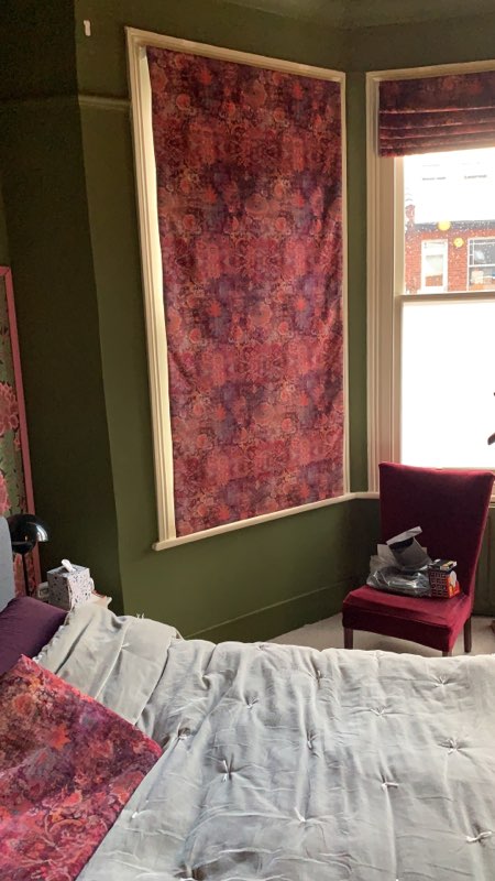
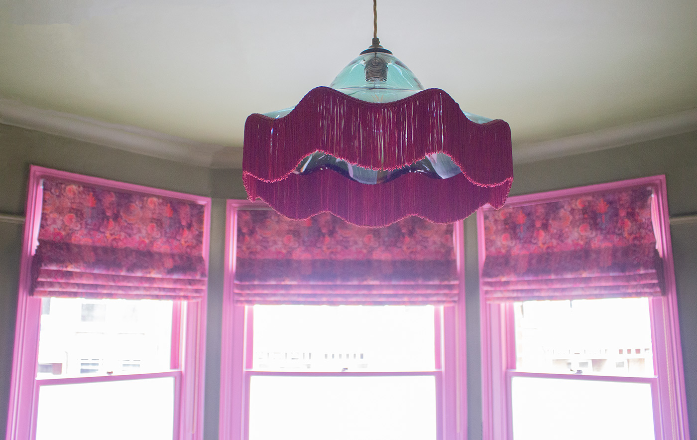
| I then thought about the window dressings. The clients had inherited some pretty hideous granny style short curtains (and I don’t mean granny chic by the way). They had to go, but I felt that full length curtains would have been too fussy, and they would also have covered up the radiator. So I suggested blackout lined Roman blinds - clean and simple in style, but the fabric could still add a decorative element. The windows already had one panel of window film in the middle, so I suggested the clients could add the same at the bottom half of the other two windows to provide privacy when the blinds were open. Then we just had to find the right fabric for the blinds. I offered a few options, including this one with elements of greens, pinks and teals, which almost made the cut. |
|
|
|
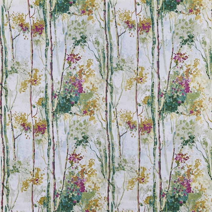
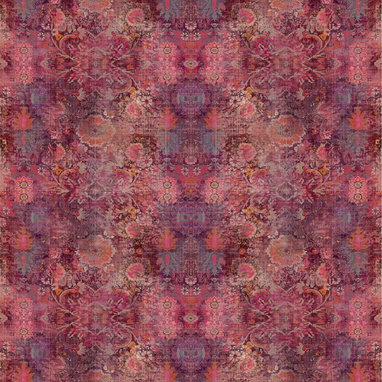
But something wasn’t quite right with the fabric for the blinds (I think the base colour was too light), and the clients asked for some more options. It was then I found THE PERFECT fabric - |
 |
|
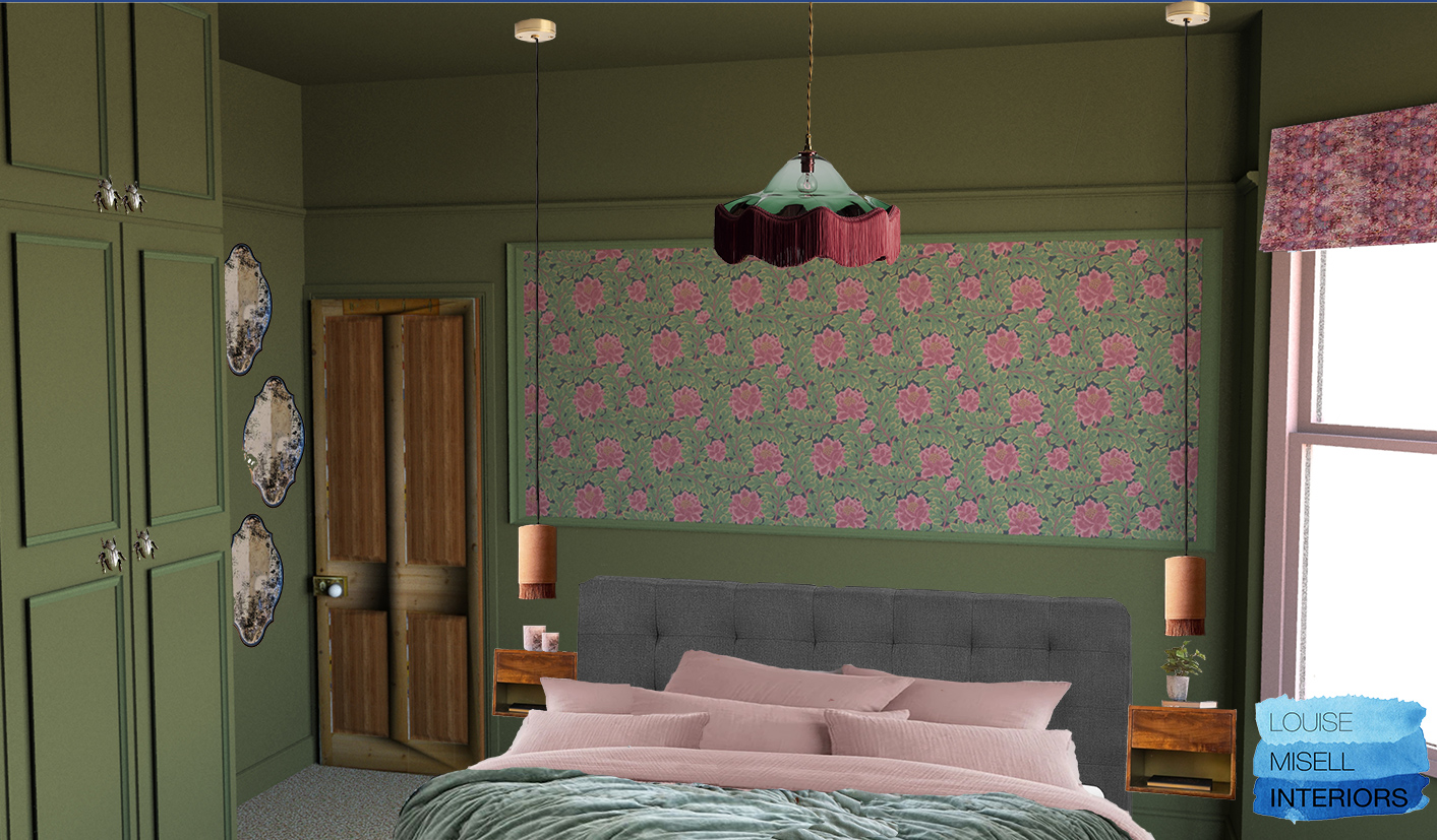
Because its a velvet, it has a luxury, decadent feel, and it has exactly the right shades of pink to complement the pinks in the wallpaper and green of the walls. It even has some peach tones in it, which pick up the colour of the wall lights and the hanging shades of the new bedside lamps. Once that was settled, I finished the visuals so that the clients could see how the finished room would look: |
 |
 |
|
As you might have spotted from the visuals I made for the proposed design, I thought that the original window frames should be painted pink to contrast the walls, and really show off this part of the room. The clients weren’t too sure about this idea, so because it was their bedroom and they needed to be happy with it, I helped them pick a toning off white instead. They actually painted the frames in this colour, and then decided that the pink I’d chosen for the beading around the wallpaper would look so much better, and repainted. I’m so glad they did - it always pays to be brave in my opinion! |
 |
 |
|
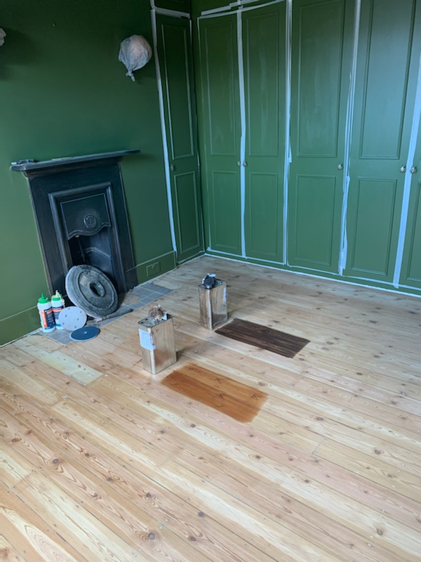
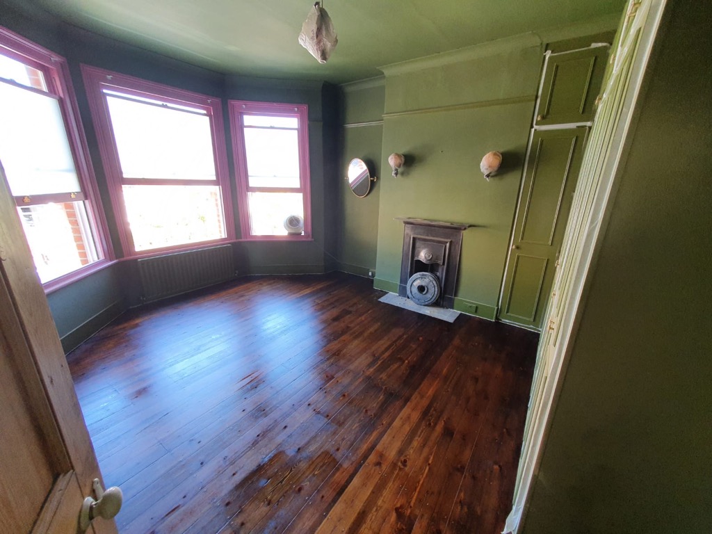
Another element which developed over time was the flooring. When we’d had that first phone call, I’d suggested taking up the beige carpet and sanding the floorboards, but the clients felt that the hassle of doing this and the mess from the sanding would be too much. They decorated the room and kept the carpet, and just when everything was nearly finished, I think they got a ‘second wind’ and decided to go the whole hog and reveal the floorboards. I helped them pick a gorgeous dark walnut shade for the newly sanded boards, and the room was finished. |
|
the sanded floorboards with two varnish colour options |
|
|
|
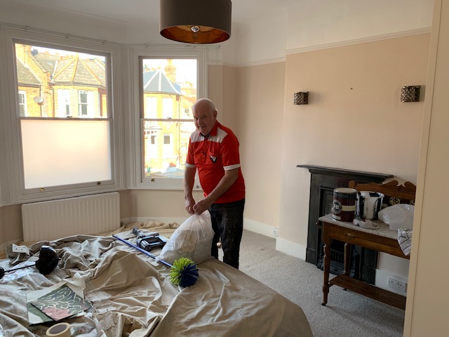
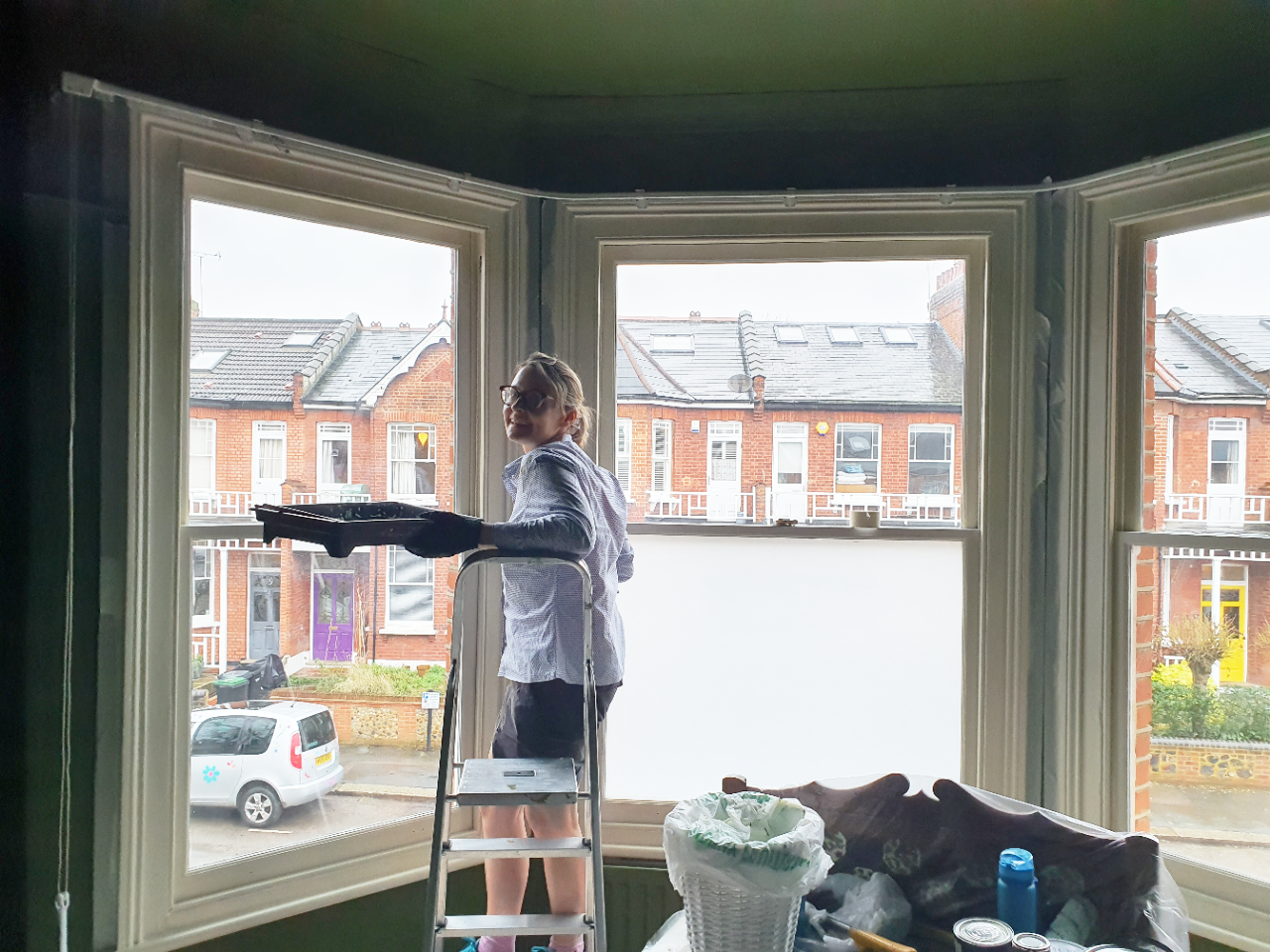
Here are some pics of the room being decorated, and the clients (and one superstar dad!) doing all the hard work themselves: |
 |
 |
 |
|
I have to thank them for working so hard and being so open to all of my ideas. It’s such a joy to see the results of our meeting of minds become a finished room that the clients can enjoy. Here’s a few words from the clients themselves on the whole experience: |
We worked with Louise on another project and she really understands us and what we want to achieve. I’d definitely recommend taking the time to be honest with your desires up front but also be prepared to be challenged too. Louise came up with 2 different colours/design ideas and we went for the bolder one as we just loved the colour she chose for our north facing bedroom. There is no way we would have ever dared to do it without her expert guidance and there’s no way we would have chosen the colour without her. Everything was so easy. Once we chose the colour and the look we wanted, she sourced some amazing products and helped with all the complex calculations for wallpapering panels, wood trims, painting etc. She also found a more expensive blown glass bespoke lampshade that once introduced, we simply had to have! |
 |
| Some final words from my clients: |
All our family and friends comment on how warm it feels. People say the room looks bigger now that everything has been ‘Bancha’d’ - I think it’s because we went for one bold colour pretty much everywhere. My 81 year old Father was called in to paint the room with us and when he opened the paint tin and saw the Bancha green he thought we had gone mad! We absolutely love it. It feels like a Victorian Boutique Hotel bedroom with mid century accents. The overall look really respects and brings out the best in our Victorian Terraced home in North London. My Dad did finish the painting and then went home inspired to painted his lounge……..…Turquoise!!!! |
|
I’m not sure what that says about my design skills... |
Welcome to the design blog, where you'll see posts about anything from the projects we are working on, to the latest fabric and wallpaper collections, and all things interiors related. We love colour, pattern, architecture and old buildings, and we love to share our finds with you.
Happy reading!