What colour should I paint my walls?
 |
||||
|
When I have colour consultations with clients, we spend lots of time thinking about colours for the walls, and then choose complementary or similar colours for the woodwork. Next, I often suggest choosing a colour for the ceiling. Lots of clients are surprised by this approach as they think that ceilings have to be painted white. Some are a little scared by the thought of doing anything else, and whilst it’s okay to feel nervous about stepping out of your comfort zone, I think it’s good to explore the possibilities for decorating this surface. Look at your ceiling as another opportunity to add style, personality and interest, as it could be the thing that takes your home from ‘nicely decorated’ to ‘wow’. |
||||
|
There are many reasons to think about other treatments for this surface. We’re happy to spend time making sure that our flooring choices co-ordinate with our decor, but most of the time a floor is covered by furniture or rugs. In contrast, our ceilings are often flat with no features other than the ceiling rose or light fitting in the middle. A large expanse of white that isn’t broken up by any other items can draw more attention to itself, so we’re really just drawing attention to the least interesting part of the room. |
||||
 |
||||
| So why do we default to white? We believe that white painted ceilings will enhance the feeling of light and space, which is something that we all think we would like more of. We believe it’s a safe choice and we think it will make our ceilings ‘disappear’, so the room will feel larger. We also do it because we’re used to it - aren’t ceilings supposed to be painted white? Isn’t that the way we’ve always done it? | ||||
|
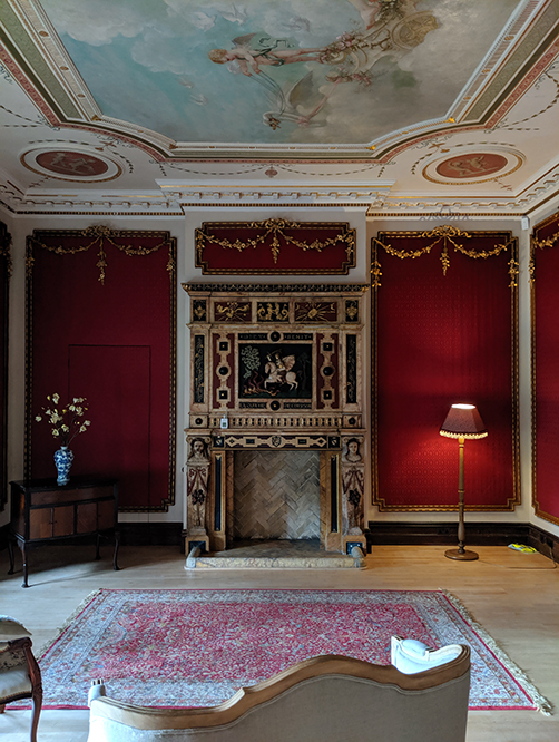
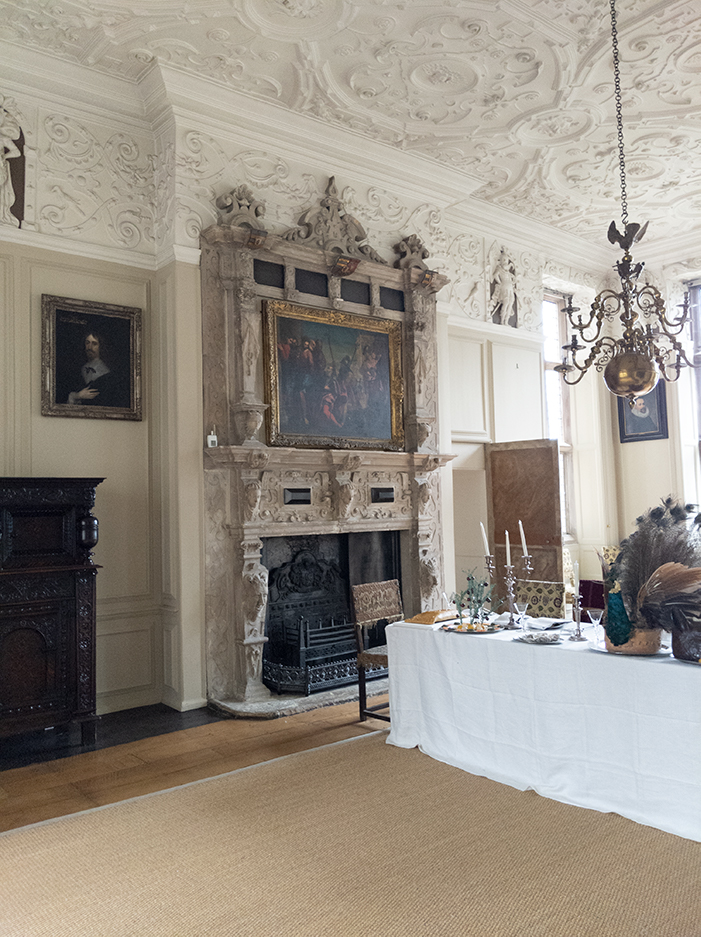
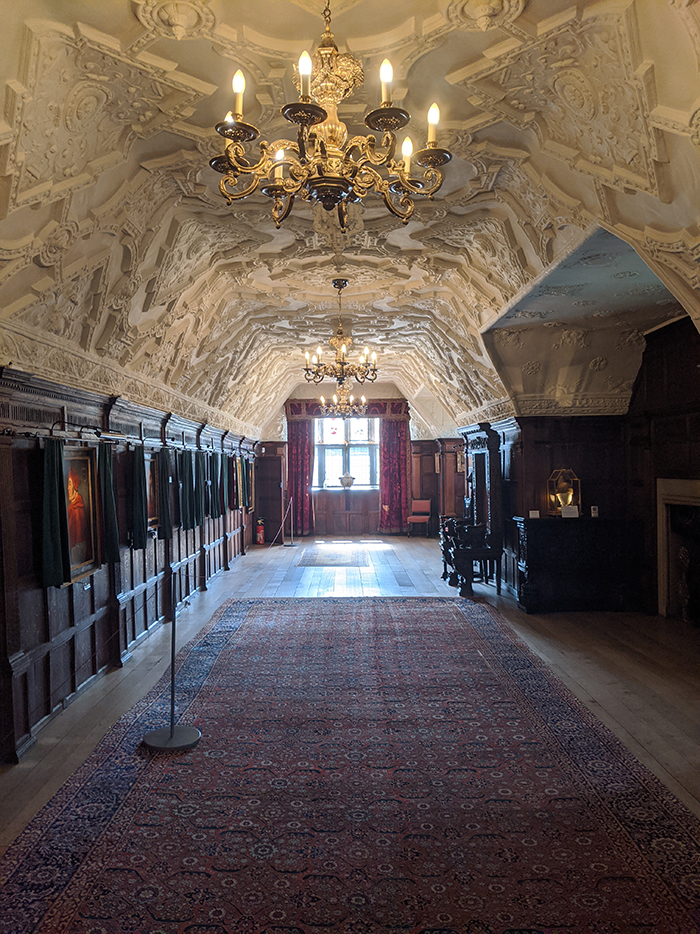
When we look back through history, ceilings haven’t always been white. Think of every stately home you’ve ever visited. The ceilings are often richly decorated and are a focal point of the room. We crane our necks looking up to see the visual delights above us - whether that be a scene depicted from the bible, or the ornate flowers, shapes and animals painted by the Victorians. These amazing pieces of art really add to our enjoyment of viewing the rooms, and it would be a real shame if the ceilings weren’t as ornate as the walls and furniture in these houses. |
||||
William Morris, (the well loved 19th Century textile designer, poet and novelist) is known for using stencilling and wallpapers on the ceilings in the homes he decorated. He and his friends often painted the ceilings by hand, and the striking patterns sometimes look remarkably modern. This extra layer of decoration is inspiring and makes the rooms feel complete. You can see some of the beautiful ceilings in William Morris’s Red House on this blog. |
||||
|
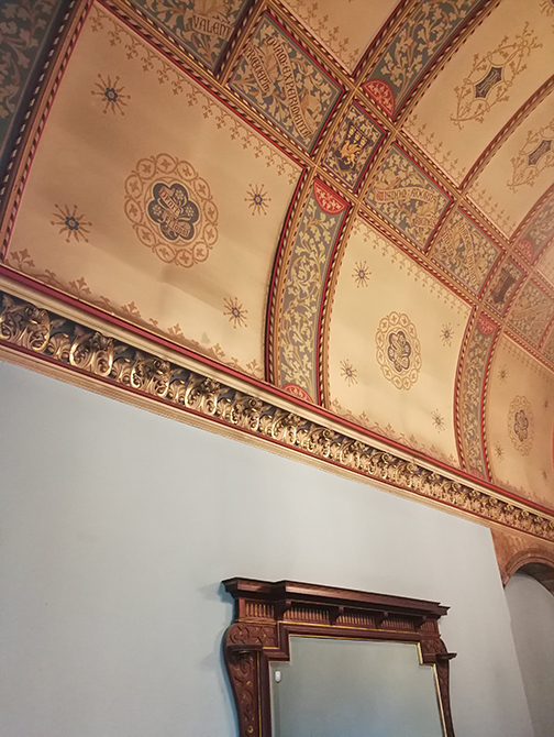
Even when the ceilings in historic buildings were painted white they were often filled with delicate plasterwork. These fine plasterwork details add texture, grandeur and an element of surprise. |
||||
So why did we decide that a plain white surface is the only way a ceiling can be dressed? One theory is that in the early days of electric ceiling lighting, the fixtures and bulbs weren’t very powerful. A way to brighten things was to paint the ceiling white so it reflected the light back into the room. But modern lighting and bulbs have come a long way since then, and we often have various types and heights of light sources in our homes, so we no longer need a white ceiling to help out. So, if we’re not going to paint our ceilings white anymore, what should we do with them? |
||||
|
Say you opt for stronger colours on the walls, if you have chosen an exciting colour scheme for your room, and the ceiling is plain white, it will become more noticeable. A white ceiling will stand out all the more and detract from the other carefully chosen elements in your room. If you have strong colour on the walls and a white ceiling, the eye is drawn to the ceiling first and the place where the wall colour stops and the ceiling colour starts. This really stands out, because in effect you’ve highlighted the contrast between the two colours. I’d suggest either painting the ceiling the same colour as the walls, or going for a co-ordinating colour from the rest of your scheme. Lots of people worry that using a darker colour on the walls and ceiling will make a space feel closed in, but it has the opposite effect - it can make a room feel larger because the edges are less defined. |
||||
|
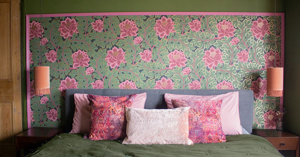
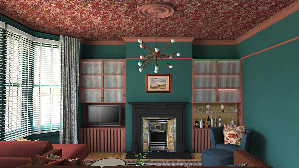
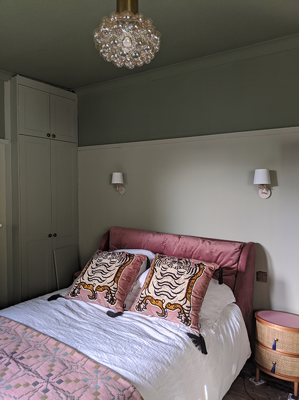
A dark ceiling with lighter walls can give a room a feeling of infinity, like the ceiling opens up and goes on for miles. A dark ceiling paired with the same colour on the walls can make a room feel really cosy and cocooning. Look at one of my recent projects to see what I mean: |
||||
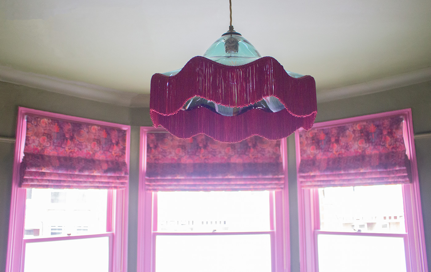 |
||||
| This is what the client said about painting the ceiling the same colour as the walls: | ||||
"I was a bit scared to do the ceiling in Bancha but it was the best thing we did. People say the room looks bigger now that everything has been “Bancha’d” - I think it’s because we went for one main bold colour pretty much everywhere. The room has the WOW factor and all our family and friends comment on how warm it feels." |
||||
|
Tina on the Bancha Bedroom. You can see more of this project here |
||||
|
Even if you choose paler colours for your walls, if you paint them any colour other than the exact same white as the ceiling, you will have made the junction between the walls and ceiling stand out because of the contrast between the white and the colours. If you really don’t want too much colour on your ceiling, I’d suggest painting it a few shades lighter than your chosen wall colour, which will give your room a sense of harmony. |
||||
|
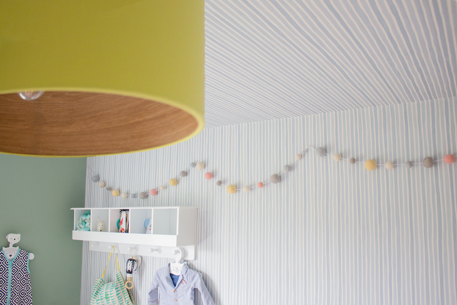
You can also use wallpaper to decorate a ceiling. In this nursery project of mine, I chose to take the striped wallpaper up one wall and over on to the ceiling. This gave the baby something interesting to look at whilst lying in his cot, whilst the subtle stripe wasn’t so busy that it might stop him from sleeping. |
||||
 |
||||
|
In a design I’ve recently completed, I chose to enhance the grand proportions of this living room with a magical and richly coloured wallpaper. I wanted to play with the large surface of the ceiling, and use it as an opportunity to add another layer of pattern, whilst also drawing attention to the gorgeous original cornicing between the walls and the ceiling. I highlighted the cornice in a colour which tones with the wallpaper but is a contrast to the wall colour, making it a key part of the overall scheme. Cornicing is technically part of the ceiling but could be treated either way - it could be painted the same colour as the walls or the same colour as the ceiling, or of course a different colour altogether. |
||||
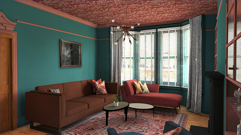 |
||||
|
The point is that these details can be played with and treated any way you like. People often think that they must paint one colour up to the picture rail, then add another colour lighter colour above the picture rail, then the ceiling colour would be white. This approach gives a fragmented look - the visual lines of the room are too broken up and the proportions of the room aren’t enhanced. |
||||
 |
||||
|
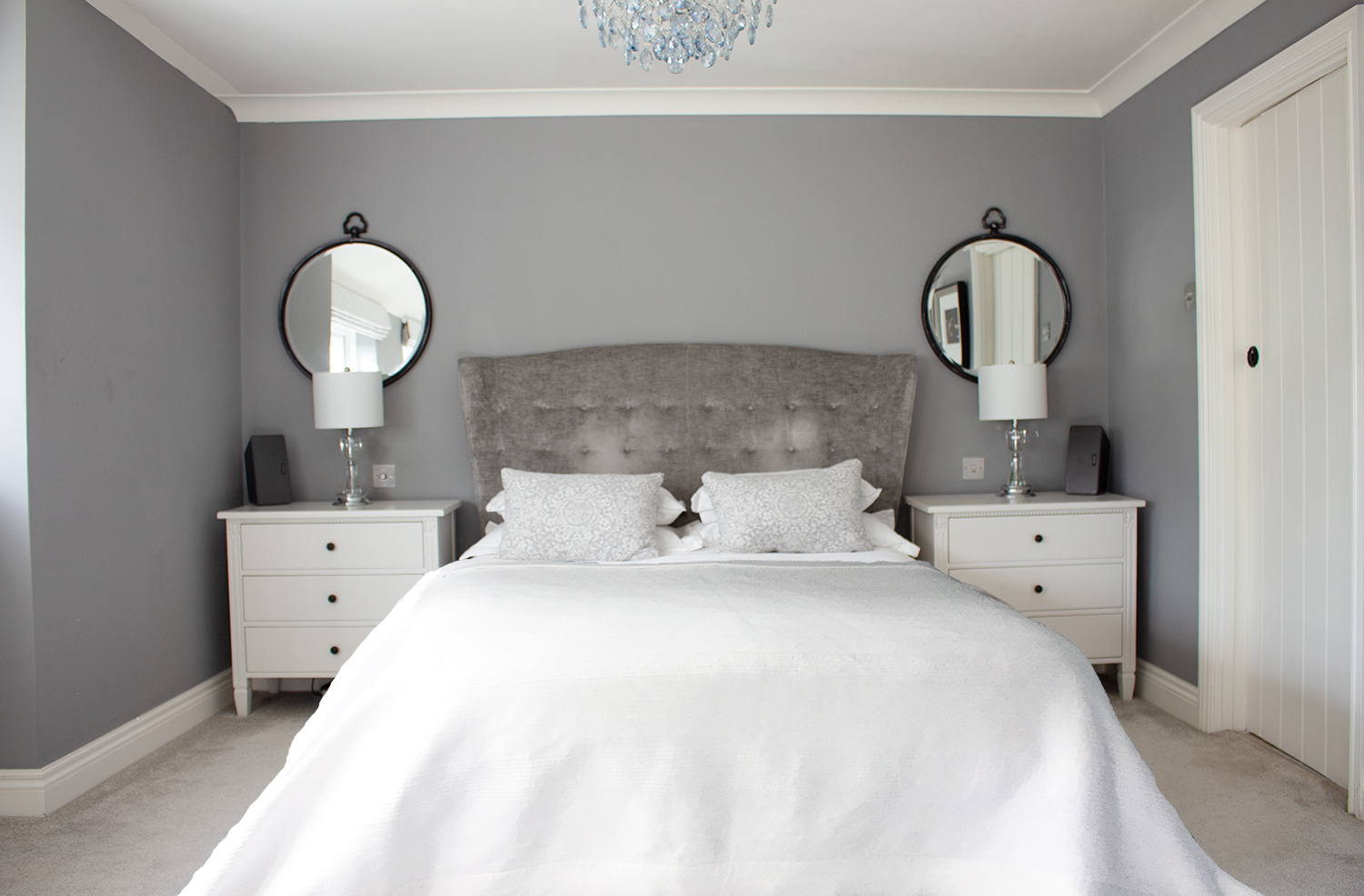
If you do have a picture rail, one option is to take the colour of the ceiling and bring it down to the rail, which will visually lower the height of the ceiling and make the room feel cosy. You might want to do this in a room such as a bedroom, where you’d like to feel snug and safe. Here’s a project where I did this (still a work in progress): |
||||
 |
||||
|
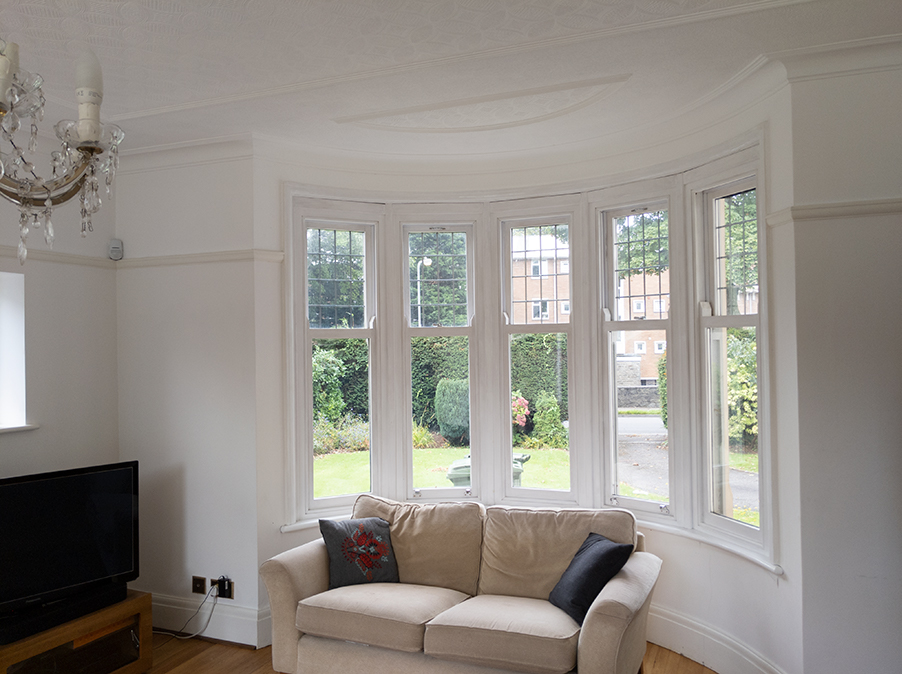
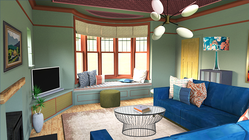
If you have any architectural details on the ceiling itself, you can play around with colours and finishes to make them a focal point. Here’s the plain white ceiling of a client’s room before, and my design for the room, which included painting the details in different colours. |
||||
 |
||||
|
A before picture of a living room I'm working on, with the ceiling details all painted white |
||||
 |
||||
|
the design highlights those beautiful details using contrasting paint colours |
||||
|
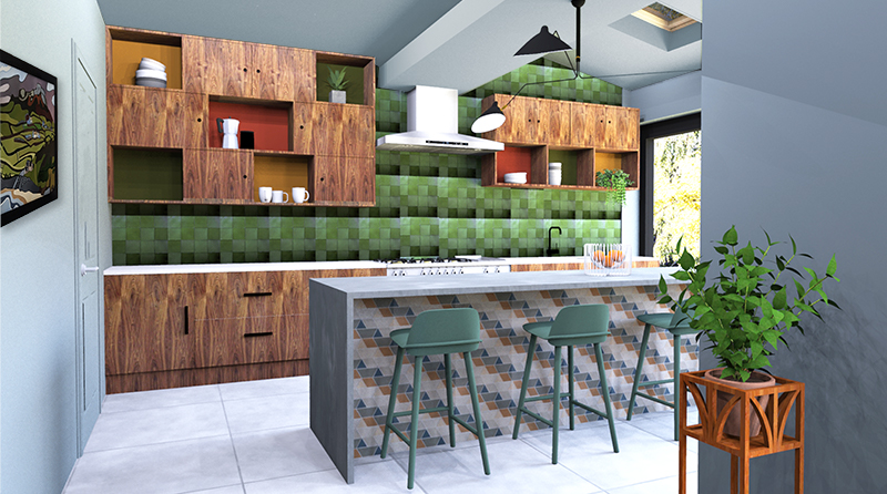
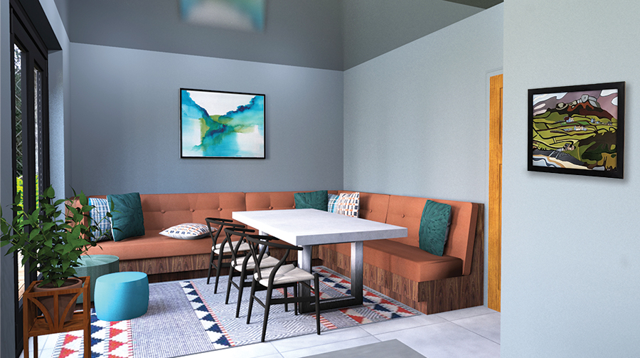
For this same client, I chose to use one colour for the walls and ceilings in the kitchen, as the extended room had lots of quirky angles. Painting them white would only have highlighted the many angles in the room, making it feel too busy. However, in the dining area of the same room, I wanted to encourage a more relaxed mood, as this would be the place where family dinners would be held. I decided to use the same colour as before, but the section above the dining area would be painted in a gloss finish, whilst the rest of the walls and ceiling would be matt. The gloss paint would reflect back to define this area, making it feel special, and would look great when dinner candles give a soft glow on the ceiling. |
||||
 |
||||
|
painting the ceiling the same colour as the walls helps soften the different angles |
||||
 |
||||
|
the gloss finish over the dining area of the kitchen |
||||
|
So, there are lots of reasons not to play it safe with your ceilings. If you’ve gone to the trouble of designing a colour scheme for your room, not considering the ceiling is a missed opportunity. Experiment and have fun, and remember, it can always be painted over if you don’t like it. |
Welcome to the design blog, where you'll see posts about anything from the projects we are working on, to the latest fabric and wallpaper collections, and all things interiors related. We love colour, pattern, architecture and old buildings, and we love to share our finds with you.
Happy reading!