Do you need an expert eye to look over your renovation plans? Try our Renovation Plan Review service

A weekend Ikea cupboard makeover

9 min read

Published 14 Dec 2018


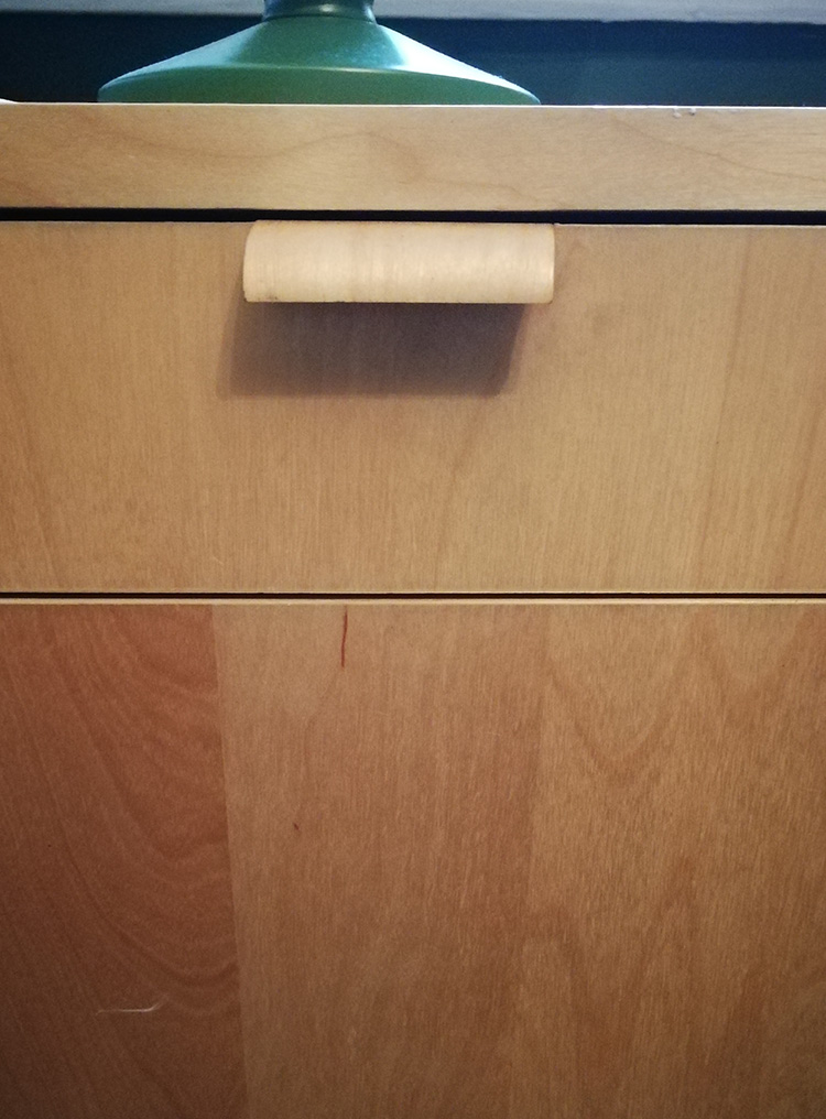
Whilst everyone is madly trying to get themselves and their homes ready for Christmas, I decided to finally get around to a little project I’ve had on the back burner for a while now. I bought this cupboard when we moved in to our house over 13 years ago. We needed some extra storage in the hallway, and there was a handy space next to the front door which was perfect. We didn’t have much spare cash (having just bought the house, that and the fact that I wasn’t working as I was looking after our two boys). So, off we went to Ikea, and I found this cupboard which fitted the space perfectly.

 a photo of the cupbaord before I started to work on it

I never really liked the finish of it, as I’m not really a Scandi type girl when it comes to decor, but it did the job and I always thought I would replace it sooner or later. Fast forward 13 years and although I’d completed lots of projects around the house, including a kitchen extension and a new bathroom, somehow I never quite got round to doing anything about this cupboard. It looked even worse when I painted the hallway this gorgeous shade of dark green (Paint & Paper Library's Hunter Dunn) a couple of years ago, as it really made the pale wood stand out.

So, one weekend I finally tackled the problem. I didn’t want to go hunting for a new cupboard, and this one does fit the space well, so I decided to revamp it. I’d had a go at painting furniture with chalk paint before, and that turned out well, so I thought I’d paint it. I also wanted the finished look to be a little more glam (especially as the hallway is now a rich colour), so I thought of combining paint with wallpaper to make it look a little special. I also wanted to change the handles to something a little more interesting.

a close up of the handles on the cupbaord before being changed

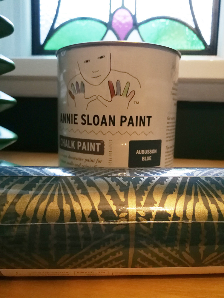
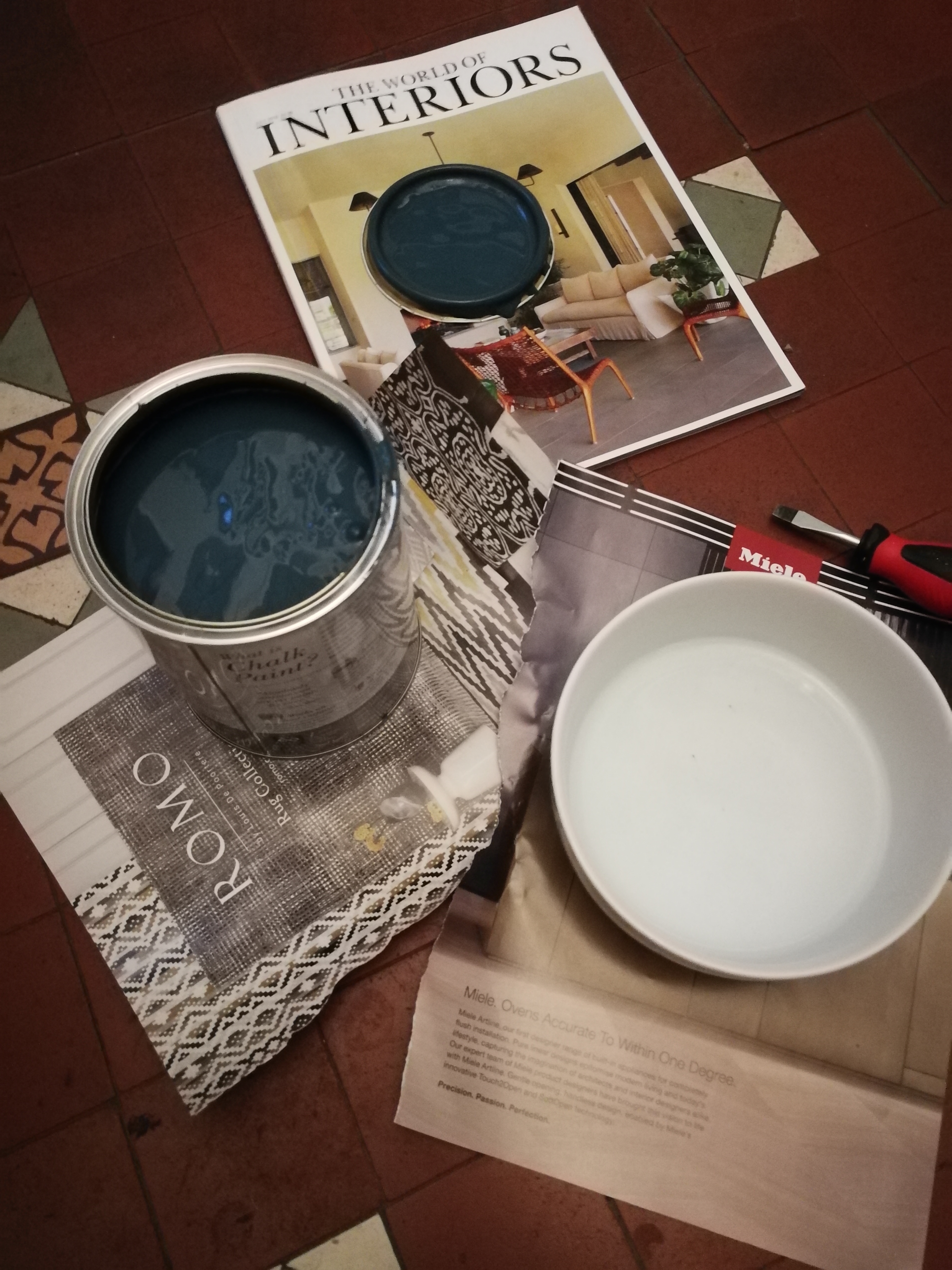
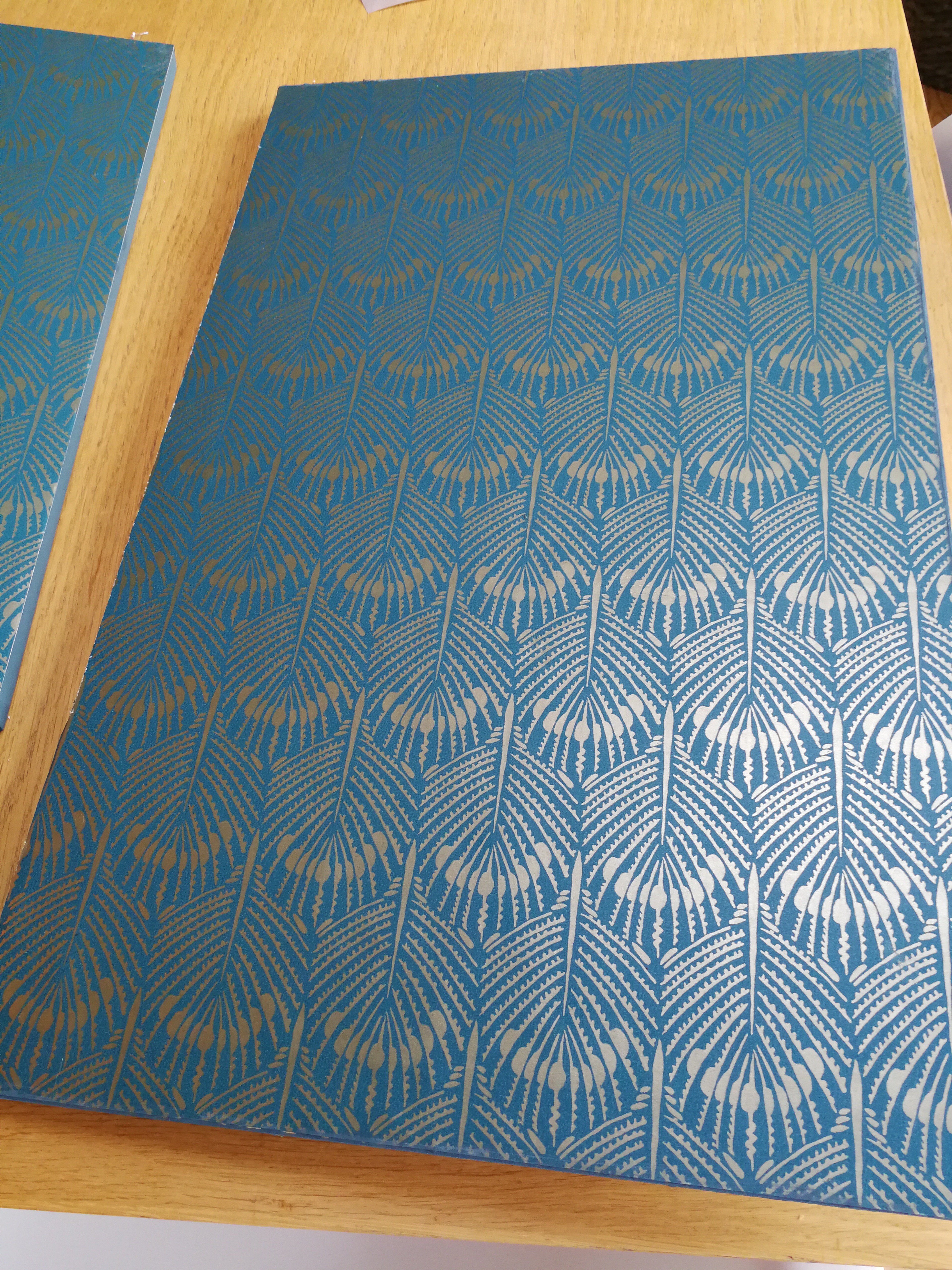
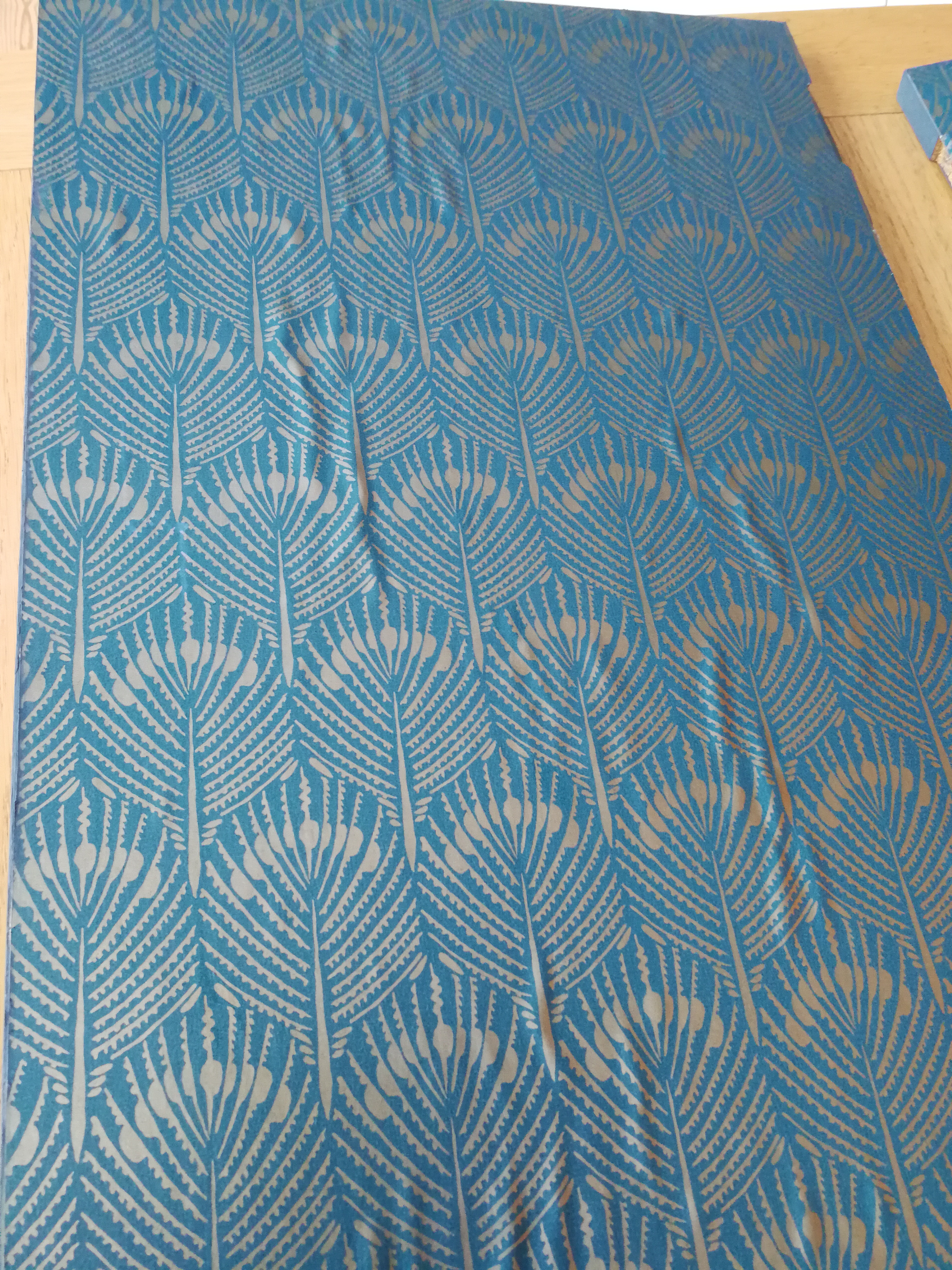
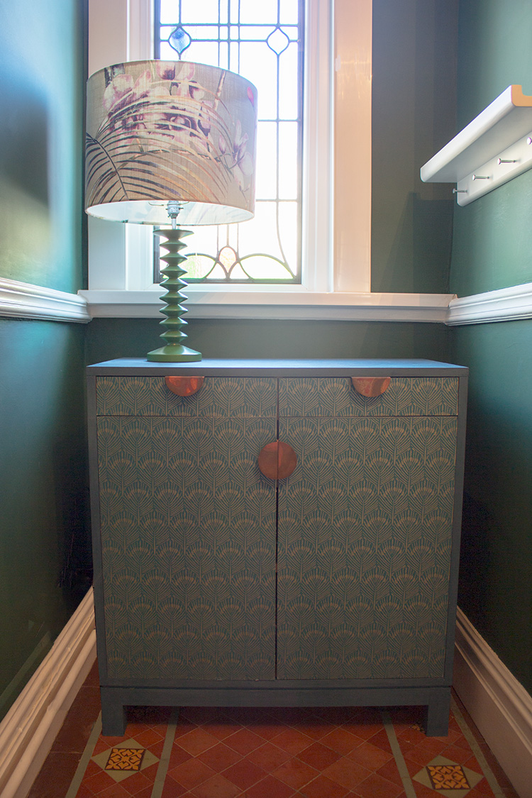
The paint I chose to use is this gorgeous shade of blue from Annie Sloan called ‘Aubusson Blue’, and an inexpensive wallpaper from John Lewis called ‘Pavone’ in Teal. I thought the rich blue would look great against the dark green of the hallway, and the background colour of the wallpaper matched the paint perfectly. The gold Art Deco inspired pattern on the wallpaper exudes glam, so I thought it was perfect. You can buy the paint here, and the wallpaper here.

the roll of wallpaper I used, im front of the tin of paint I used

I used masking tape to cover the areas where I was going to wallpaper, as I didn’t want any stray paint stopping the wallpaper from sticking to the wood. I didn’t do this on the drawer edges, or on the parts of the doors which I could just open to avoid getting paint on.

a shot of masking tape over on edge of the cupboard
a shot of the drawers open, with paint being applied around the edge

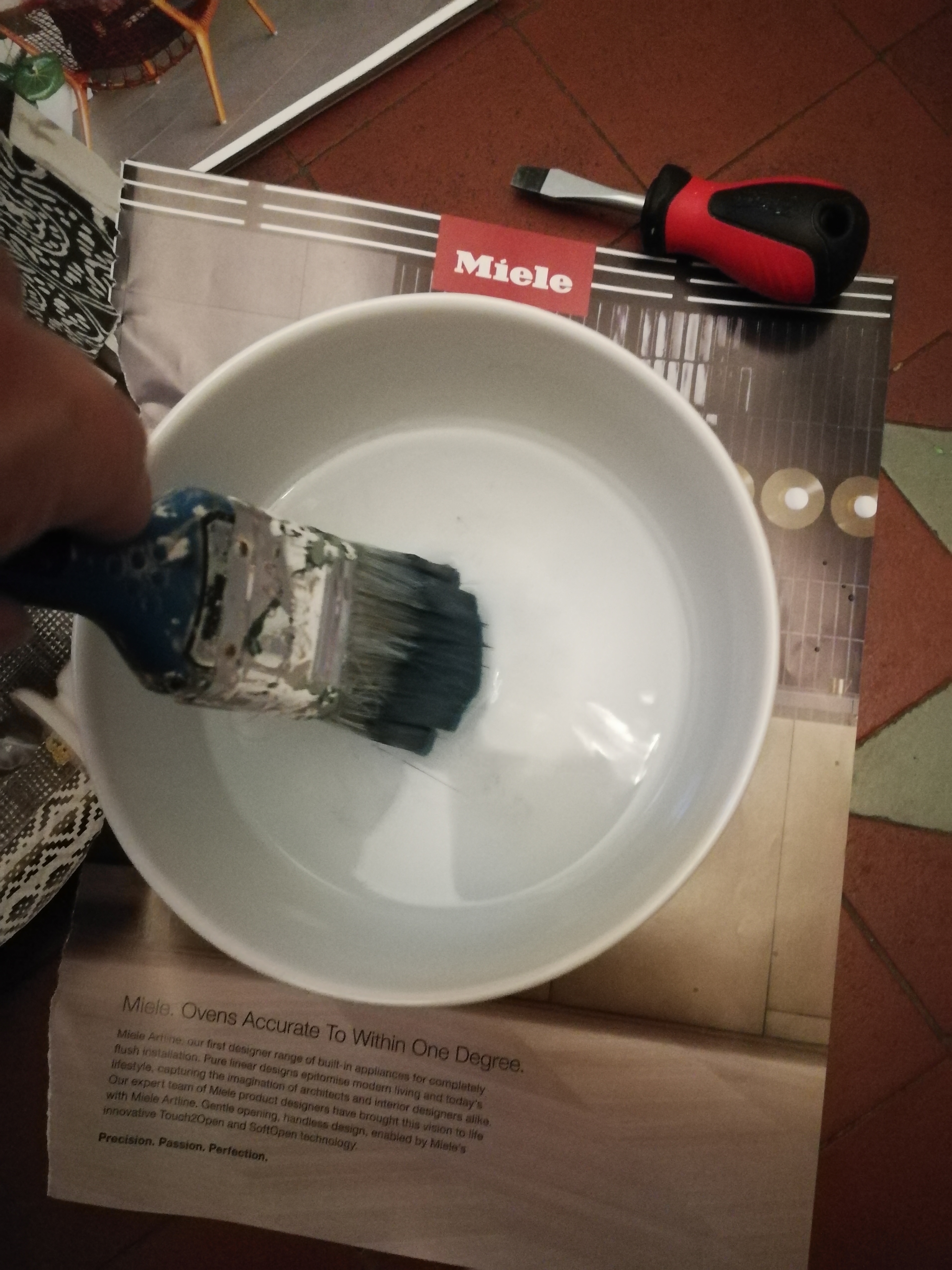
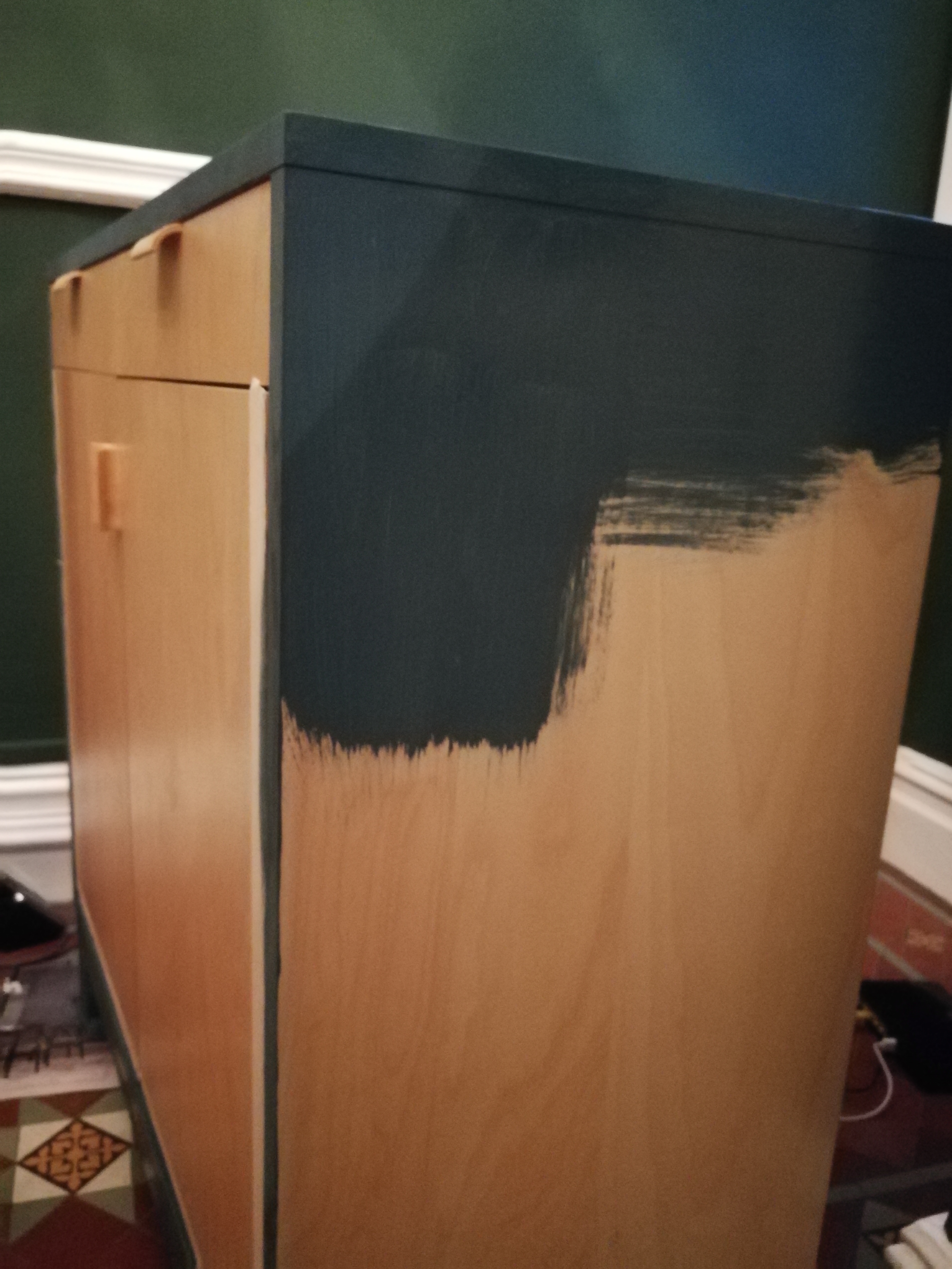
Next I had to start painting. The first time I used Annie Sloan chalk paint I was worried about how easy it was to use, but it’s SO easy, and as you don’t need to do any prep (such as sanding the wood) it’s great for impatient people like me. There are two ways to use the paint, depending on the finished look you’d like. The first one is to use the paint straight out of the tin, and apply it quite thickly, and then sand it back lightly - this is best for creating the distressed look that the paint is famous for.

The second  way to use this clever paint is to add a small amount of water to it and apply it more thinly, so that the finish is solid and even, for a more contemporary look.

I wanted a smooth finish, so chose the second option.

a photo of the open paint next to bowl of clean water

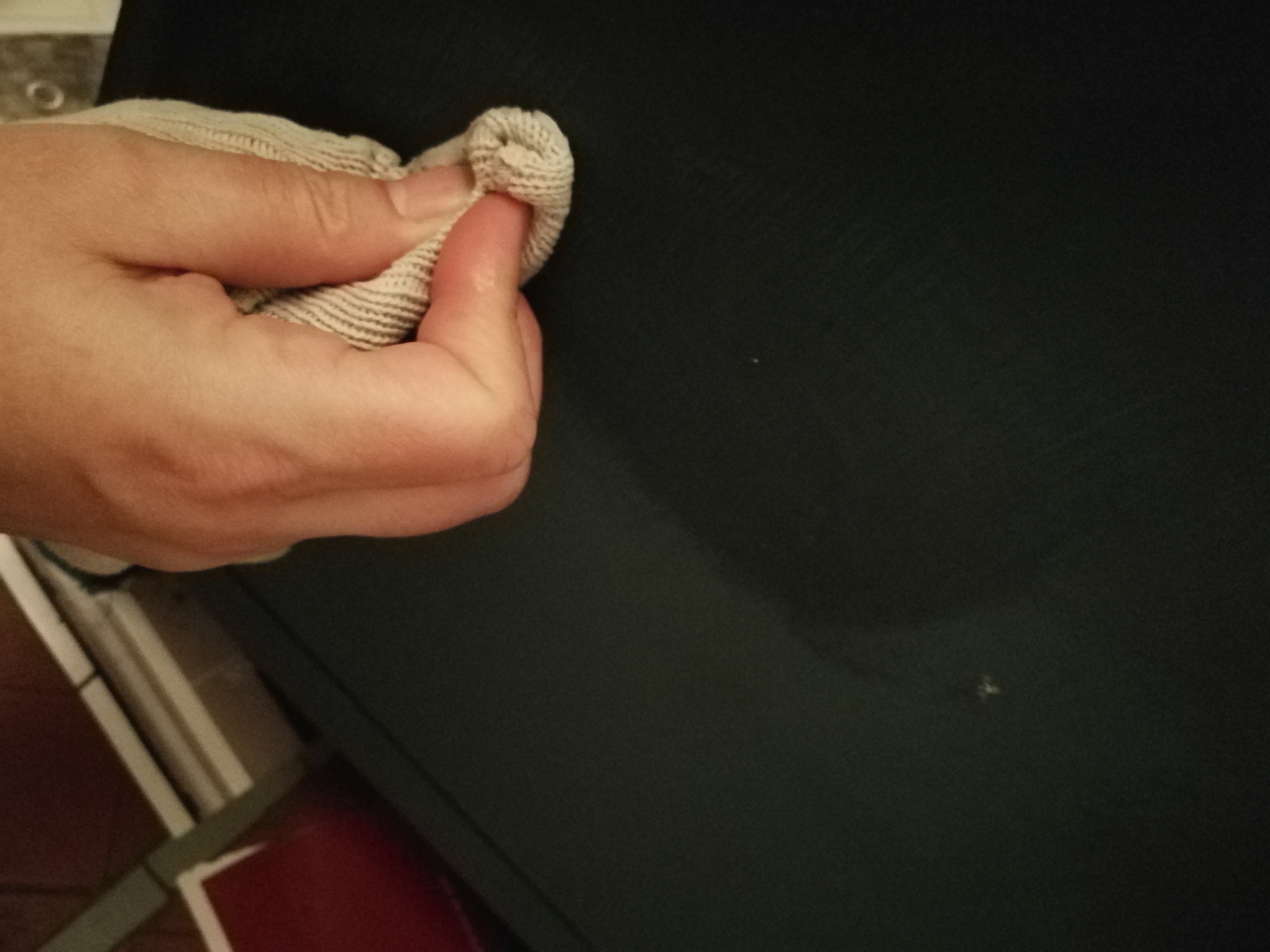
The best way to add the water is to just dip your brush into a bowl of water before dipping it in to the paint - you don’t want too much water or the paint will get drippy. You don’t need to dip your brush in the water every time you dip it in the paint, but you’ll get to feel when the paint is starting become drier and needs more water. The great thing about using this paint is that it’s very forgiving, so if you add too much water or make a mistake, it’s really easy to sort out - you can just wipe it off with a cloth and start again.

a photo of the paint brush being dipped in water

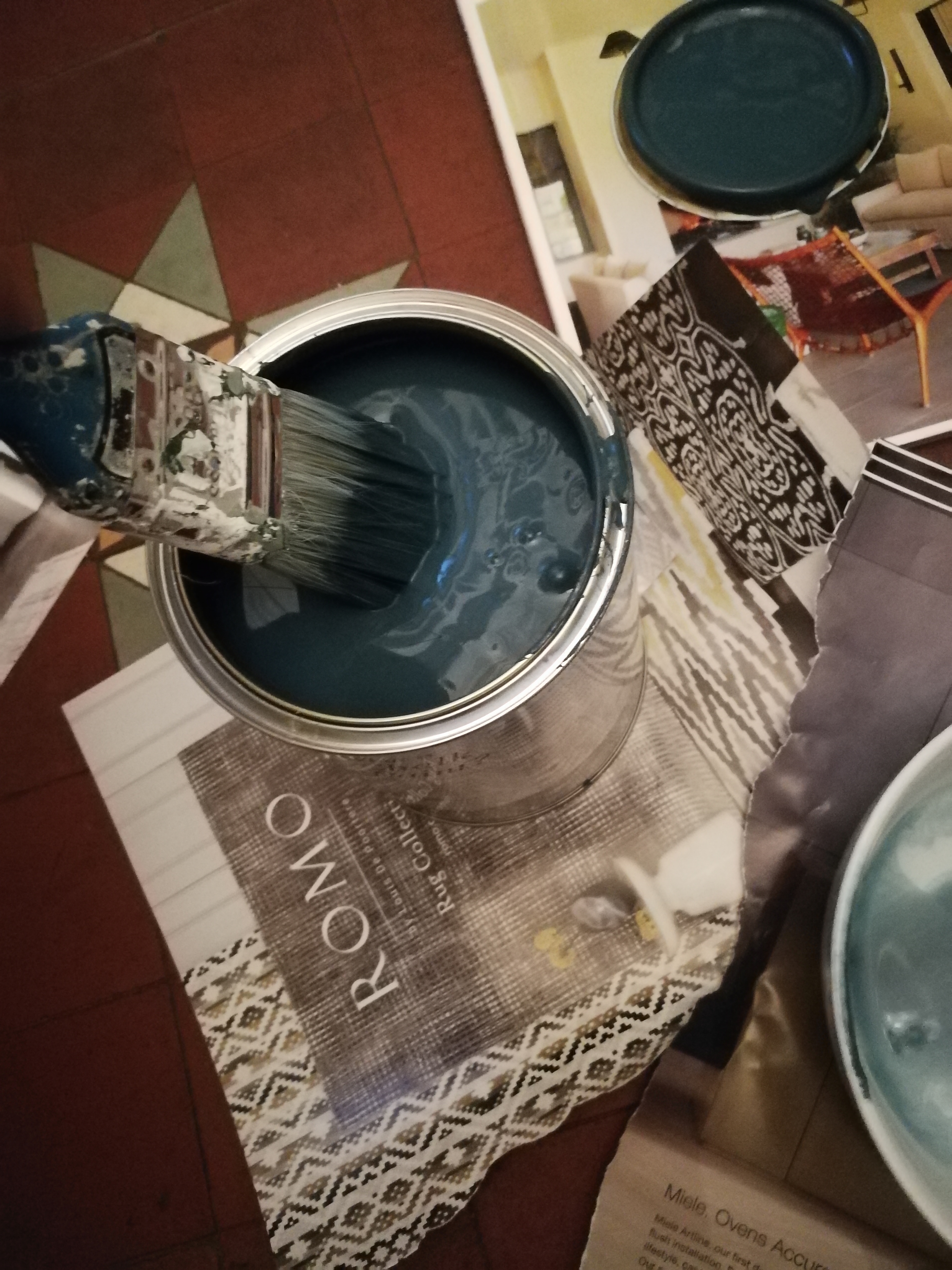
Dipping the slightly wet brush in to the paint

a photo of the paint brush being dipped in the paint

The painting went pretty smoothly, and was so easy to do.

a photo of the cupboard partially painted

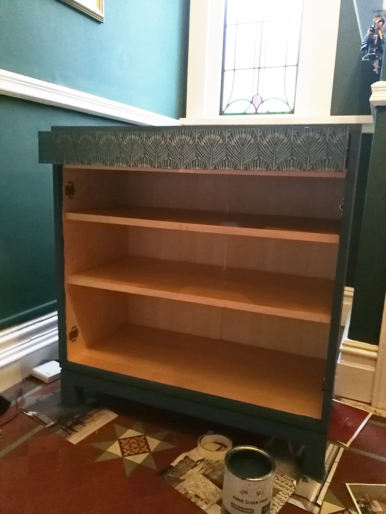
Once I’d finished the second coat of paint (leaving 24 hours to dry in between coats) and it was touch dry, I started to prepare for the wallpaper to go on the door and drawer fronts. I took off the handles and measured the areas I needed to cover.

a photo of me unscrewing the handles from the cupboard

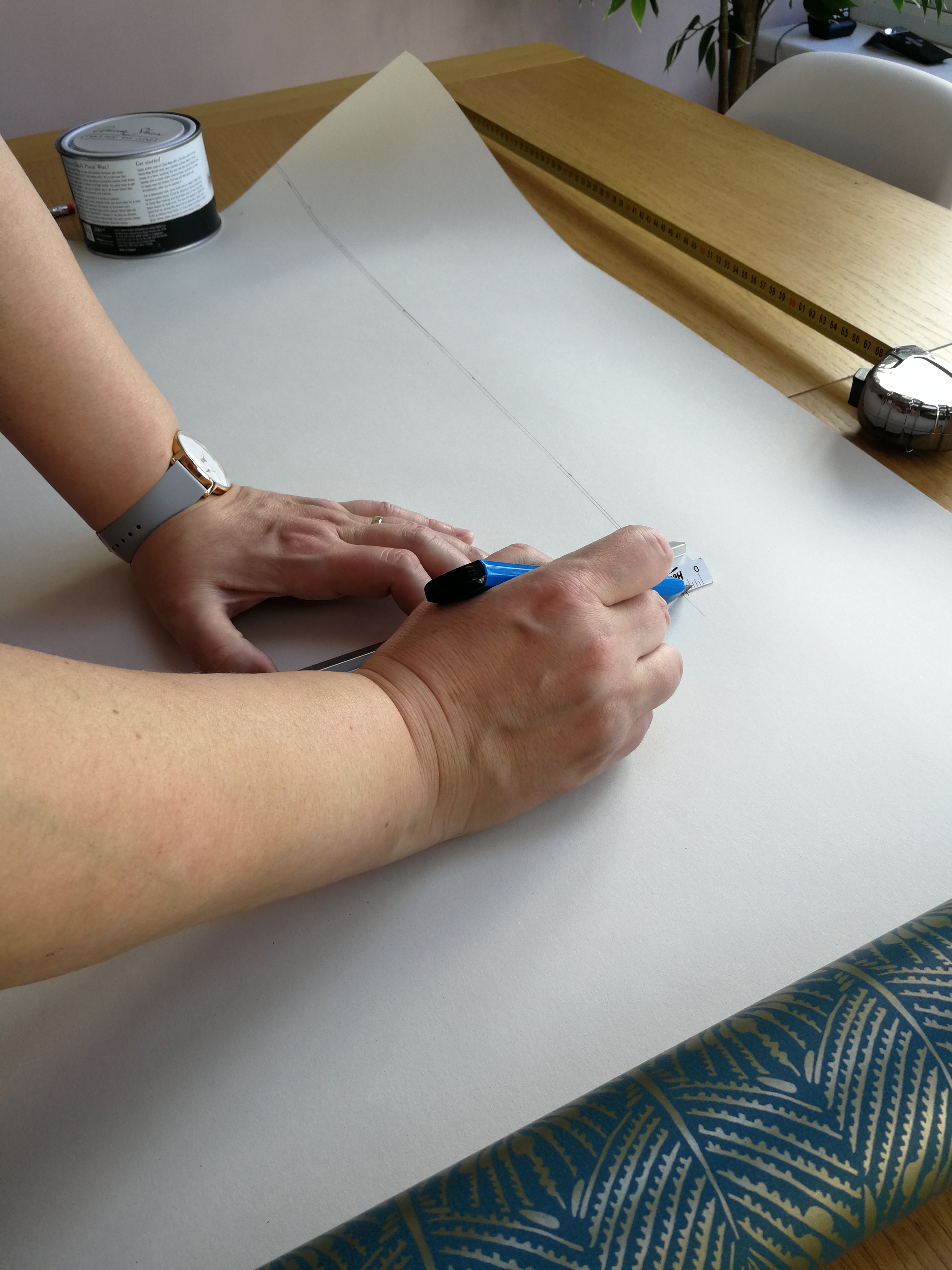
The main thing I had to think about when measuring for the wallpaper pieces, was that I needed 4 pieces (2 doors and 2 drawers) and that the pattern had to match across them all. This caused a bit of head scratching, but I think I got there in the end. To be honest, if I’d considered this before buying the wallpaper I might have gone for a less repetitive pattern!

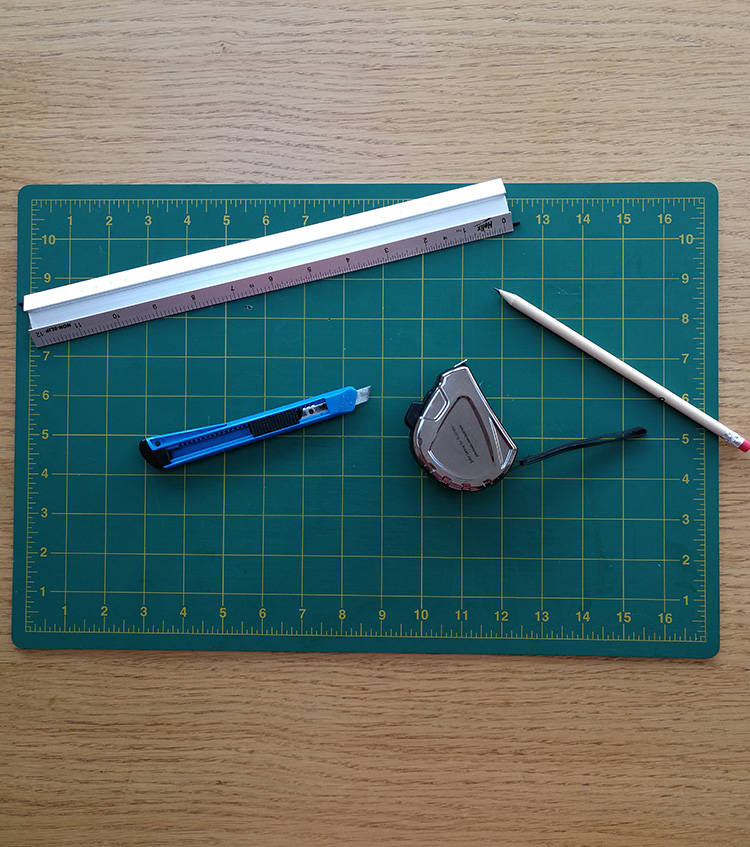
I then had to cut out the pieces pretty accurately, as I knew it would be hard to make adjustments once the wallpaper was on. I used the stuff I use to make my sample boards for clients, so I already had a cutting mat, metal ruler (to protect my fingers) and Stanley knife.

a photo of my cutting mat, metal ruler, stanley knife and pencil

You could use sharp scissors but it’s harder to get a really clean cut with scissors. They always say measure twice, cut once, so I did make sure I checked my measurements before cutting. I used a metal tape measure as the cloth ones can stretch over time, and give inaccurate measurements. I then labelled each piece on the back, so that I wouldn’t get them mixed up, as they were all slightly different sizes.

a photo of me cutting out the wallpaper with a Stanley knife

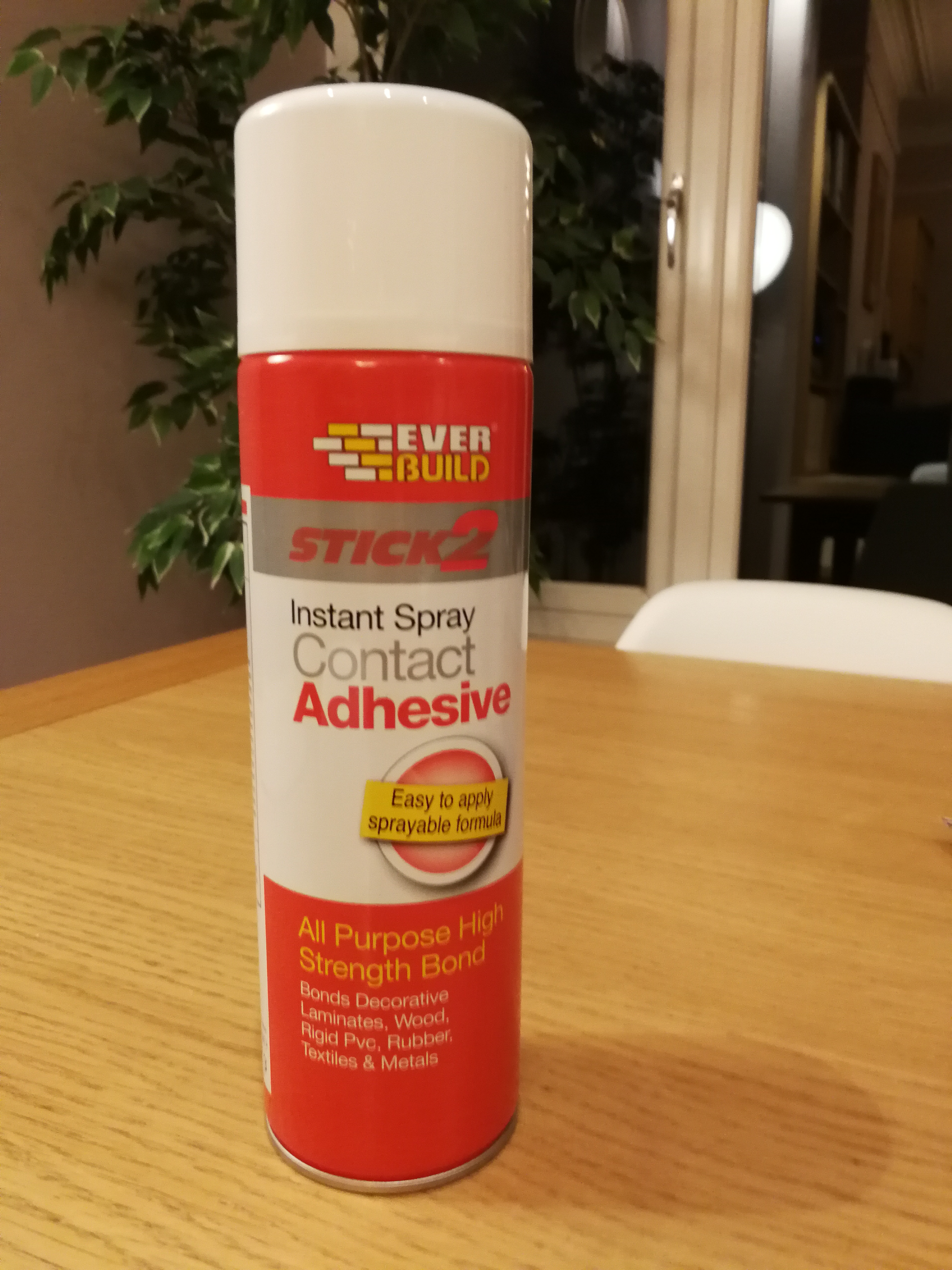
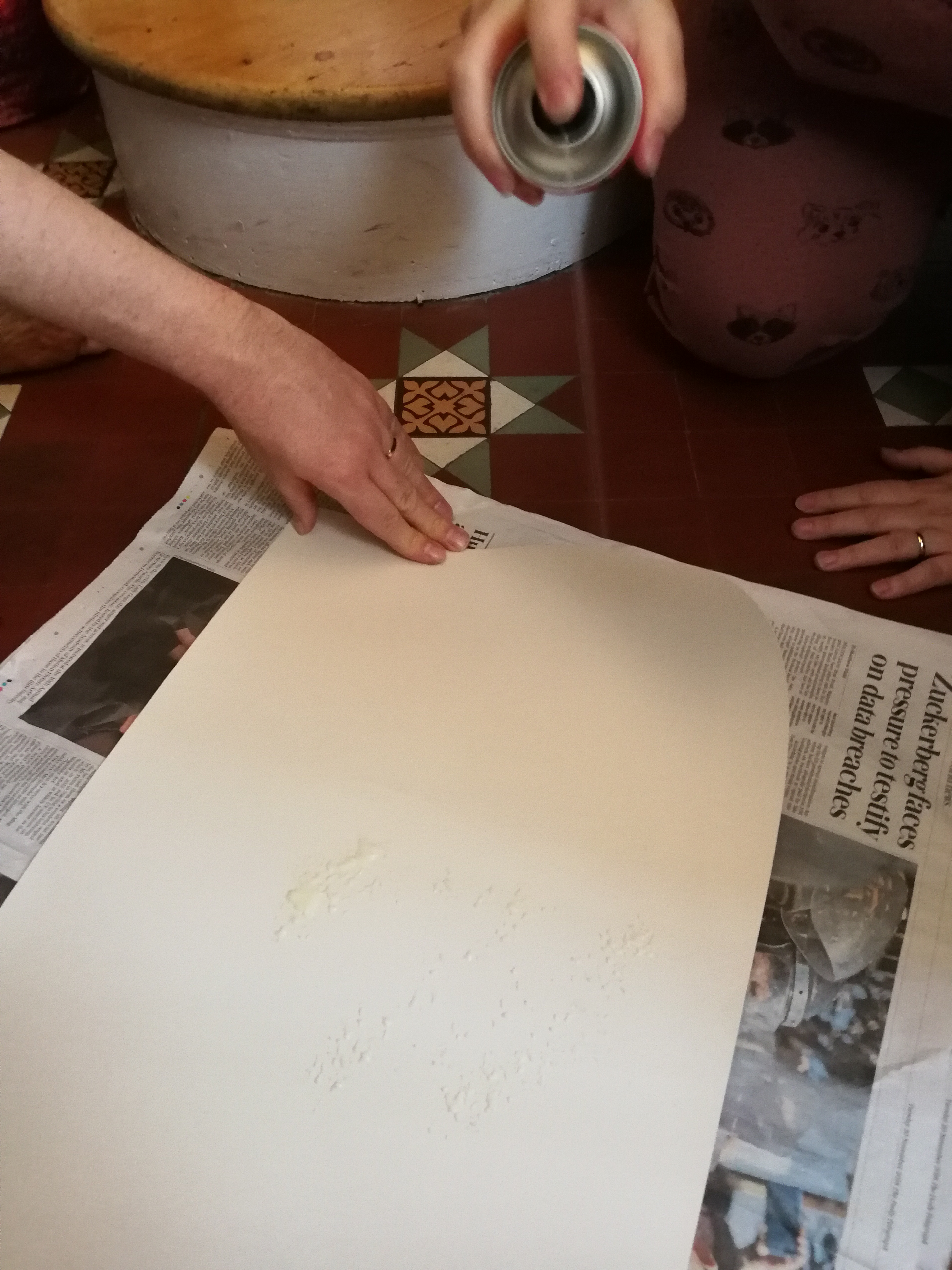
Then came the nerve wracking bit, I had to get the cut pieces on to the doors. I had done some research and found that contact adhesive would be the best glue for the job. It’s a spray glue, so easy to apply to large areas, and can bond two different surfaces easily - in this case laminated wood and wallpaper.

a photo of the contact adhesive I used

I had some help to hold down the wallpaper pieces, as this bit needs three hands!

 a photo of me spraying the contact adhesive on to the back of the wallpaper

I put the drawer fronts on first, as these pieces were smaller and I thought they’d make a good practice run.

a photo of the cupbaord with the wallpaper on the drawer fronts

I then decided to take off the doors, as I wanted to make sure I got the wallpaper on straight. I have to be honest and say that the contact adhesive bonds pretty quickly, so there isn’t much wiggle room if the wallpaper ends up going on wonky. I just consoled myself with the thought that I’d bought a whole roll of wallpaper, so I could always try again. Luckily, it went well at the first attempt.

a photo of the doors with the wallpaper on them

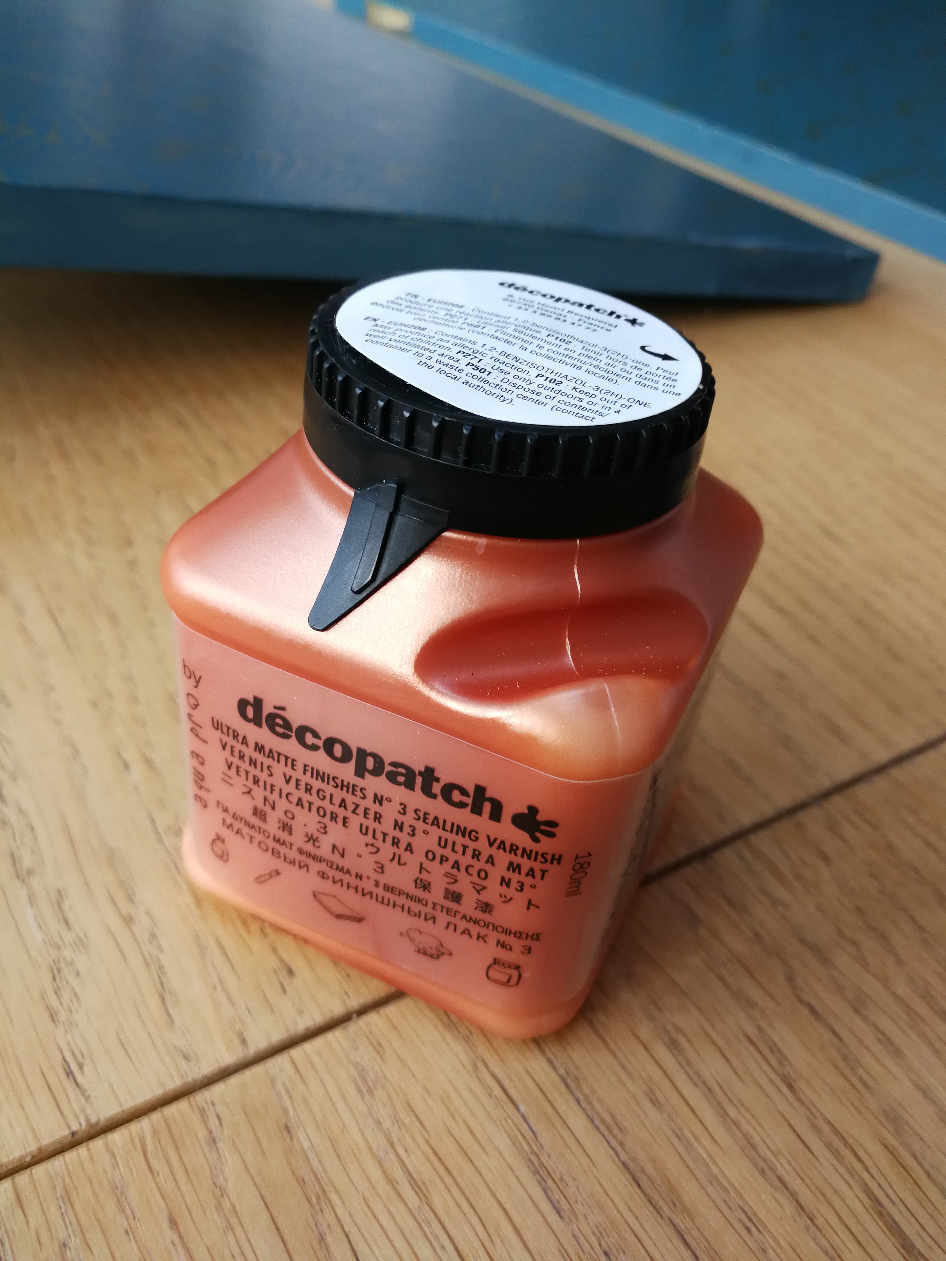
Once the glue was all dry, I had to protect both the paint and the wallpaper. Wallpaper is meant to go on walls, where it doesn’t get touched very often, not on a cupboard which is used daily, so could get damaged easily. I'd done some more research (the joys of the internet) and found that you can varnish the paper to protect it. However, it’s not the kind of varnish I was thinking of - the stuff that goes on wooden floors - it’s a decor varnish which is milky white and goes on clear. This is the one I used.

a photo of the Decorquip varnish I used

You need to apply two coats to fully protect the wallpaper, and this is where I started to think that it was all going to go horribly wrong. As soon as I applied the first coat, the wallpaper wrinkled and bubbled.

a photo of the wallpaper on a door, with the wrinkling and bubbling

But I needn’t have panicked, as once it was dry it was perfectly smooth again. The second coat wrinkled too, but I knew what was coming, so just waited patiently this time.

Next I needed to protect the paint - as it’s water based it can chip quite easily (this is one of the reasons it’s so easy to work with - you can just wipe off any mistakes). I used the recommended Annie Sloan wax, which seals and protects the paint from wear. As it’s water repellant, it also adds a layer of spill proofing, and more wax can be added as and when needed down the line. I chose the clear wax because the blue paint is a very rich colour and I wanted it to shine through, but there is also a dark wax available which will change the colour of the paint slightly, and give you a different look. You can buy the wax here.

a photo of me applying the wax over the paint

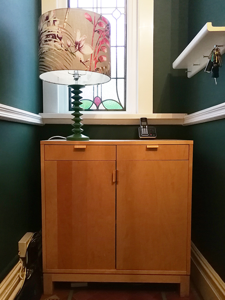
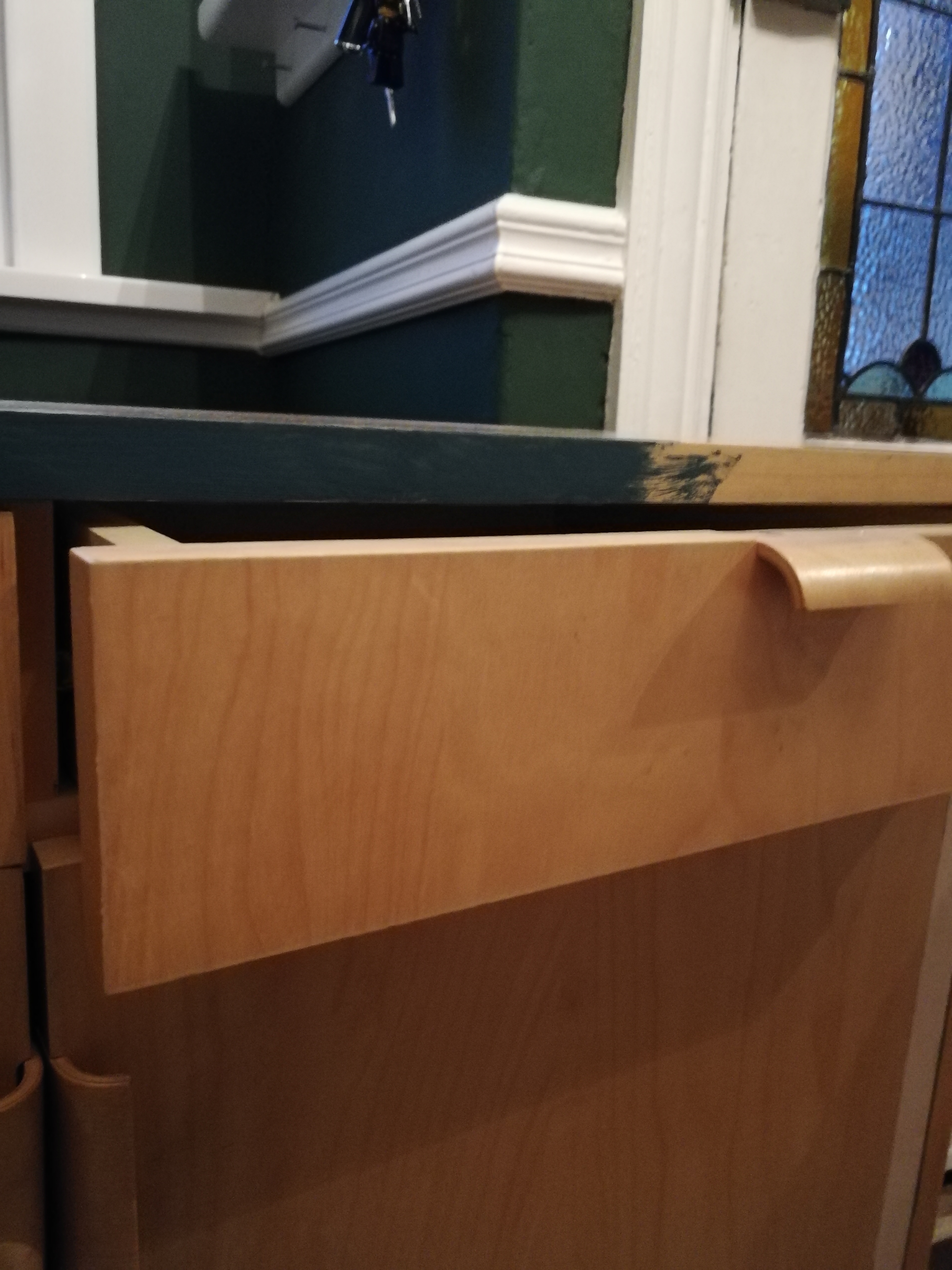
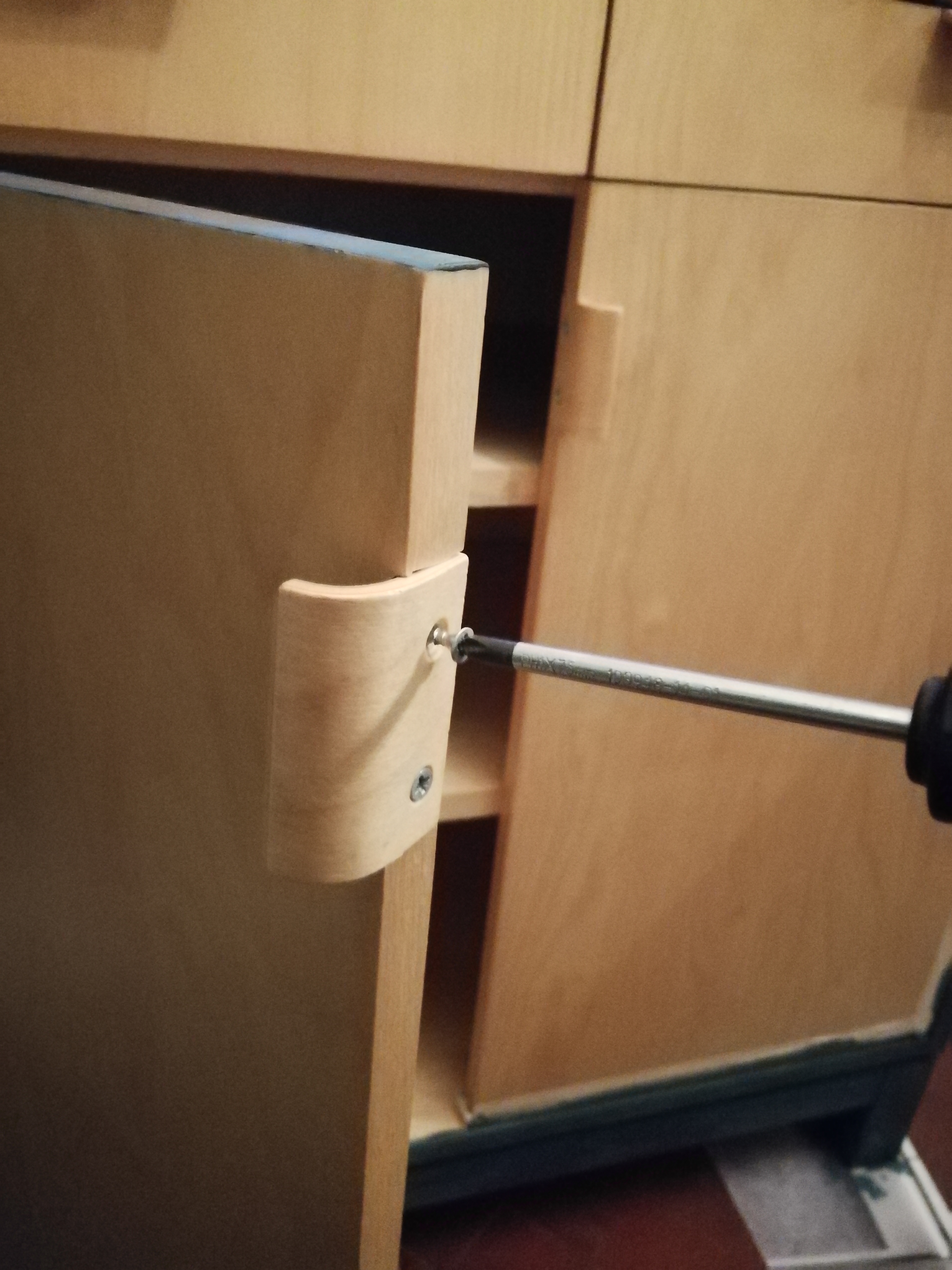
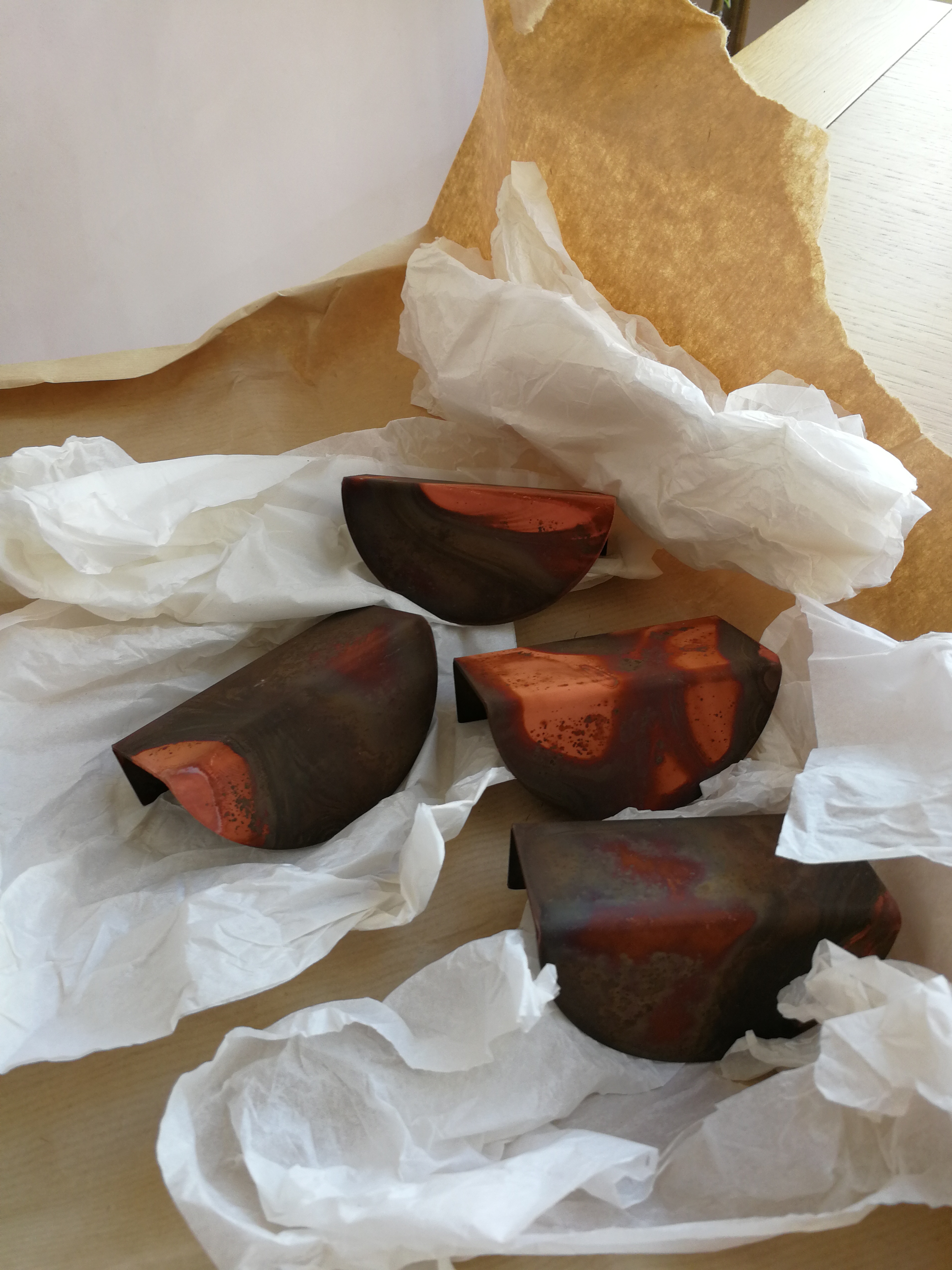
The final stage was to replace the handles I’d taken off with the some fab new ones. I found these gorgeous ones from Dowsing and Reynolds which were the right shape and size for my cupboard. You can buy the handles here.


a photo of the handles having just been opened from their packaging

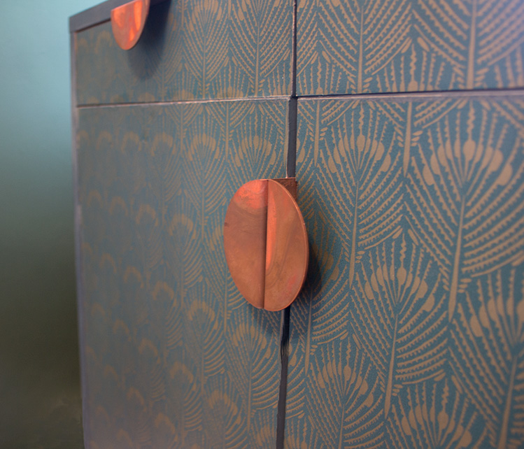
The thing I love about these handles is their tarnished copper finish. As I mentioned, I wanted the cupboard to have a glam look, but I felt that shiny handles would have been too much bling for me. The uneven, slightly industrial look of these handles contrasts well with the even pattern of the wallpaper, and adds extra textural interest. I also really liked the fact that the two handles on the doors make a circle when put together - another Art Deco reference.

 a close up photo of the new handles on the cupboard

So, here is the finished project! It may have taken most of a weekend, but I really enjoyed doing it, and I think the finished cupboard looks so much better than it did when I started. Let me know what you think, or if I've inspired you to have a go, please share your projects with me, I'd love to see them.

a photo of the finished cupboard in the hallway

Welcome to the design blog, where you'll see posts about anything from the projects we are working on, to the latest fabric and wallpaper collections, and all things interiors related. We love colour, pattern, architecture and old buildings, and we love to share our finds with you.

Happy reading!

The Great Outdoors

28 Mar 2024

A photo of a parasol made in colourful outdoor fabric in a garden.
New from one of our favourite brands, outdoor fabric from House of Hackney. Their colourful prints are durable and colourfast, so they are perfect for use outside, and the sun (if we get any) won't fade them. You can see the outdoor collection here.

Beata Heuman's Direktors Lampa

28 Feb 2024

A GIF of the Direktors Lampa in different positions.
A new product from one of my favourite designers - the ever so versatile Direktors Lampa from Beata Heuman. It has an articulated joint on the base and a directional shade holder, so you can move this lamp into the perfect position, whether that be for work or play.

Little Greene x National Trust

28 Jan 2024

a pantry room with green cupboards. The walls and ceiling are covered in green floral wallpaper

Little Greene have launched their latest collection of wallpapers in collaboration with the National Trust and they are just gorgeous.

Featuring eight historic wallpaper designs that have been created from original patterns found at several of the National Trust’s historic houses, the collection comprises an array of exotic birds, stylised florals and large-scale tropical murals. You can see the collection here.

All that glistens - antique copper from Soho Lighting

28 Nov 2023

A photo of three copper pans on a shelf with matching copper light switches beneath the shelf.

Add some warmth and interest to your interiors with the Autumnal hues of antique brass, copper and brushed brass light switches and plug sockets from The Soho Lighting Company. Our favourites are the antique copper collection, as they are hand finished to replicate the aged tone of Victorian cookware.

Paint made from olive stones?

28 Oct 2023

A photo of a mustard yellow painted wall with a dressed table in front of it.

Well known paint brand Mylands have created an innovative new paint range made from ground olive stones. Using a waste product and turning it into an eco friendly paint is genius as it has virtually no VOCs (Volatile Organic Compounds) and creates minimal environmental harm. It is available in all their beautiful colours, and will leave the air in your home purer after decorating, meaning you and your loved ones will benefit too.

Recycled yarn given a new life

28 Sep 2023

An image showing the new recycled fabric on a sofa with a yellow background and foreground.

kirkby design's latest range is a happy collection that not only looks good but does good too. Created using 100% recycled cotton yarn from the fashion industry these eco-conscious prints are the perfect way to bring a splash of colour into your home this Autumn.

Shower curtains can be cool too

28 Aug 2023

A photo of the Zsa Zsa shower curtain from Divine Savages.

Who says shower curtains have to be white (or greying with mould)? The fabulously patterned range from Divine Savages is a bold and easy way to add a wall of colour and pattern to your home with no commitment. Very easy to change, and very easy to fall in love with too!

Beautiful outdoor lighting

28 Jul 2023

A photo of one of the new lights from the Soho Lighting outdoor collection
Outdoor lighting is not usually something to get excited about. But this new collection from Soho Lighting is beautiful, and in on trend but timeless brass. Inspired by the Chelsea Flower Show and designed to compliment any style of planting, there are three new lights in this collection. They are all made in Britain and you can take a closer look here.

The perfect combo

28 Jun 2023

A photo showing a light switch which is made up of a combination of toggle and dimmer switches.
We often have lighting combinations in our rooms (such as kitchens) where some lights need to be dimmable, (say over the dining table) and others need to be a functional on or off switch. The clever people at Dowsing & Reynolds have combined these types of switches into one plate, which is not only practical but stylish too. You can see the range of switches and finishes available here.

Rebel Walls x Jack Kinsey

28 May 2023

A photo of Jack Kinsey in front of one of his wallpaper designs from Rebel Walls.
If you are a fan of the BBC's Interior Design Masters, you'll recognise Jack Kinsey, the runner up in the final of this year's show. He was our favourite to win, and is incredibly talented. It's lovely to see him team up with one of our wallpaper suppliers, Rebel Walls, to create a hand painted bespoke mural collection which brings the best of the past into the present. You can see the collab here.

Heritage tiles from House of Hackney

28 Apr 2023

A slideshow photo showing the new tile range from House of Hackney.
One of my favourite maximalist brands, House of Hackney, have released a stunning new collection of heritage tiles based on their most popular floral design, Artemis. They are hand made and traditionally glazed, and come in a rainbow of signature House of Hackney colours. You can buy the tiles here.

Fired Earth x Nina Campbell

28 Mar 2023

A photo of a bathroom room set with the new tiles on the walls and floors, with the designer in the corner of the image.
One of the best known interior designers, Nina Campbell, has collaborated with one of my favourite tile suppliers, Fired Earth, to produce an elegant range of beautifully patterned tiles, and a complementary range of understated plains. They are designed in her signature style, and are very easy to mix and match to create a relaxed look in your home. You can see the collection here.

New National Trust wallpapers

28 Feb 2023

A photo of the Poppy Trial wallpaper in the Masquerade colourway, with yellow paneling and a white sink.
A new collaboration from Little Greene and the National Trust, a collection of wallpapers spanning over 200 years of decoration. The designs have been created from original papers found at three of The National Trust's historic houses, and printed using traditional techniques. The collection includes hand painted birds and stylised florals, and comes in 45 colour ways. You can buy the collection here.

More pattern joy!

28 Jan 2023

A photo of one of the new cushions from Woodchip and Magnolia, in blue with a red fringe.
New from one of my favourite wallpaper suppliers, Woodchip & Magnolia, comes a long awaited collection of 18 bold and beautiful cushions. Inspired by some of their best selling wallpaper designs, they are made in tactile velvet and feature a pattern on one side and a coordinating plain on the other. You can see the collection here.

New colours from Fenwick & Tilbrook

28 Nov 2022

A photo of some shelving showing the five new colours from Fenwick & Tilbrook.
One of my favourite paint suppliers, Fenwick & Tilbrook, have just released 5 new colours. Named lovely things like Tarnished Brass and Spring Puffin, these warm, muted shades have been mixed by eye and are perfect for creating cosy, cosseting homes. You can see all their colours here.

Out of this world lighting

28 Oct 2022

A photo of the new Mars wall light from Mullan Lighting.
It just so happens that I'm excited by newness from Mullan Lighting again this month. They have launched a fabulous colourful series of wall lights, with celestial names like Mars, Neptune and Jupiter, and I just LOVE the use of colour in them. You can see the range here.

Introducing sustainable pendants from Mullan Lighting

28 Sep 2022

A photo of the new rattan pendants from Mullan Lighting.
The brand new Altus and Betty ranges of pendants from Mullan Lighting are beautiful, but we are also excited about them because they are handcrafted from rattan and abaca, which are sustainably sourced materials. You can see the Altus collection here, and the Betty collection here.

Whipping up a storm

28 Aug 2022

A photo of a neutral coloured stir runner with a red whipped edging.
A colourful innovation from stylish flooring brand Alternative Flooring - you can now add a colour of your choice to the edges of any stair carpet runner they are making for you, taking whipped edges from ordinary to full of fun.

A responsibly made lamp

28 Jul 2022

A photo of the new light from HouseOf.
New from lighting brand HouseOf, a responsibly made eco table lamp. Made from recyclable and waste materials, and designed and made in London, they will even take it back within the next ten years in exchange for 20% off another one of their products. You can learn more here.

Corduroy is cool again

28 Jun 2022

A photo of a curved chair covered in orange Sculpt fabric.
A new fabric from Kirkby Design called Sculpt includes these deep pile cotton velvets which look just like large versions of corduroy. The look takes me right back to my childhood, and is very comforting. You can see the collection here.

Colourful, wonderful boucle fabric

28 May 2022

A photo of a sofa upholstered in a blue Linwood Sienna boucle fabric
The trend for super soft Boucle fabric is still going strong, but up until now we've mostly seen it in creams and whites. One of my favourite fabric suppliers, Linwood, has produced a new colourful collection of 48 shades. It's a durable and soft fabric, and works particularly well on sofas and cushions.

We won!

28 Apr 2022

The Cardiff Life Awards 2022 winners badge
This month, we were pleased as punch to receive the Best Homes & Interiors award from the prestigious Cardiff Life Awards. Cardiff Life Magazine are well-known champions of our city, and the annual awards celebrate the best of Cardiff talent, so we are over the moon to be named 2022 winners!

Morris & Co. X Ben Pentreath

28 Mar 2022

A room styled with items for the new collection of fabrics and wallpapers.
The designs of William Morris have made a comeback over recent years, and now they have been given a striking makeover by interior designer Ben Pentreath. The Queen Square Collection has reimagined some of Morris's most famous fabrics and wallpapers in rich tones and vibrant colourways. You can see the collection here.

Matchy Matchy

28 Feb 2022

A photo of Woodchip & Magnolia's wallpaper matching the fabric on the sofa.
One of my favourite design houses, Woodchip & Magnolia, have gone all out for the all over pattern trend and produced wallpapers and fabrics in the same prints, which I love. You can see the whole stunning collection here.

New fabric collection from Prestigious Textiles

28 Jan 2022

A photo of fabrics and cushions from the new collection from Prestigious Textiles.
A new collection of sumptuous fabrics has just been released from Prestigious Textiles, called Monsoon. The collection includes tactile velvets, animal motifs, embroideries and beautiful sheers, so it's versatile enough to use anywhere in your home. If you'd like to know more about these fabrics, please get in touch.

New reeded glass pendants from Mullan Lighitng

28 Nov 2021

A photo of the Nahla glass reeded pendant
Lighting designers and manufacturers Mullan Lighting have a new range of reeded glass pendant lights available. These Mid Century inspired lights come in three shapes and four finishes, but the Nahla (the one pictured above) is my favourite. You can see the range here.

Little Greene and Bert & May join forces

28 Oct 2021

A photo of some green Bert & May tiles from the new collection, in a bathroom painted green.

Little Greene has announced a collaboration with tile brand Bert & May. The collection sees eight gorgeous Little Greene shades translated onto tiles, giving you even more opportunity to add colour, texture, and a mix of materials to every area of your home. I love this bathroom combination above, with the perfectly matched tiles and paint offset with touches of terracotta, mustard and oak. You can see the full collection here.

Dulux colour of the year - Bright Skies

29 Sep 2021

A promotional photo from Dulux showing the paint colour Bright Skies in a room setting.

So, Dulux have announced their colour of the year for next year, and here it is! Bright Skies is described as the 'breath of fresh air' that we all need after being indoors for so long. What do you think? I'm reserving judgement at the moment. It looks a little cold in the picture, but I don't think the beige sofa and the styling are doing it any favours here. Maybe colour drenched (painted on walls, ceilings, trims and doors) and with some warmer burgundies and terracotta, it could be lovely. You can buy the colour here.

A new home collection from Paloma Faith

28 Aug 2021

A photo of the vintage botanical black wallpaper from Paloma Home.
British singer songwriter Paloma Faith has recently launched her first collection for the home. It includes wallpapers, fabrics, cushions and bedding, and she describes the look as 'faded grandeur and retro maximalism'. The prints are everything I love - dramatic, colourful and fun, and you can see more of the collection here.

It's all about soft yellows

28 Jul 2021

A photo for Little Greene with room inspiration for using Carys yellow paint.
I was watching an Instagram live post from The Little Greene Paint Company last week, and they were discussing a comeback for yellow. Now, as you know, I don't think you have to follow the trends but yellow hasn't been fashionable for a long time, so this sunny, uplifting shade is often overlooked. A warm yellow like Little Green's Carys (above) is perfect for cheering us all up, and you can buy it here.

The cushion that gives back

28 Jun 2021

A photo of the green velvet cushion on a chair.
Introducing the cushion that gives back, from homewares company Oka. They have produced this cushion in partnership with The Trussell Trust who support two thirds of the UK's food banks, and 100% of the proceeds from sales of this lovely green velvet cushion will be donated by Oka to The Trussell Trust. It comes in a range of other colours too, and you can buy the cushion here.

A beautiful new tile collection inspired by the National Trust

28 May 2021

A photo of one of the new tiles in a kitchen roomset with pink walls and black bar stools.
Just launched, Ca Pietra a new tile collection in collaboration with the National Trust. Every tile has been inspired by one of the historic properties, gardens or coastlines looked after by the Trust, and a minimum of £10,000 from sales of the tiles will be given to the National Trust to help them continue their important work. You can see the collection here.

Yummy new switch & socket colours

28 Apr 2021

A photo of two of the new light switches from Dowsing & Reynolds
Did you ever think that your light switches were good enough to eat? I'm guessing the answer is no, until now. You can now buy switches and sockets in these gorgeous colours from the new Dowsing & Reynolds Cafe Culture collection. They come in luscious shades like Cinnamon, Caramel Latte and Whipped Cream, so you can tone, coordinate or contrast with your wall colours and make every part of your interior scheme look delicious. You can buy the gorgeousness from here.

A sustainable fabric choice

29 Mar 2021

A photo of the some of the new Eco range of fabrics.
A beautiful new sustainable fabric range from Clarke and Clarke has just been launched. It's made entirely from recycled materials so you can refresh your home with a clear conscience. You can have a look at the fabric here. Get in touch with me if you'd like to buy any of this fabric.

Sought & Styled - Preloved items given new life

28 Feb 2021

The sought and styled logo on a green background
This month I want to highlight a business run by a very talented lady I met a few years ago (remember when we could meet people?) Not only is she a creative interior designer, she also runs an online shop where she reuses and repurposes anything from soft furnishings to larger furniture items. Everything sold is bespoke and unique, and is effortlessly waste conscious because it's being used again. You can visit her shop here.

Do kitchen worktops bore you?

27 Jan 2021

A photo of a Blackpop design on a kitchen worktop.
Thanks to a genius idea from kings of pattern Blackpop, you can now have one of their colourful designs on your kitchen worktop. They will put any of their funky fabric or wallpaper designs onto waterproof MDF to make you a unique worktop, or they can even make a design just for you. Chopping will never look the same again! You can buy the worktops from their website here.

A Fresh Take - Cardiff Life feature

18 Dec 2020

The cover of the December 2020 issue of Cardiff Life magazine.
This month's issue of Cardiff Life Magazine is out today, and features an interiors special, because one thing this past year has made us do is take a new look at our homes and how we'd like to live in them. To see what I and other local interiors experts have to say on the subject, including a round up of the trends for 2021, have a flick through the digital mag here.

An enchanting inaugural wallpaper collection from Tom Baker

26 Nov 2020

A tropical teal wallpaper plasters the wall above a wainscoting panelling and a navy fabric covered bench. The wallpaper is adorned with tropical wildlife and atmospheric jungle scenery including parrots and  jaguars.
This opulent and atmospheric wallpaper from Tom Baker immerses you in a world of tropical flora, fauna and exotic animals. With soft cool tones and hints of pink floral detailing, this is the perfect wallpaper to add a relaxing and exciting edge to your home. Find this enchanting collection here.

A new shady collaboration between Matthew Williamson and Pooky

20 Oct 2020

A picture of designer Matthew Williamson, standing next to a blue dresser with a wide array of candles and candlesticks on the top. Behind him in a ornate floral wallpaper with a sunburst mirror
The humble lampshade is often overlooked, but with the new collaboration between Pooky and Matthew Williamson they won't be for much longer! Matthew Williamson has applied his talent to design a new range of Pooky lampshades. Whatever your taste, colour scheme or budget you will find the perfect lampshade for your home in this new collection which is now available. This spectacular new collection can be found here.

Felt covered curtain poles

17 Sep 2020

Walcot House felt cover curtain poles

Now you can add some texture to your window dressing with these Walcot House felt covered poles. The pure wool coverings come with a option for bronze or steel fittings and wide spans up to six metres. The curtain track is cleverly hidden within the wooden curtain pole and there's a choice of nearly 50 colours and textures. You can find out more here.

Please vote for my blog

11 Aug 2020

A picture of the Amara Blog Awards vote for me sticker.
I'm really thrilled to have been nominated for an Amara Interiors Blog Award this year! If you enjoy reading my blog and would like to vote for me, I'm nominated in the Best Interior Designer Blog category, and you can vote for me here.

Upcoming interiors trends from Love Rugs

10 Jul 2020

A photo of the Love Rugs website featuring the article.
Love Rugs, the people who know about all things rugs have just published a feature on the upcoming interiors trends for 2020. They asked six of the UK's top interior designers (including me!) to tell them what the upcoming trends are, and in particular the changes we will be making to their homes. The article can be read here, and if you'd like to have a look at the huge range of rugs they offer, click here.

A new fabric collection from Linwood Fabrics

15 Jun 2020

A photo of the new Kami collection from Linwood fabrics.
I love Linwood fabrics - they have a fab way of mixing colour and pattern into something really special, producing fabrics and wallpapers that make me want to coo. This new collection, available at the end of June, is just as gorgeous. It's called Kami, with the pattern inspired by a 19th Century document. The collection is a range of printed velvets, so perfect for upholstery and accessories like cushions.

An easy way to update your kitchen

16 Apr 2020

A photo of the new birch handles from Superfront.
If you are looking to update your existing Ikea kitchen rather than replace it, Stockholm based company Superfront are here to help. They sell a range of fronts, handles, legs and tops to fit not just the Faktum kitchen range but also the Besta, Metod and Pax ranges - so you can customise anything from your sideboard to your wardrobe. These super cute round handles are part of their new birch collection, and the whole range can be found here

Move over boring taps - colour is the new black

13 Mar 2020

A photo of the new coloured taps from the Dowsing & Reynolds Miami colour pop collection.
Colour has been taking over our kitchens and bathrooms for a while now (yay!), and has slowly been creeping into sanitaryware and fittings. These perfectly coloured mint green and pastel pink taps from the new Miami Colour Pop Collection from amazing homeware brand Dowsing & Reynolds are spot on and would look gorgeous in any kitchen or bathroom to add a shot of colour without overwhelming with sugary sweetness. You can learn more about this new collection here.

Who knew a door stop could look this good?

19 Feb 2020

a photo  of the new doorstop from Buster and Punch, with their logo and branding.
Door stops are one of those little annoying things that we all need, but are not the prettiest to look at. Now London based Buster & Punch have turned their attention to the problem and transformed the humble door stop into something cool and covetable. They might cost more than your average one from a DIY store, but as you're going to see it every day, why not look at something beautiful? here.

Wallpaper made of cork?

29 Oct 2019

A photo of the wallpaper made from cork, By Monkey Puzzle Tree
Sustainability and concern for our environment are key in the interiors world right now (as they should be). So when I saw that Monkey Puzzle Tree (a brand I admire for their sense of style and creativity) had produced this wallpaper made of cork, I was blown away. Cork is great for so many reasons - it can be harvested every nine years without harming the tree, is grown without the need for pesticides or fertilisers, has excellent sound and heat insulation properties, and is naturally antimicrobial and antifungal. This wallpaper has an A+ rating for emissions so it creates a healthy environment wherever it is hung. Add to this that the design was produced in collaboration with the talented Drew Millward who lives in my home county of West Yorkshire, and that it's called 'Hit The North', I was bound to fall in love with it. You can buy the wallpaper here.

I'm in Cardiff Life magazine - again!

17 Sep 2019

The front cover of Cardiff Life Magazine issue no.208, Autumn 2019

Now that the summer is officially over and our thoughts turn to cosying up our homes for winter, I'm here to help. If you're in need of some inspiration, you can read all about the interiors trends for Autumn and how to work them into your home in this month's Cardiff Life magazine. Hear what I and other interiors experts have to say on pages 18-22. You can read the digital version of the magazine here.

I've been nominated for an Amara Interiors blog award!

6 Sep 2019

The Amara interiors blog awards voting banner 2019.
Exciting news! My little blog (Design Insider) has been nominated for an Amara Interiors Blog award! I'm so chuffed to be included at all, and not expecting to win, but if you enjoy reading my blog posts then please vote for me. I'm nominated for the Best Interior Designer blog category. Voting is open until the 11th of September and you can vote for me here.

My kitchen project featured on the Artifact Lighting blog!

1 Aug 2019

A view if the contemporary copper kitchen featuring the copper pendant lights from Artifact Lighting.

When I designed the contemporary copper kitchen, I wanted to use some copper elements to add warmth and also to tone in with the pink walls and pale grey units. I found these pendant lights from a company called Artifact Lighting, and they are perfect because they add to the 'warm glow' I wanted to acheive. They also have a vintage look which contrasts nicely with the sleek look of the kitchen units. When the kitchen was finished I sent some pictures to Artifact Lighting, and they liked the kitchen so much they featured it on the blog page of their website.

You can read the blog page here

House of Hackney's first outdoor fabric

26 Jun 2019

A photo of the new House of Hackney Palmeral print for outdoor use.

One of my favourite interiors brands, House of Hackney, who are known for their daring and quirky prints, have just released a new fabric which is suitable for our door use. They took one of their designs, Palmeral, and reimagined it in a fresh colour palette of off white and green. This colour fast and water resistant fabric can be used for anything from outdoor cushions to furnishing yachts (if you are lucky enough to have one!)

My thoughts on the colour Living Coral in Cardiff Life Magazine

31 May 2019

A photo which accompanies the Cardiff Life article about Living Coral
Hear what I and my fellow designers have got to say about Pantone's colour of the year, Living Coral, and how to use it, in this month's Cardiff Life magazine. The article is on pages 84-86, and you can read it here. Do you think you could use it in your home?

Sustainability in furniture design

7 May 2019

A photo of the new Componibili Bio.
Sustainability is something that is becoming more and more important in interior design - not just where we buy items from and how far they've travelled to get to us, but also the materials that they are made from. Kartell, one of Italy's best known design brands, have just released the world's first piece of furniture made from a bioplastic called Bio-On. It's a fully sustainable version of one of their best selling items - the Componibili modular unit, and it comes in four delicious pastel shades. They may be 100% sustainable, but they are also super cute and bang on trend with this seasons colours. You can buy them here

The latest trend in shutters

24 Feb 2019

A photo of California Shutters new range in ash wood.

Forget painted shutters - the new style direction for window shutters is bare wood. These full height shutters made from sustainably sourced ash are the newest product from California Shutters, and are set to be big this year.

californiashutters.co.uk

My new favourite tile!

7 Feb 2019

A picture of the Lampas Marint pattern tile from Topps Tiles

I was searching for some tiles for a client's splashback recently and came across these beauties from Topps Tiles. There's long been a trend for patterned tiles, with lots of geometric shapes and bold colours going on, but I've begun to see more and more tiles with a pattern in the surface of the tile itself. These ones are a lovely example, and the deep blue colour is just stunning. To get a closer look at them, follow the link below.

Lampas Pattern Marine tile

Pantone announce their colour of the year 2019

11 Dec 2018

a shot of a coral reef with the description Color of the Year 2019

Leading colour experts Pantone have annouced the shade which they think will be the colour of the year for next year - Coral pink. It might look very bright and scary, but it's actually quite easy to use. I wouldn't suggest painting a whole room in it, as that might be a bit overwhelming, but I would use it in small doses, such as on cushions or in artwork, to liven up a shceme. Pantone say that the colour is meant to 'embrace us with warmth and nourishment and provide comfort and bouyancy in our continually shifting envirnoment', which basically means it's a happy, uplifting colour, and might just cheer us all up!

My work featured on Homify

8 Oct 2018

a view of the dressed bed, pink walls and blackout lined curtainsMy work has been featured in an article on Homify - one of the leading online ideas platforms for all things interiors. My project is in an article on how to avoid common mistakes when designing a bedroom. The article mentions how important it is to block out light for a good nights sleep - something I addressed by adding blackout lining to the curtains and adding an extra layer of window dressing with the wooden Venetian blinds. To see the article, please use the link below.

Homfy article - Are you guilty of these 8 bedroom design mistakes?