
When it's time to hire a professional
 |
||
|
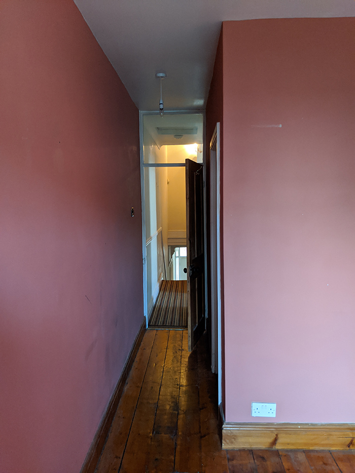
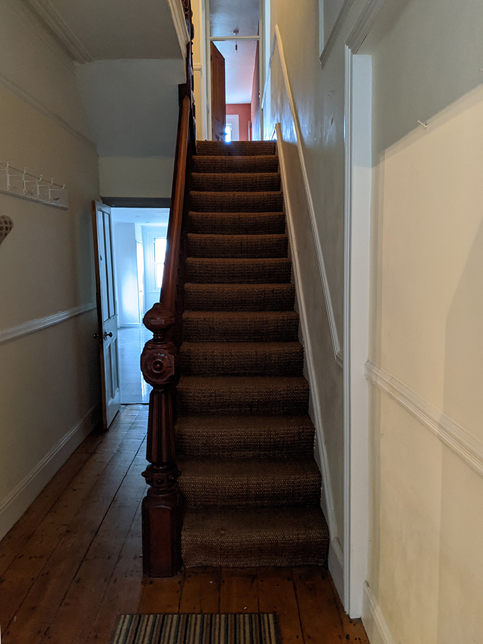
Today I’m excited to be sharing the final photos of the Victorian terraced house I’ve been working on for over a year and half, known as the Pontcanna Project. It has been a long journey, but we are finally done, and the homeowner is delighted and now showing off the house to her friends, neighbours and family. I’ve written about this house before, in my piece about the right time to hire a professional designer, which you can read here, but I thought you might want to see some of the rooms I haven’t shown you before, and the finished photos of the ones I have. When I first saw it, the house had tons of original features, but hadn’t been very well maintained. There were issues with the downpipes causing damp inside the house, and the windows needed replacing, among other things. But the main reason the homeowner called me in was that she wanted to create a real home, for it to feel welcoming and full of warmth, and to reflect her quirky and eclectic style. Somewhere that was really ‘her’. I went to photograph the house last week, and after doing a huge amount of prep and styling, (it takes a lot of time to plan and execute photographing a whole house), here are the results. I think they speak for themselves, so I’m going to show you the before and after pictures without too much explanation (you can play spot the difference if you like!). First up, the hallway. This space definitely had character, but lacked warmth, and wasn’t the grand entrance you’d expect from a property of this age and size. |
||
 |
||
| a before pic of the hallway | ||
 |
||
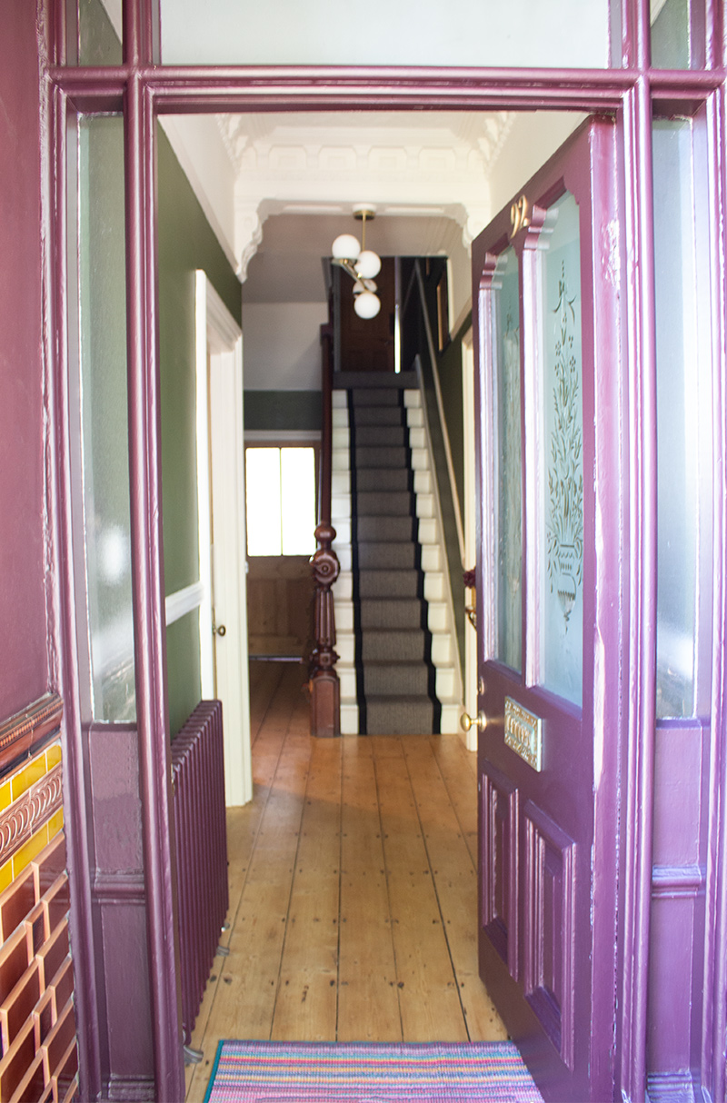
| the finished hallway | ||
It is now a fitting entrance, and the rich colour scheme draws you into the house, making you want to explore the rooms inside. |
||
|
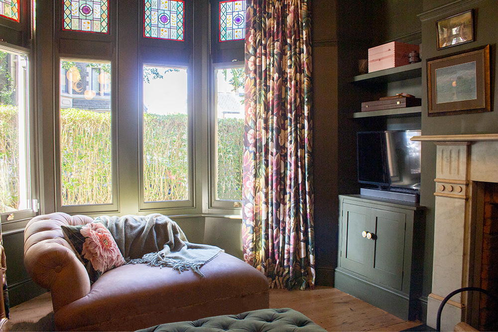
Next, the living room, as it’s the first room you come to when you walk in. It felt very drab when on my initial visit, as it had been painted in a beige grey colour and the wallpaper was peeling. It felt dark and gloomy, even though the paint colour was relatively light. |
||
|
a before photo of the living room |
||
|
|
||
|
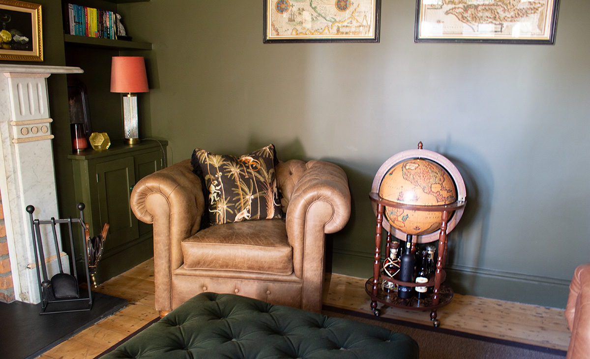
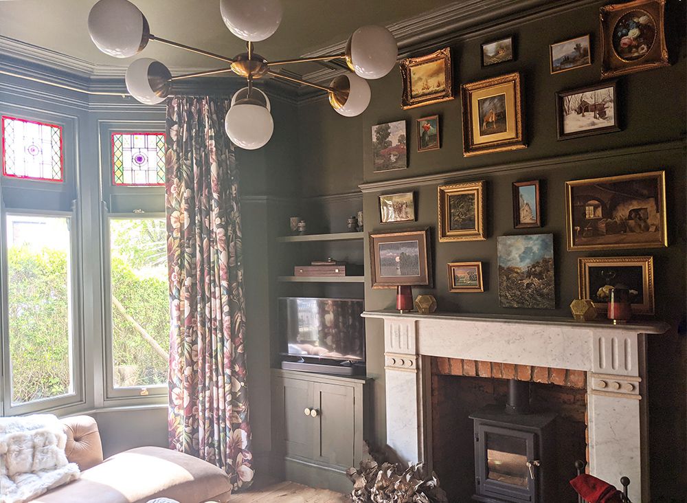
the finished living room The new room is pretty spectacular now, filled with carefully chosen artwork and knick knacks, and of course painted in a much deeper colour. The Chesterfield style sofas add to the relaxing ‘Gentleman’s Club’ feel, and the eclectic mix of patterned cushions add depth to the overall scheme. The room next to the living room is what would have been the dining room when the house was built, but as the owner was planning an extension to the kitchen to include a dining area, she was going to use this as an extra reception room. |
||
|
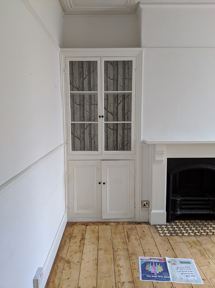
the middle reception room as I found it |
||
|
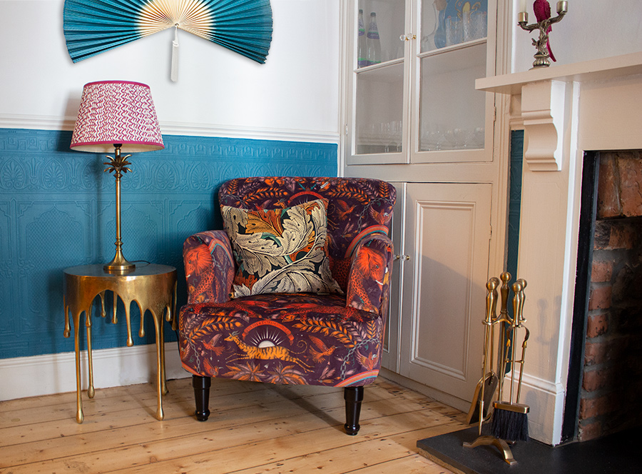
the room is a bit more colourful now |
||
| Again the room had good ‘bones’, so we updated the scheme and added some quirky touches. We decided to keep the original Anaglypta wallpaper beneath the dado rail, and paint it in a warm, rich turquoise, and contrasted this with some yellows, oranges and pinks in the furniture and accessories. | ||
|
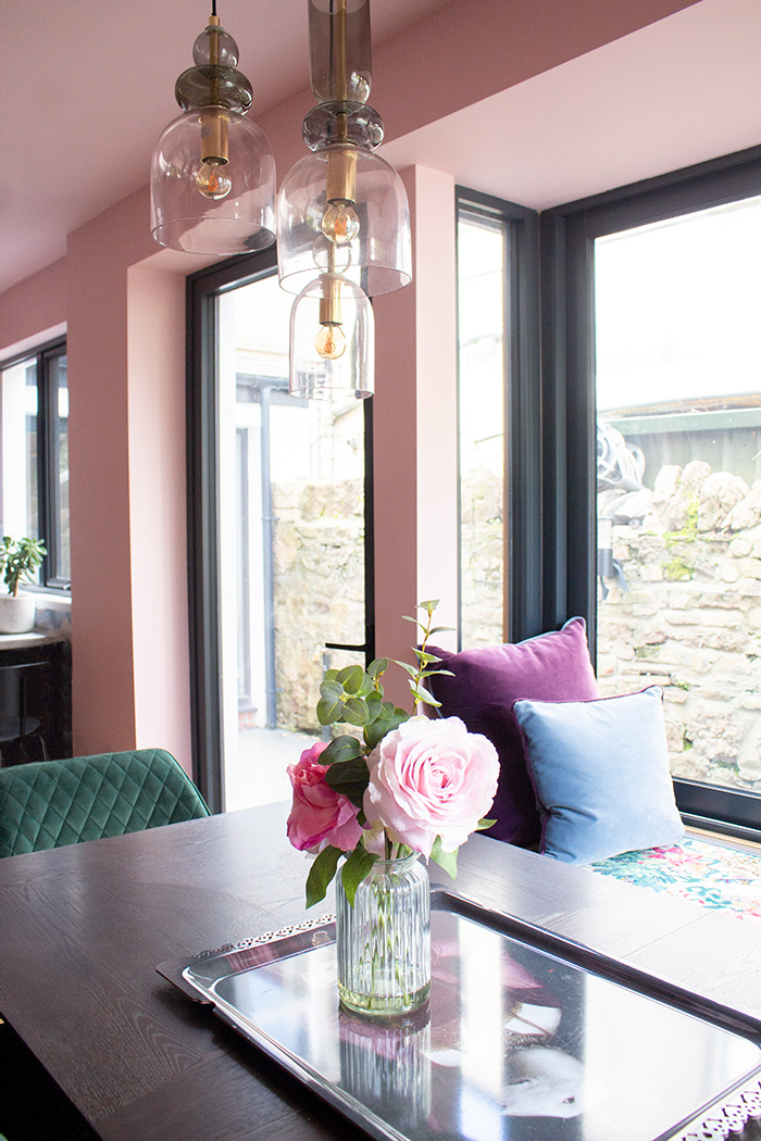
Moving to the back of the house is the kitchen, and the space where the extension would enlarge the kitchen and become the utility room and wetroom. |
||
 |
||
|
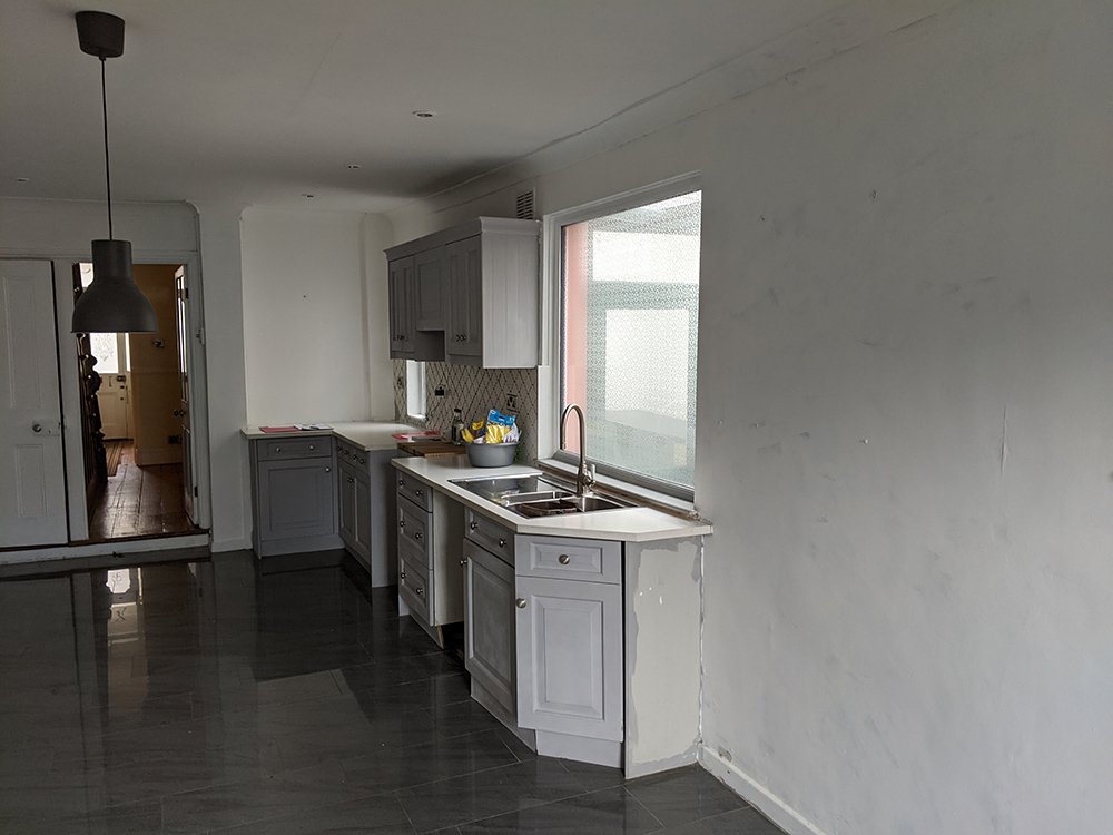
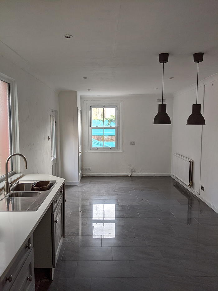
some before pics of the kitchen |
||
 |
||
|
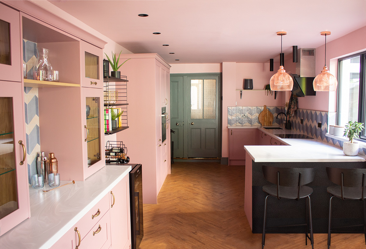
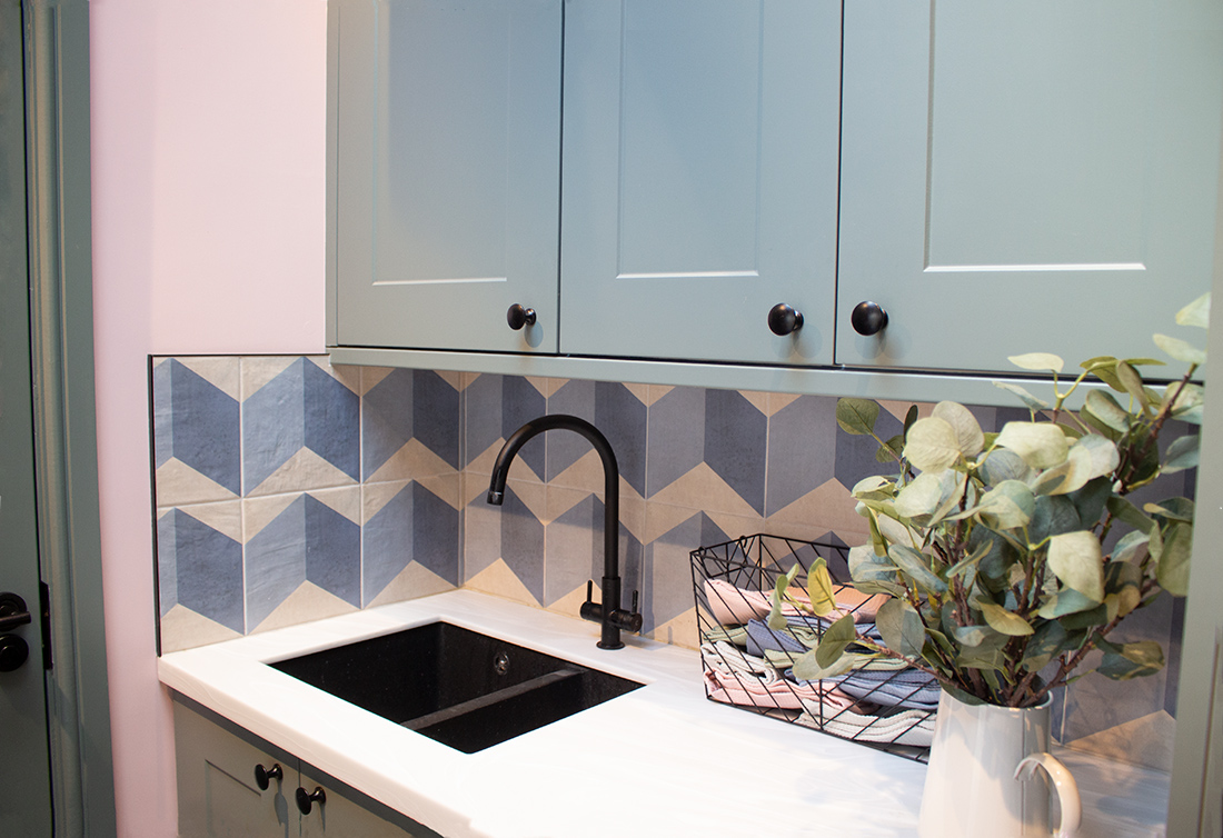
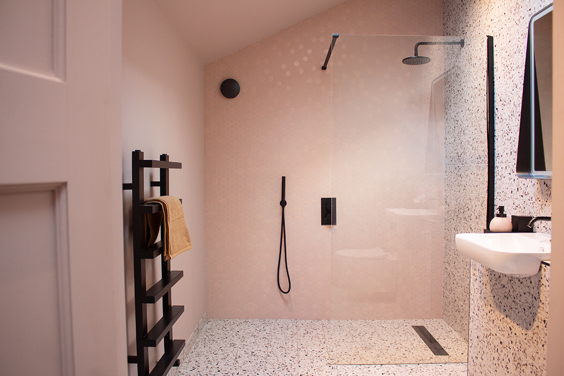
the finished kitchen, including the corner extension |
||
|
the finished utility room, which was built as part of the extension |
||
|
the finished wetroom, also created as part of the extension Even though we were renovating a period property, the owner and I both felt that these spaces should be more contemporary, as they had to work hard (the utility room also acts as a boot room) and would house all the appliances you’d expect in a modern kitchen. We kept the period features as much as possible, and went for shaker style kitchen units, so that the overall feel wasn’t too contemporary, but a mixture of old and new. We added the quirkiness the owner craved in the colour scheme and in touches like the lighting and the patterned window seat cushions. |
||
 |
||
|
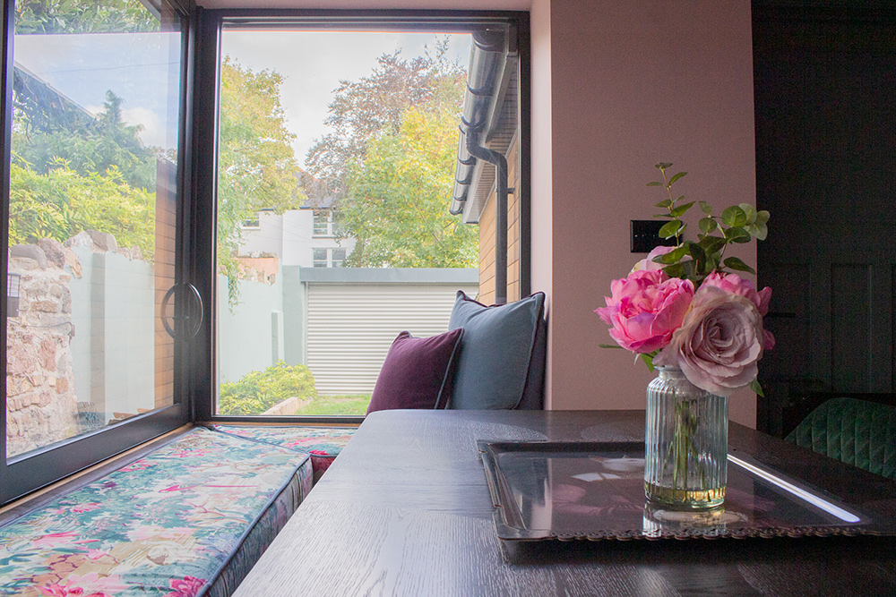
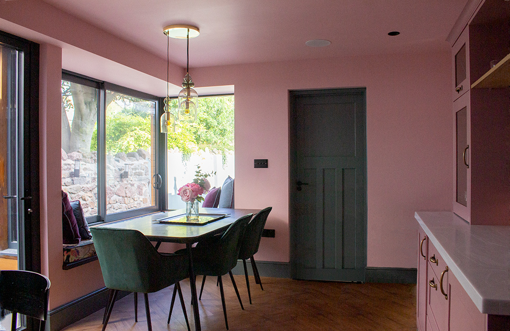
A view of the garden from the corner window seat |
||
| This clever corner extension designed by the architect makes the kitchen a place to relax as well as to cook and entertain. The window seat is a great place to sit, and the deep velvet cushions we added make you want to linger here. | ||
|
Moving upstairs now, the first room you come to is the bedroom at the back of the house. In a lot of Victorian terraces, this room is quite small and often gets sacrificed to become an upstairs bathroom, but in this house we were lucky as the space is big enough to be both a bedroom and an ensuite. |
||
 |
||
|
you can see that the ensuite has been built into a corner of this room |
||
|
||
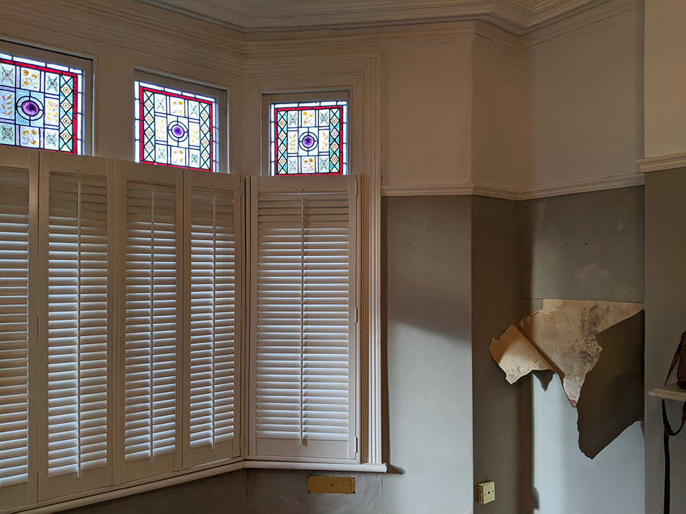
| inside the dreary ensuite before the transformation | ||
|
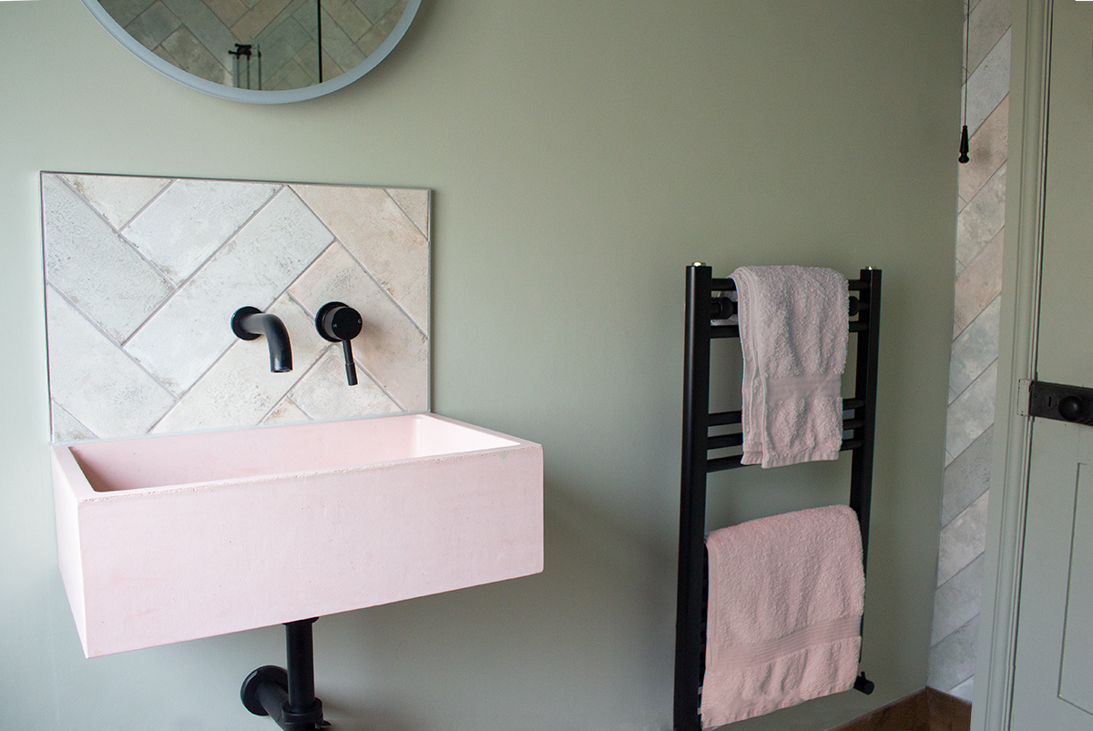
we actually chose a similar colour to the one the walls were originally painted in, but it's less harsh in tone |
||
 |
||
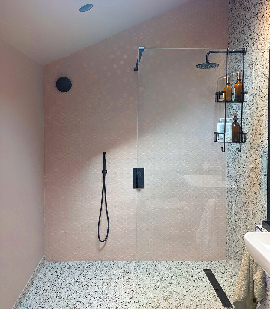
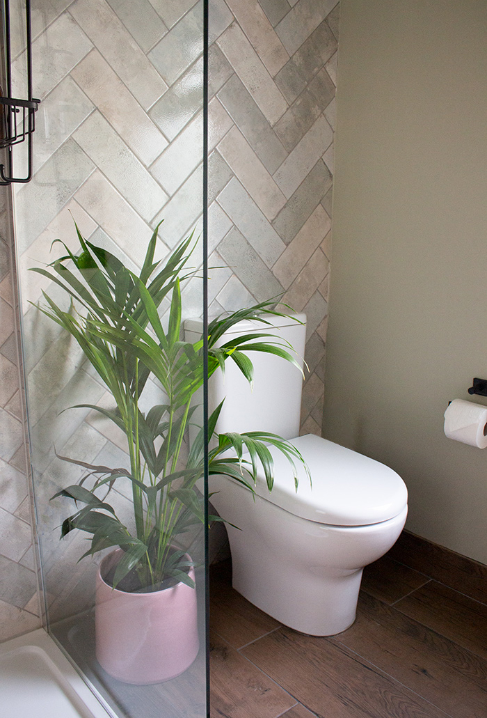
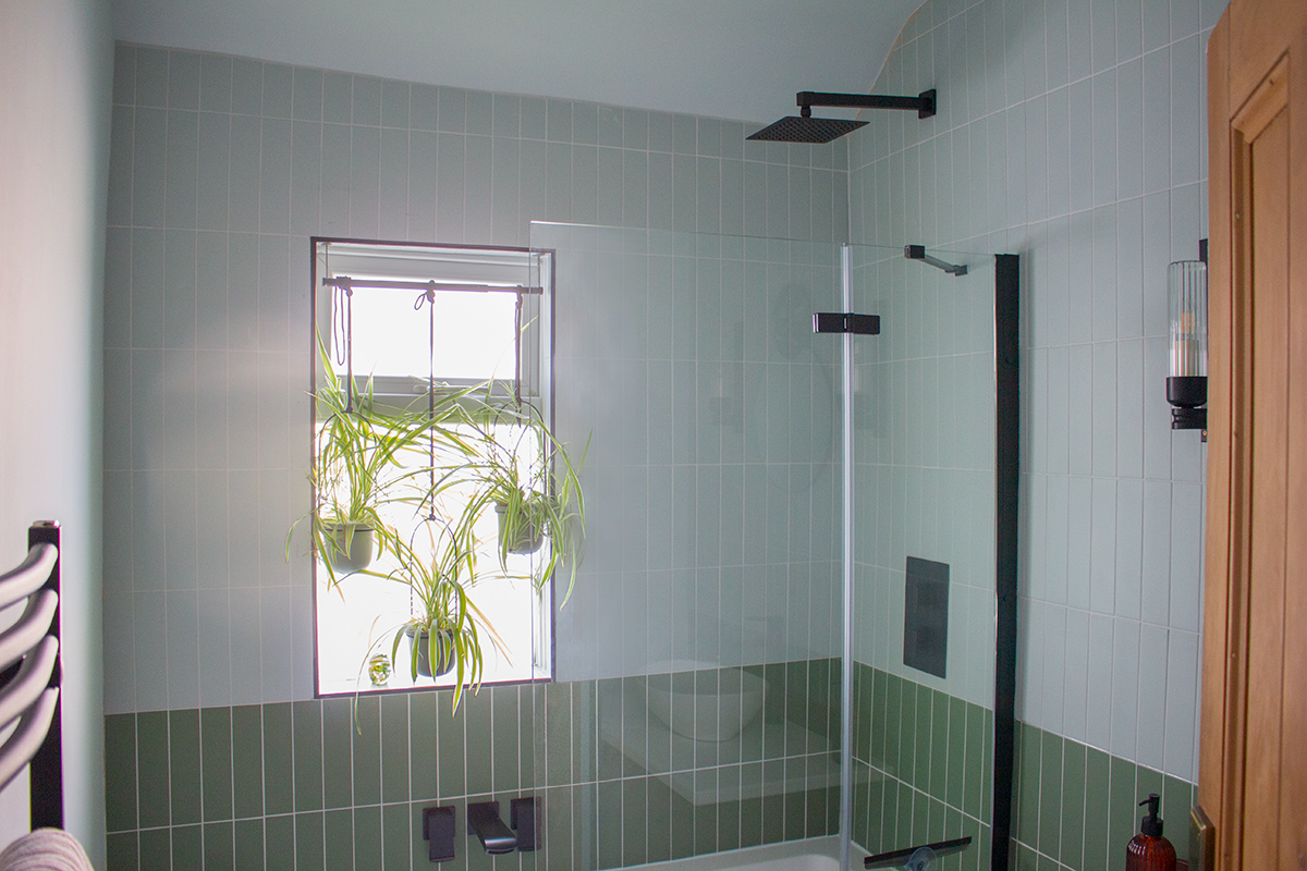
The new pink basin, green and pink tiles and black bathroom fittings liven up the ensuite These rooms are now guest ready, with colour schemes which reflect the choices we made downstairs, with contemporary bathroom fittings eased into, but not overwhelming, the period space. Next door to this room is the main bathroom, which was dominated by the heavy, dark tiling around the bath, and an oversized basin and radiator squeezed into this fairly small room. |
||
 |
||
|
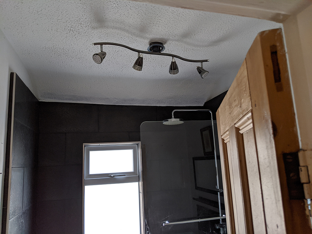
the black basin vanity is too visually heavy for this space (if you look closely you can see me taking the photo in the mirror!) |
||
 |
||
 |
||
|
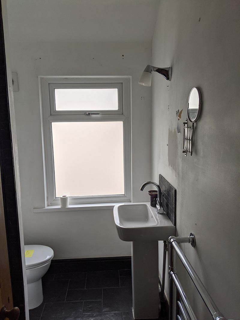
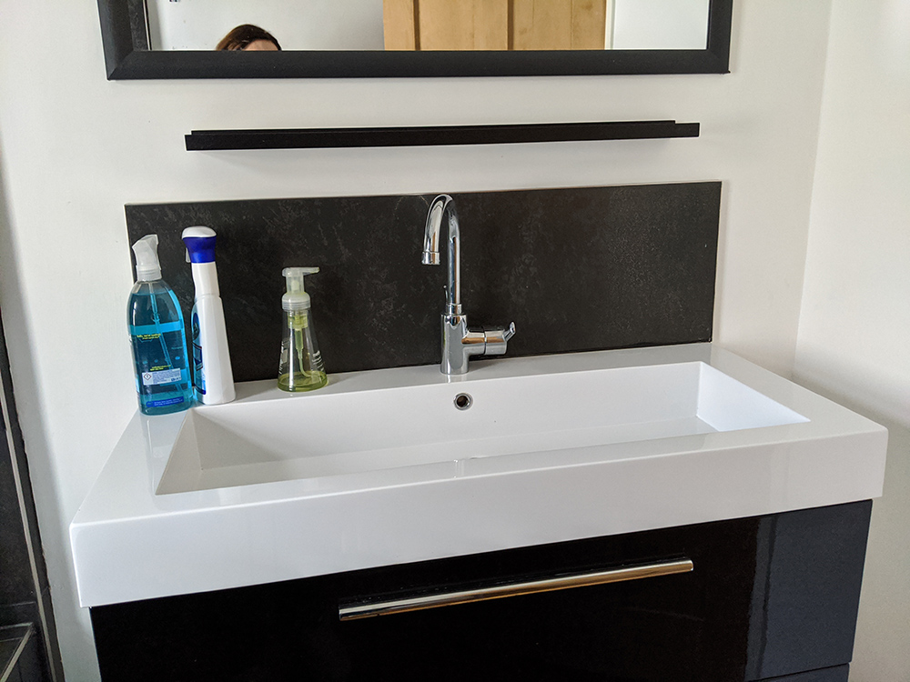
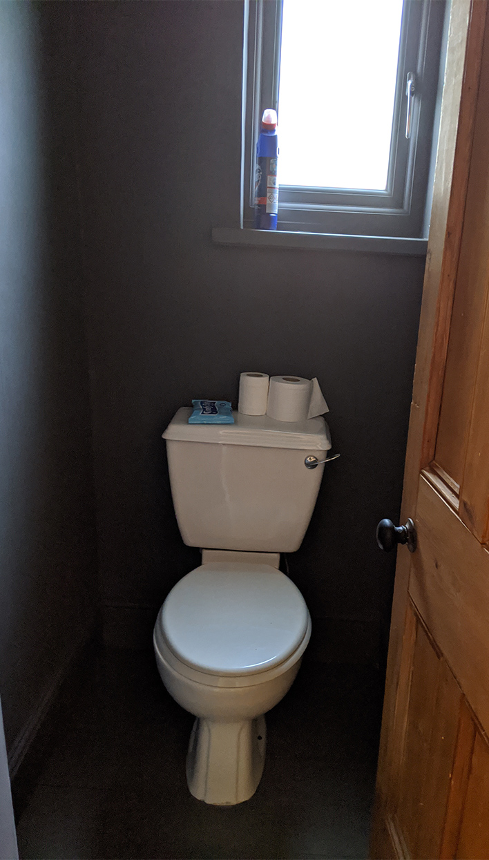
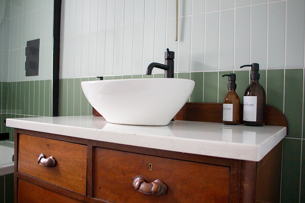
the new basin in the main bathroom mixes old and new styles The room is now lighter and brighter, and feels much cleaner than before, but has warmth in the form of the antique chest of drawers which we converted into a basin. Next door is a compact loo, which felt gloomy because it had been painted in such a dark colour. Now, you know I love a dark, dramatic space, but when going dark you have to consider the natural light in the room, and balance the darkness with texture and pattern to make it work. Being painted all over in one flat grey colour with a tiny window made this a room you wanted to get in and out of fast! |
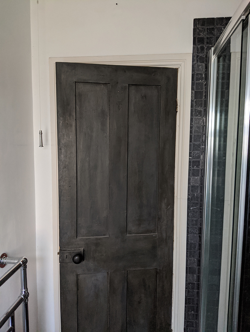
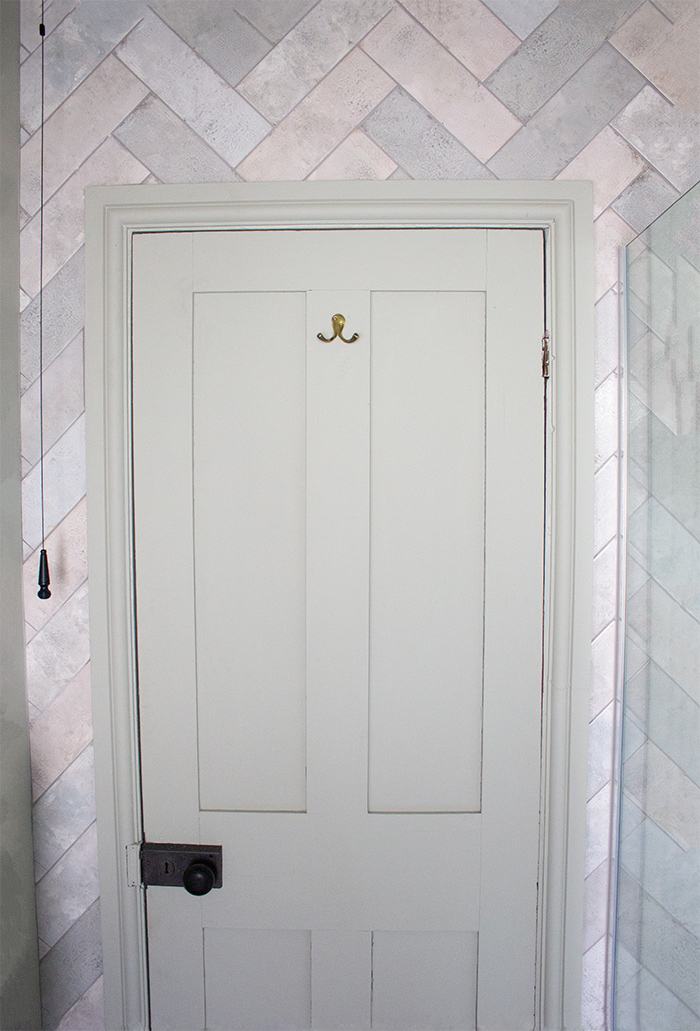
||
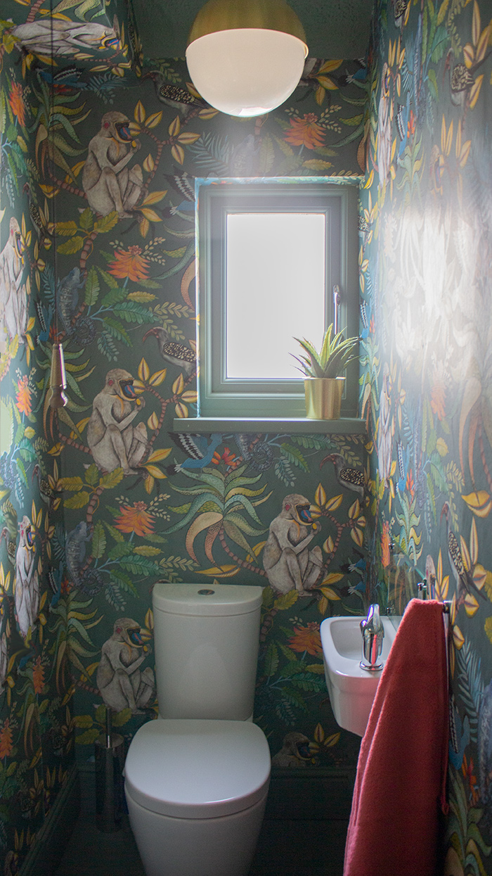
the WC before and after redecoration - we rehung the door to open outwards, giving more space inside We decided to keep the dramatic feel here, by adding a wonderful, whimsical wallpaper all over, but the range of warm and bright colours in it add interest to this room and make it feel much more welcoming. The brass touches warm it up even more. Along the landing is the bedroom in the middle of the house. Again the previous owner had opted for a dark colour here, and whilst the room can take it, it was another flat charcoal grey which didn’t work with the light coming in through the beautiful sash window, and it deadened rather than enhanced the space. |
||
 |
||
|
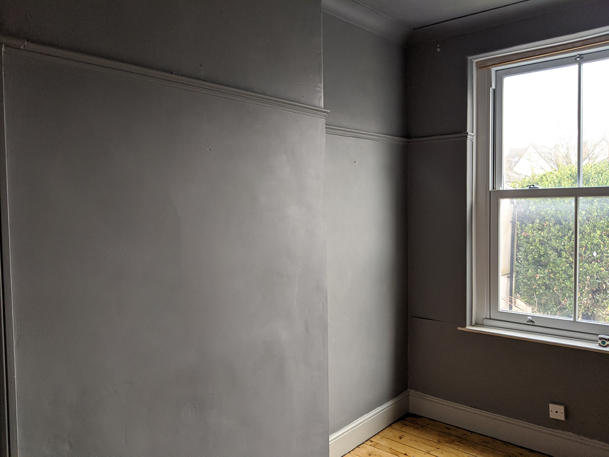
the middle bedroom before it was renovated |
||
 |
||
|
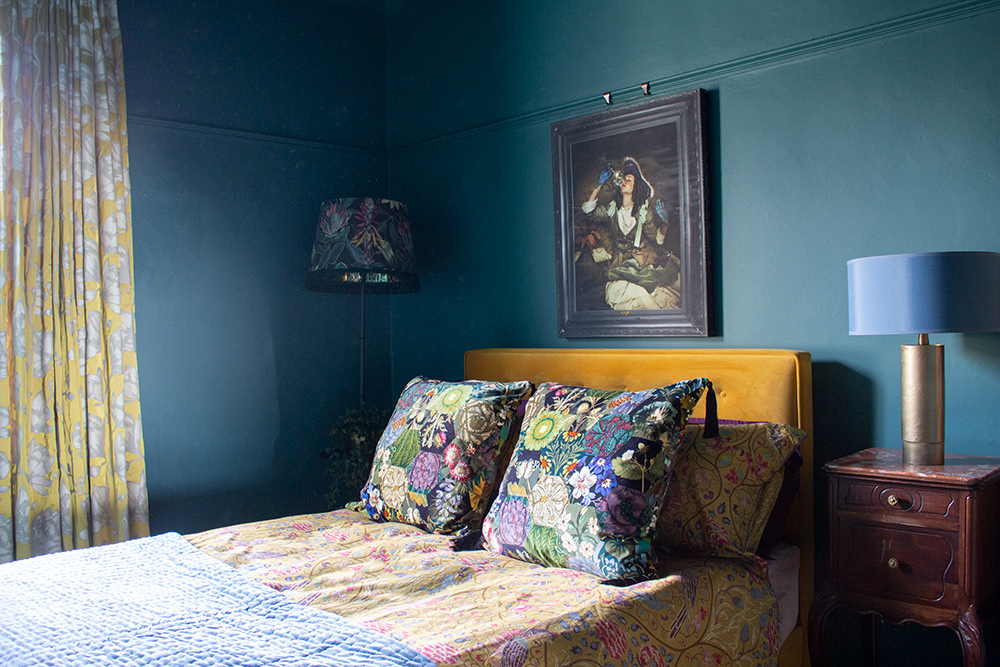
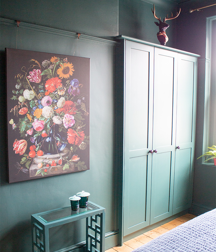
see how the colour looks so different and alive in each photo? |
||
|
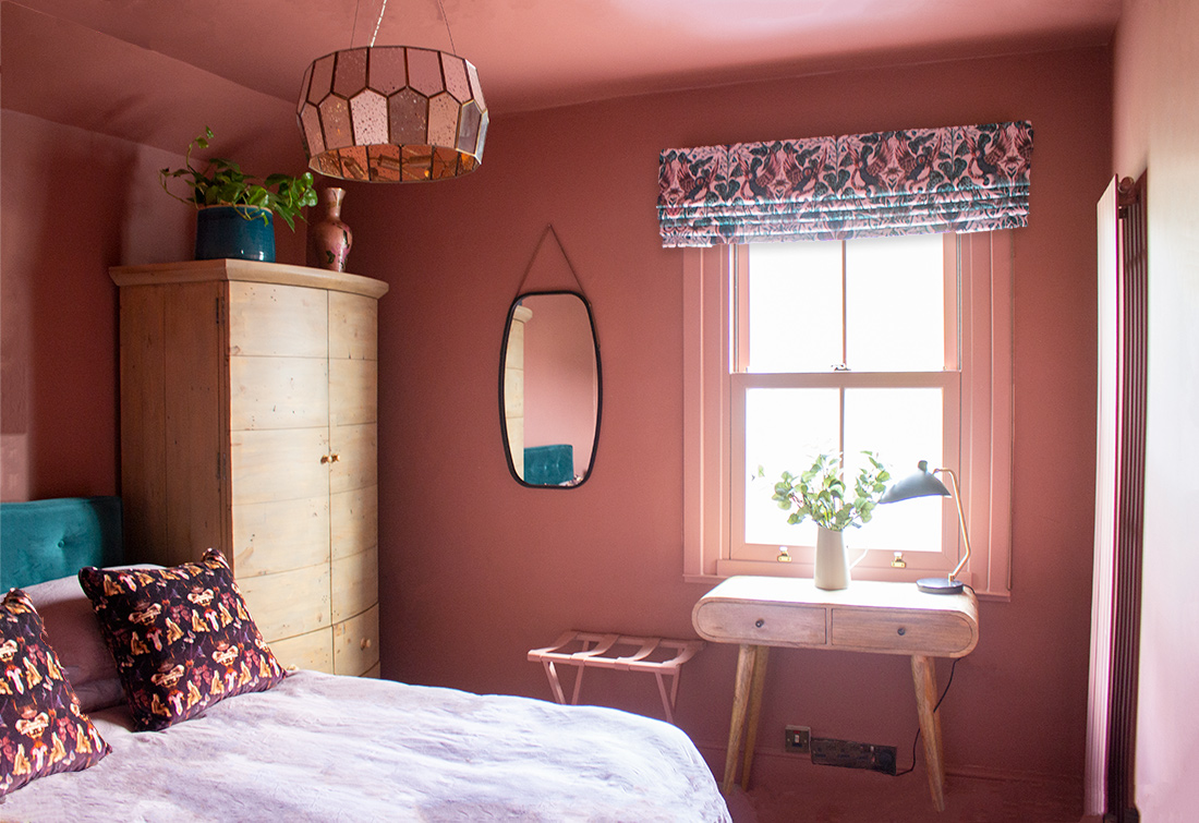
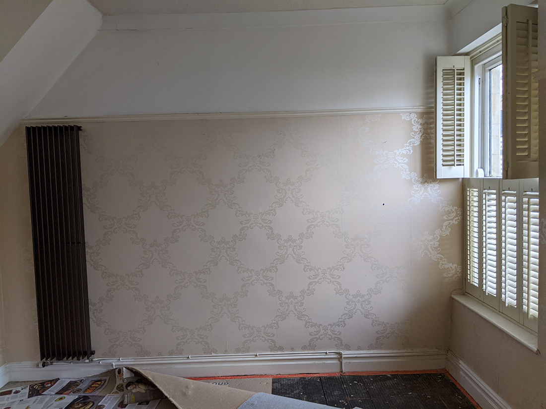
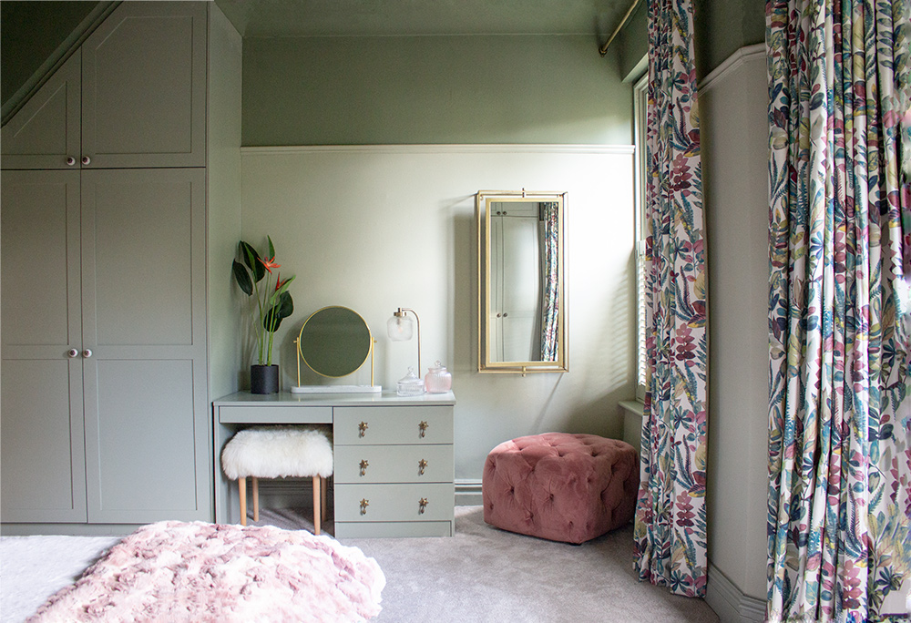
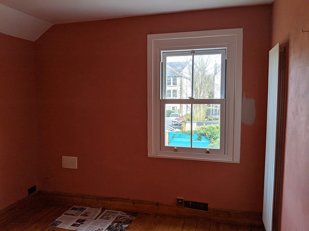
As you can see, we kept it dark here too, but chose a stunning colour that reflects the light and changes throughout the day as the sun moves in the sky. The contrasting but rich colours we used for the furniture and furnishings, and wealth of pattern soften the dark colour and make this room so inviting. The final room on this floor is the main bedroom. It was suffering from damp issues too, and a serious lack of storage. The previous owners had chosen a Baroque style wallpaper, presumably to add some interest to this large room, but it wasn’t my client’s taste and still felt bland, despite the pattern. |
||
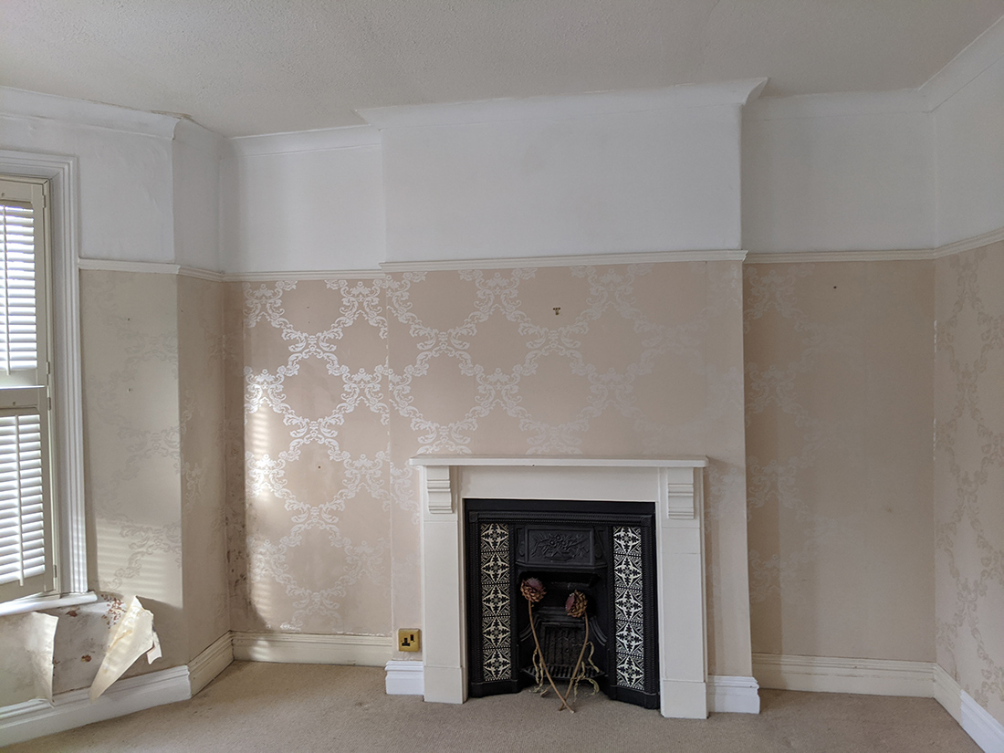 |
||
|
this wallpaper wasn't doing it for either of us |
||
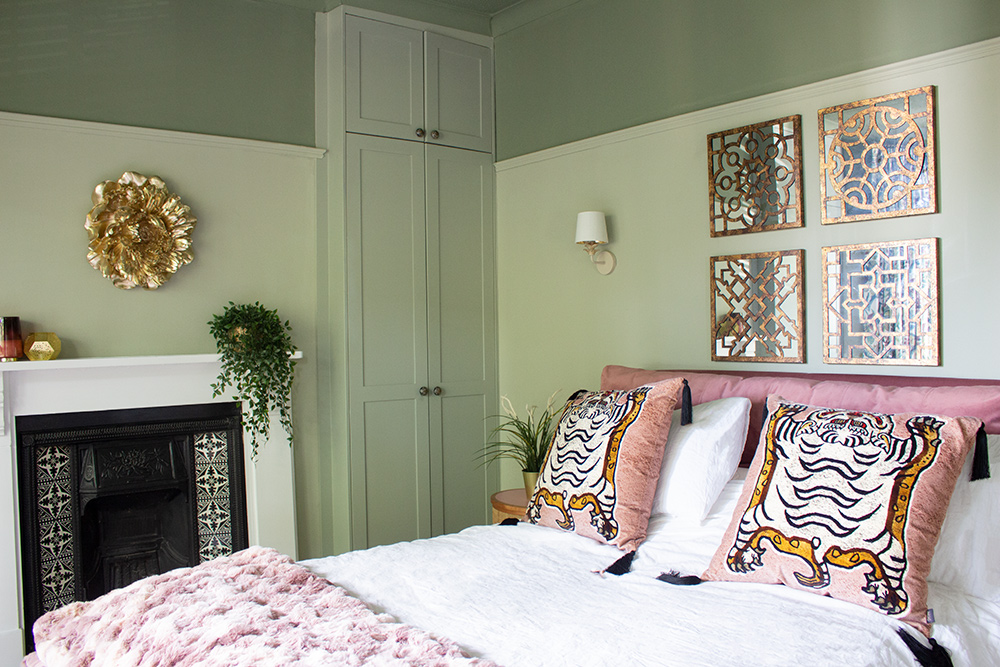 |
||
|
the finished bedroom has lots more going for it |
||
|
We chose to keep the pattern to the fabulous curtain fabric, and added layers of texture with the two toned colour scheme, the velvet bed and stool, faux fur bedding and the unusual details such as the antique brass handles on the dressing table. This room has a really different feel to the darker one next to it, but is equally warm and enticing. I’m actually quite jealous that my client gets to live here! Writing this post and putting these pictures together has made me take another look at what the homeowner and I achieved together. Working on a project which took this long and evolved so much over time can mean that you lose sight of all the many decisions you’ve made and how they have improved the house. Yes, the house looks better, but more importantly, it enriches the life of the owner and the people who spend time in it. I’ve spent a few evenings in the kitchen having dinner there and the house really does exude the warmth and relaxing vibe the client wanted. I’ll leave the final word to her: |
||
It has been a privilege and a pleasure to work with Louise throughout the refurbishment and extension of my home over this last year. From the outset, Louise took a keen interest in my ideas and immediately understood my personal style and tastes. With this understanding and her expertise, she guided me through my refurbishment and I am absolutely thrilled with the results. It now feels like my home |
Welcome to the design blog, where you'll see posts about anything from the projects we are working on, to the latest fabric and wallpaper collections, and all things interiors related. We love colour, pattern, architecture and old buildings, and we love to share our finds with you.
Happy reading!