How to choose a builder
 |
|
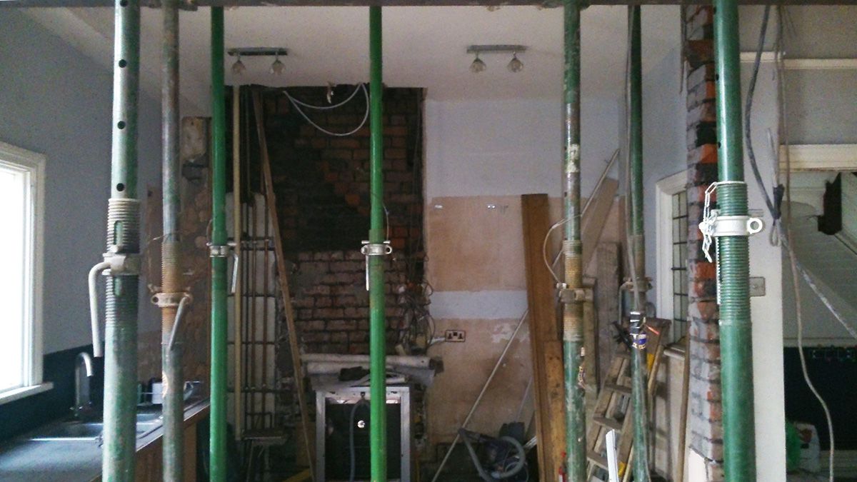
This month, I’m writing about another work in progress which truly is still in progress - there are remaining bits and bobs to be installed and/or bought, but the clients have kindly shared some update pics with me, so I thought I’d show them to you. When I was contacted by this lovely family needing help it was before the pandemic began and we couldn’t have dreamed of what was to come. As the project (and the pandemic) progressed, the focus shifted from making the most of a recent kitchen extension, to providing a work from home space for two - something that I’m sure is familiar to a lot of you. Here’s what the space looked like when I first saw it: |
|
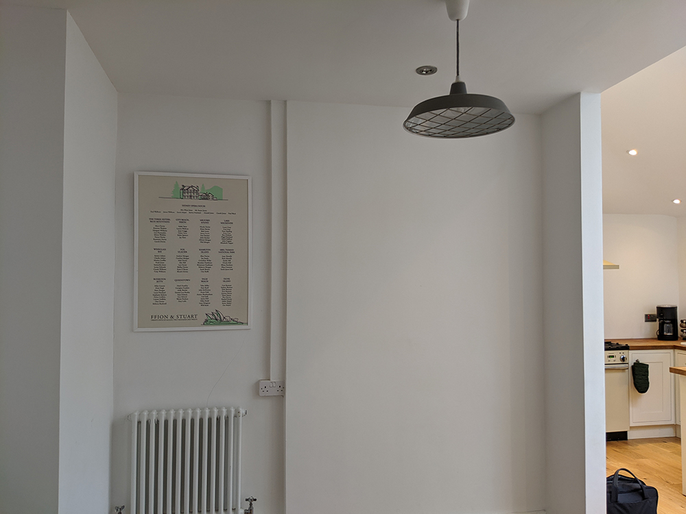
here's the area which had become a corridor and had no purpose |
|
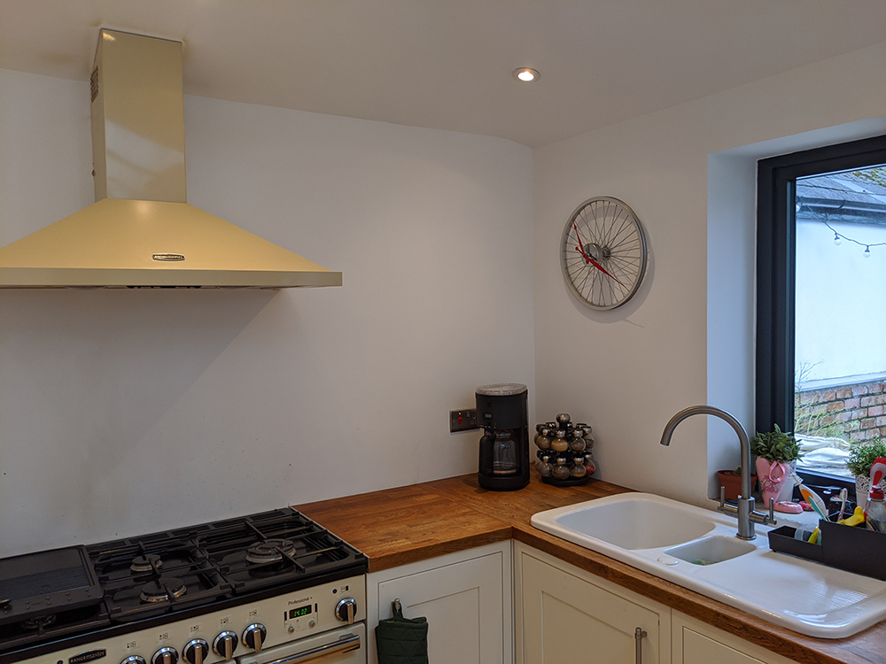
the kitchen area before we started work |
|
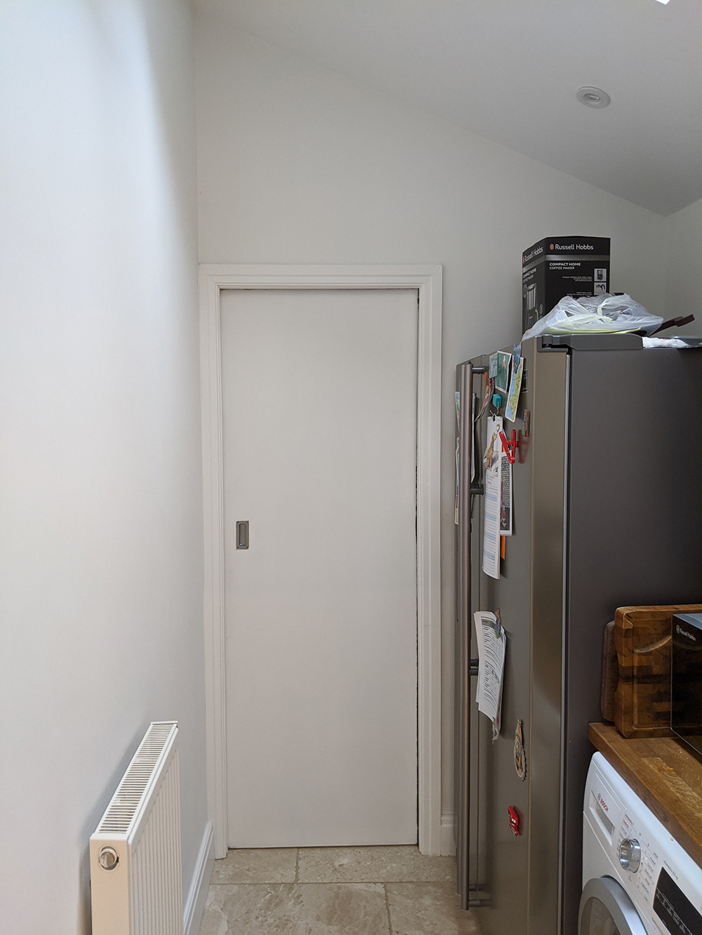
the pantry area which is just off the kitchen |
|
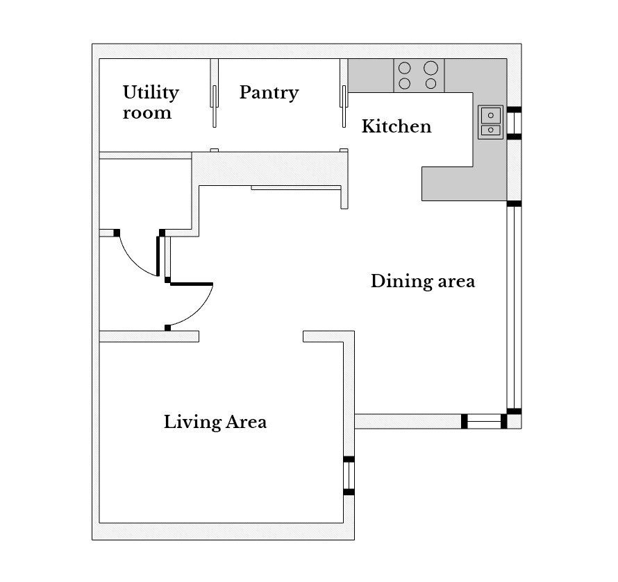
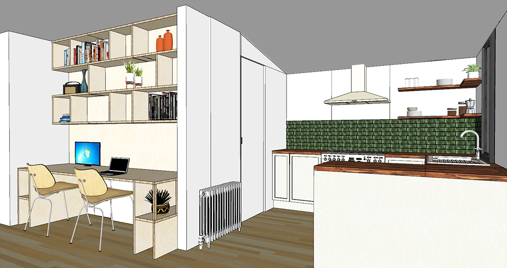
Here's the floorplan to explain how the areas all fit together: |
 |
|
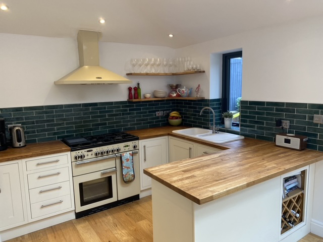
They had originally called me in to add the finishing touches to this new space and to make it feel like a cohesive whole. There were little things that needed to be done like installing a tiled splashback and adding some extra storage in the kitchen area. They also wanted to find a use for the awkward area between the living room and the kitchen. Before the extension was added, this area would have been part of the original kitchen, but now that the kitchen has moved, it had become a walkthrough - not much more than a corridor - and it felt underused and empty. We did discuss adding a desk or maybe some storage for kid’s toys in this area at our first meeting, and were getting ready to come up with a design plan. And then lockdown happened and the world ground to a halt in March last year. The couple got in touch with me again in June, with an update that they were both now working from home and that a new desk area was a priority. They needed a space which was large enough so they could both work side by side, with plenty of room for laptops and monitors, and also some storage for all those office bits and bobs. The clients also wanted me to address the lack of storage in the pantry (which is just off from the kitchen) and to add some form of display shelving in the kitchen itself for glasses etc. They’d been given some beautiful glasses as a wedding present and understandably wanted to have them out on display. And if we were going to be getting the other things done, we may as well address the lack of a splashback. It was impractical as the walls were getting splattered with food when cooking, and it meant the small window in the kitchen didn’t have a window sill and looked unfinished, so we decided to get that sorted out too. |
|
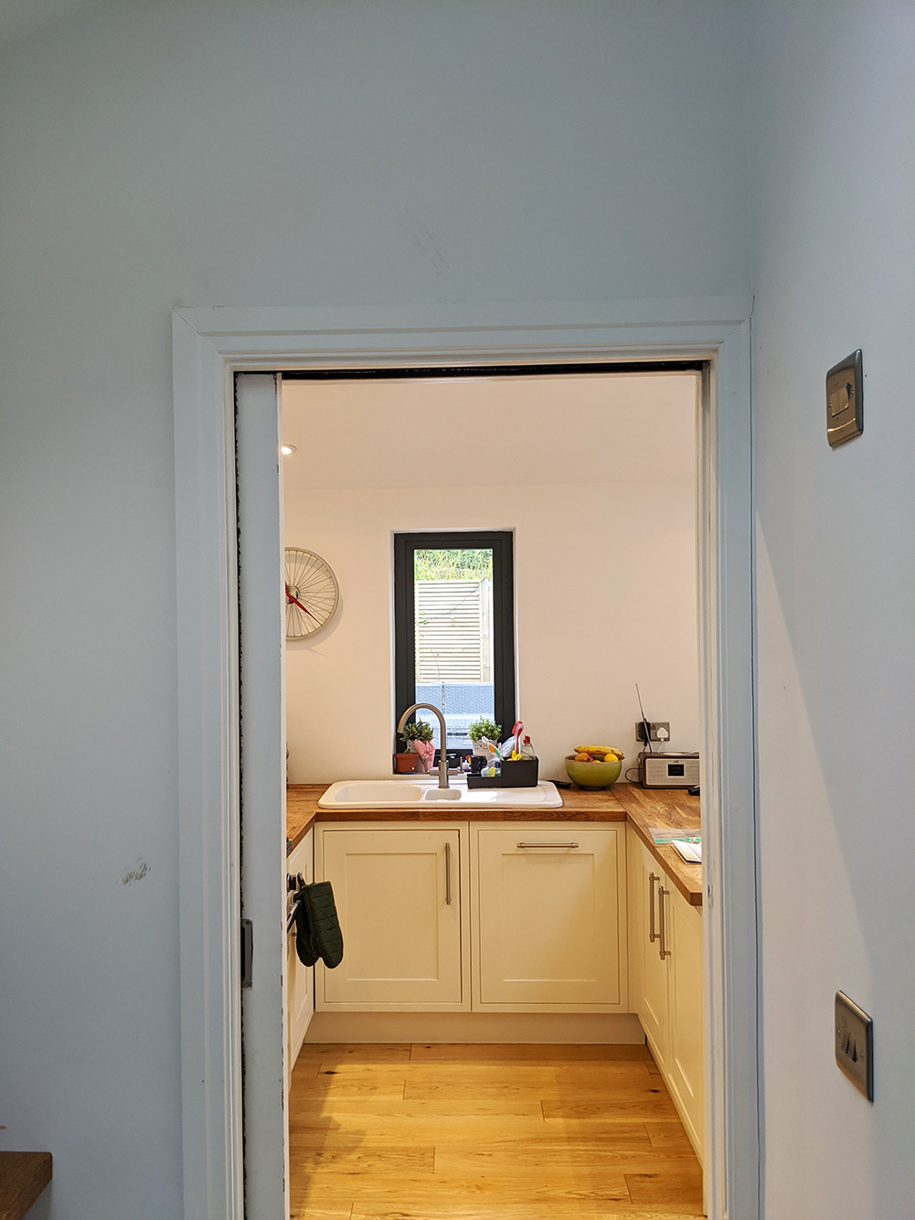
the view from the pantry to the kitchen |
|
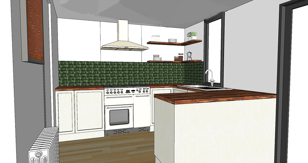
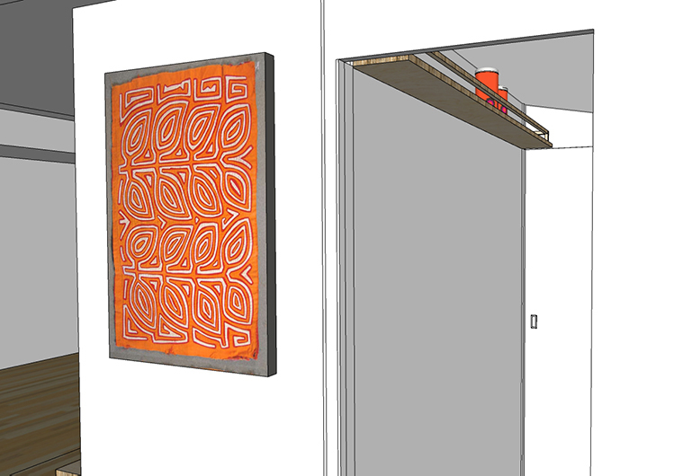
So - on to the ideas and the brainstorming stage. The couple wanted to add some more colour and liked greens, blues and oranges, but as they already had a large orange sofa in the living area and had seen some glossy green tiles they liked, we decided not to add any more orange and go for the green. They also had some stunning original artwork with lots of oranges and greens in it, so I thought the green tiles would work well. I felt that the green would sit nicely with the cream shaker kitchen they had, and laying the tiles in a classic ‘stretcher bond’ or metro tile pattern would bridge the gap between a more traditional kitchen style and the modern look they both liked. We all agreed that some open corner shelving above the splashback would provide the display space they were looking for. I suggested making the shelves in the same wood as the existing wooden worktop (American white oak which was finished with a stain) to help to make them look like they were part of the original kitchen installation. I designed the height of the splashback to cover the minimum needed for keeping the area clean, finishing the tiling at the next full tile above this measurement. I made sure to use only full tiles in the design, as it would not only look better, but not having to cut tiles would also keep labour costs down. The new shelving would then ‘sit’ on top of the tiles. Here is my design for the splashback and shelving: |
 |
|
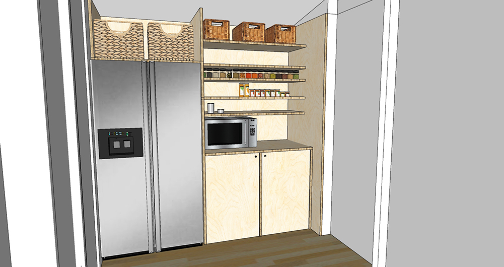
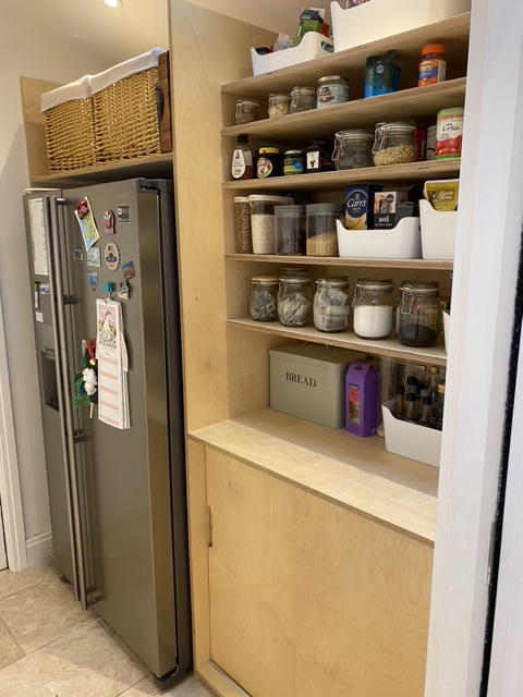
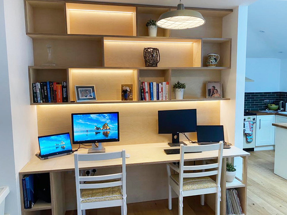
We stuck with American white oak for the shelving, but the clients really liked the idea of using plywood for the desk as it’s clean and modern looking, and I felt the pale colour of the wood wouldn’t dominate the whole space when used over a large area. Plywood looks great when it’s not painted, and can be protected with a clear oil, so it’s easy to maintain. I think the wood grain in plywood is truly beautiful, and even though it’s a relatively inexpensive material, when used well it can really add to the visual appeal of a room. Up next - the pantry which is connected to the kitchen with a clever pocket door. The fridge is in here so the whole area needed to be accessed easily, and it definitely needed more storage space. The washing machine and tumble dryer were going to be moving to the utility room which is one door further along, so that gave us some room to play with to add the extra storage. The idea in here was to add as much storage as possible without making the space look cluttered, and to make use of the currently redundant space above the fridge. We all thought that using the plywood in here again would help to unify all the spaces, and even though there was already a worktop in here, replacing it with a new plywood one made sense visually. The old worktop could be used in the utility room, so we were also able to reduce the amount of waste this project produced. Here are my designs for the pantry area - I chose sliding doors for the doors under the new worktop so the items inside could be easily accessed and it meant that there would be no possibility of an open door blocking the entrance from the kitchen, or worse still, that someone could hurt themselves by walking into it. |
 |
|
I measured the fridge and designed the rest of the storage to fit around it neatly. The couple would now have a usable space above the fridge where they could add baskets to hide some of the kitchen bits they didn’t use very often. I also designed some high level storage on the opposite side of the pantry which didn’t have the depth for any more cupboards. This shelf is above head height and deep enough to house tinned goods etc. I added a rail around it so that the tins wouldn’t be in danger of falling off the shelf and hitting you on the head. Here is the shelf design: |
 |
|
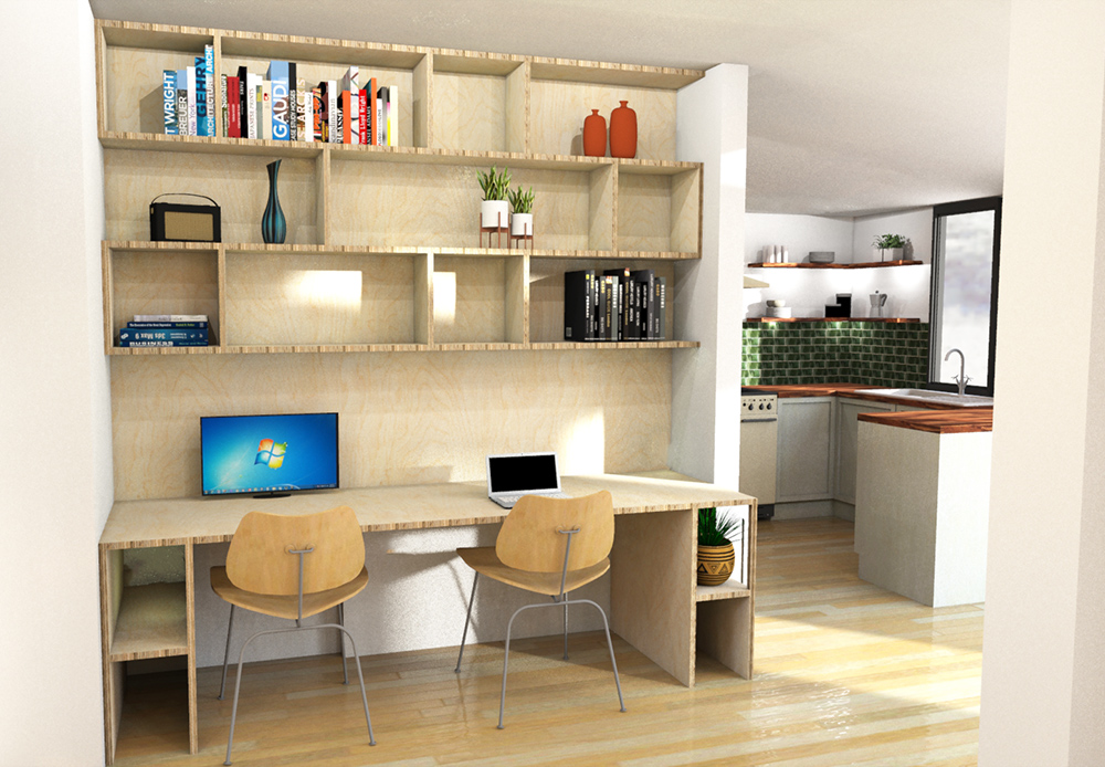
The final job was for me to design the desk. It needed to be a functioning desk, but we also wanted it to fit in with the home and not just look like a work space. My solution to this was to add in some shelving above it which could also be used as display space, and adding lighting to some of the shelving meant that the couple could show off some of their treasured items too. The recess between the main wall and the wall leading to the kitchen area was the obvious place to build the desk, but the wall leading to the kitchen wasn’t deep enough to house a desk that would be big enough to use. Building a practically sized desk meant that it would stick out further than the wall, so I had to find a way to do this and make it look intentional. I decided to add a cut out in the plywood support at this end of the desk, as it would reduce the visual weight of the whole piece, and it could also be used as another display area. Adding a plant here which could be seen from both the sofa area and the kitchen area would help integrate the desk design into its new home. Here’s what the design looked like: |
 |
|
There were a few other practical things to consider too - there was a radiator on the wall where the desk would be going, so I arranged to have it moved on to the adjoining wall. We needed to add more plug sockets so all the couple’s work equipment would have power, and I kept these under the desk so they wouldn’t spoil the look of the display area but could still be reached easily. I needed to plan in holes for the cables to be managed neatly, and we had to decide how to finish and protect the desk. We discussed stains and different looks but we all felt that the plywood should be kept as natural looking as possible. In the end, we finished the plywood with Danish oil to protect it and bring out the grain, as this is something I’d done before and was pleased with how it looked. And I have to give a shout out to the couple here, who spent their evenings applying three coats of oil - it’s a sticky and quite smelly job, so thank you for your dedication! The couple asked me to project manage the build, so after producing construction drawings I brought in my extremely talented carpenter and all the other trades needed. They did a fantastic job and it really was a team effort, and it’s great to see how they translated my design into a finished product. I also want to thank the lovely couple who allowed me to work on their home and coped with all the mess and disruption that a project like this brings, and I’m glad to see from the photos they sent me that the space is working well for them. |
 |
 |
 |
Welcome to the design blog, where you'll see posts about anything from the projects we are working on, to the latest fabric and wallpaper collections, and all things interiors related. We love colour, pattern, architecture and old buildings, and we love to share our finds with you.
Happy reading!