Work in Progress - Bancha Bedroom
 |
||||||
|
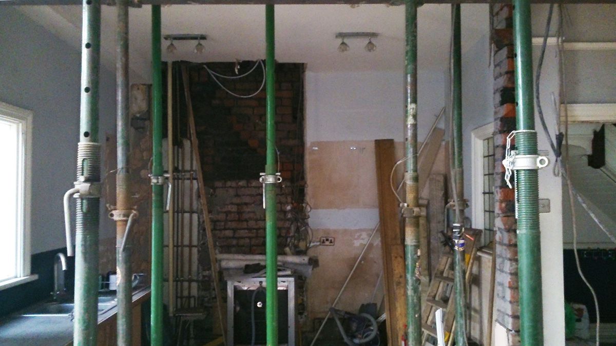
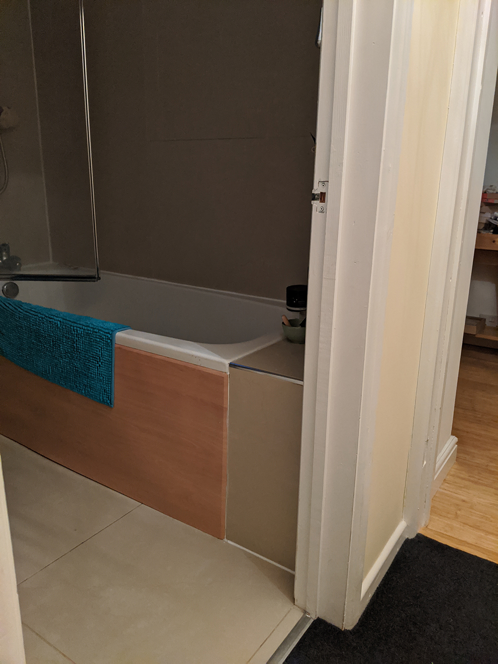
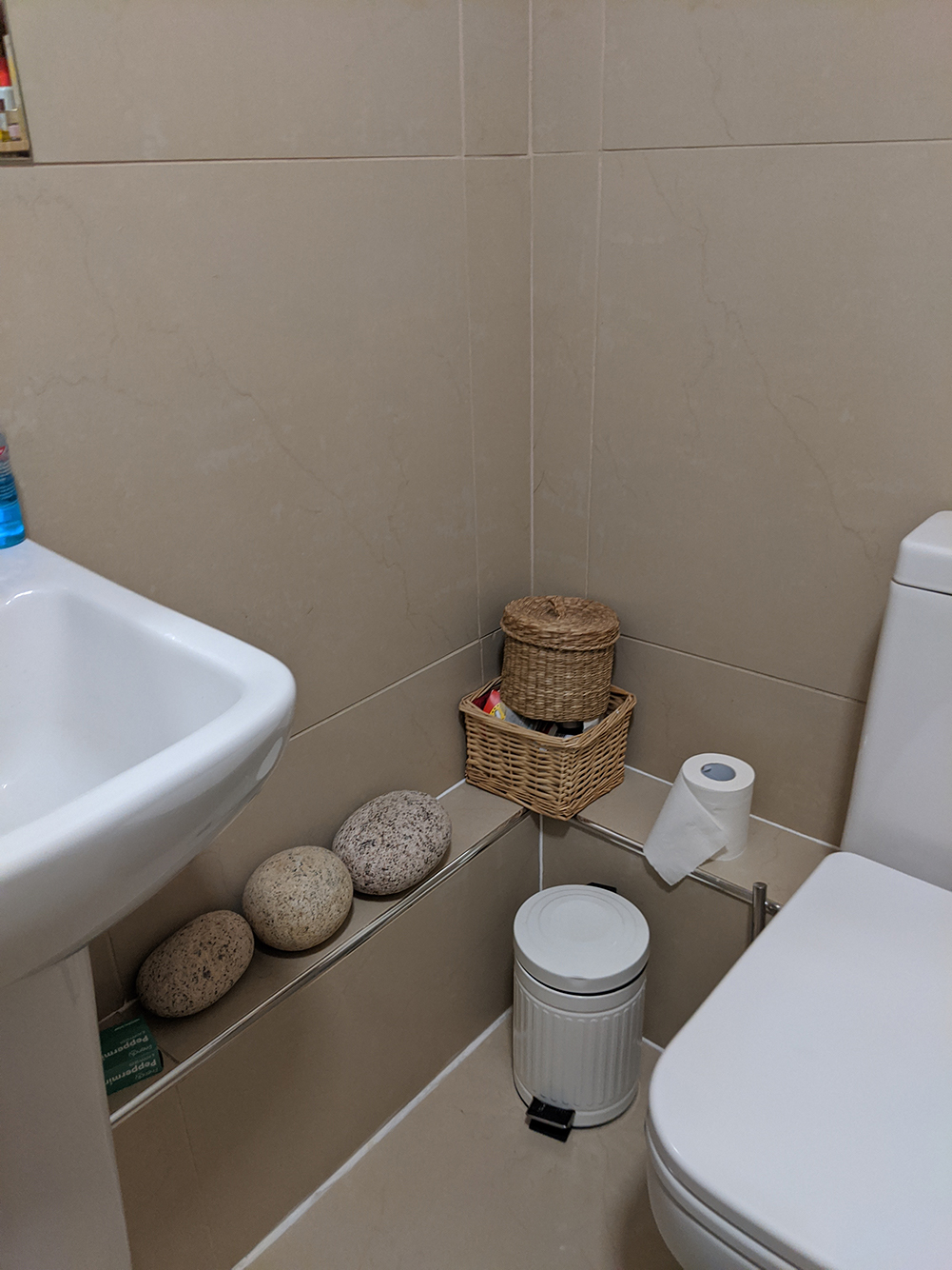
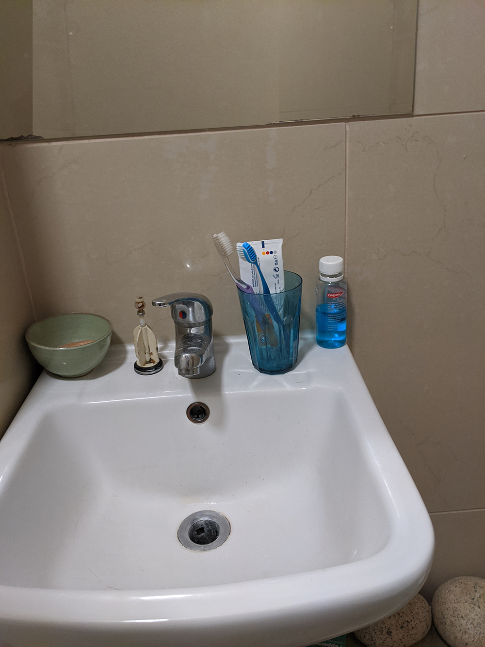
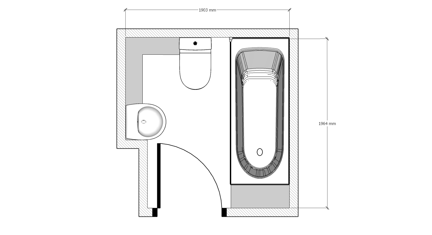
I’m sharing another work in progress this month, a small but perfectly formed bathroom. Just like the last work in progress blog, the space is actually now finished but due to the current lockdown I can’t go to take the final photos. But I can share the design and some pics the clients kindly sent me with you. First up, why the clients wanted to make changes to the room, and the all important before pics. This cool young couple had bought the house and been slowly doing it up room by room, and the bathroom was the last room left to do. Unfortunately, the previous owners hadn’t done a great job when they refurbished it, so some of the tiles were cracked, the lighting was terrible and the sink was too big. To make things worse, the bath wasn’t the correct type to stand in to take a shower, so it was gradually falling apart. It was also a pretty small room - 1.9m x 1.9m (smaller than the average UK bathroom size of 2m 43cm x 1m 83cm) and the room isn’t square, which made it even more of a challenge. The house is a Victorian terrace and wouldn’t have had a bathroom when it was built, so this room has been carved out of the third bedroom using the least space possible and creating the awkward shape. Here’s the original floorplan, and what it looked like when I went to see it for the first time: |
||||||
 |
||||||
 |
||||||
During our initial consultation, I asked lots of questions and together we came up with a wish list for the room: Practicalities
From looking at lots of inspiration pics, colours and samples, we came up with these style preferences for the room:
|
||||||
| So you can see, this small room needed to both work hard and look good, but I do love the challenge of designing bathrooms, and I knew that I’d really enjoy coming up with a cool design for my clients. I was really on board with the couple’s sense of style, as it meant that I could produce a design that was a bit different than the usual white tiles/grey floor and neutral decor that we often see in bathrooms. | ||||||
|
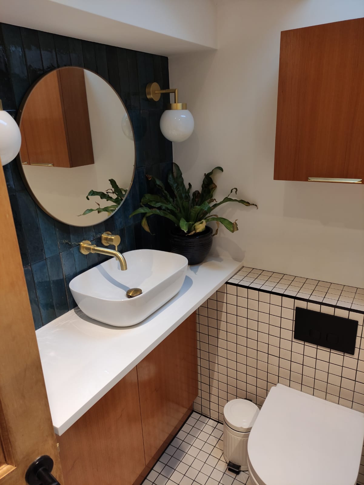
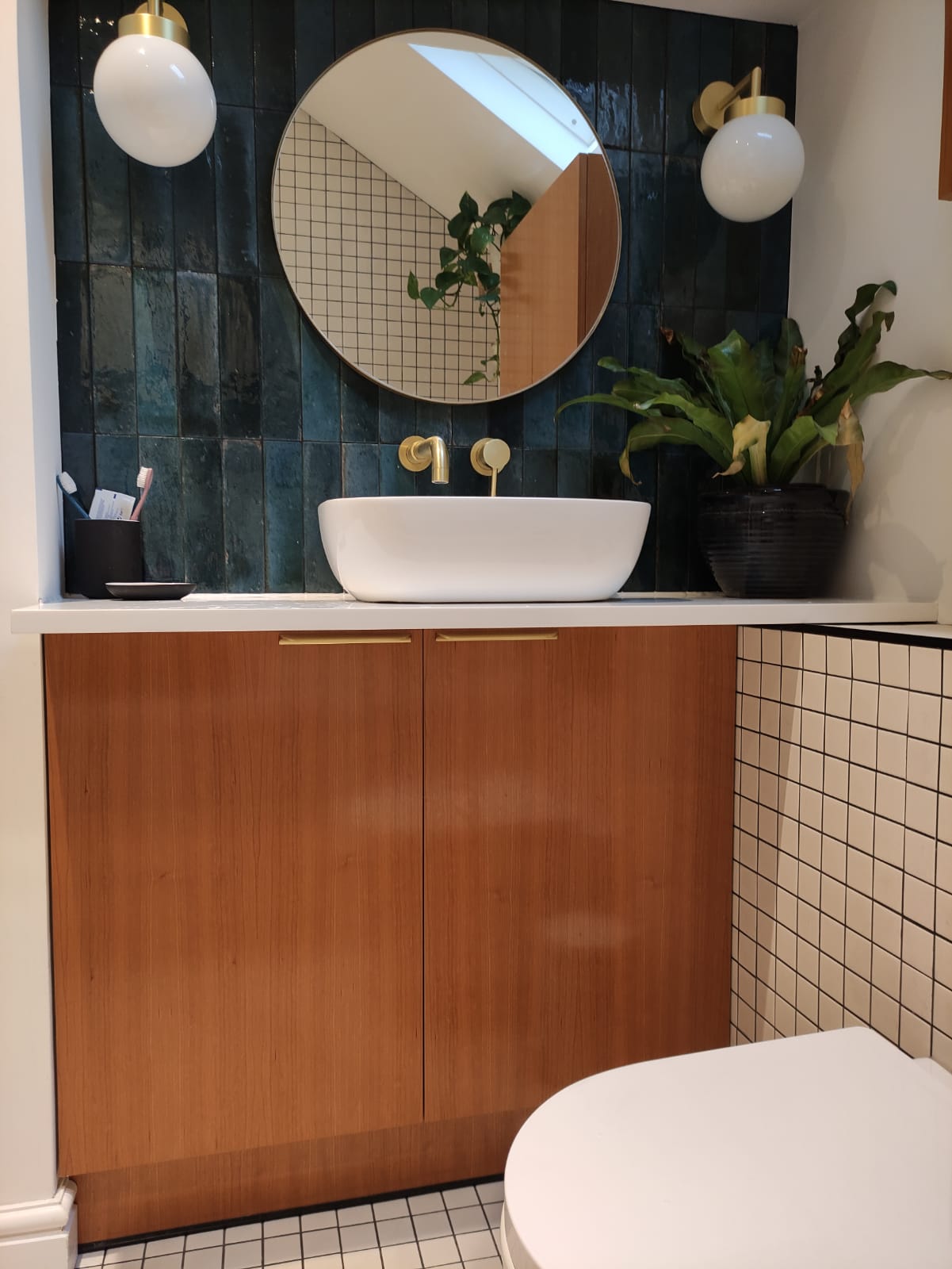
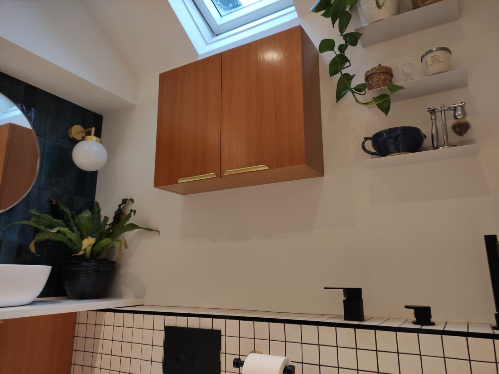
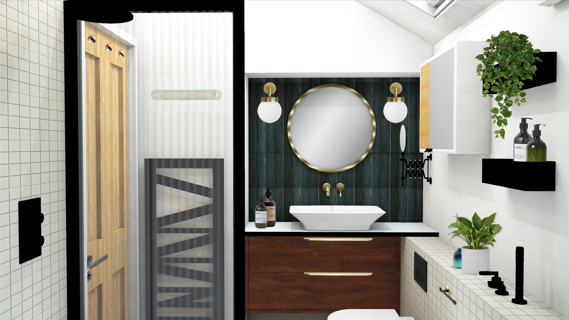
So I got cracking with the layout. I tried a few different positions for the bath to see if I could make better use of the space. The loo couldn’t really be moved too far, as it needed to stay on the only outside wall to connect to the soil pipe. It quickly became clear that the current layout was the best one, so I stuck with it. But I did want to improve the sink area - the current sink was far too deep and was squished into the corner of the recess, so it made sense to place it on a unit that would fill up the recess, giving the couple the space either side that they wanted. I really wanted to give them a vintage Mid Century unit to put the sink on, and I found some gorgeous original G Plan units which could be converted to hold a sink, but sadly they were just too deep for the space. If I’d used one, there wouldn’t have been enough clearance to sit on the loo without banging your legs on the cabinet! The solution was for me to design one, and have it made from teak, so it would look like a Mid Century piece. In the end, it was made from cherry wood because it is more water resistant than teak, but it looks similar and still has the same effect. I also found some perfect brass Mid Century style handles, and they helped achieve the look I was going for. The bespoke unit made the best use of space and offered lots of storage, whilst creating a focal point with the sink. I originally designed drawers for the unit under the sink but the overhang of the worktop meant the top one wouldn’t be easy to use, so we changed the design to doors instead. I’d also found a less expensive ‘off the shelf’ wall cabinet to keep costs down, but the couple weren’t keen on the bamboo in it so we decided to have one made by the builders to match the sink unit below. Next came the search for the sink. I had to find a long but narrow sink to fit on the worktop in the recess, and make sure it was wide and deep enough to shave in. As I mentioned earlier, the couple were trying to avoid using more water than they needed to, so the first sink I found was too wide, as it would have taken a lot of water to fill it up. The next sink was better size, but when it came to be fitted the plug hole was too far forward and wasn’t actually sitting over the unit at all, so the plumbing underneath would be on show. I don’t know if you noticed in the design visual above but the worktop is a standard depth so we could fit a sink on it, but underneath, the cabinets are shallower so there is room to use the loo comfortably. This was my design solution to fit everything in to such a small area. Even with all the technical info from the suppliers, we had to try two more sinks before we got the exact size and shape we needed - at one point I even nicknamed this project ‘the room of a thousand sinks’! Luckily were able to get the wrong sinks returned and refunded and the couple were very patient whilst all this was going on. The next layout decision I made was to move the shower head to the opposite end of the bath, as the wall is taller here (so they would have more headroom). It also meant I could use some of the wasted space at the end of the bath to build a false wall to hide the shower pipework. The shower screen would also move to the opposite side of the bath, meaning the area around the loo would look more open and spacious. |
||||||
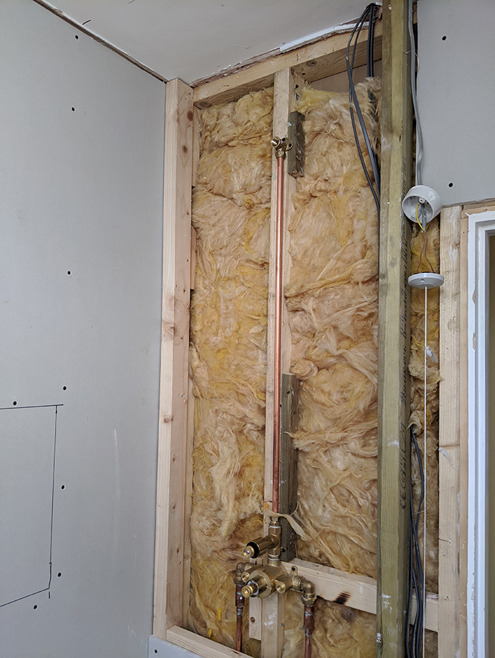
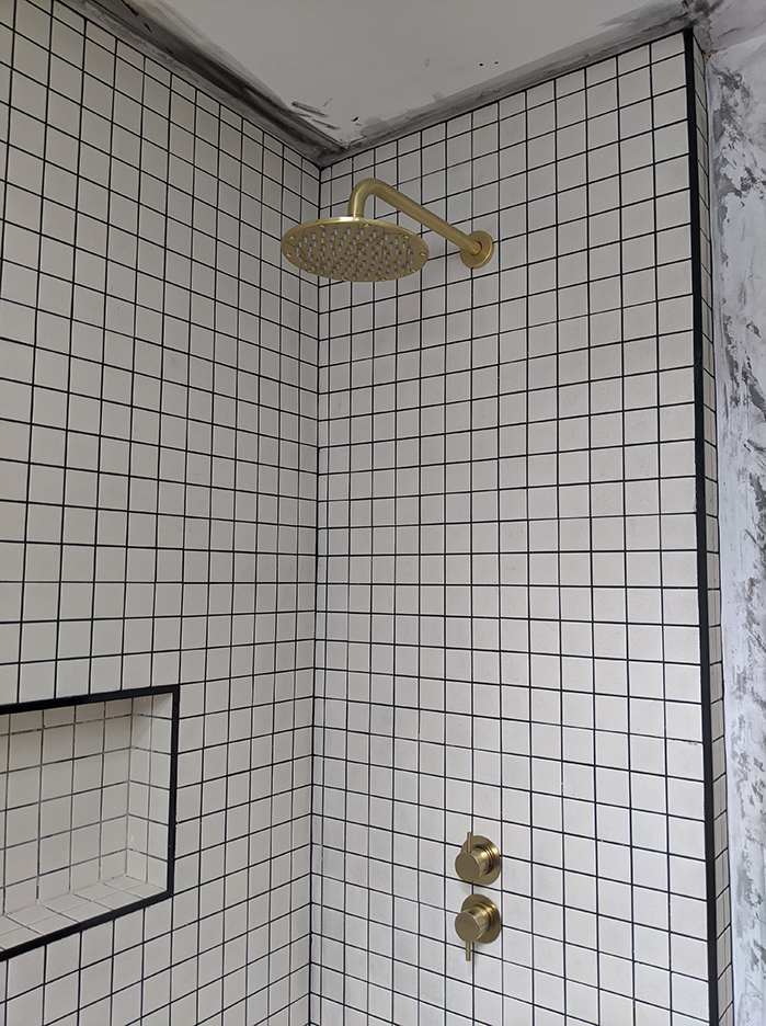
I then decided to place the hand held shower the couple wanted at the opposite end of the bath to the fixed shower head, so that it’s not behind the shower screen and it could be used more easily. The couple were expecting their first child when I started working with them, so I was designing with young children and family life in mind when making design decisions. Small children need an easily accessible bath so that their parents can hold onto them when bathing them, so we discussed how having a shower screen would impact this. I suggested choosing a folding shower screen but the couple weren’t keen on the way they looked (nor am I, and I’m yet to find a folding one that looks good - if you know of one please let me know) so this was another factor in my decision to move the screen to the opposite end of the bath. The controls for the taps could then be placed with the hand held shower and the couple wouldn’t have to move the screen out of the way to fill the bath. I had already decided to build a low false wall to hide the cistern for the loo and the rest of the pipework, as having a concealed cistern would make the room feel less cluttered and would make it easier to clean. I didn’t want the hose part of the hand held shower to dangle down into the bath as that would be annoying when you’re trying to have a relaxing soak, so using a hose which could retract inside the false wall made perfect sense to me. |
||||||
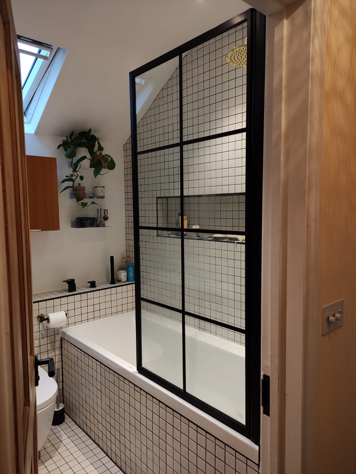
This led me onto the tap placement, and another problem to solve. The bath is designed to be stood in at one end so you can shower in it, so one end of the bath is straight so you can stand close to the edge and get right under the shower. The other end of the bath is sloped so that you can lie back comfortably while bathing. Let me show you what I mean: |
||||||
 |
||||||
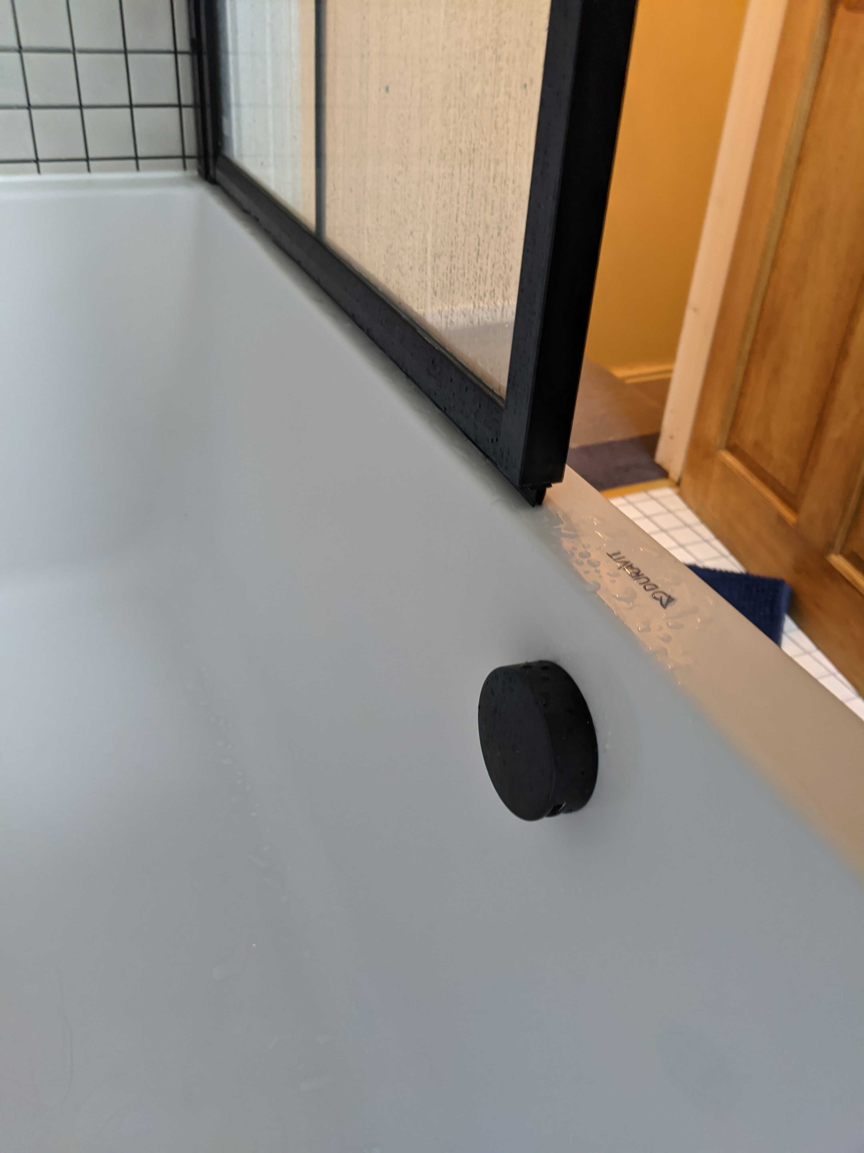
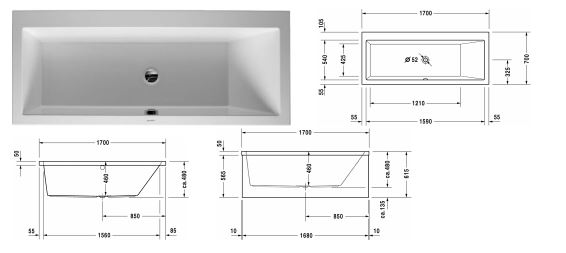
| I couldn’t place the taps at the sloped end because you could easily hit your head on them when lying down in the bath - not very relaxing! If I put them at the straight end where the shower is, they would be behind the shower screen again and not easy to reach when you want to fill the bath. My solution was to go for a bath filler and overflow in one, and place the controls for it in the false wall. So all I needed to do now was to find a bath with a central overflow (not at either end), with no pre-drilled tap holes, strong enough to hold a person standing at the shower end, and with one straight end for the shower. Oh, and it had to look good too! No problem! A designer look bath with a slim rim all the way around was what the clients wanted. I did a lot of searching and finally found the one above from Duravit. | ||||||
|
the new bath installed with the black overflow and filler in one |
||||||
|
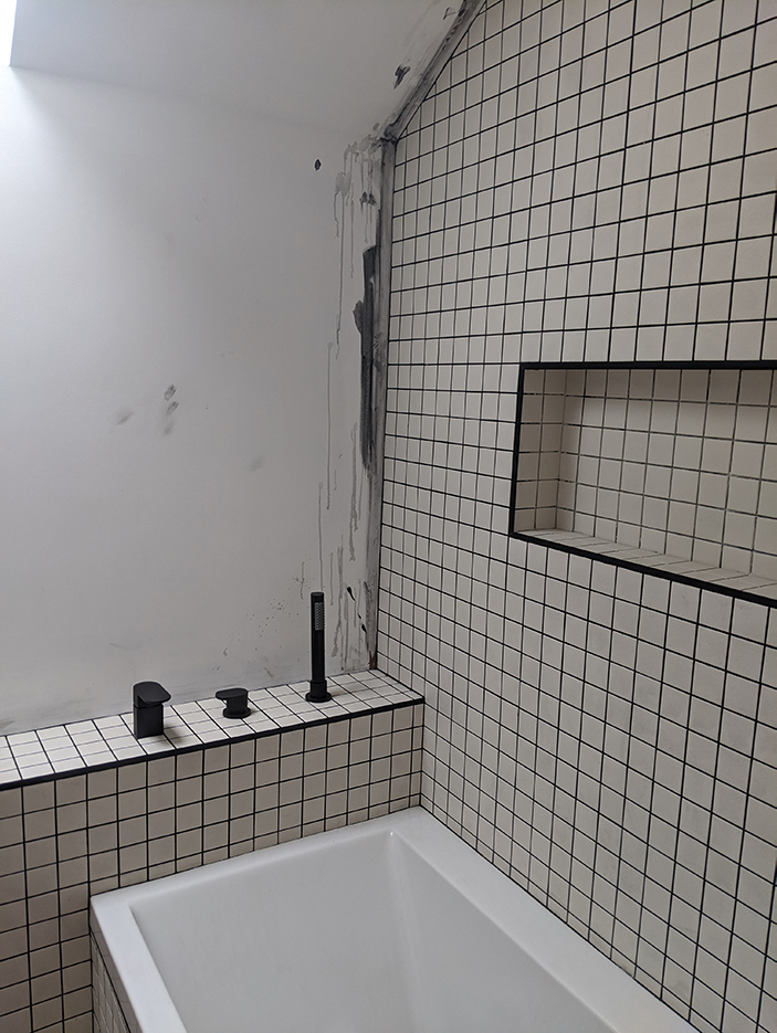
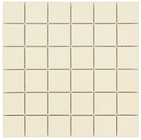
With all the technical issues dealt with, I could think about the style decisions which needed to be made. I found some gorgeous teal green tiles with a beautiful shiny glaze and a deliberately uneven colour and texture, which I loved. They were perfect for around the sink, and would add the splash of colour that the clients were looking for. I was then looking for some white tiles for the rest of the room, and decided to use the same white tile on the floor and walls to avoid making the small space look too busy. The floor tiles needed to be non slip, especially with a little one on the way. I found the stunning but affordable tiles from Topps Tiles, which would look so good when paired with black grout. I loved the graphic, grid like and slightly 1980s feel to them. |
||||||
 |
||||||
|
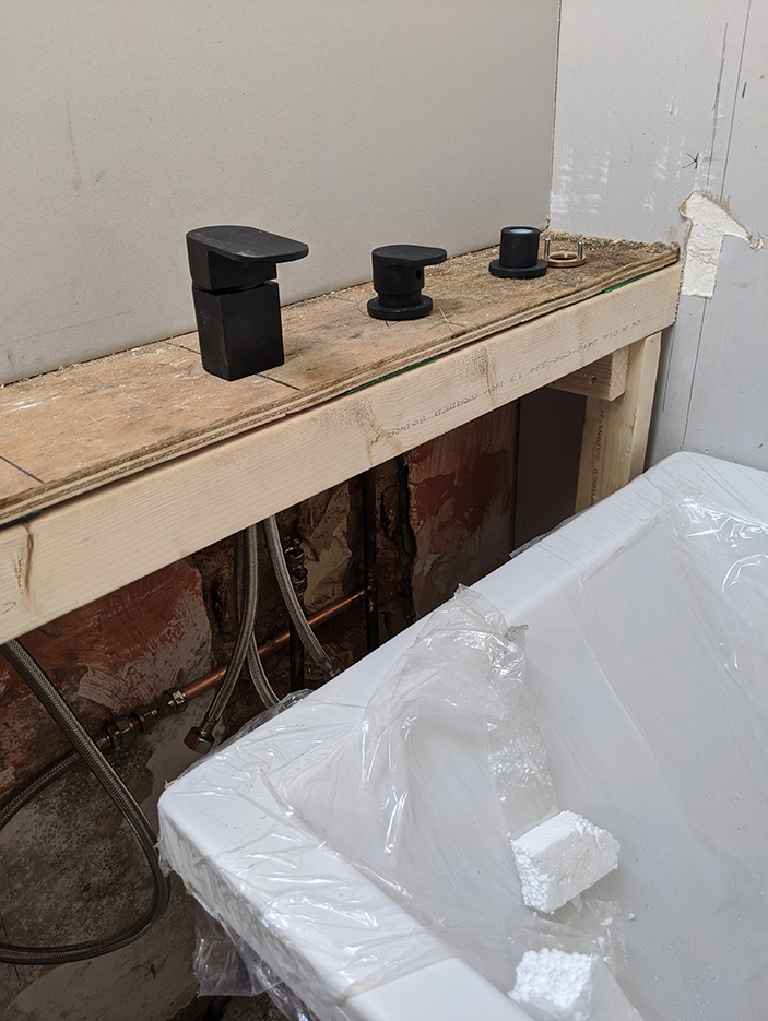
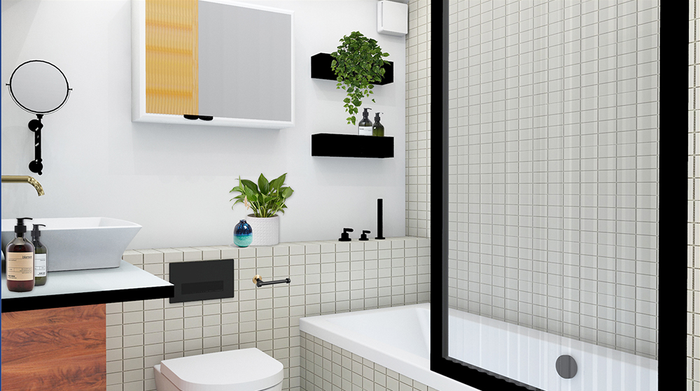
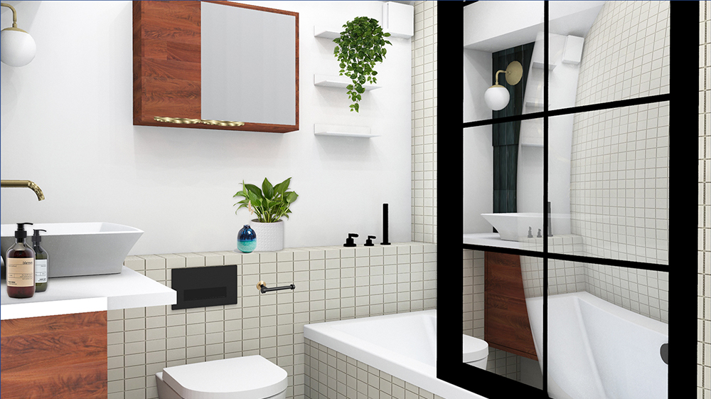
I mixed brass and black taps and fittings, as I didn’t want all the fittings to be black. Black fittings have been on trend for a while now, and the look has been quite overdone. I didn’t want this scheme to date quickly, so mixing in some brass kept the look fresh. I also chose a shower screen with a black border and fluted glass, to work with the other black items in the room and to be on trend but not too trendy. Whilst we’d been looking at inspirational images, I’d shown the clients a black ‘Crittall’ style shower screen, which they’d decided they loved and would prefer. I explained that these screens were definitely on the more trendy side of cool, and as they were very popular now, they would soon start to feel dated. But the clients loved it, so that’s what I sourced for them. |
||||||
|
My visual for the bathroom showing the fluted glass screen |
||||||
|
My visual for the bathroom showing the Crittall style screen |
||||||
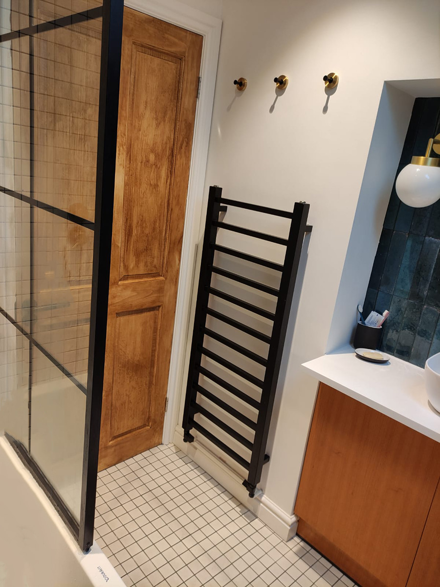
| The screen was quite pricey, and pushed the budget up quite a bit, but having looked at cheaper alternatives and found that the black lines were made with stickers, we opted for the expensive one which is made from metal. You really do get what you pay for! This had a knock on effect on the budget and meant that we swapped the expensive angled designer radiator (which you can see in my visual at the top of the blog) for a cheaper, straight lined one. But I think the replacement looks pretty good, and if it meant keeping the costs down without compromising on quality, it was worth it. | ||||||
|
here's the new radiator installed |
||||||
|
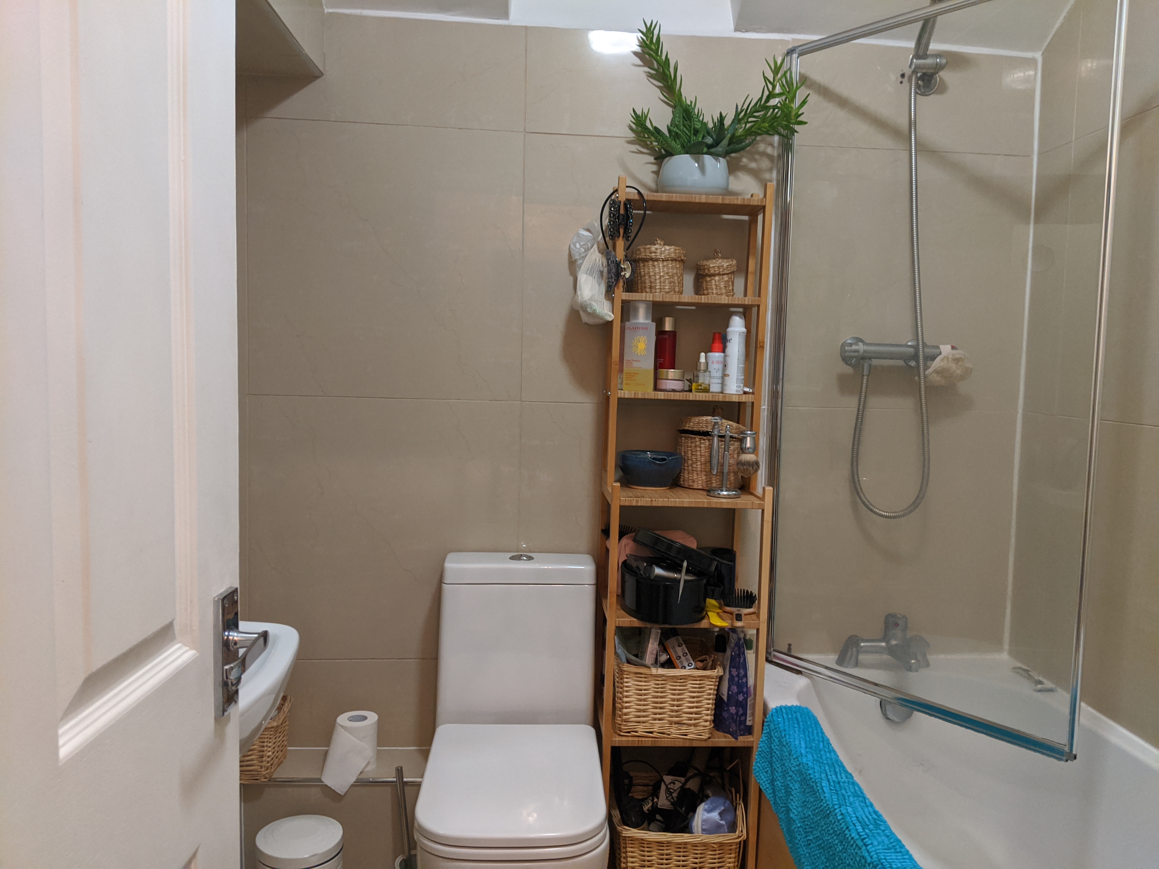
With most design decisions made, I moved onto the lighting. I chose globe style statement lights for either side of the large mirror above the sink, making sure that they were safe for use above a sink. They are beautiful to look at, and provide the practical light that you need to shine on your face when using a mirror, and also give the sink area a touch of luxury. I chose warm white bulbs for them so that the space didn’t feel too clinical, and put the wall lights on a separate switch so they could be operated independently. We also settled on adjustable downlights in the ceiling, so the light could be directed where it was needed. Here are some more pics of the finished room that the clients sent me this week: |
||||||
|
||||||
|
The best part of all this work is seeing my design come to life and the bathroom being used. When the clients tell me that there are many things in the design that they just wouldn't have thought of themselves, and that they find little unexpected parts of the design useful it warms my heart. Since the bathroom was finished, the lovely clients have now had their baby and the bathroom is being well used. They tell me that the pull out shower nozzle next to the bath can be used to hose down most parts of the room and it has become invaluable for cleaning up the mess that babies can make! |
Welcome to the design blog, where you'll see posts about anything from the projects we are working on, to the latest fabric and wallpaper collections, and all things interiors related. We love colour, pattern, architecture and old buildings, and we love to share our finds with you.
Happy reading!