A weekend Ikea cupboard makeover
 |
||
|
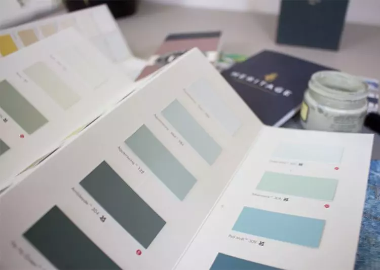
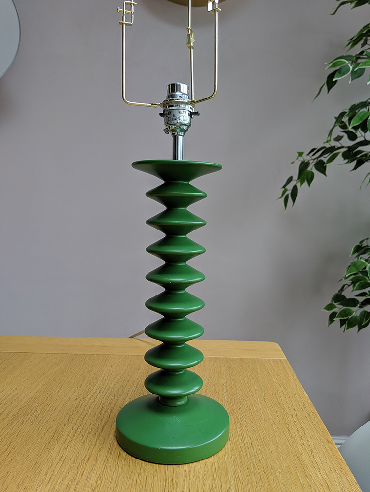
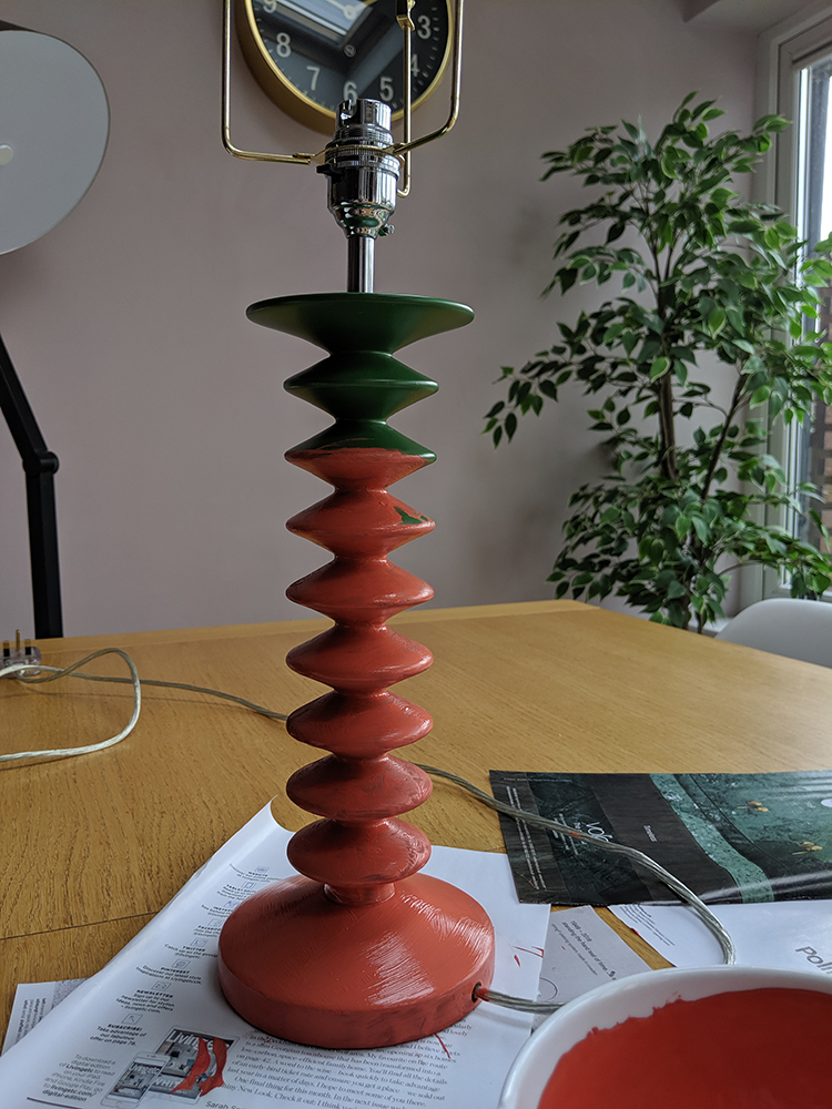
If you’ve been reading my blog posts, you probably know that I’m a fan of Annie Sloan chalk paint, and I love using it to update and refresh tired bits of furniture. I recently painted and wallpapered an old Ikea cupboard in my hallway (which you can read about here) which I was really pleased with. Once I’d done that, I decided that the green lamp base I had on the cupboard wasn’t sitting quite right with the darker green walls of my hallway and the rich teal of the newly painted cupboard. |
||
 |
||
|
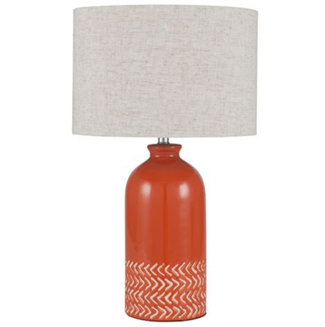
I knew I wanted to add some more colour to the scheme, and found this fab lamp from Pacific Lifestyle: |
||
 |
||
|
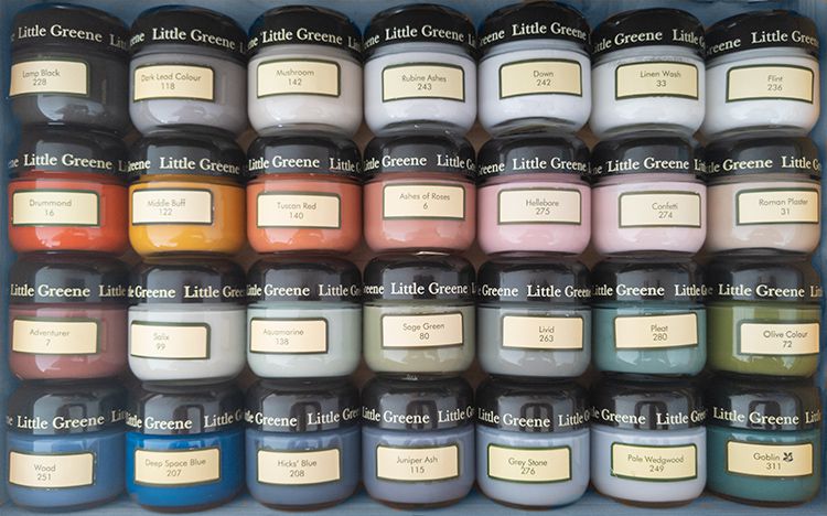
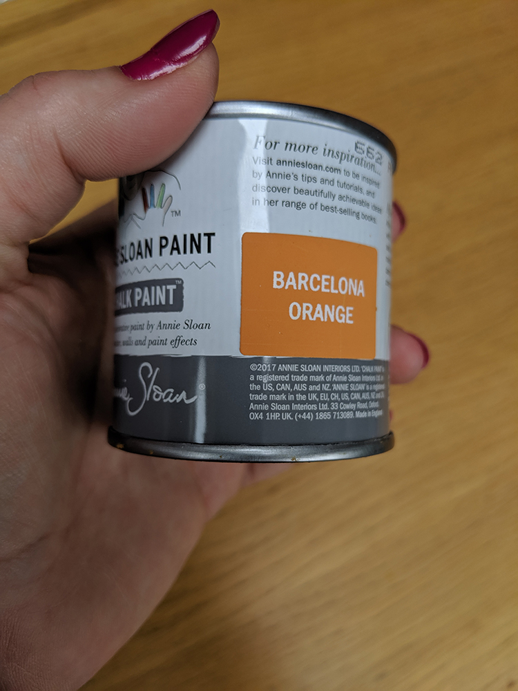
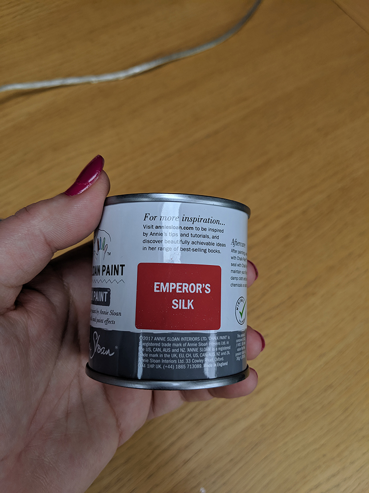
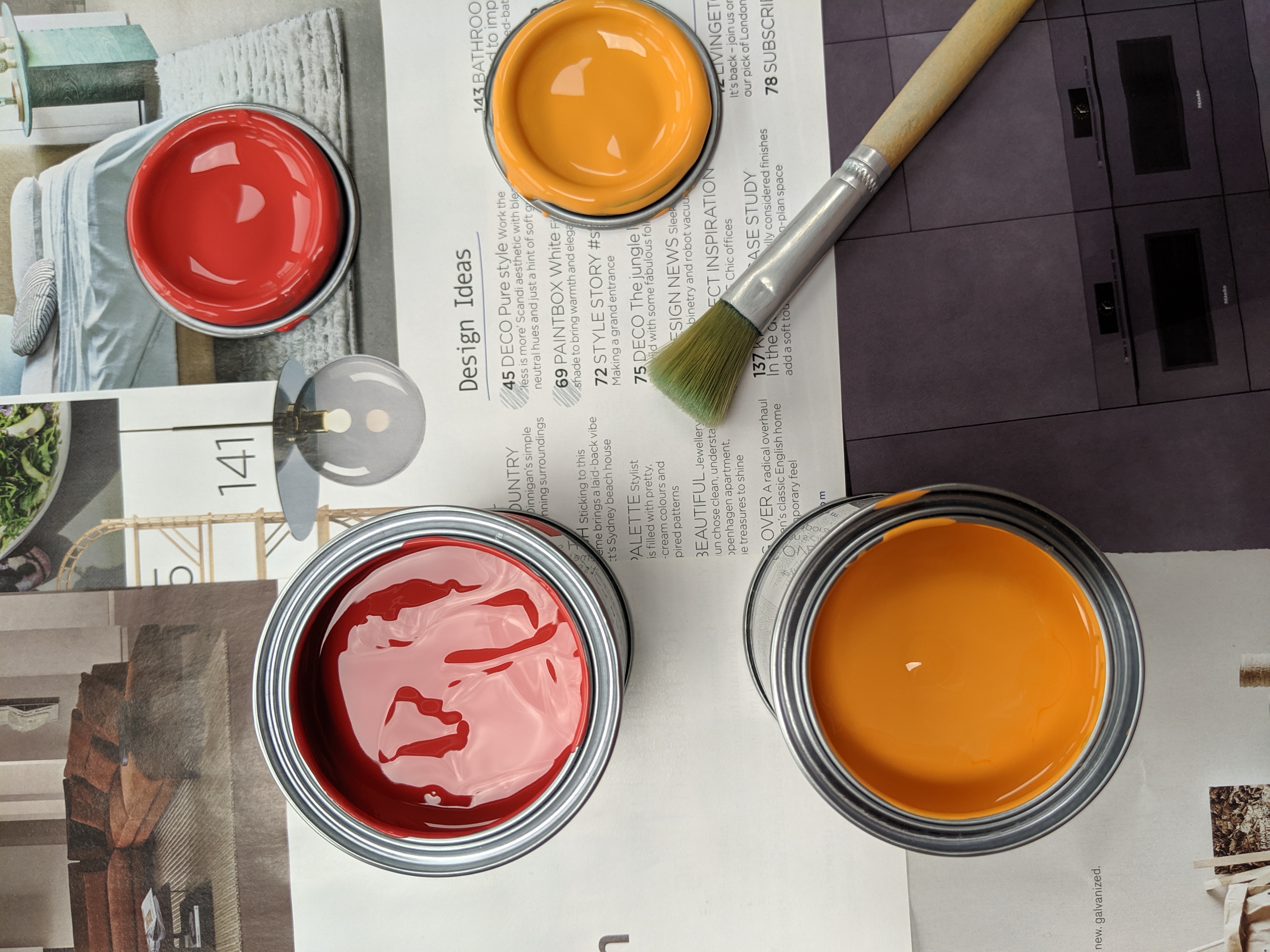
I loved the colour and thought it would be a perfect contrast to the darker green and teal colours around it, but in the interests of not replacing things for the sake of it, I decided not to buy a new lamp and to paint my green lamp base in a similar colour instead. I don’t know if you’re familiar with Annie Sloan’s chalk paint, but it comes in a wonderful set of colours. I love them all, but the perfect colour for my lamp wasn’t there, so decided to mix the paint colour myself (this is something Annie suggests doing herself to get the right shade). I bought two tester pots, one Barcelona Orange and one in Emporer’s Silk. |
||
|
||
|
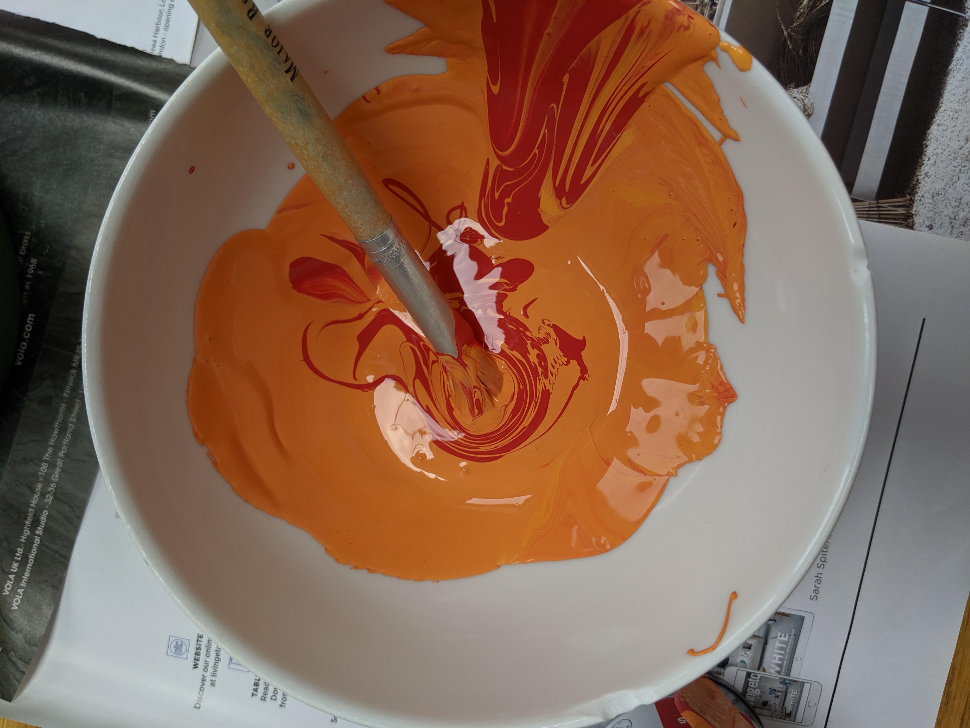
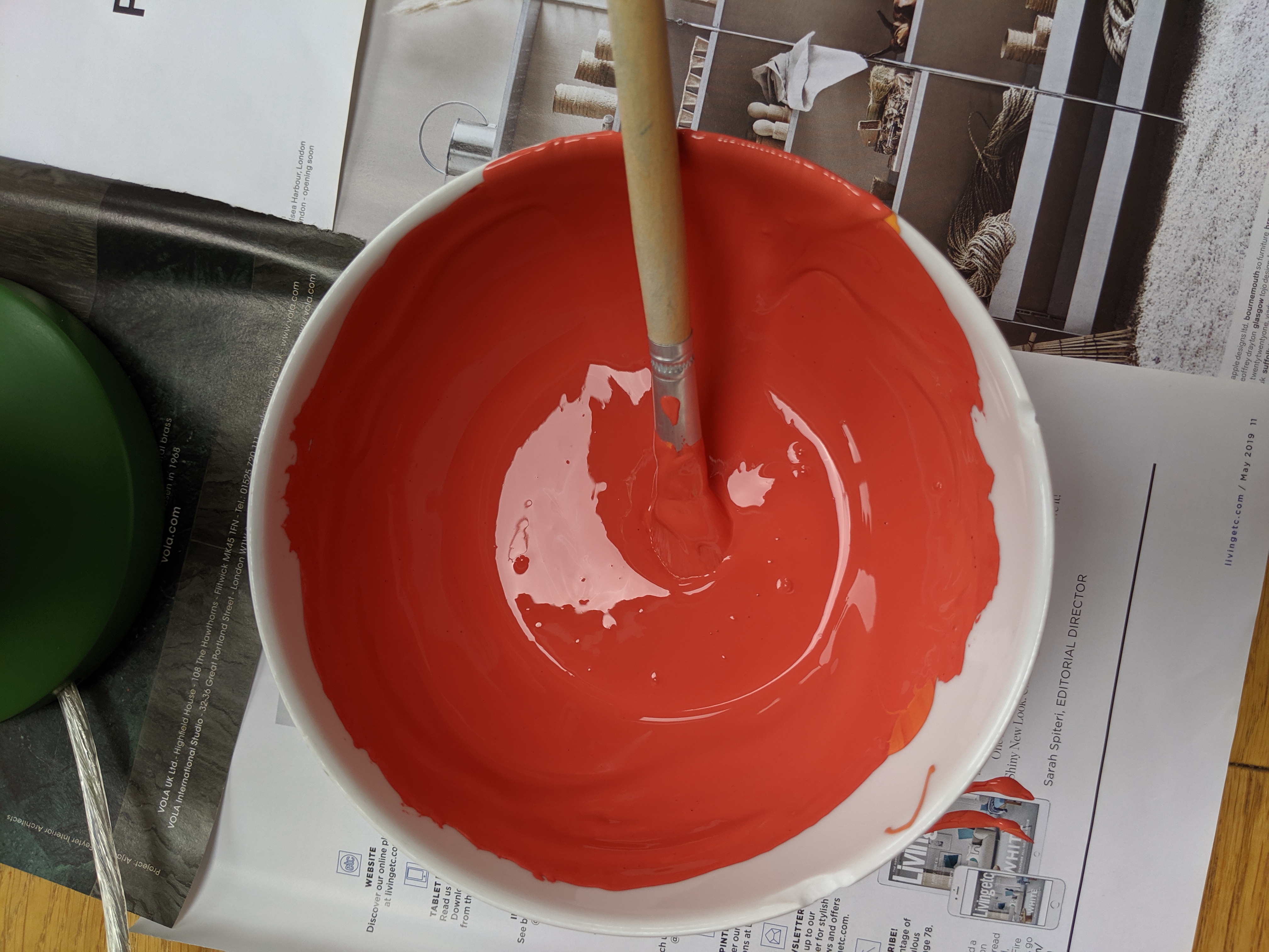
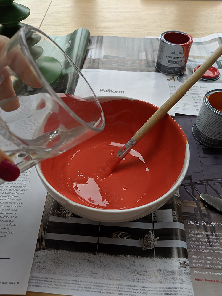
Mixing the colours was as easy as putting them into a bowl and adding little bits of each until I was happy with the colour. |
||
 |
||
Now the colour was right, I was ready to start painting. I wanted the lamp to have a smooth contemporary finish, so as Annie Sloan advises, I added a small amount of water to the paint and to achieve a flat, non-textured look. |
||
 |
||
|
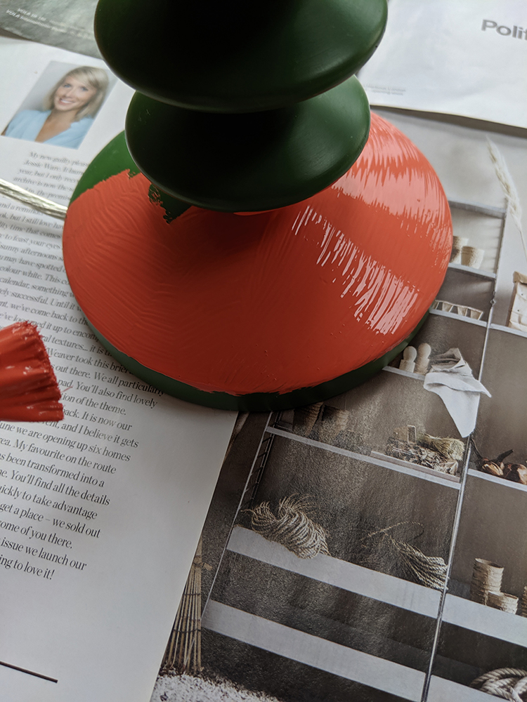
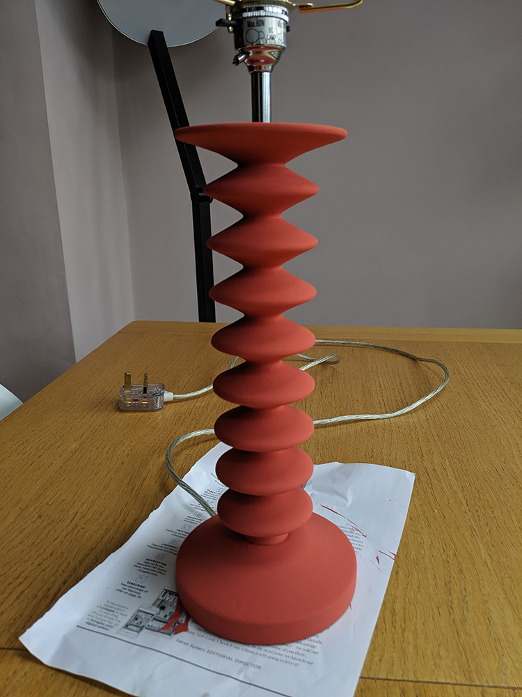
I worked all the way around the lamp, turning it as I went so that there were no drips. I used two coats of paint to cover the green of the lamp base, and then left it to dry. |
||
 |
||
 |
||
 |
||
|
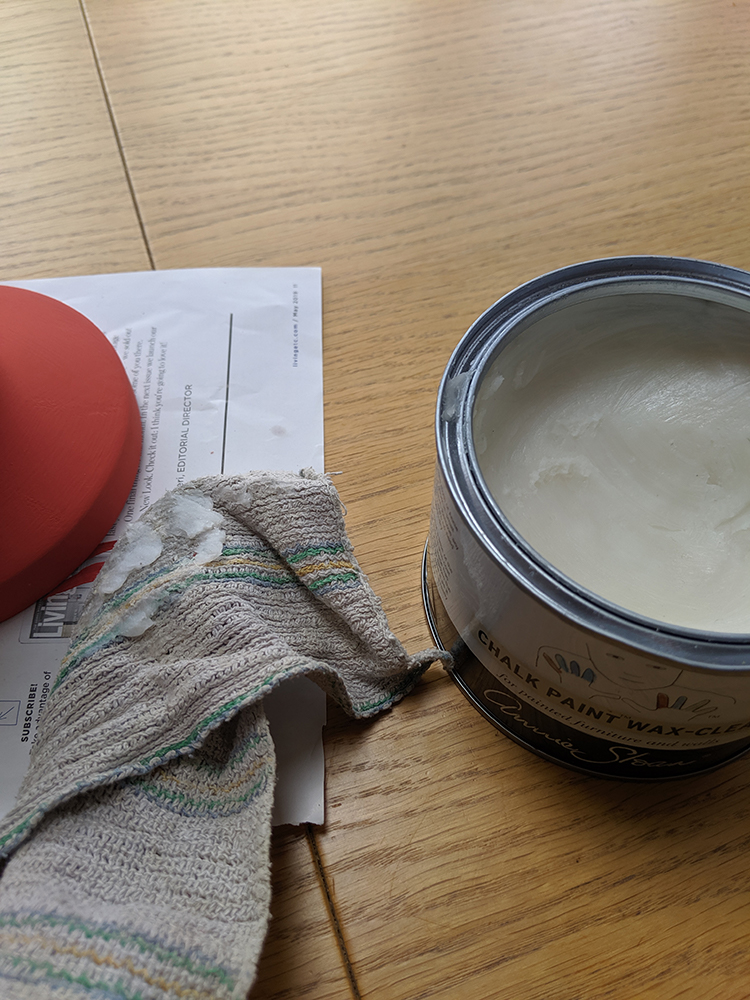
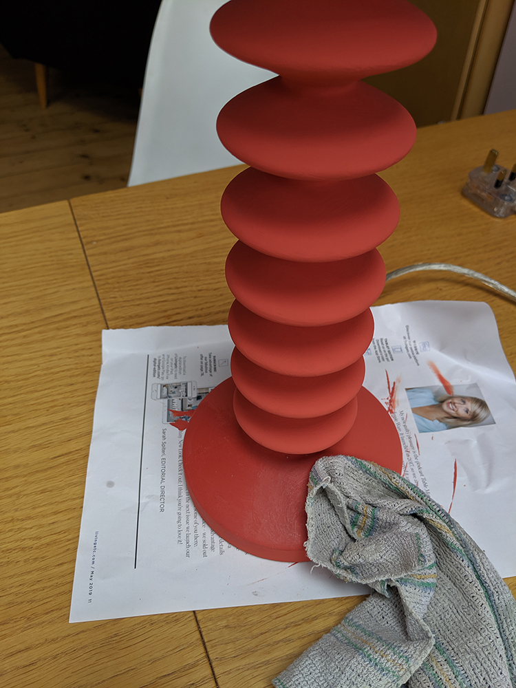
Once the paint was dry, I used the Annie Sloan wax to finish and protect the chalk paint. |
||
 |
||
 |
||
|
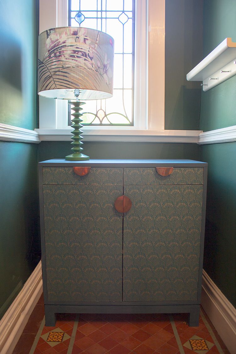
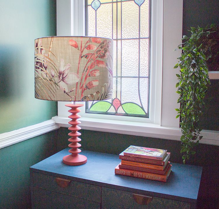
I then put the lamp back together and added the shade. It really was that simple. Here’s the finished lamp back on the cupboard. |
||
 |
||
|
I really love this pop of colour against the dark walls and cupboard. It picks out the colour of the terracotta tiles on the floor, and the rust colour on the cupboard handles. The reason this colour works so well is that red-orange is opposite blue-green on the colour spectrum, so the shades really contrast and set each other off. The colour reminds me of Living Coral, Pantone’s colour of the year for 2019. That colour works so well with turquoise for the same reason. I think this shade has lifted my whole hallway scheme, and I like it so much it’s inspired me to add more of it into my hallway - watch this space to see where it turns up next! |
Welcome to the design blog, where you'll see posts about anything from the projects we are working on, to the latest fabric and wallpaper collections, and all things interiors related. We love colour, pattern, architecture and old buildings, and we love to share our finds with you.
Happy reading!