Work in Progress - The Loft office
|
This project is still ongoing, but I wanted to show you how it’s coming along so that you can see the changes we’ve made already and learn a little about my design process along the way. |
|||
 |
|||
|
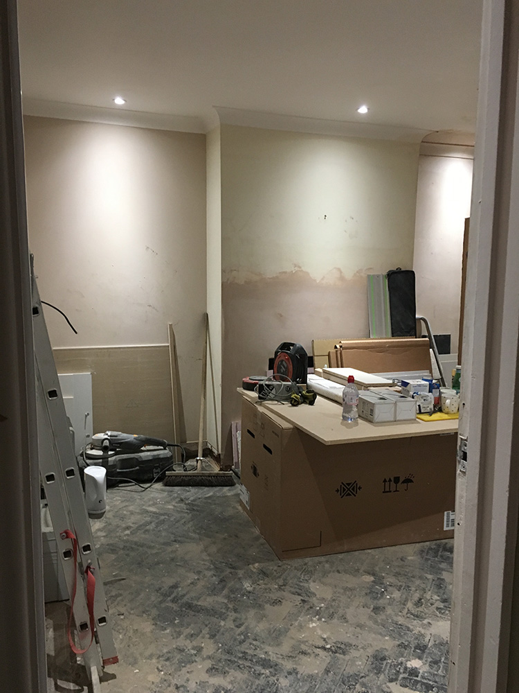
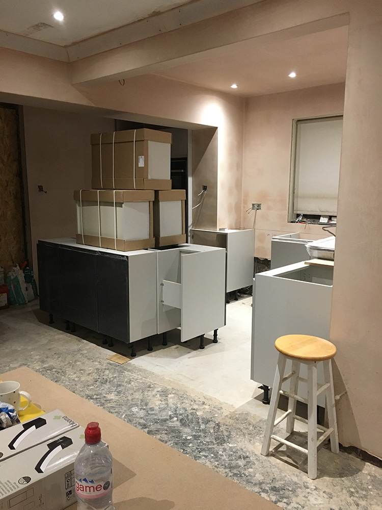
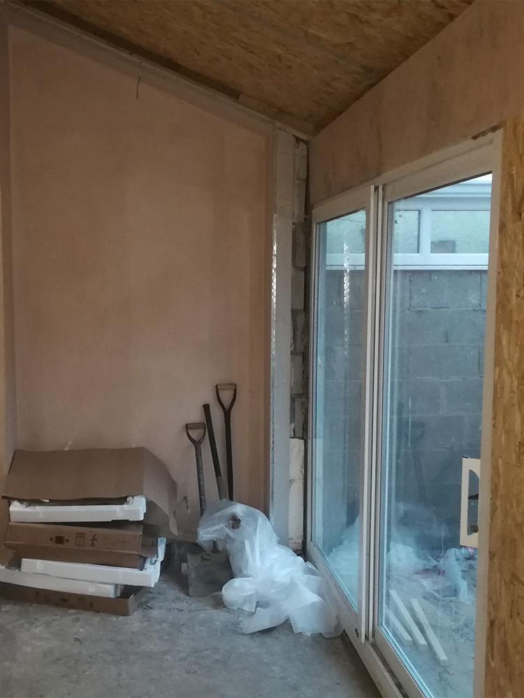
The clients contacted me at the end of December when they were nearing the end of their building work. They had knocked down some walls and taken out part of the ceiling at the back of their house to make a light open plan kitchen/dining/living space. The bi-fold doors and glass roof lights were on order, and the kitchen was partly installed. Here are a few pics of what it looked like when I first when to see the space: |
|||
The poor clients had lived through Christmas this way (with no heating in this part of the house). They’d even had to eat Christmas lunch in their bedroom with their meals on trays! |
|||
|
They had some ideas for the flooring, and called me in to help with choosing colours, furniture, lighting and accessories. Their brief was that they wanted something ‘fun, funky, light and fresh’ but definitely NO wallpaper or pink (given that I have two pink projects on my website I can see why they might say that). |
|||
|
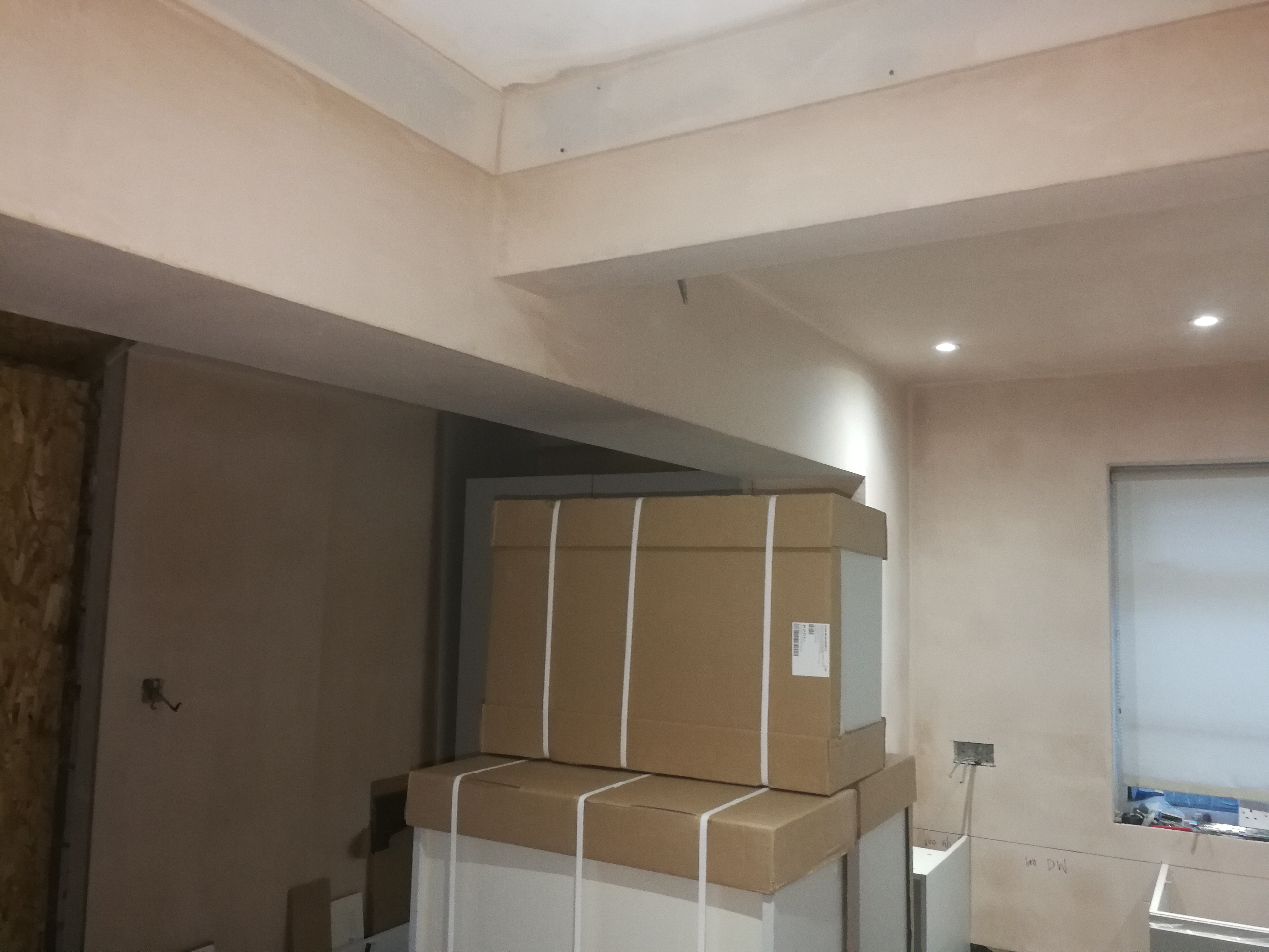
We talked through the practicalities - they have a dog in the family who visits often, they wanted the lighting to be flexible, they needed dining seating for 6 and some more storage. We discussed budget too - what it was likely to cost and what they were comfortable spending. They also had an unexpected support beam in the ceiling which posed problems for putting lighting over their soon to be installed island. Here’s the awkward beam we had to fit the lighting around: |
|||
 |
|||
|
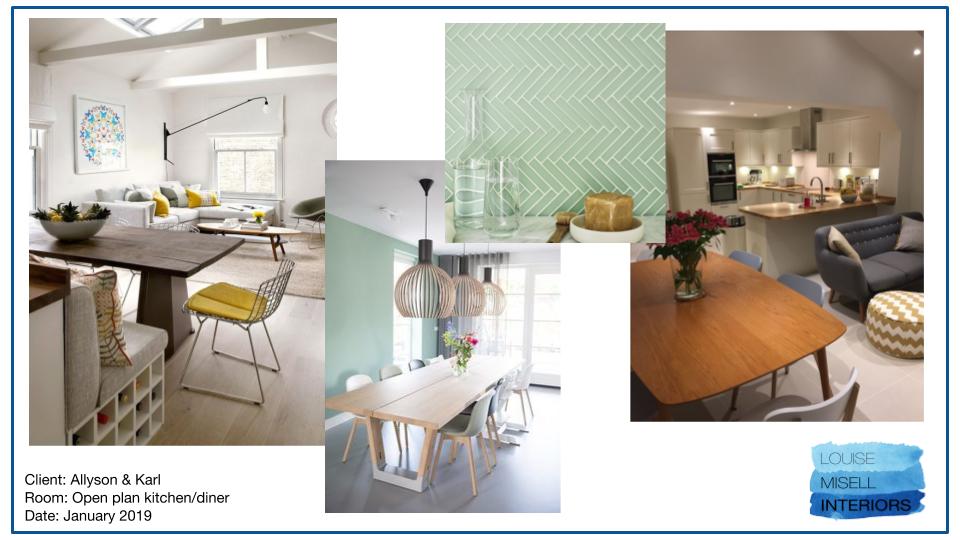
Next, we looked through a digital ‘moodboard’ I’d made for them, showing different looks they could have in the space, and discussed which images they liked and why. The clients liked a ‘mid-century’ or 50s and 60s inspired style, but with more colour. They also really liked some pictures of a small scale herringbone glass tile I showed them, so they were considering using these as tiles for the splashback. Here are some of the pictures they particularly liked: |
|||
 |
|||
|
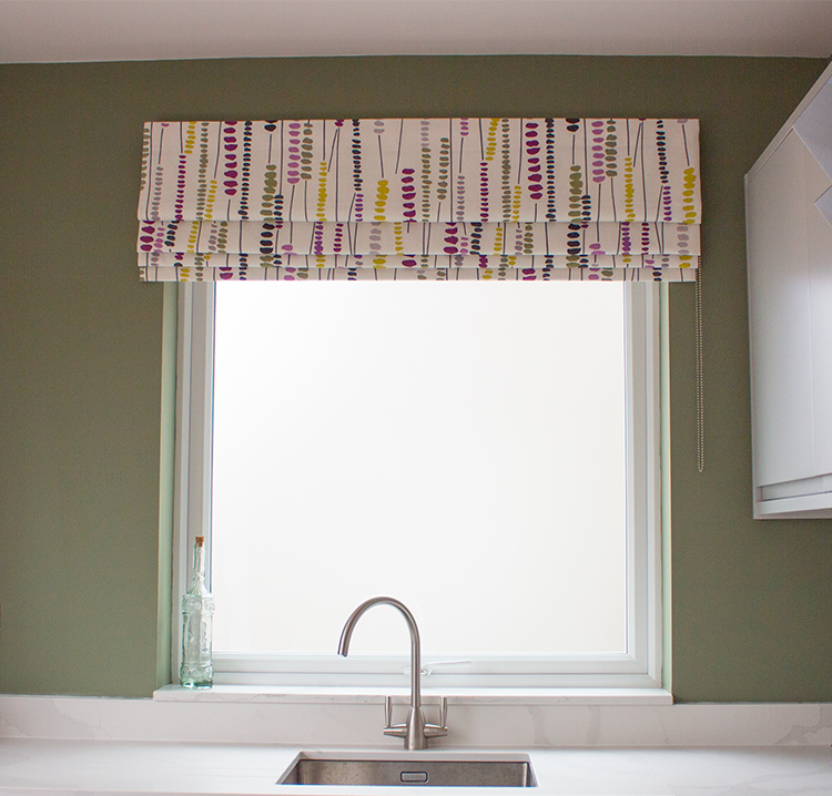
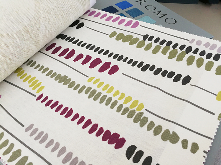
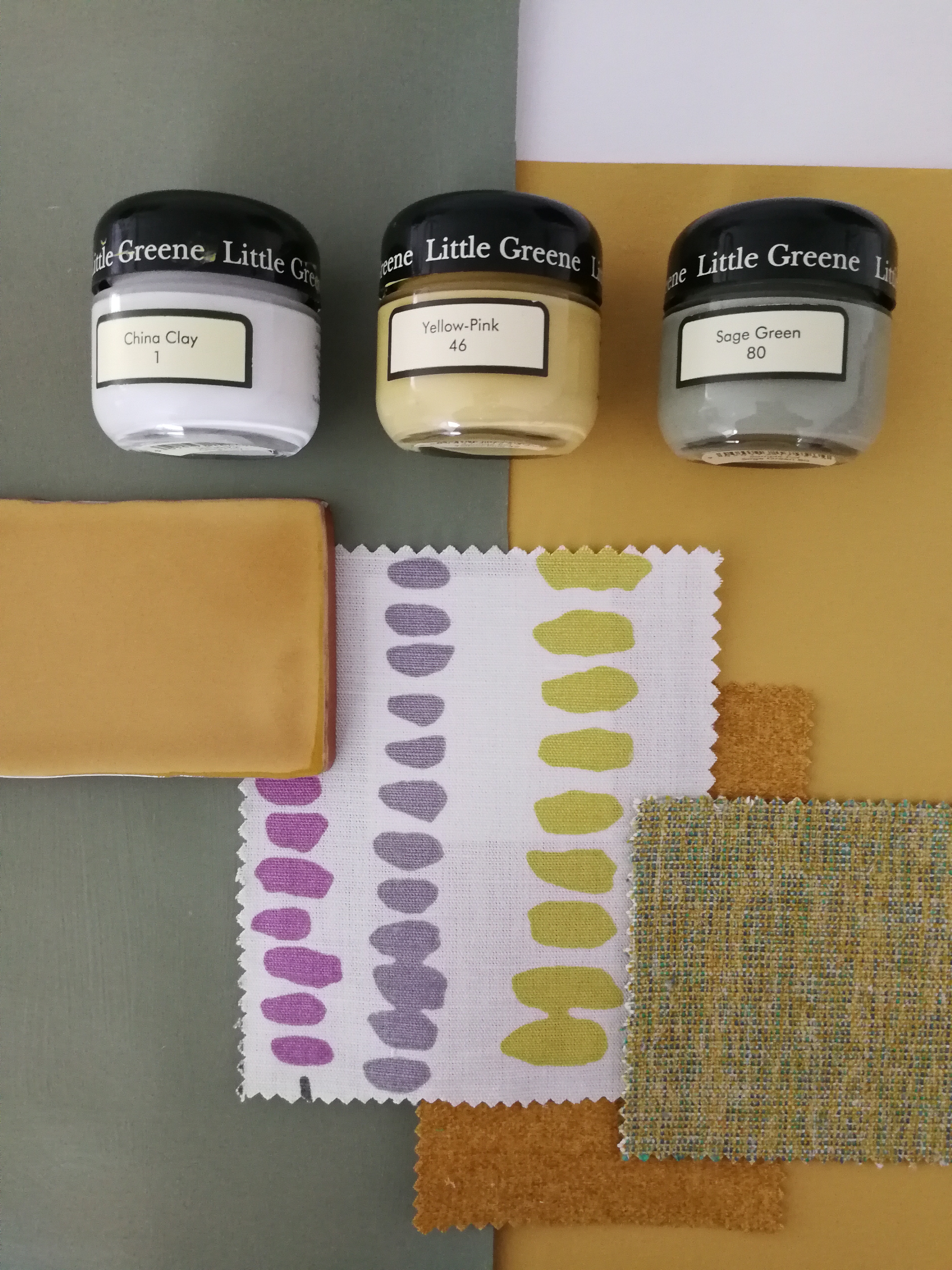
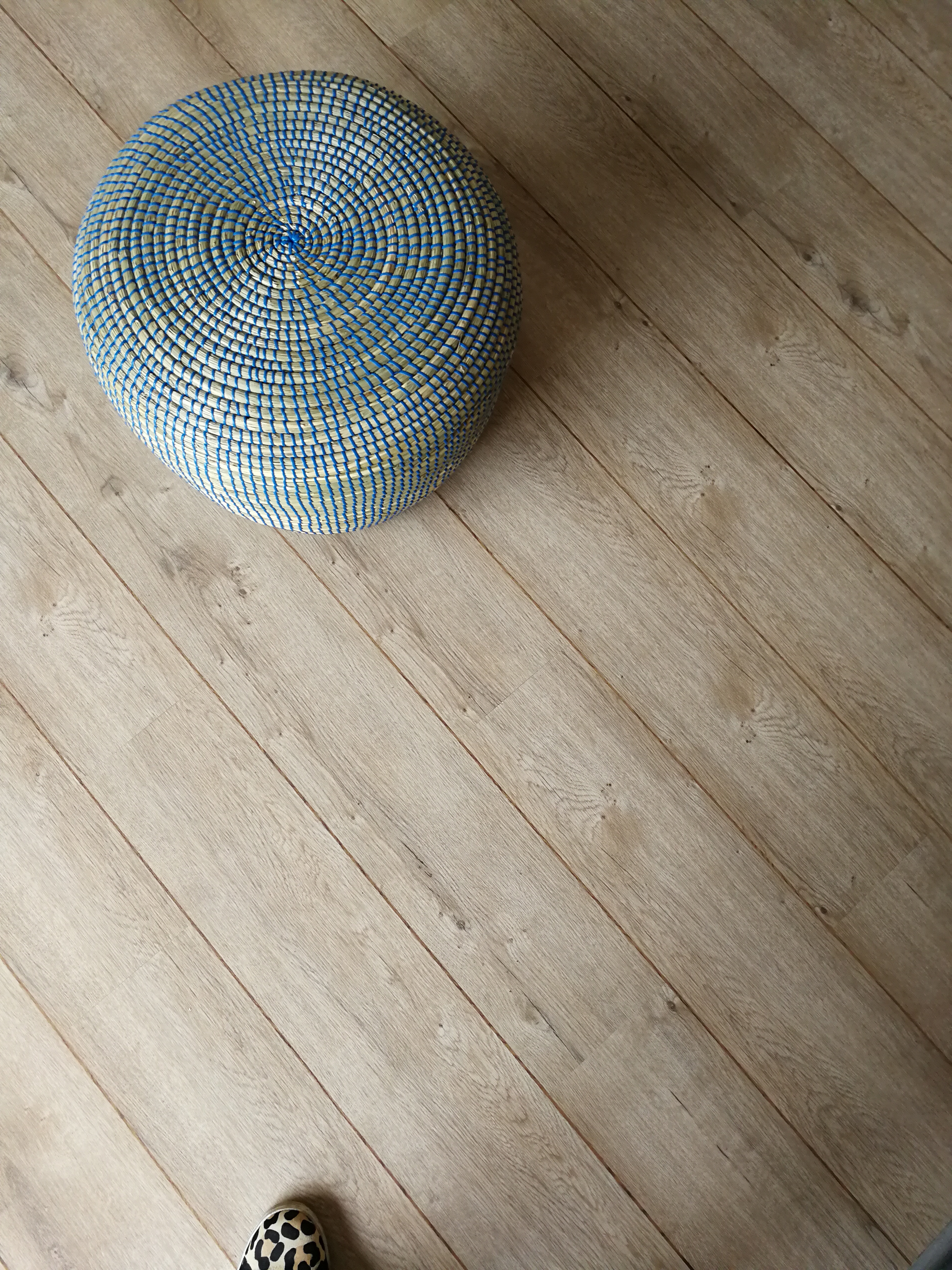
We then looked at colours and some of the fabric books I’d brought along. They liked green in particular and we found a lovely sage green which they both liked immediately. They didn’t want the whole space to be green and wanted fairly neutral walls, so we agreed that I’d work the colour into the space in smaller amounts, and into the furniture. We also found a fabric (from a supplier called Romo) which they loved and was perfect for the blind they wanted at the kitchen window. They loved it so much they didn’t want me to look for any other fabrics and we decided to build the scheme around it. What I liked so much about the fabric was that it has lots of colours in it, meaning it would add depth to the scheme, and the style was fresh and fun, just as the clients had asked for. Here’s the fabric: |
|||
 |
|||
|
Starting with the fabric and the sage green which they loved, the next stage in my design process was to pull together a colour scheme. Here are the colours I chose when I went away to finish designing the scheme for them. |
|||
 |
|||
|
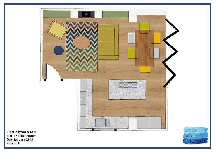
I then chose all the furniture and accessories, making a scale floorplan as I worked to make sure that all the items would fit and that there was enough room to move around the space and use it comfortably. Here’s the finished floorplan: |
|||
 |
|||
|
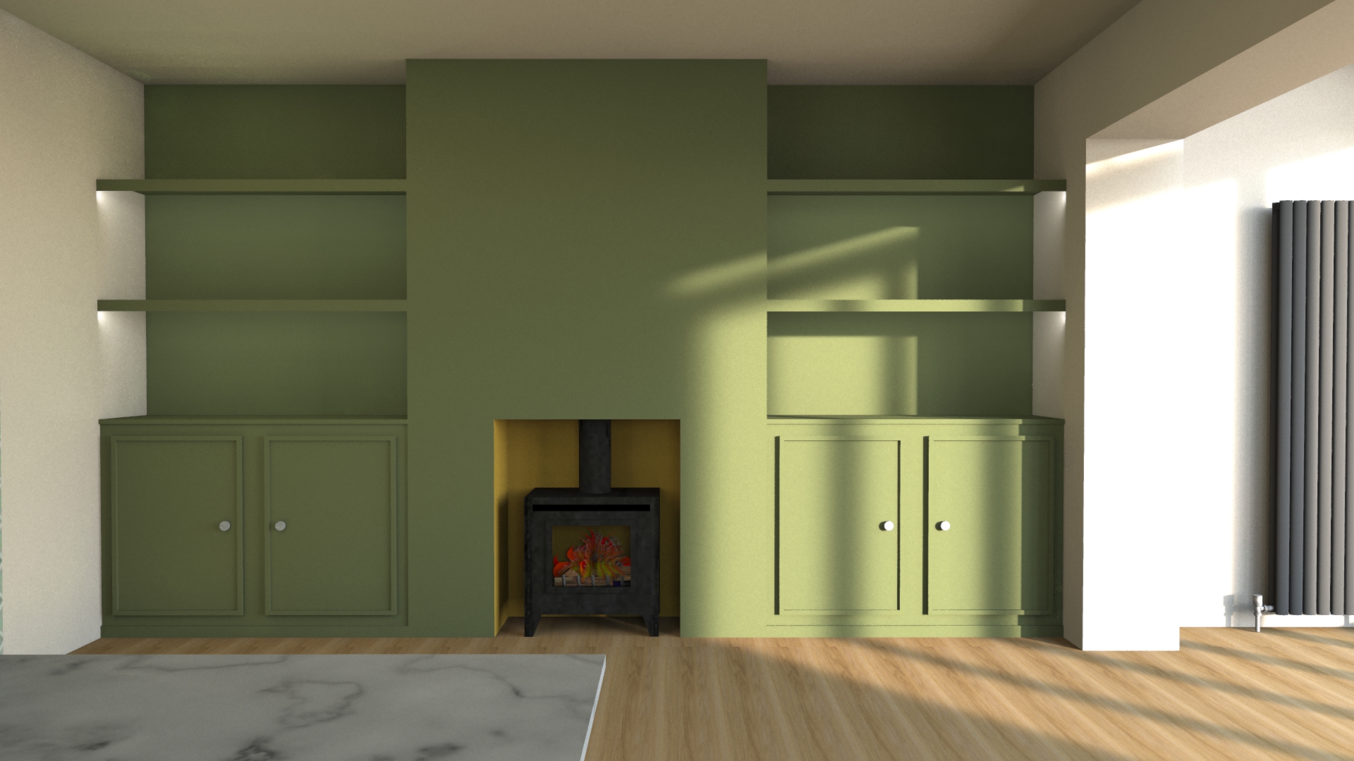
I also made a model of the room in the software I use called Sketch Up so that I could see how the heights and proportions of everything worked together. I used this model to design the built in storage in the alcoves - cupboards up to fireplace height and floating shelves above, with LED lighting along the edges of the shelving to give a soft glow. |
|||
 |
|||
|
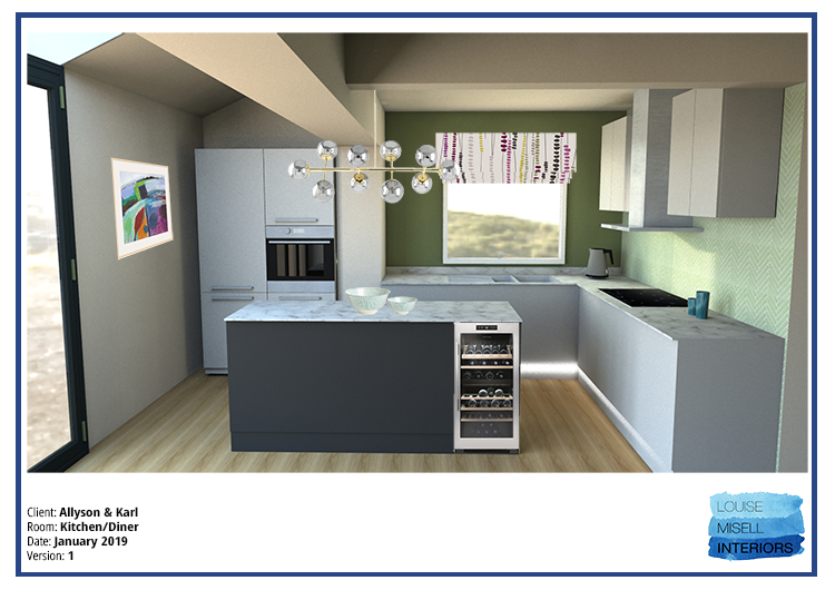
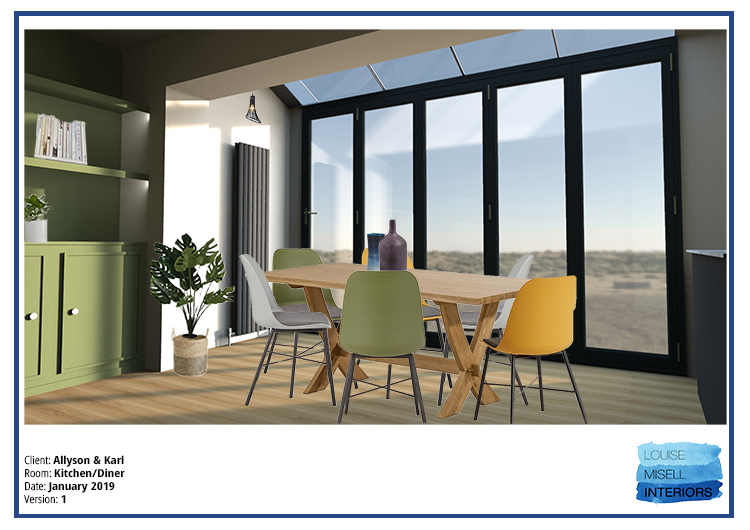
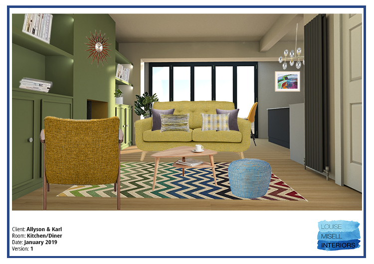
Once I’d sourced everything, I put everything together to present the scheme to the client. This included the scale floorplan, a sample board with the paints, fabrics and tiles I’d chosen, and the visualisations I’d made so that they could see what the room would look like. I also gave them a list of all items and costings - in my experience, no matter how much a client loves a scheme, they will always want to know how much it’s going to cost them before they can give me a definite yes or no (which makes perfect sense to me) so I include as much information as I can at this stage. I also work out things like how much paint and fabric or flooring they will need, so that the clients have a better idea of the overall cost of the project. Here are some of the visualisations I gave to them: |
|||
 |
|||
 |
|||
 |
|||
|
The clients absolutely loved the design and didn’t want to make any changes apart from losing the small pendant light under the glass ceiling because they felt they had enough lighting in this area. We went to work straight away and started ordering everything, the flooring was laid, and things started arriving - this is the exciting bit! |
|||
 |
|||
|
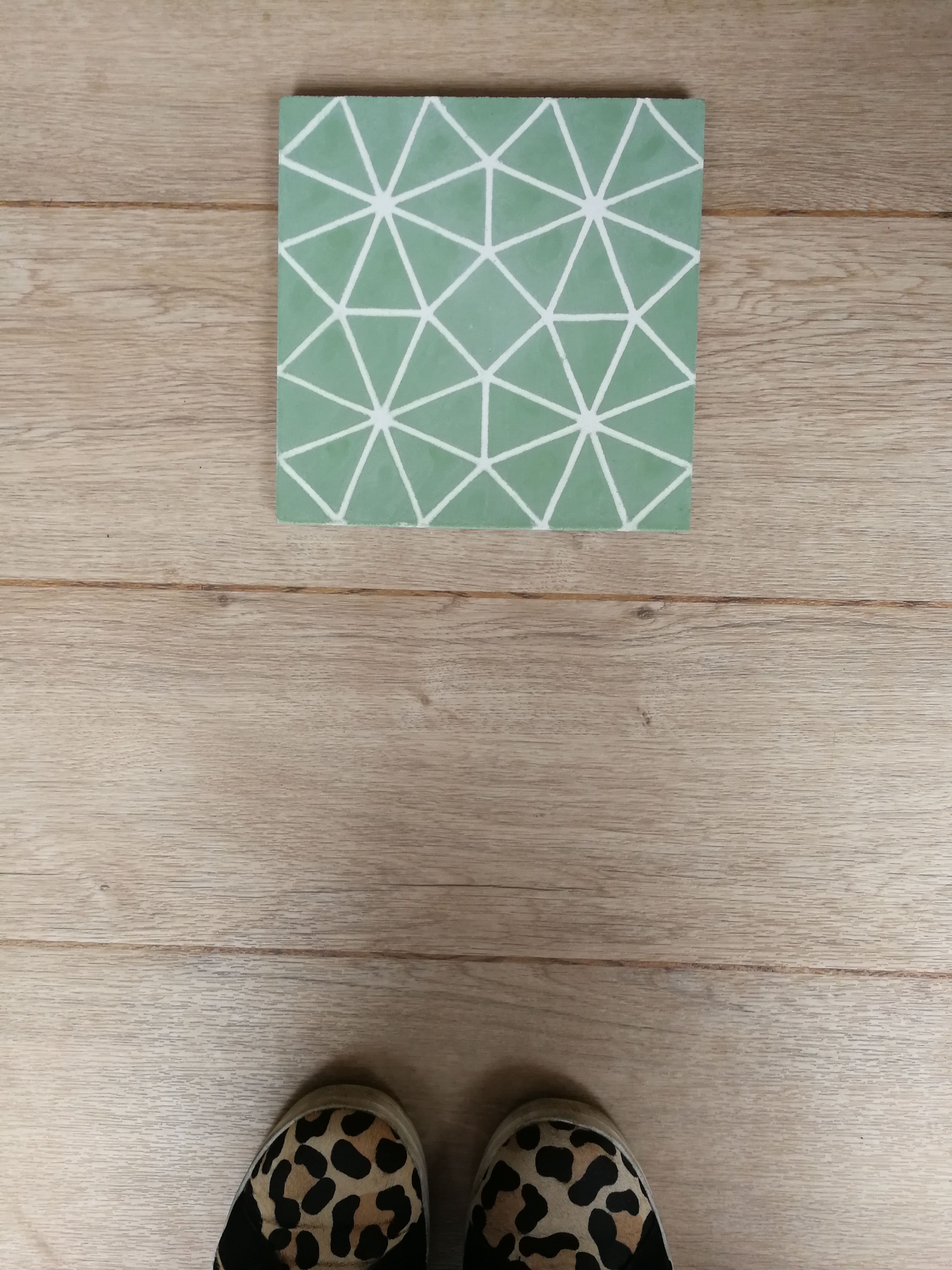
After a visit from my curtain fitter, I arranged for my curtain maker to make the Roman blind in the funky fabric we loved. I then brought in my tiler, who worked out that the tiles we’d fallen in love with were going to be expensive to fit as there would be so much cutting involved, and as the tiles themselves weren’t cheap, we decided to look for some alternatives. I found a few for my clients to choose from, but we all loved these gorgeous ones from Bert & May: |
|||
 |
|||
|
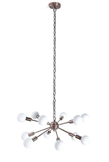
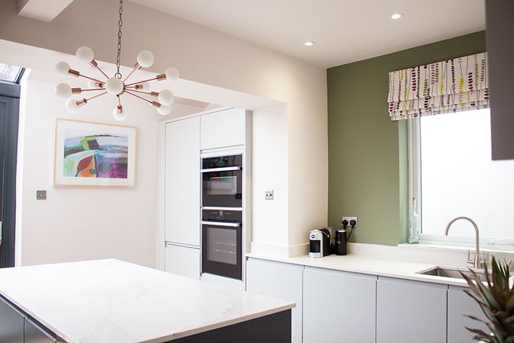
The only slight hiccup was when the light I’d chosen for over the island arrived, it couldn’t be shortened to fit the space as we’d hoped - we’d spoken to the supplier about the possibility of shortening it and decided to order it and see if it could be done neatly, but sadly not. So I got my thinking cap on and chose one from Marks and Spencer which was suspended on a chain and could easily be shortened. The clients had said that they wanted some copper in the scheme, so this antique copper finish was perfect. |
|||
 |
|||
|
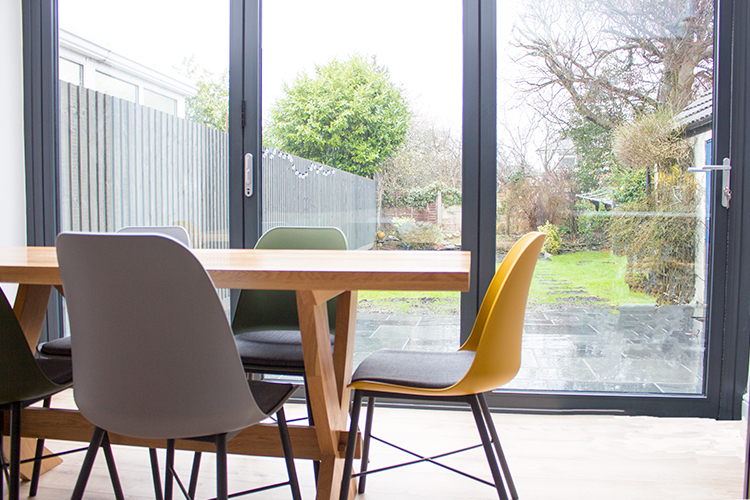
I went back after a few weeks to see progress and take some pictures. We’ve still got a way to go - we’re waiting for the tiles to be delivered and fitted, and the sofa, rug and chairs are on their way, but it’s getting there. The log burner has been installed and now the clients are arranging for their carpenter to build the units either side of the chimney breast, but I think it’s looking pretty good so far. The clients are very happy and said that they brought me in ‘because they wanted to do the room justice’ and said that I’ve more than done that. I’m very pleased with the room as after the clients had to live through all the dust and upheaval for so long, they now have a (nearly finished) space which they can share with their family and friends. |
|||
 |
|||
 |
Welcome to the design blog, where you'll see posts about anything from the projects we are working on, to the latest fabric and wallpaper collections, and all things interiors related. We love colour, pattern, architecture and old buildings, and we love to share our finds with you.
Happy reading!