Final Reveal - My living room
 |
||
|
Whenever I’ve been interviewed, either for TV or a magazine article, I usually get asked where I get my ideas and inspiration from. When I’m working on a specific project I would say that my inspiration mostly comes from conversations I have with my clients, but as a visual creative, I like to keep things fresh by keeping a mental note of interesting and inspiring things whenever I see them. I am always looking at the world around me to see how I can use it to inform my work, and saving ideas to use in a design someday. Of course, there are obvious places to look for inspiration, such as magazines, other designers’ work, film and TV sets, theatre and fashion, and online scrapbooks like Pinterest. I often use Pinterest as a starting point and a way to get my brain focused on a project, but the downside is I find the same ideas are repeated many times across the platform, or are simply out of date. In order for an idea to exist as a photograph on Pinterest, the concept needs to have been created, then executed, and then photographed, so a lot of time can pass between the creation of the idea and it being available for you to pin it on your board. This generally means the ideas are no longer new, and whilst not every good idea has to be ‘new’, using Pinterest as a place to look for what’s current in the design world isn’t as reliable as it could be. The same can often be said for print magazines, other online images, and even physical stores. Whilst going to furniture showrooms and shops can be really useful to touch and see the quality of items, these places are set up to cater to the wider tastes of the public. In order to sell goods to as many people as possible, it follows that the aesthetics of the displays in shops and online tend to be more generic than innovative, and not full of the freshest ideas. We don’t all want to be repeating and recycling the same ideas for our homes, so when creating something new, it can help to look in more unexpected places, and I’ve found that looking elsewhere is the most inspiring solution for me. I also find that some of the best ideas I have come from outside of the interiors world - I am fascinated by patterns and shapes (and the patterns that repeating those shapes can make) and often photograph interesting things when I’m out and about. Buildings, floors, railings and even a road surface can be inspiring, and can remind me of a wallpaper pattern I’d like to use, or a shape I’d like to add to a bespoke design, or just get my brain moving and processing. |
||
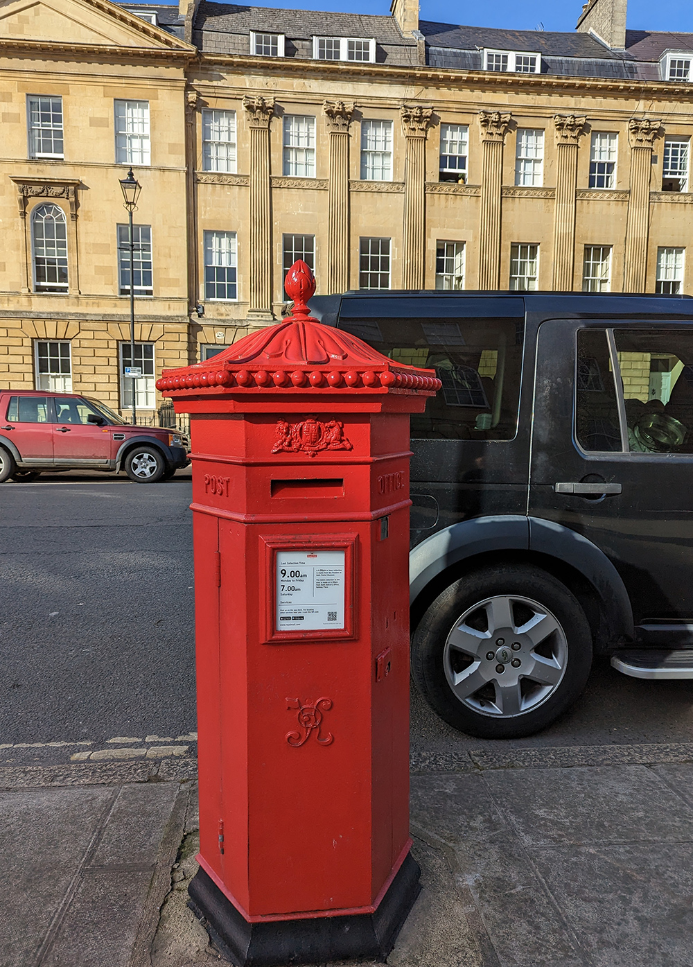
If you take a look at this photo I took of a late Victorian post box in Bath, you’ll see that not only is there a lot of detailing for something so functional and everyday, but the top part has been cast to look like the drooping petals of a snowdrop. This shape is lovely in itself, but it also reminds me of a wallpaper by Scion, called Snowdrop (funnily enough). It’s described as ‘an ode to the Arts & Crafts period’, which is exactly the period this post box was made. The pattern on the postbox and the wallpaper are both lovely organic shapes which would work well in a room with a relaxed vibe like a bedroom. |
||
 |
||
| The 'Snowdrop' wallpaper in Sage from Scion | ||
|
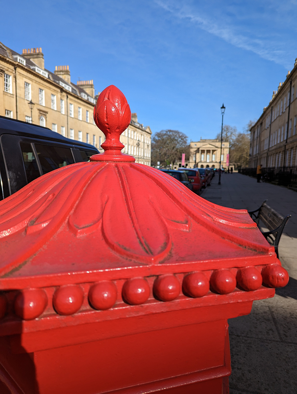
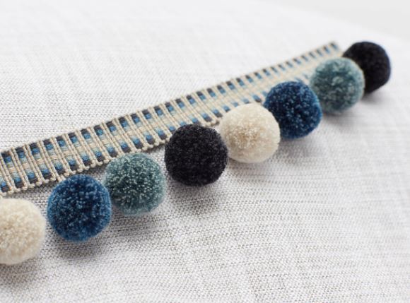
The round bobbles underneath the snowdrop pattern on the post box are also interesting because they are a contrast to the free flowing shapes of the petals, and I like the more regimented repeated shape of the bobbles next to the curves. When I was looking at the post box, the bobbles also reminded me of a pom pom trim and inspired me to add this trim to some curtains in a project I’m currently working on. |
||
 |
||
| The 'Tivoli' pom pom trim from Romo. | ||
|
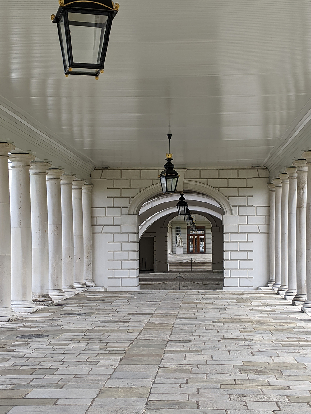
Buildings themselves and the shapes they make also get my brain turning over. Below is a photo I took of the Queen’s House Collonade in Greenwich, because I liked the way the repeated columns lead the eye through to the archways and eventually to the set of doors at the end, drawing you through the space. The building itself is inviting you in, which is an important function of architecture. When looking down the row of columns, we can see many straight lines - in the floor slabs, the columns and the brick pattern around the arches, but what makes this piece of architecture interesting is the contrast with the curves of the arches themselves. The whole area is ordered and visually balanced, and the tension between the straight and the curved edges makes it much more attractive to look at. |
||
 |
||
|
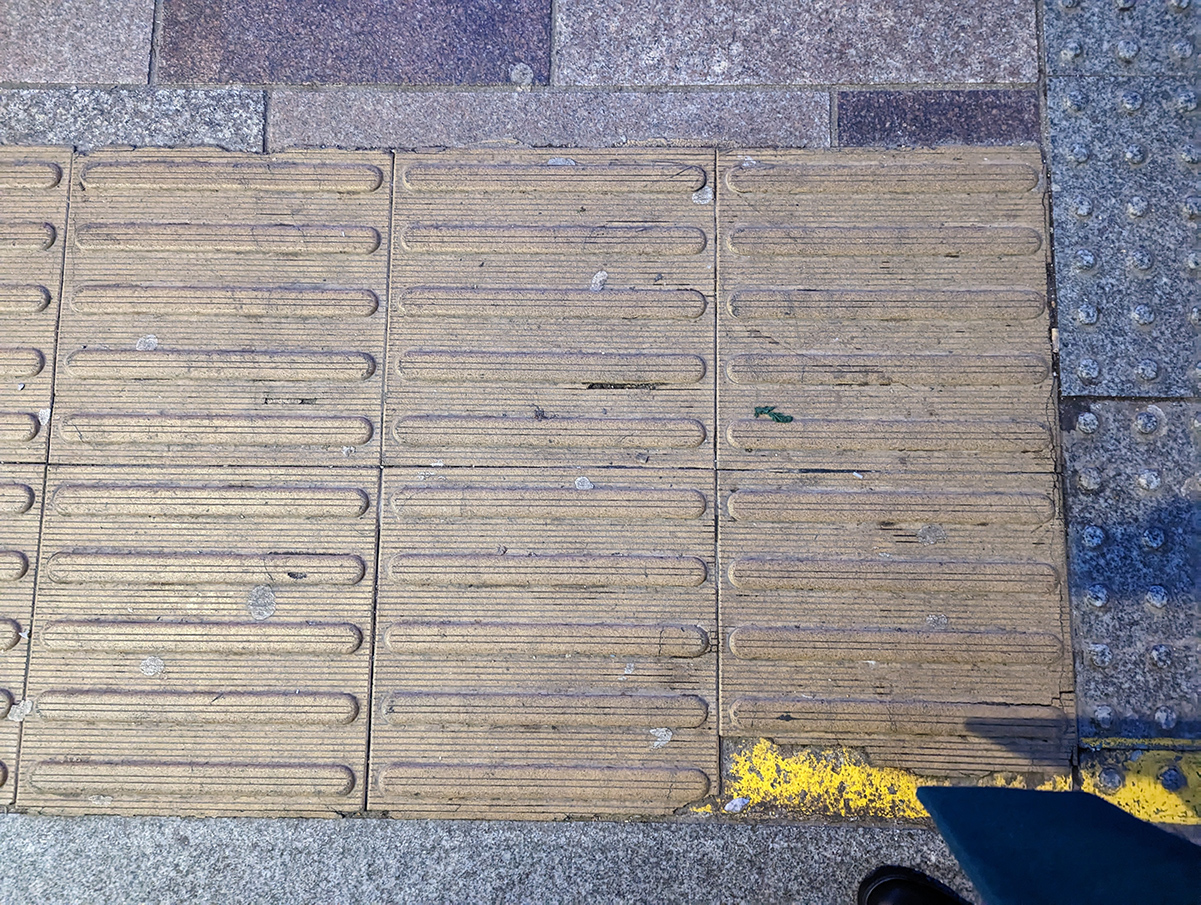
Sometimes, it's best to look down instead of up, as I often see lots of unusual flooring when I’m out walking. I recently took this photo of a floor tile whilst walking along Queen’s Street in Cardiff, as I liked the shapes on the tile and the raised parts got me thinking. I had been mulling over how to make my design for a kitchen island more interesting, and although I knew I wanted something textural and raised, I wasn’t quite sure what form this should take. The tile caught my eye and I decided to use it as the basis for the wooden island, tweaking it until it worked for the space and looked pleasing to the eye. Below is my design for the island, and you can clearly see the ideas from the floor tiles in the shapes. I’m really pleased with it, but I think my carpenter won’t be so happy when I ask him to make it! |
||
 |
||
 |
||
|
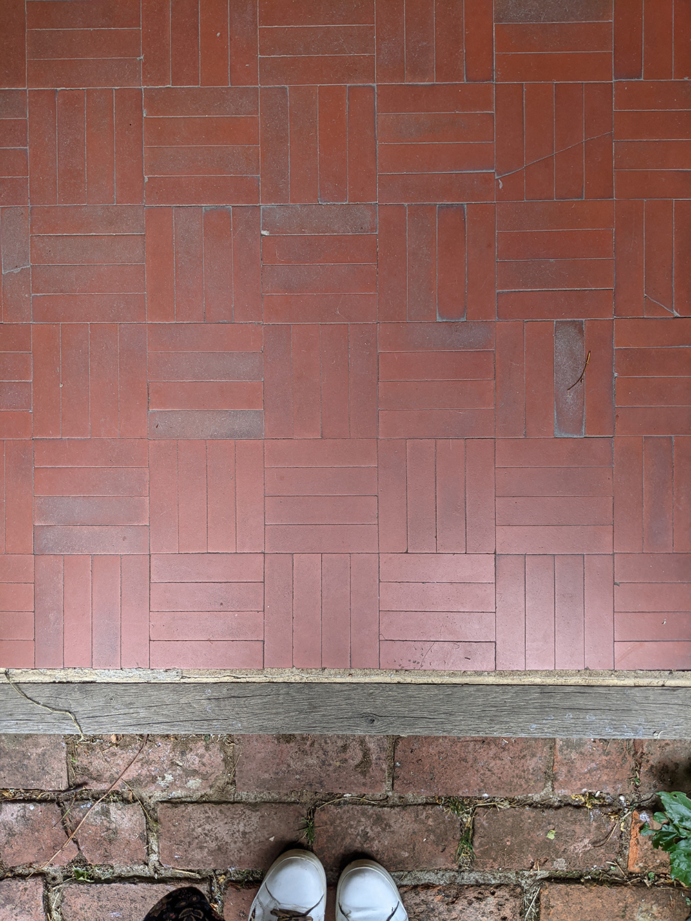
I was also thinking about floors (and looking down again!) when I took this photo of the porch floor a few years ago at the former home of William Morris, The Red House, in Bexleyheath. I love the way the tiles have been laid, and this is what made the unfussy flooring stand out. |
||
 |
||
|
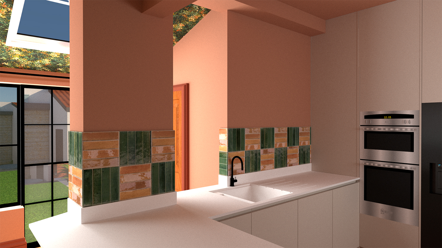
This tiled floor was designed and laid in 1860, but it looks very modern, as it’s a laying pattern which has been revived recently and is currently used today. It consists of four rectangular tiles laid in rows in opposite directions, and I like it because it’s so simple, and the symmetry is striking. It’s a pattern which looks great when used with contemporary glossy tiles, and even better when the colours are mixed up. Here’s an example of this pattern used in a kitchen design I’m working on: |
||
 |
||
|
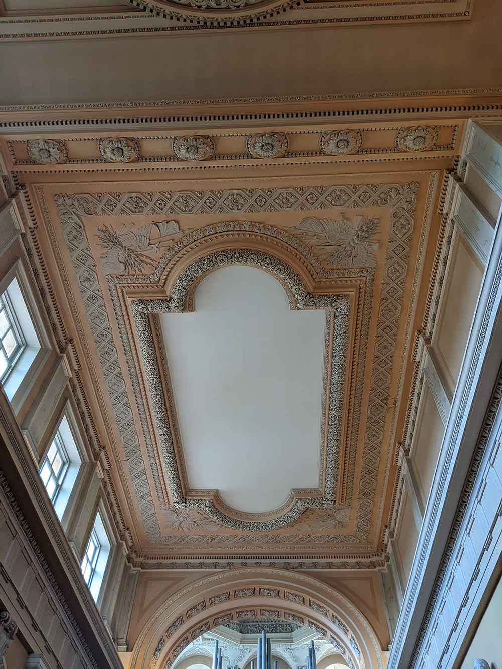
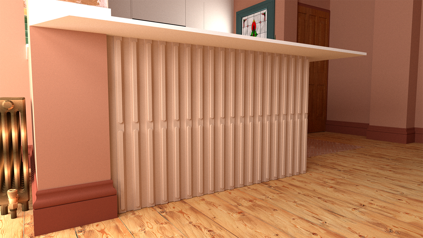
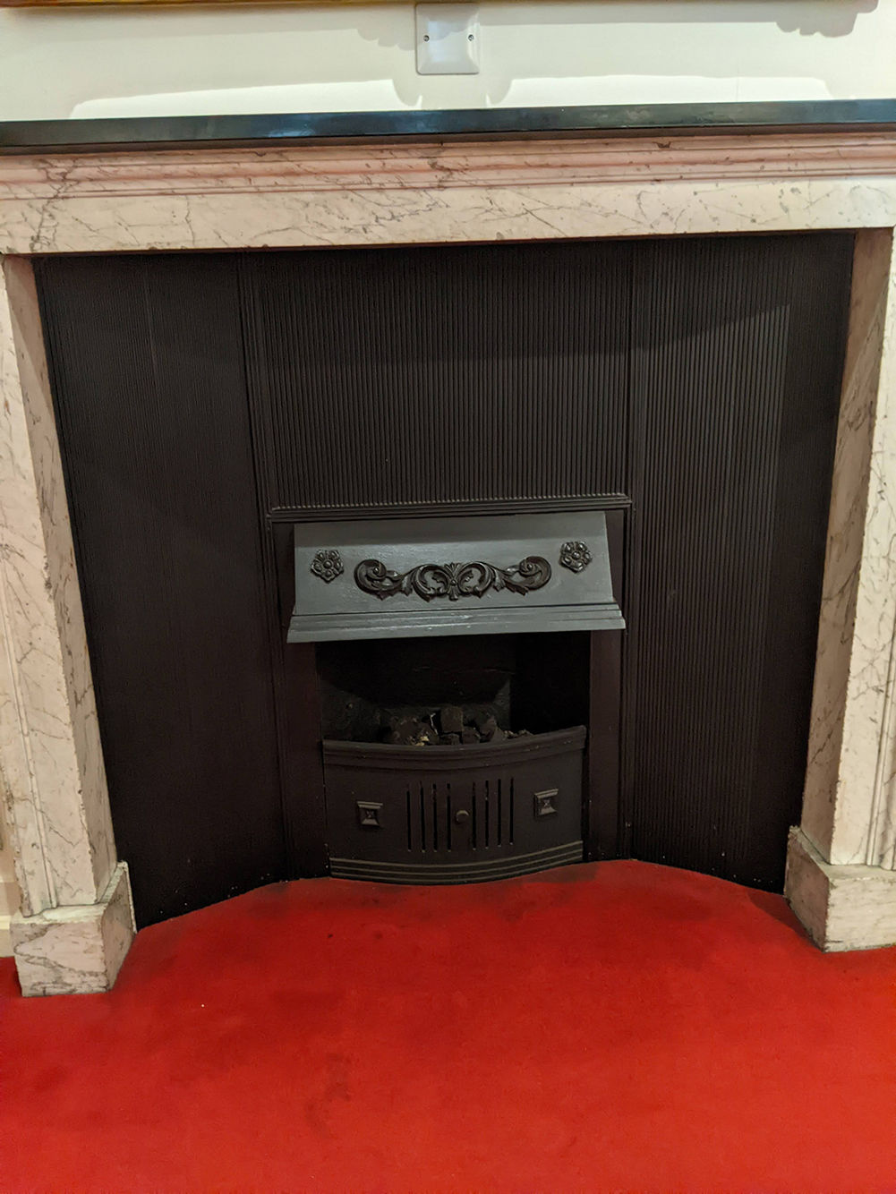
It’s wonderful to look back into history and use decor ideas from the past in new ways. I took tons of photos when I visited Blenheim Palace, the birthplace of Winston Churchill, last year. Looking back through them gave me some great ideas - the fluted lines on this simple fireplace in the servant’s quarters are elegant and it’s a shape I’ve loved for years. |
||
 |
||
|
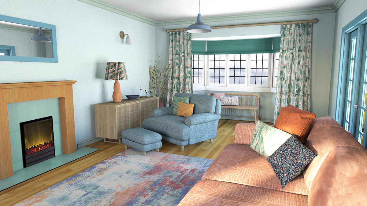
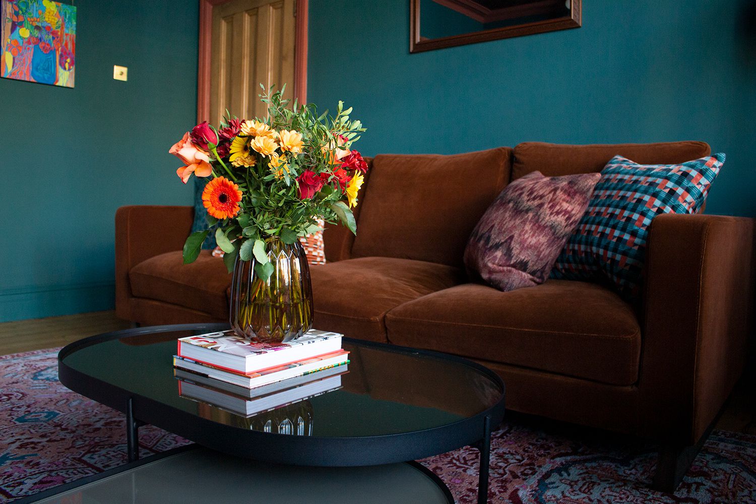
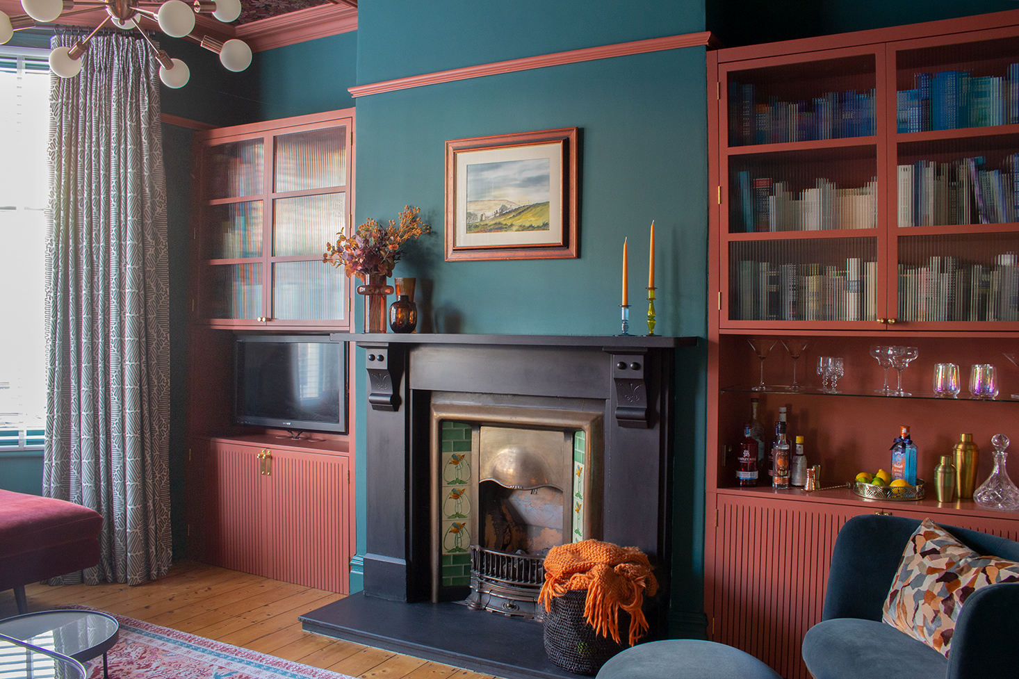
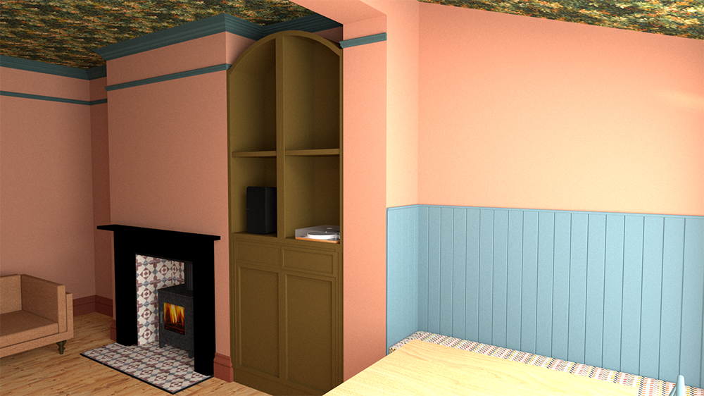
When creating the cabinet designs for my living room, I wanted to use fluting on the doors as I knew I would be adding fluted glass to the glazed part of the cupboards. I thought they would look great together, and the repeating shape of the fluting across the cupboards would have a calming effect in a room which is meant for relaxing. Here’s the finished room with the fluting on both the doors and the glass: |
||
 |
||
|
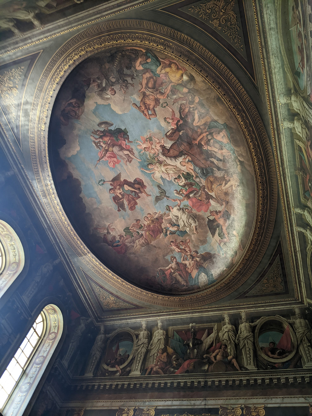
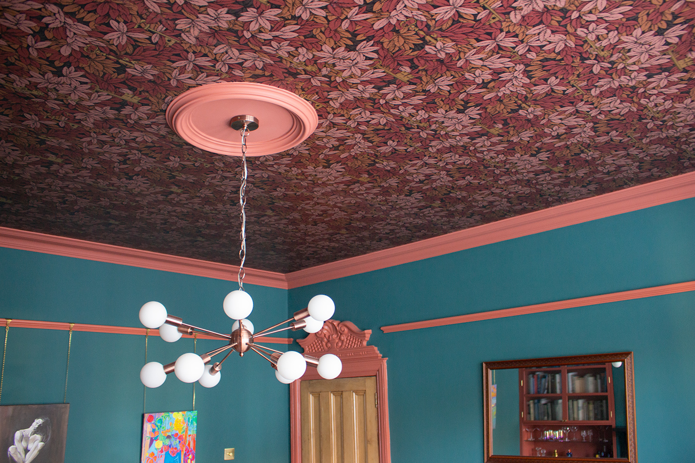
I also took lots of photos of the ceilings in Blenheim Palace (sometimes looking up is good too). They were very ornate and richly decorated, often treated with the same grandeur as the walls, and whilst we can’t all have ceilings like these, we can take away the idea that ceilings are an important area when decorating a space. |
||
As regular blog readers will know, I love a decorated ceiling, as it adds an element of surprise and seems to uplift the soul. I recently decided to add wallpaper and paint the cornicing of the ceiling in my living room, and I think the result is magical. So much more interesting than a white painted ceiling would have been. |
||
 |
||
|
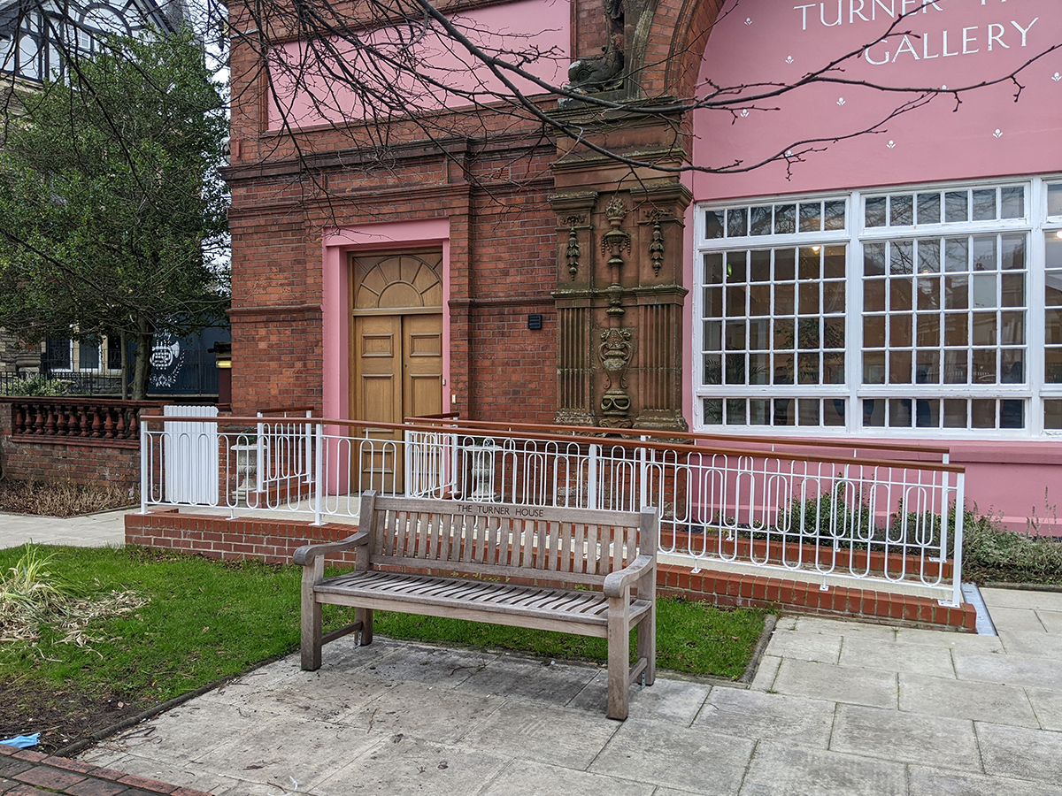
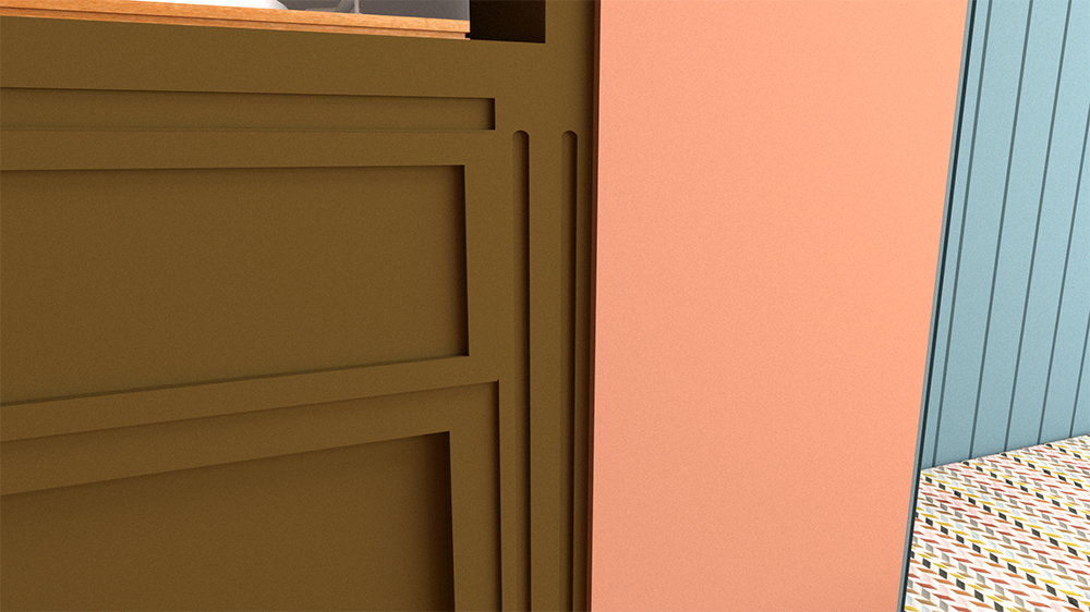
A little closer to home, I recently took a photo of the curved shape of these railings outside the Turner House Gallery in Penarth, and used them as inspiration for the detailing on some fitted cabinets I’m currently designing. This is very much a work in progress, but below are the designs for the cabinets - you can see how I’ve translated the curves into a recessed pattern on the frames of the cabinets which adds a little something extra to the design, and is more interesting than a flat panel. |
||
 |
||
 |
||
 |
||
| A close up of the curved detailing on the cabinet design | ||
|
I hope this blog has shown you that there are so many interesting things to look at in the world, and literally anything can spark an idea. I always keep my eyes peeled and my camera ready to capture the mundane, everyday items that can be the starting point for something beautiful. You never know what could be turned into an interior design detail, and keeping your mind and your eyes open is an inspiring way to go through life. |
Welcome to the design blog, where you'll see posts about anything from the projects we are working on, to the latest fabric and wallpaper collections, and all things interiors related. We love colour, pattern, architecture and old buildings, and we love to share our finds with you.
Happy reading!