Work in Progress - My living room
 |
||
|
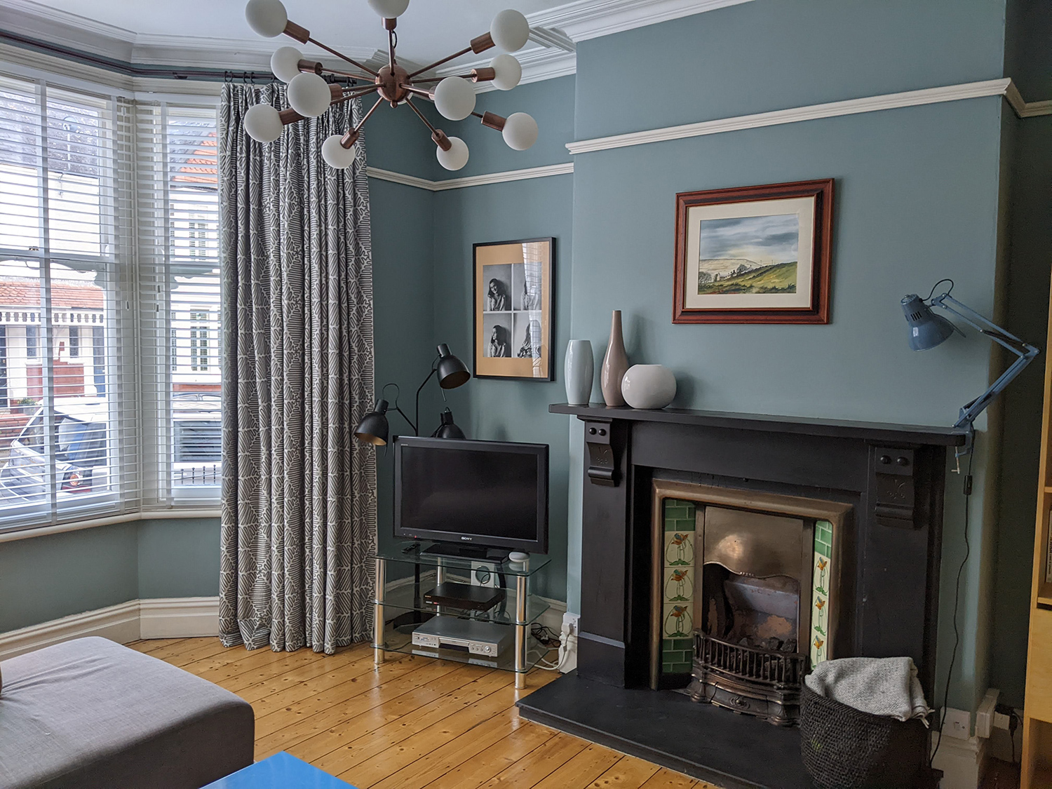
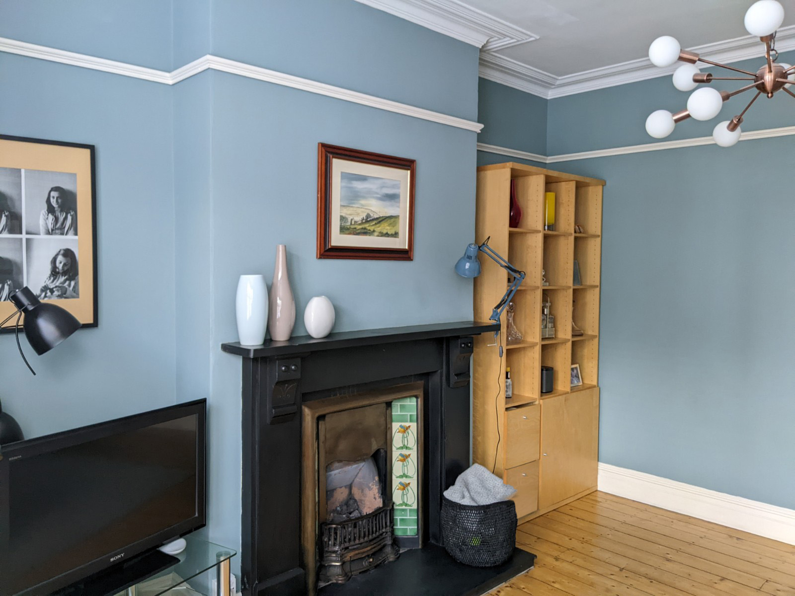
This month’s blog is the final reveal of my own living room project. The finished article has been a long time in the making, since I first began designing it back in 2020 (I seem to suffer from the same syndrome as all people in the trade, that work on your own house always goes to the bottom of the list). You can read more about the problems I was trying to solve here, but here’s a quick recap. The reason the room so desperately needed a redesign was that it hadn’t been decorated for over 17 years; it needed more space efficient storage (including a nicer space to house the TV); we wanted more seating and more flexible lighting; and well, I wanted it to feel better. More relaxing, cocooning, luxurious, and more like me. I wanted to be able to walk in and know I was home. Here’s a reminder of what the room looked like before we started work: |
||
 |
||
 |
||
|
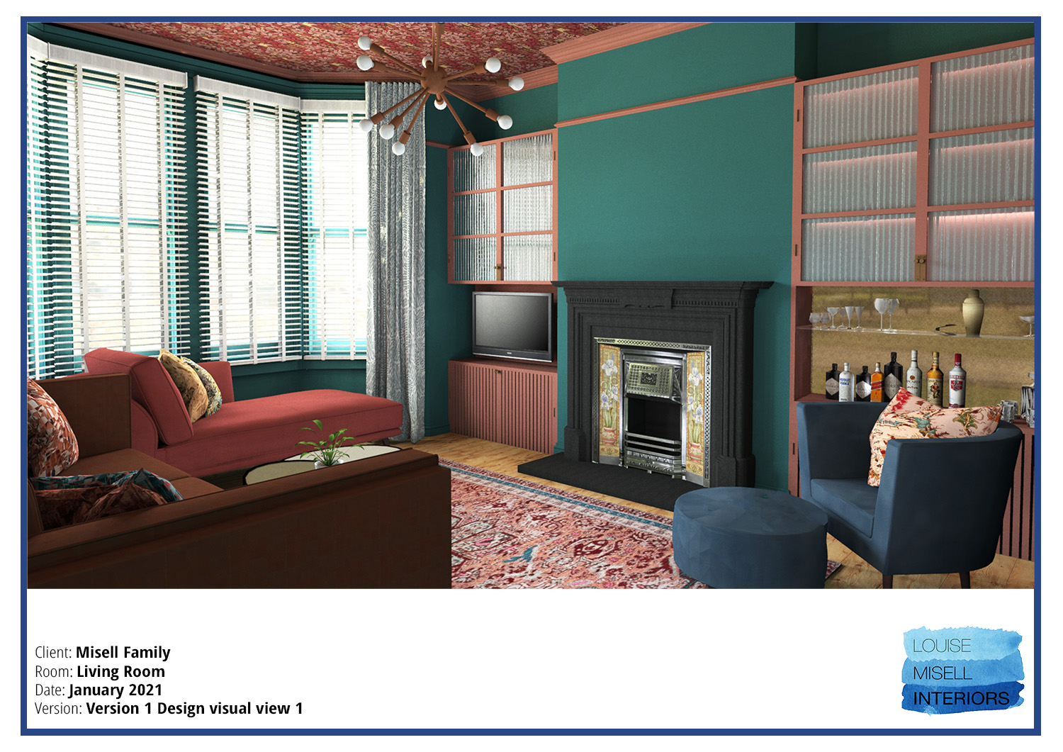
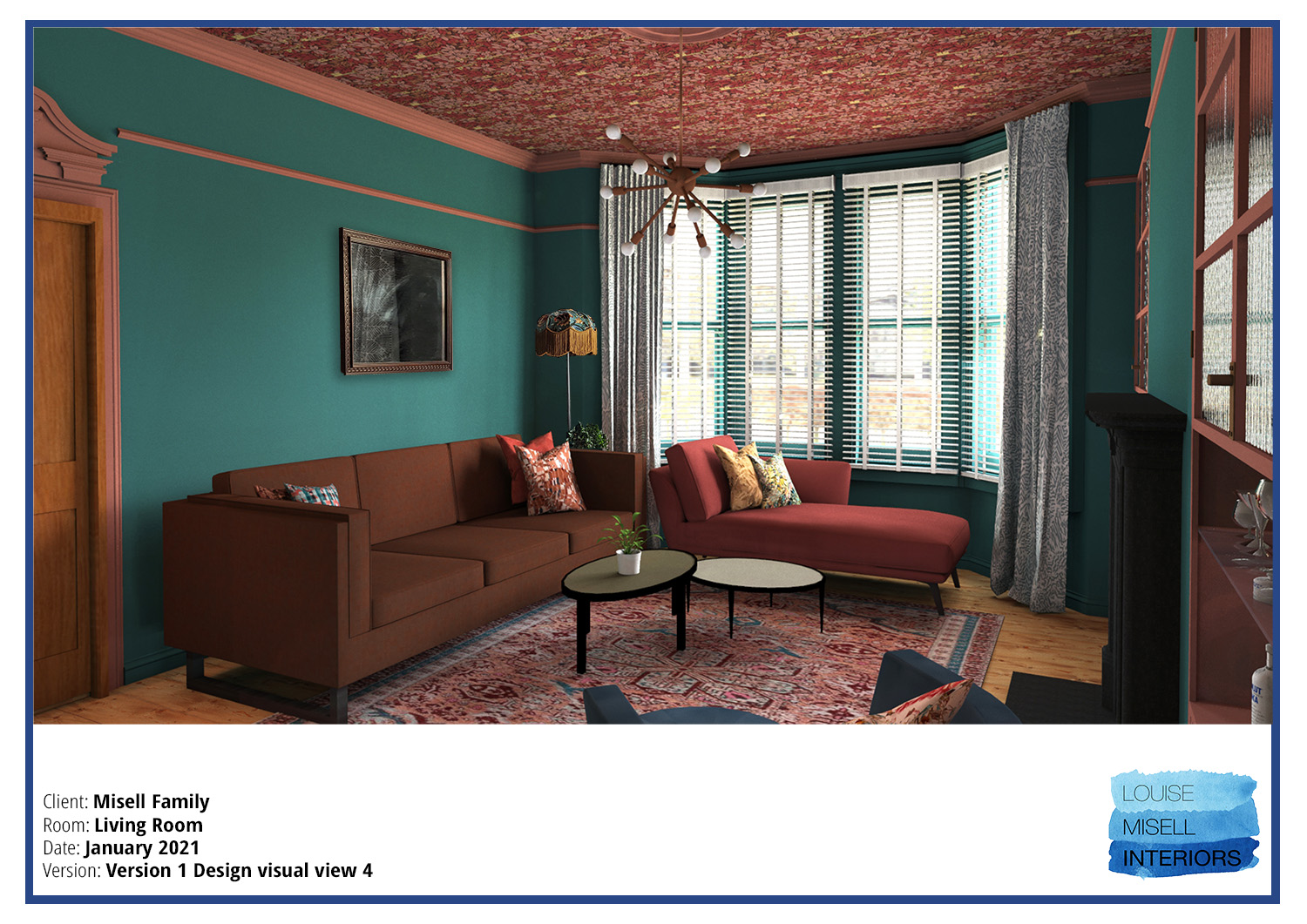
You can see the problems with it, as it really didn’t reflect my personality, or exude any warmth at all. After having a chat with myself and my husband about what we wanted (his input was ‘I don’t really mind what you do’) I got to work designing the new storage, choosing colour schemes and sourcing items, and after a few weeks I came up with this design: |
||
 |
||
 |
||
|
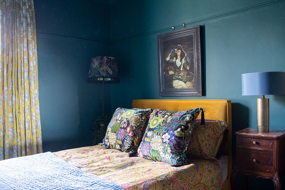
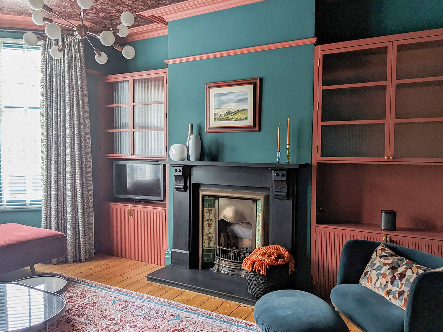
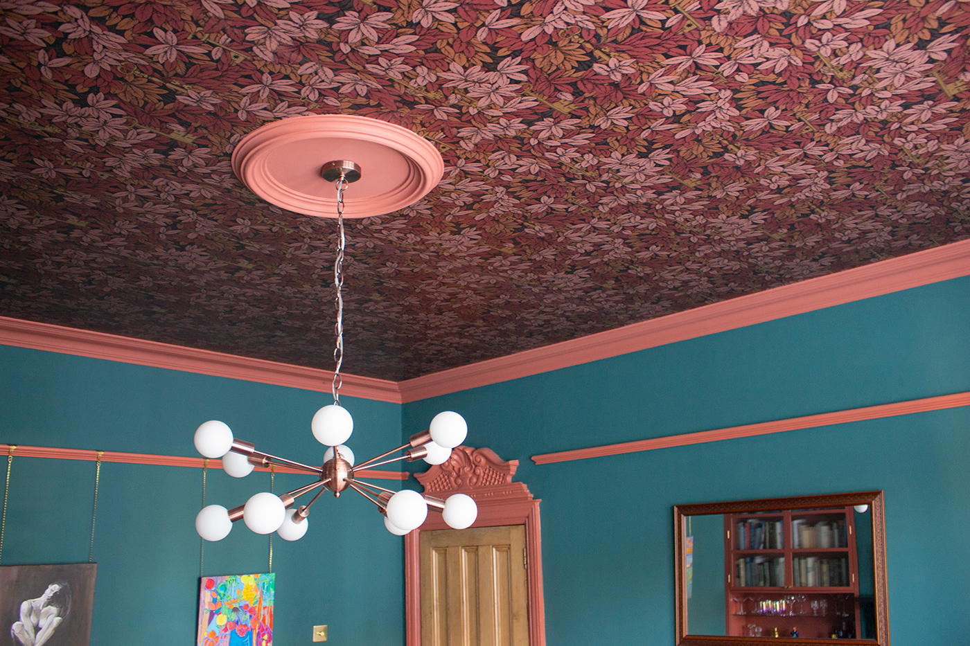
You might remember that the scheme began with the decision to put the magical Cole and Son wallpaper Chiavi Segrete on the ceiling, which has worked really well. The secret keys glow in the light, and it really has made the room feel so special. Combined with the rich velvets and deep colours in the rest of the scheme, it provides instant warmth and a real feeling of luxury. |
||
 |
||
|
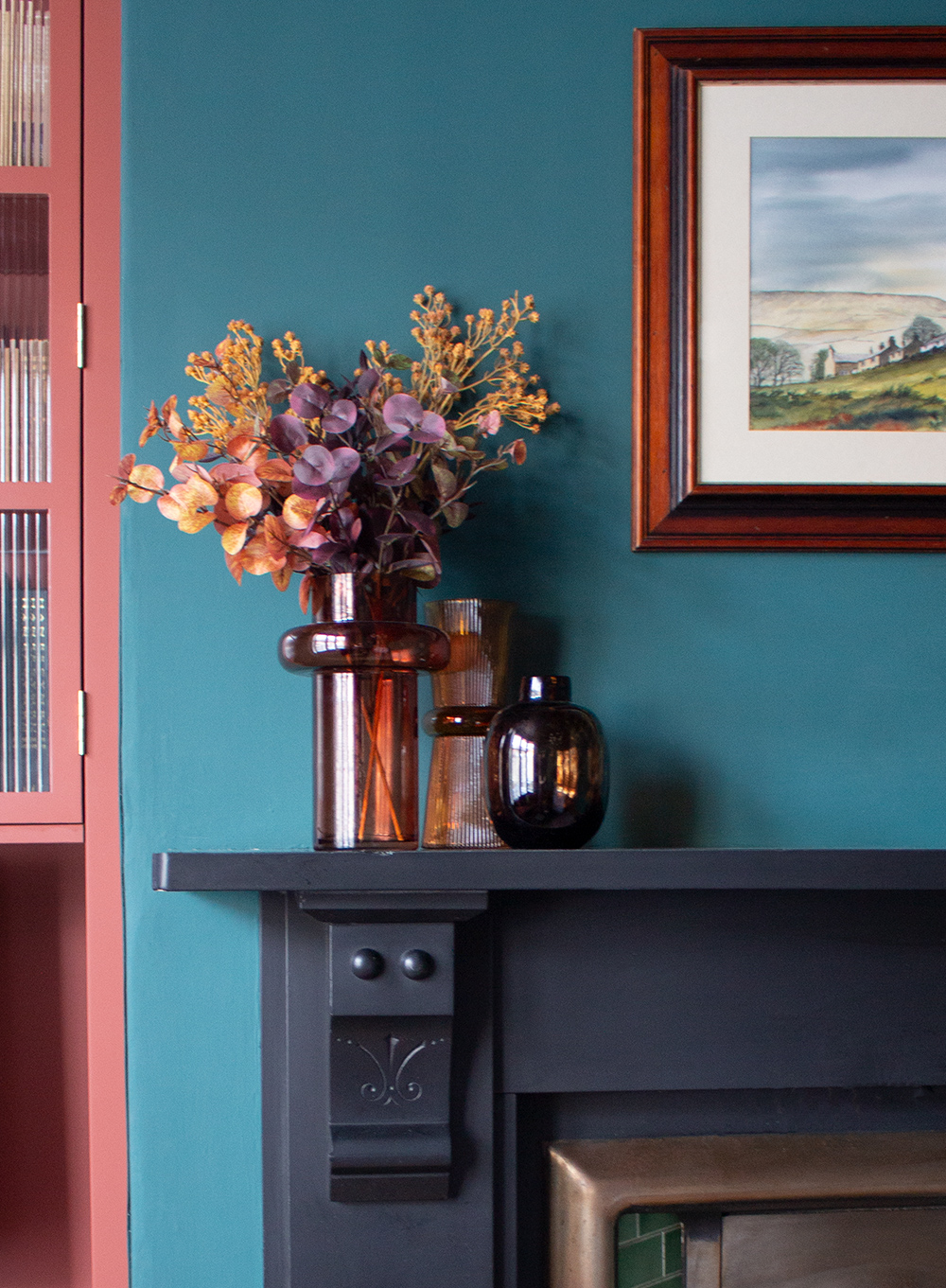
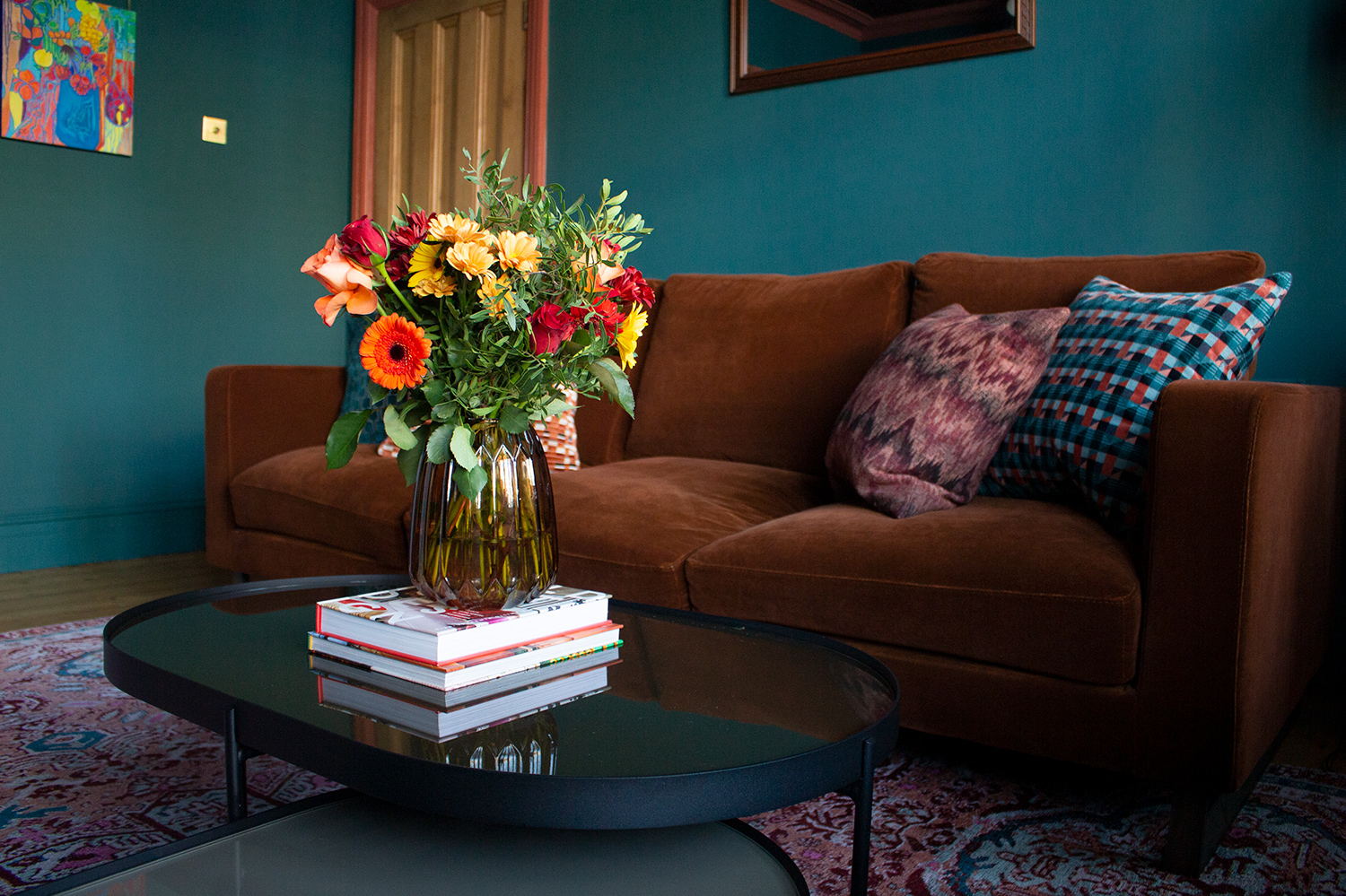
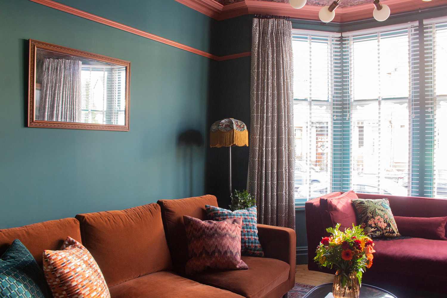
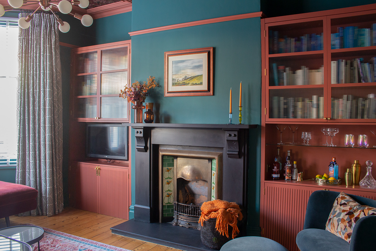
I love how this room looks now, but what I really love is how it feels. The reason the room feels so rich and deeply layered is because of the colour palette (a base of red, green and blue, with shades of camel, brown, orange, mustard, pink and peach, added in), and also because I deliberately chose lots of tactile and competing textures to combine together. We have plush velvets in three colours on the seating, the raised geometric pattern on the curtains which can be felt every time the curtains are drawn, the ribbed glass in the alcove storage which refracts the light, and the velvety matt painted walls contrasted with the shiny metals of the handles, sockets and light switch. Even the brushstrokes in the artwork are visible and full of energy. Nothing is flat, and there is lots for the eye to enjoy every time it takes in the room. |
||
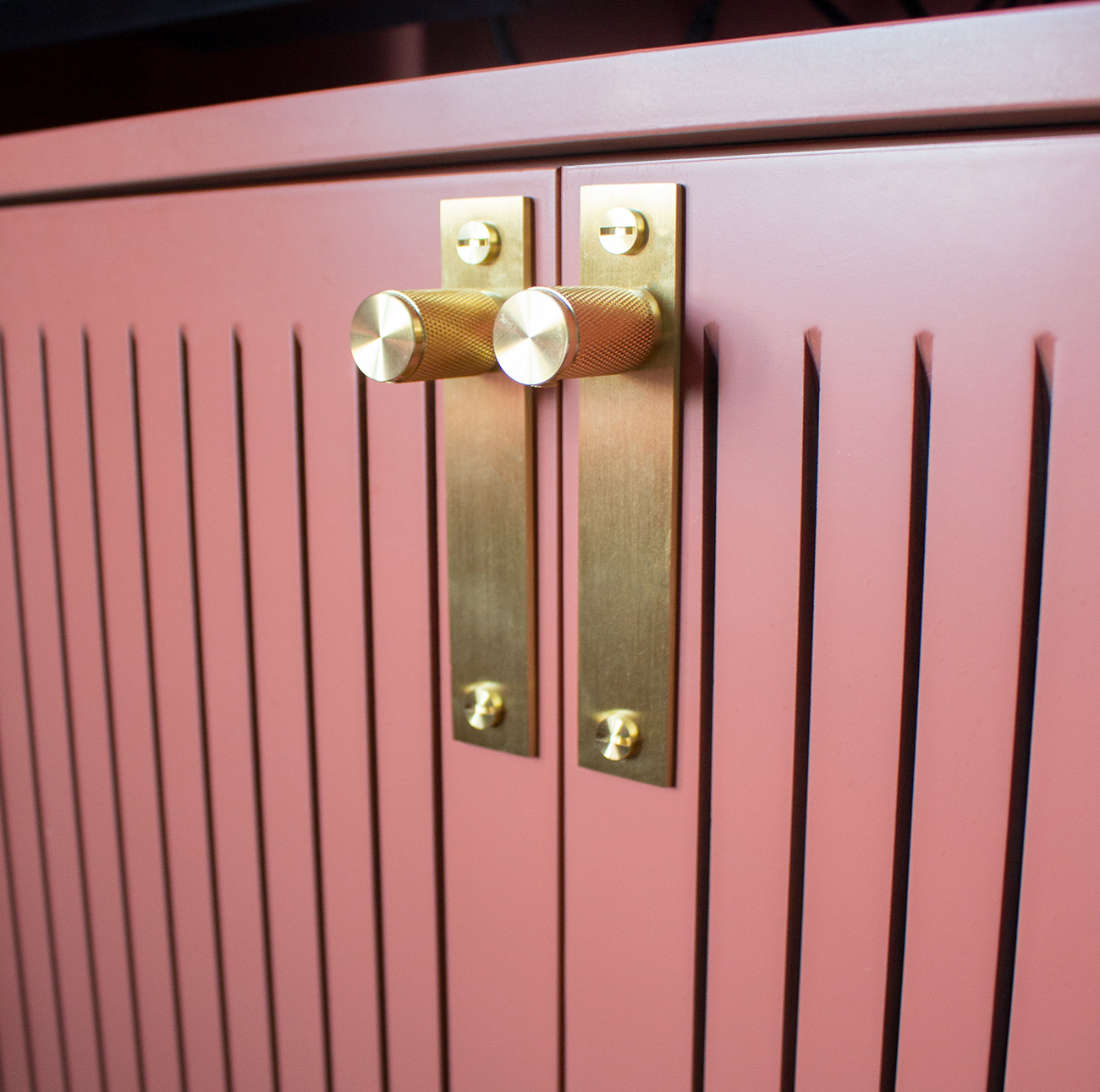
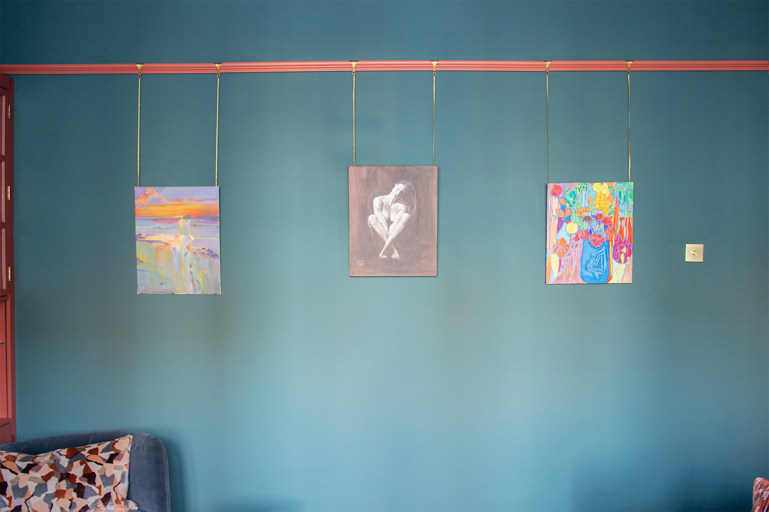
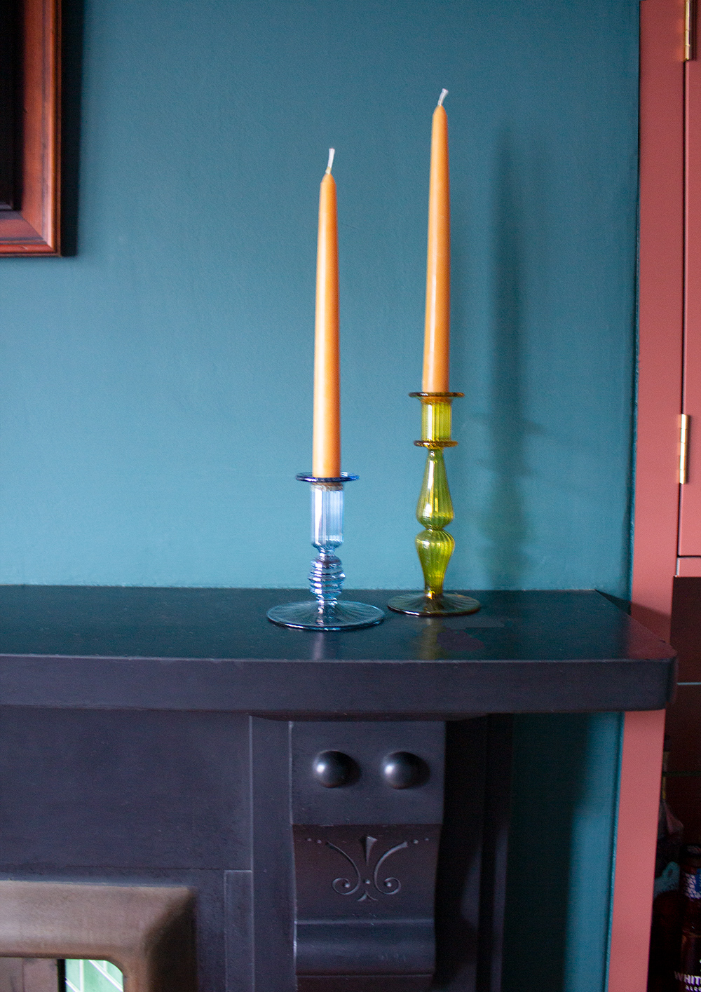
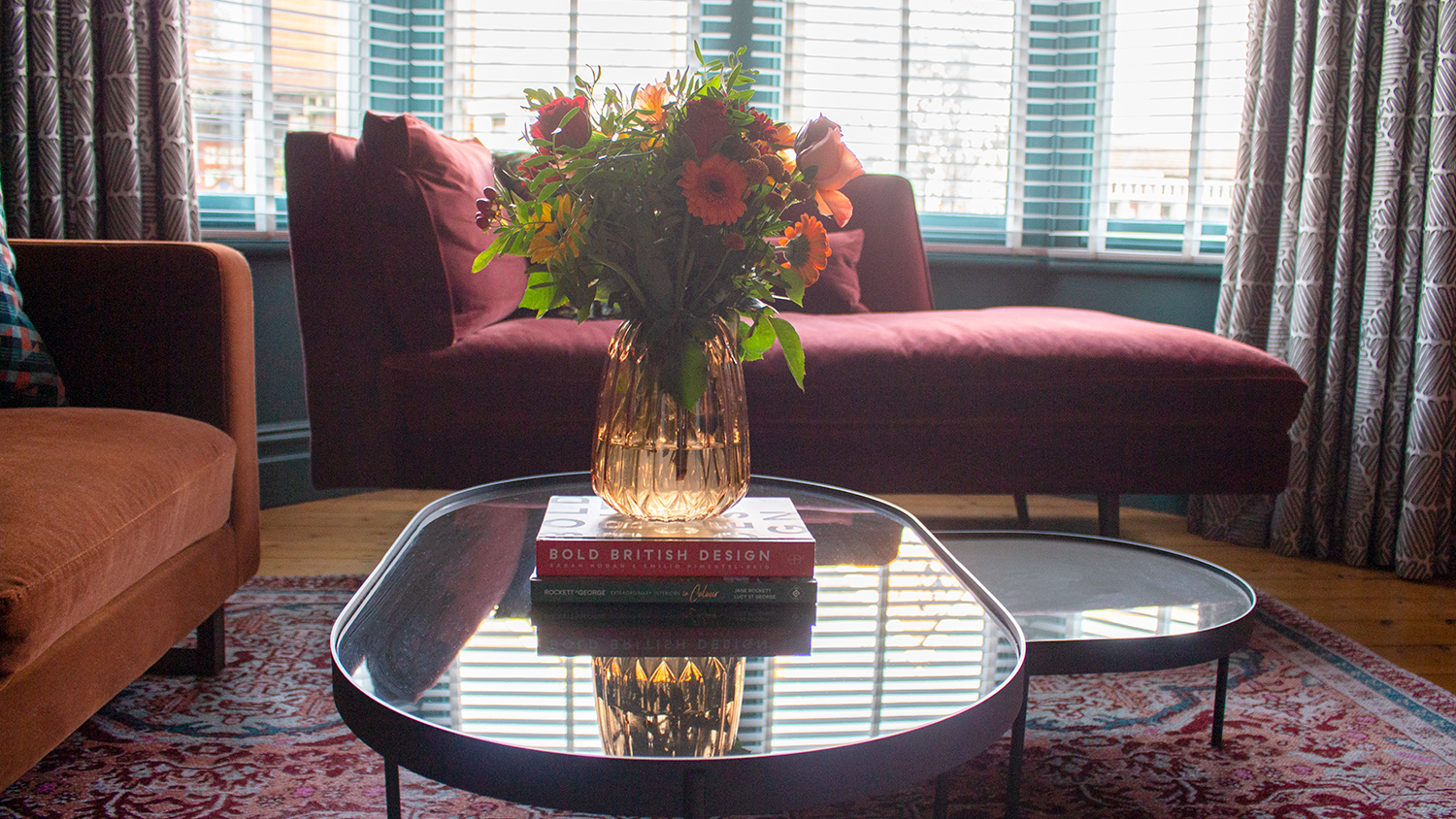
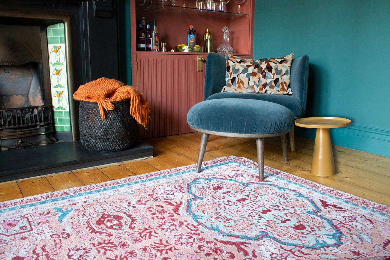
By the way, the beautiful artwork was provided by my very talented aunt, who has been painting all her life. These works span different periods in her painting career, and what’s more, they are perfect for the room and make me think of her every time I see them. I’ve consciously repeated some of the shapes and textures I chose and dotted them around the room, to create a design language for the space and a feeling of cohesion. This makes the room feel ‘settled’ and grounded, so although there is a lot going on, it isn’t so busy that it’s not relaxing to be in. I have used the straight lines from the lower half of the alcove cupboards and echoed them in the ribbed glass of the doors above, I’ve repeated them in the ribbed glass of the candlesticks, and picked up on the shaped glass in the lines on the vases. There are more straight lines in the shapes of the sofas and the mirror, the wooden Venetian blinds at the windows, and even in the arms of the sputnik ceiling light. But then I’ve chosen to soften these lines with some curves - in the coffee tables, the globe bulbs of the ceiling light, the lampshade of the floor lamp, and in the curved back of the armchair and footstool. Too many straight lines wouldn’t have been relaxing at all, and I believe it’s the reason why some contemporary rooms (especially kitchens) can feel soulless and cold. |
||
The other form of contrast I’ve introduced is in the patterns I’ve chosen. This is an Edwardian house and in lots of ways the design I’ve produced is quite traditional and reflects the way the Edwardians would have decorated. The colour scheme of deep greens, reds and blues reflects the late Victorian/Edwardian period, but we are a modern family living in the house in 2023, so the house has to feel current enough to complement the way we live today. I chose to blend the more traditional colour scheme with some contemporary patterns to reflect this mix - and created tension from the contrast, which makes the scheme interesting. The life in this scheme comes from the very modern geometrics in the cushions, the stylish take on a floral standard lamp and the updated oriental style rug. The pattern on the lampshade is rooted in the Victorian style, but the colours used are brighter and reflect a modern colour palette. There is more spacing in the pattern between the birds, the flowers and the swirling vines, which makes the fabric look contemporary. The rug is based on a Persian style, but the lightness of the background and the colours used make it feel more up to date. Persian rugs are usually quite dark and often have a rich ruby red base and have a lot of busy pattern going on, whereas this rug has a strict colour palette and a much looser pattern. |
||
 |
||
 |
||
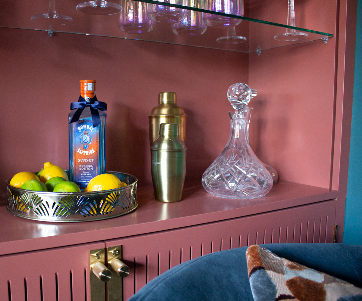
As the main walls are painted in a rich, dark teal, and the wallpaper on the ceiling is on the darker side, I also used the rug to lift the overall scheme. The light colour in the base of the rug provides some relief from the darker hues and rich velvets in the furniture. An all over dark painted room could appear gloomy, but if there are enough areas of light and contrast added, it will feel bright and colourful. This room is lucky enough to have large bay windows which bring in a lot of light, but I also used the white in the Venetian blinds, the large mirror above the sofa, and the white in the base colour of the curtains, to elevate the scheme. The sanded wooden floor is light, and together with the lighter rug, they freshen up the whole space and break up the effect of the darker colours used. The light which is reflected off the glass doors in the cupboards and the coffee tables also increases the feeling of light and space. Imagine how different these cupboards would feel if they had solid doors all the way up? They would feel much heavier and would dominate the room. |
||
 |
||
|
All of the pieces I sourced work together as a whole to create the overall feeling I wanted in this room - cosy, cocooning, restful but also exciting and inspiring. Seeing these pictures will go some way to conveying how it actually feels to be in the room, but no photo can capture it properly. It feels exactly how I wanted and for me, creating that feeling in people's homes is what interior design is all about. |
Welcome to the design blog, where you'll see posts about anything from the projects we are working on, to the latest fabric and wallpaper collections, and all things interiors related. We love colour, pattern, architecture and old buildings, and we love to share our finds with you.
Happy reading!