Work in Progress - The space savvy loft conversion
 |
||
|
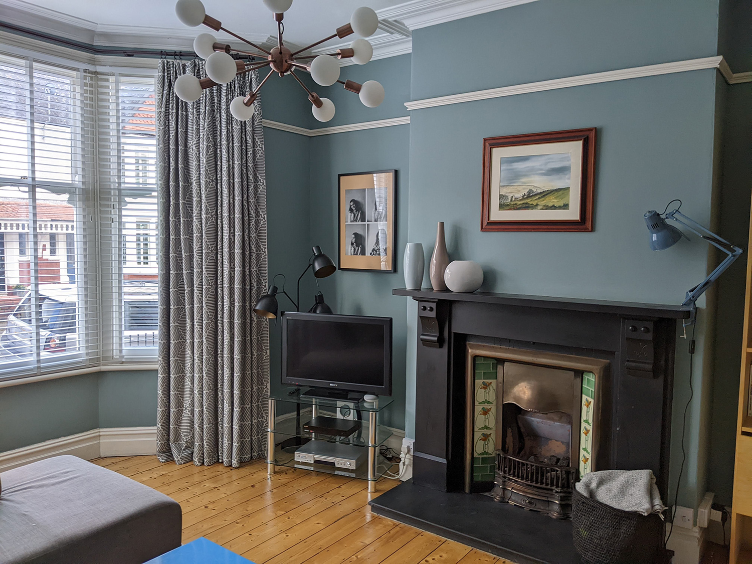
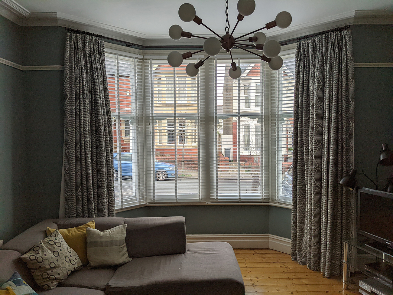
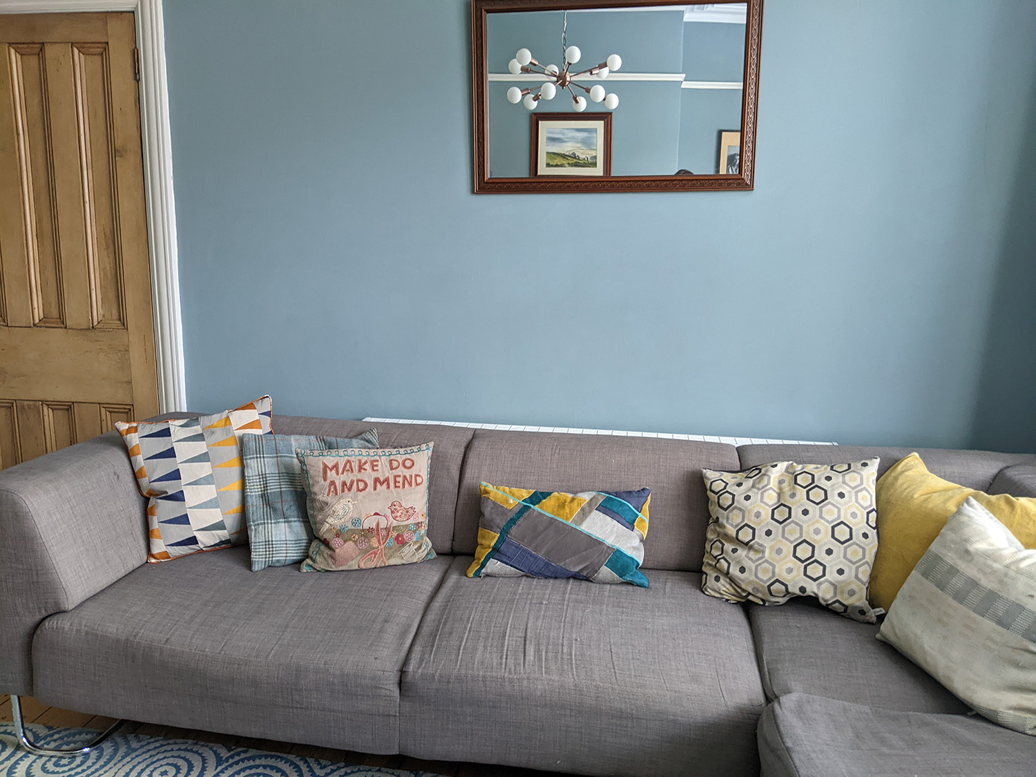
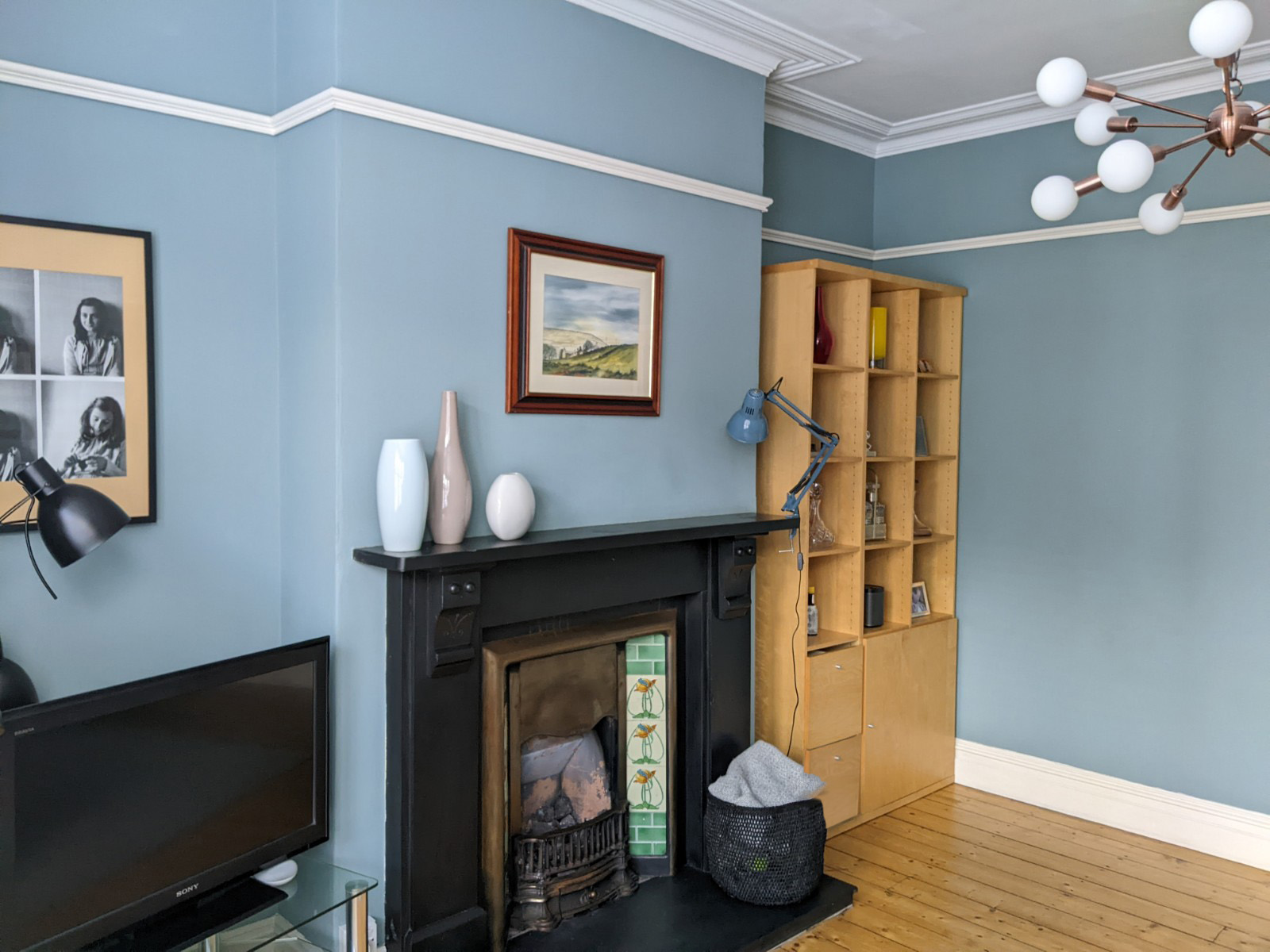
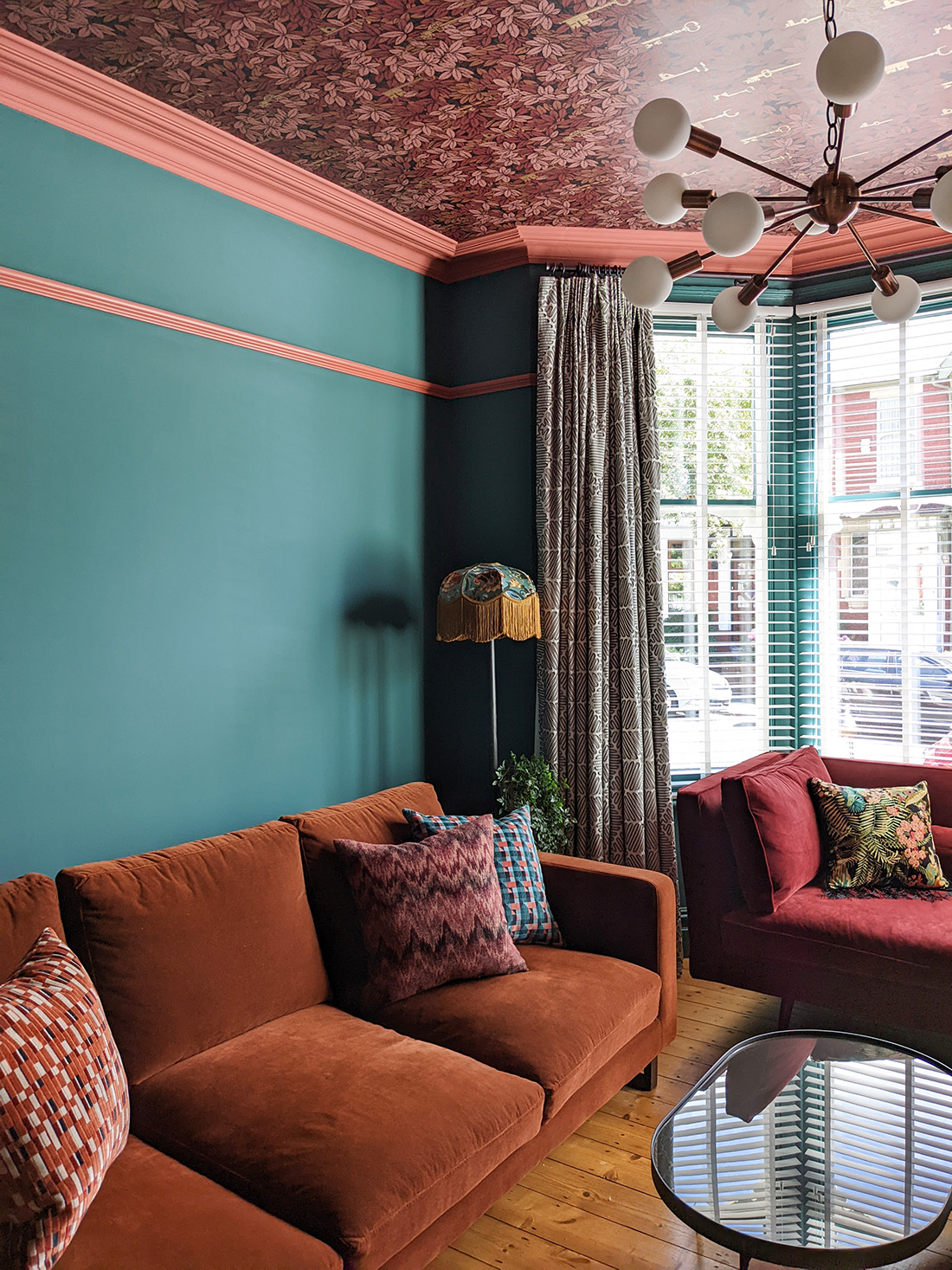
This month I’m sharing a personal work in progress with you - the transformation of my living room, which has been planned for a good while now, and dreamt about even longer. When we moved in to our house 17 years ago, the walls were painted cream and there were ill-fitting cream curtains on an even more ill-fitting pole (you can read about how I solved that problem in this blog post). Not having the budget to redo everything in the house immediately, we concentrated on the kitchen and bathroom. I gave the living room a quick makeover by painting the walls in a colour I liked (Farrow & Ball Oval Room Blue) and made new curtains to go on the existing poles. When it came to furniture for this room, the budget was limited, so we bought an inexpensive corner sofa and used an existing rattan chair. When the kids were little the corner sofa was great for curling up together and watching movies. And it got jumped on and spilt on A LOT. As they got older we needed more seating - if two people stretched out on the sofa that meant it was full, and the old rattan chair in the corner fell over if you didn’t sit on it just right, so it was a bit of a death trap and no one really used it. Because we’d bought an inexpensive sofa, it didn’t wear well and became lumpy and uncomfortable fairly quickly, so good quality seating was on the top of the wish list. We had also bought an Ikea bookcase to go in one of the alcoves when we moved in, because it was within the budget we had at the time, and it did the job but had always bothered me. It was too short and looked out of proportion with our tall ceilings, and didn’t fill up the alcove properly, so wasn’t a great use of space. For the other alcove, we bought one of those ubiquitous glass shelving units to house the TV and the boxes that go with it, which was functional but not great to look at. It was also too low (has anyone else noticed that purpose-built TV units are usually too low, making you tilt your head down to watch?) Here’s what the room looked like before: |
||
 |
||
 |
||
 |
||
 |
||
|
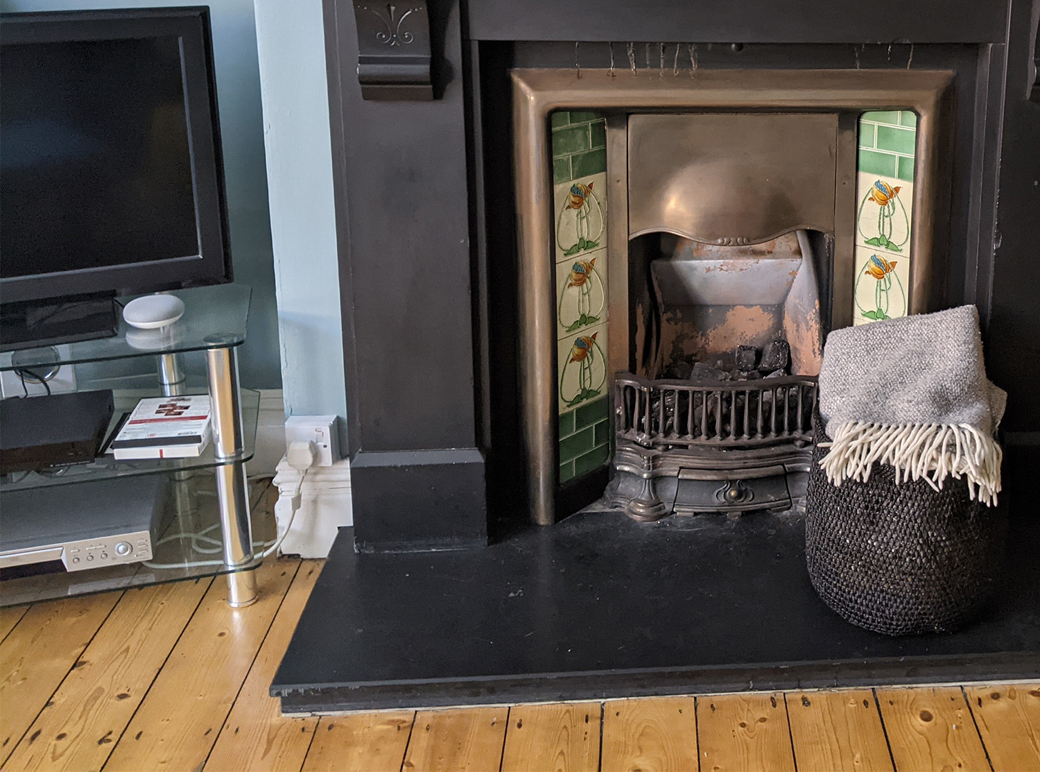
It was an okay space, but not really ‘me’. And the one thing that really annoyed me about this room was the state of the electrics. There were two plug sockets in total! How is that enough for a modern family living room? One of them was a ‘spur’ taken from the other so not really ideal, and they had both been plonked either side of the fireplace above the skirting board, sticking out into the room and looking ugly. We plugged in some extension cables to power the TV, a floor lamp and a small lamp on the mantlepiece, but other than that we couldn’t have any more lamps or electrical goods in the room. The ceiling light was operated by a standard on/off switch, so the lighting options in the evening were either glaring overhead light or a small amount from the TV and the one lamp. Not very relaxing. I promised myself that when we got this room redecorated I would get the lighting and electrics sorted and add more sockets to give us some flexibility. |
||
 |
||
| the ugly face fixed plug socket by the fireplace | ||
|
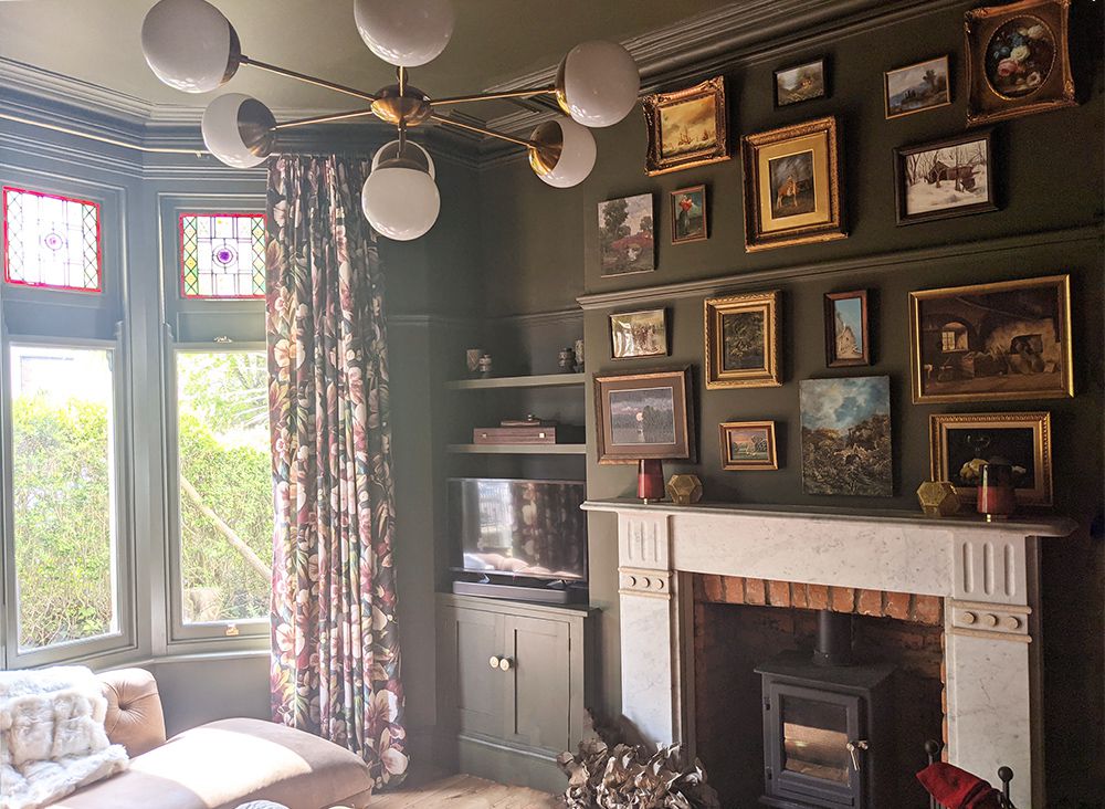
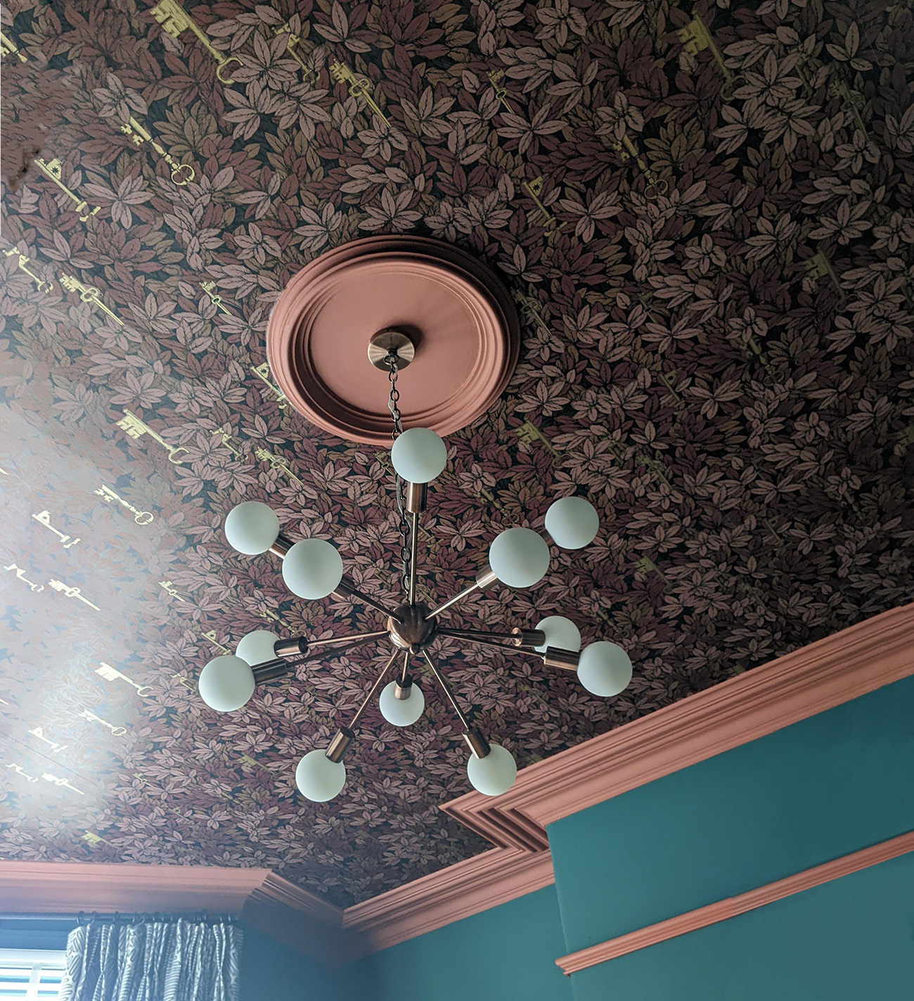
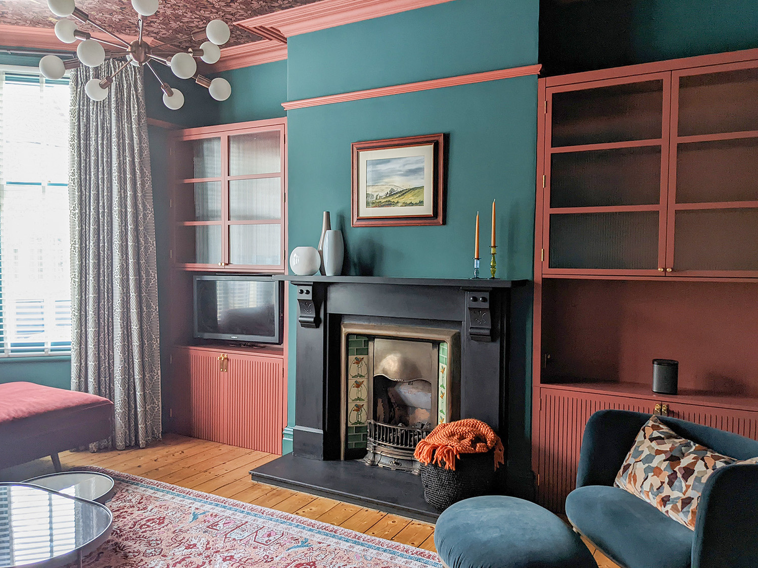
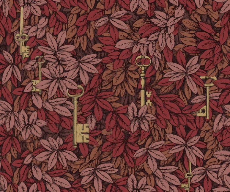
So that was the scene before the big redesign. I sat down over Christmas 2020 (yes, that long ago!) and thought about how to improve the room, and how I wanted it to feel. I knew I wanted it to be cosy, luxurious, a grown up space to relax in, and a little haven away from the kitchen and ‘working’ part of the house. I started by looking at colours to define the feel I wanted to create in this room. I sat with all my paint charts around me and didn’t really think about the colours, I felt my way through them. I came up with a scheme based on rich reds, greens, browns and blues. Once I had the colours chosen, I found the perfect wallpaper to go with them - Cole and Son’s Chiavi Segrete (which means secret keys in Italian). I didn’t want to wallpaper the walls as I didn’t want the room to feel too busy, but had fallen in love with this wallpaper, so I decided to put it on the ceiling. It’s a great design for a ceiling, as the secret keys are highlighted in gold, and can only be seen when the light from the window or a lamp hits them, making it fascinating to look at. |
||
 |
||
|
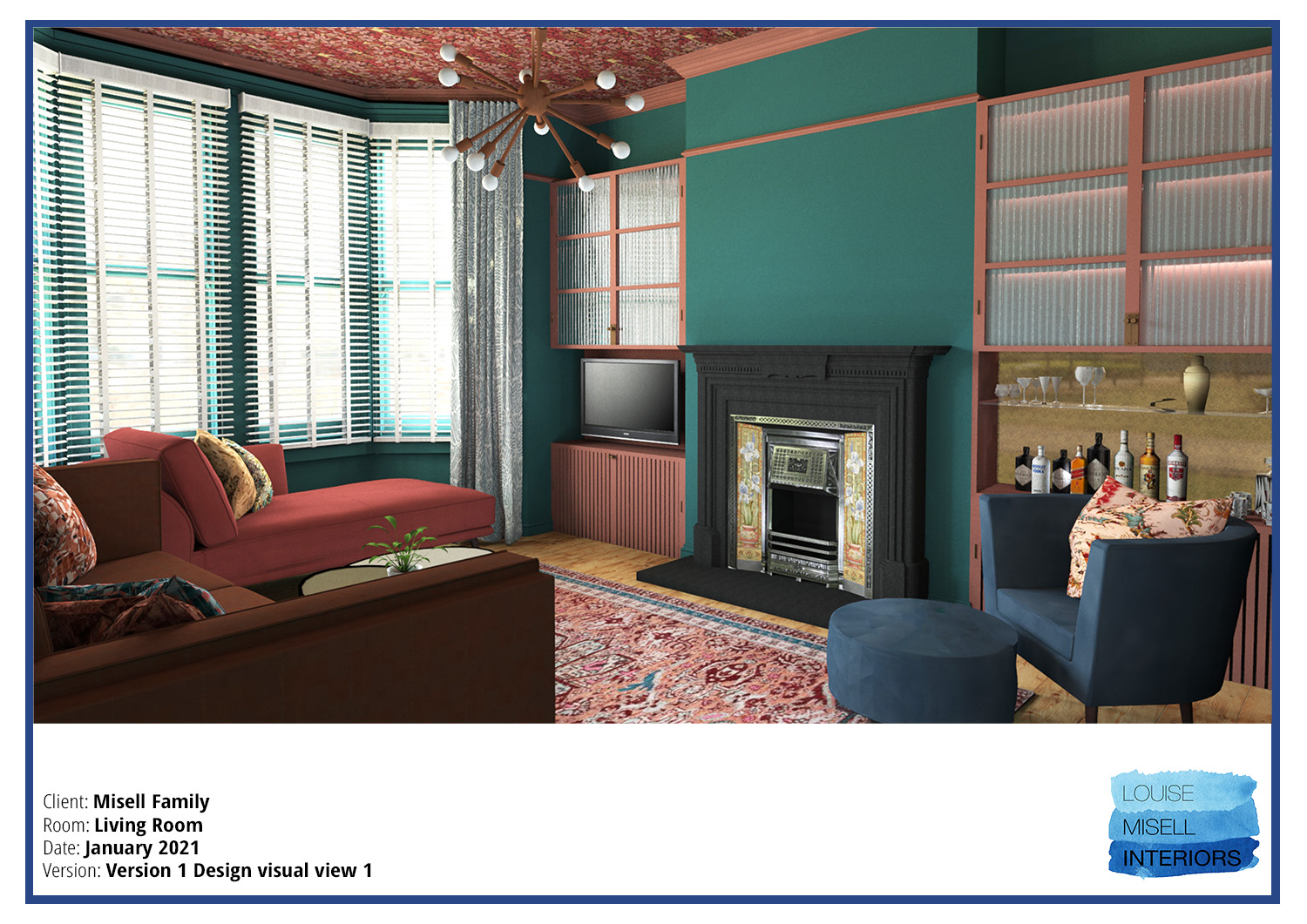
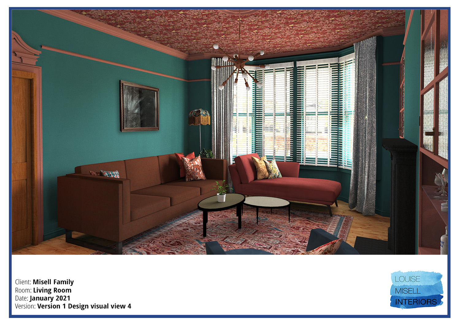
Next, I designed the built in cabinetry which would go either side of the chimney breast. I knew that filling up the alcoves could potentially make the room feel smaller and that I didn’t want these cabinets to overpower the room, but we needed more storage and a better way to house the TV. I decided to make the height of the cabinets stop just below the picture rail. This meant they wouldn’t dominate the room and we would still be able to see the beautiful original cornicing on the ceiling. I also designed the top half of the cabinets to be glass fronted so they would break up the space visually, instead of being a solid wall of wood, and made the lower portion open to house the TV on one side, and a glass shelf for a bar area on the other. I used fluted glass for the top cabinet doors as I love the way it looks and how it refracts the light hitting it, creating echoes of the objects behind it. The bottoms of the cabinets would be solid doors to hide away all those bits you have near the TV (DVDs, media boxes and remotes etc), that everyone has but no one wants to see. |
||
| It’s great to hide your DVD player and smart boxes etc behind doors if you can, but it can also create a problem. When you want to use the remote controls, you have to open the doors and keep them open to be able to control what you are watching. I don’t know about you, but it’s not something I find very relaxing - staring at the cables and boxes under the TV all evening. So, I came up with a plan. I have always loved the look of thin slats or batons of wood used in interiors and on surfaces such as walls, and I wanted to use them here. My idea was that the gaps between the slats would be cut through the wood, allowing the infra red of the remote controls to get through to the boxes inside, and they would echo the lines of the fluted glass above. I also decided to add LED strip lighting in the back of the cabinets which would illuminate the fluted glass and add an extra layer to the lighting scheme for the room. | ||
|
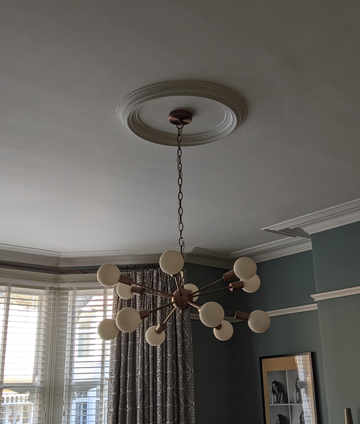
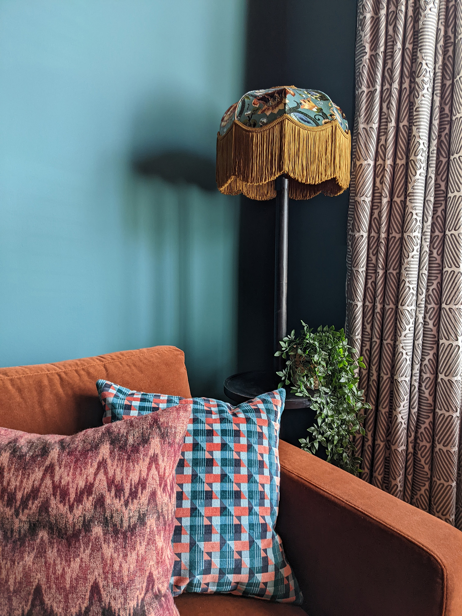
Next, I chose seating in luxurious but stain resistant velvets and found a glorious chaise longue, which would go perfectly in front of the bay window. A large sofa in a stunning cocoa velvet would go along one wall, and a little chair with matching footstool by the bar area would complete the new seating layout. I kept the existing slate blue curtains as I’d had these new ones made just a couple of years ago, but I integrated them into the scheme by using touches of blue throughout. I also kept the ceiling light we’d put in around 5 years ago, as the burnished copper tones of the fixture created exactly the vibe I was looking for. You can see from these photos of the light before and after the room was redecorated how well it works with the new scheme, and comes to life with the wallpaper around it. |
||
|
||
|
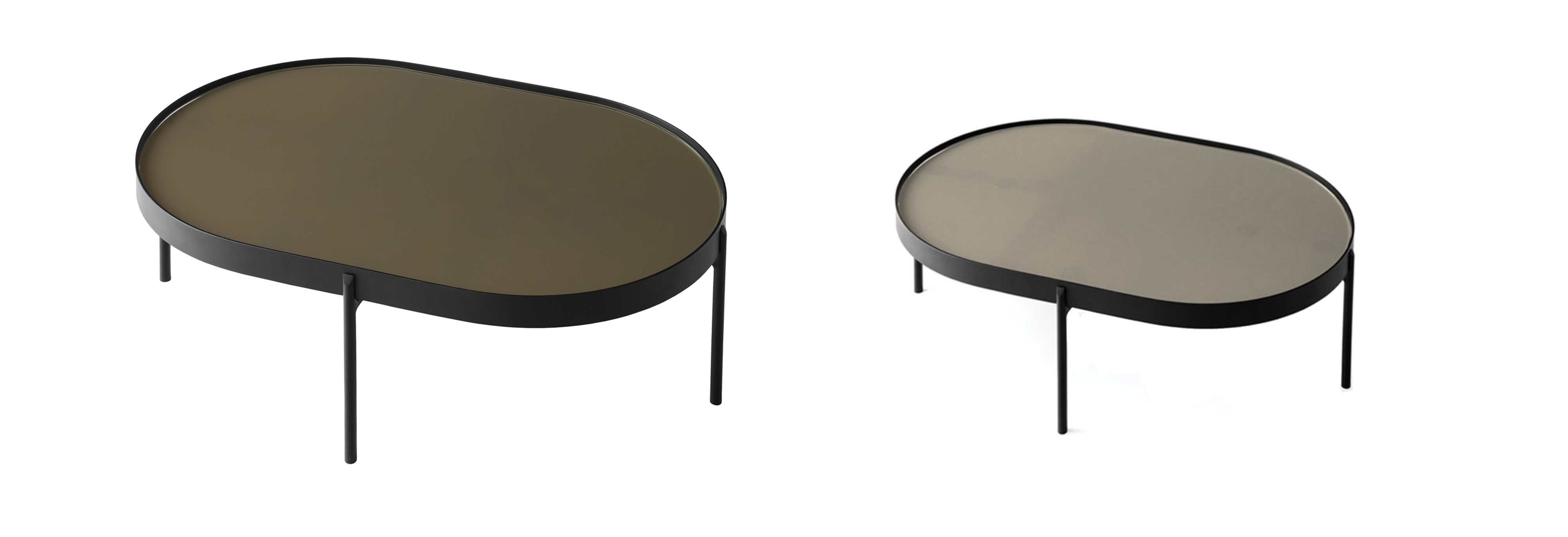
The one change I did make to the ceiling light was to swap the bulbs so they were dimmable, and I bought a brushed brass dimmer switch for this fitting. No more glaring overhead lighting in this room, which gave us the flexibility we wanted. Then I had to hunt for a coffee table. We previously had three small tables that nested into each other, which were quite useful as they could easily be separated and moved around the room. I didn’t want a solid lump of wood in the centre of the room, and wanted something that flowed with the lines of the new sofa and chaise. After a lot of searching, I sourced these two tables which are separate but can be positioned together: |
||
|
I love that they are glass on the tops, as this reflects the light from the large windows and bounces it back into the room, and I love the oval shapes of them - making them easy to walk around. The final bits I needed to add to the design were the rug and a floor lamp. Now that we would be having more plug sockets and IN THE RIGHT PLACES, I could actually have a floor lamp by the sofa. I sourced a dark wooden lamp with a little table in the middle of it, which is very handy next to a sofa, as you can put your cup of tea on it. I needed to find a shade for it, and as I knew exactly what I wanted, this was easy. The Gaia printed velvet shade from House of Hackney was just made for this room, picking up all the colours in the palette and bringing them together in this one beautiful piece. The dark gold fringing on it just highlights the brown tones I’ve used in the room perfectly. |
||
 |
||
|
The final piece of the jigsaw was the rug. It pulls all the colours in the room together and the busyness of the pattern echoes the wallpapered ceiling above, like two bookends with the room in between. Once I had sourced everything, I created computer renderings of the room so that I could check it would all work well together before I bought any items. I find this a really helpful design tool, as there is no guesswork when it comes to visualising the room, and it really helps my clients to see my vision too. Here are a couple of my computer renders: |
||
 |
||
 |
||
|
The process of getting the room out of my head and into a finished space took a long time because I had to wait for the carpenter to be available, but once work started it all came together pretty quickly. We’re not quite there yet as we’re waiting for a glass shelf for the bar area, and I need to hang my artwork and do the all important finishing touches and styling, but here is the almost finished room: |
||
 |
||
 |
||
|
I hope you like it - I’d love to know what you think! |
Welcome to the design blog, where you'll see posts about anything from the projects we are working on, to the latest fabric and wallpaper collections, and all things interiors related. We love colour, pattern, architecture and old buildings, and we love to share our finds with you.
Happy reading!