What colour should I paint my walls?
 |
|
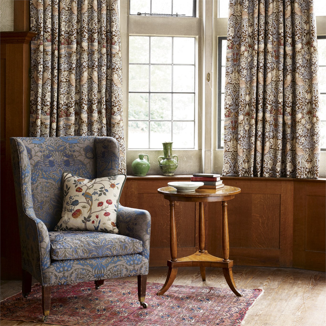
I love William Morris, the designer, artist, poet and philosopher, and somehow I don’t think I’m alone! I grew up thinking that Morris’s wallpapers and fabrics were the best way to bring a bit of history in to your home, and that as soon as I owned a period property I would use his gorgeous patterns all over the house. |
 |
|
When I did finally get that period property, my interiors tastes had changed, and although I still loved Morris’s designs, I wanted a sleeker, less busy look for my home. I love Morris’s intricate patterns based on the natural world, but felt that they might ‘overwhelm’ my space. This was also a time when ‘Victoriana’ was out of favour, and minimalism was everything. The clever people in charge of the Morris & Co. brand knew their designs sold well to a traditional interiors market, but wanted to extend the appeal of his work. So they created the Morris Pure collection in 2016, which is a fresh look at some of Morris’s best known designs. It includes some monochrome wallpaper prints, and introduces some sheer fabrics which took my breath away and would look fantastic in any modern Scandinavian interior. |
 |
|
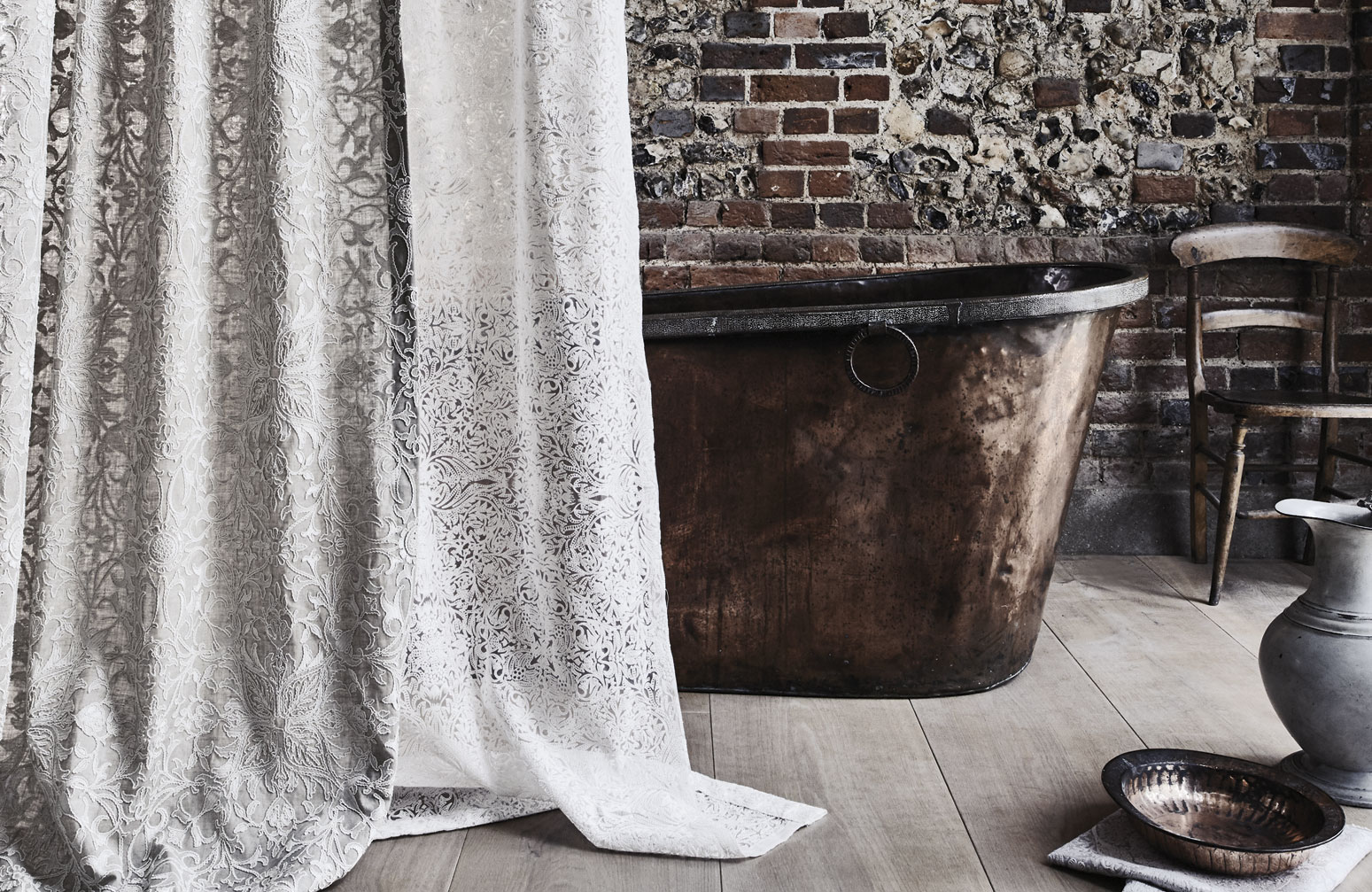
The Pure collection is extremely popular, as it embraces the current trend for greys and understated interiors but keeps all the fine detailing. Three of the wallpaper designs were made using Morris’s original wood blocks, adapted by the designers to make new patterns, which thrills the art history geek in me. I think this collection continues Morris’s tradition of using fine craftsmanship to produce beautiful items for everyday use. |
 |
|
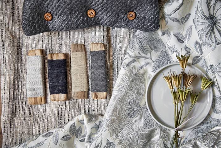
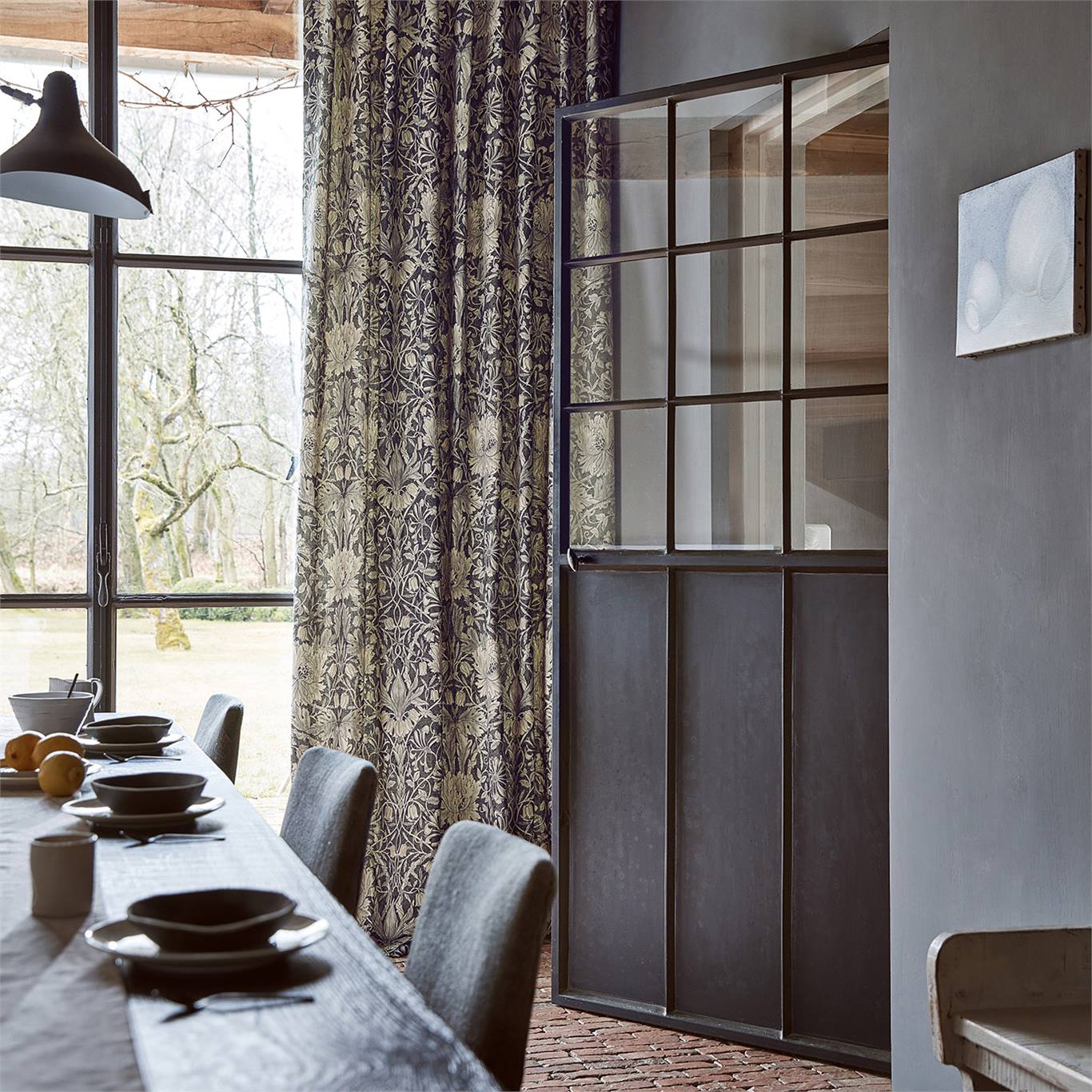
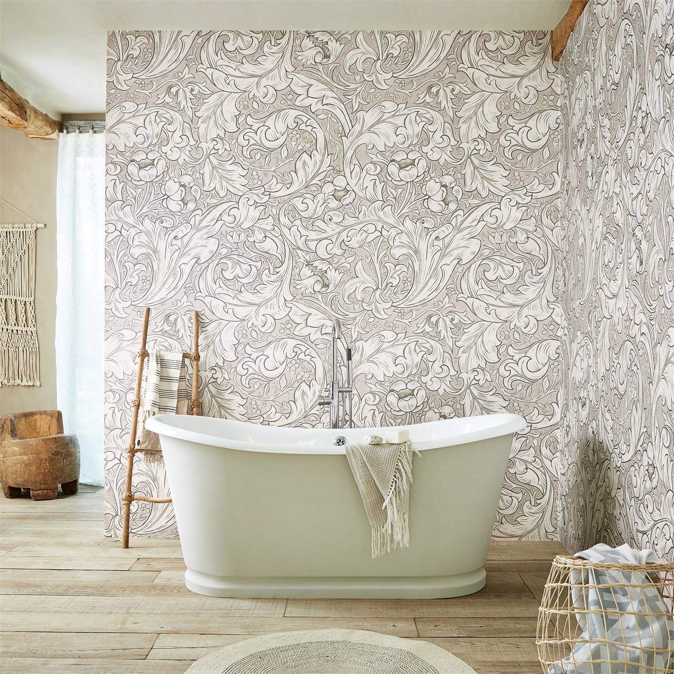
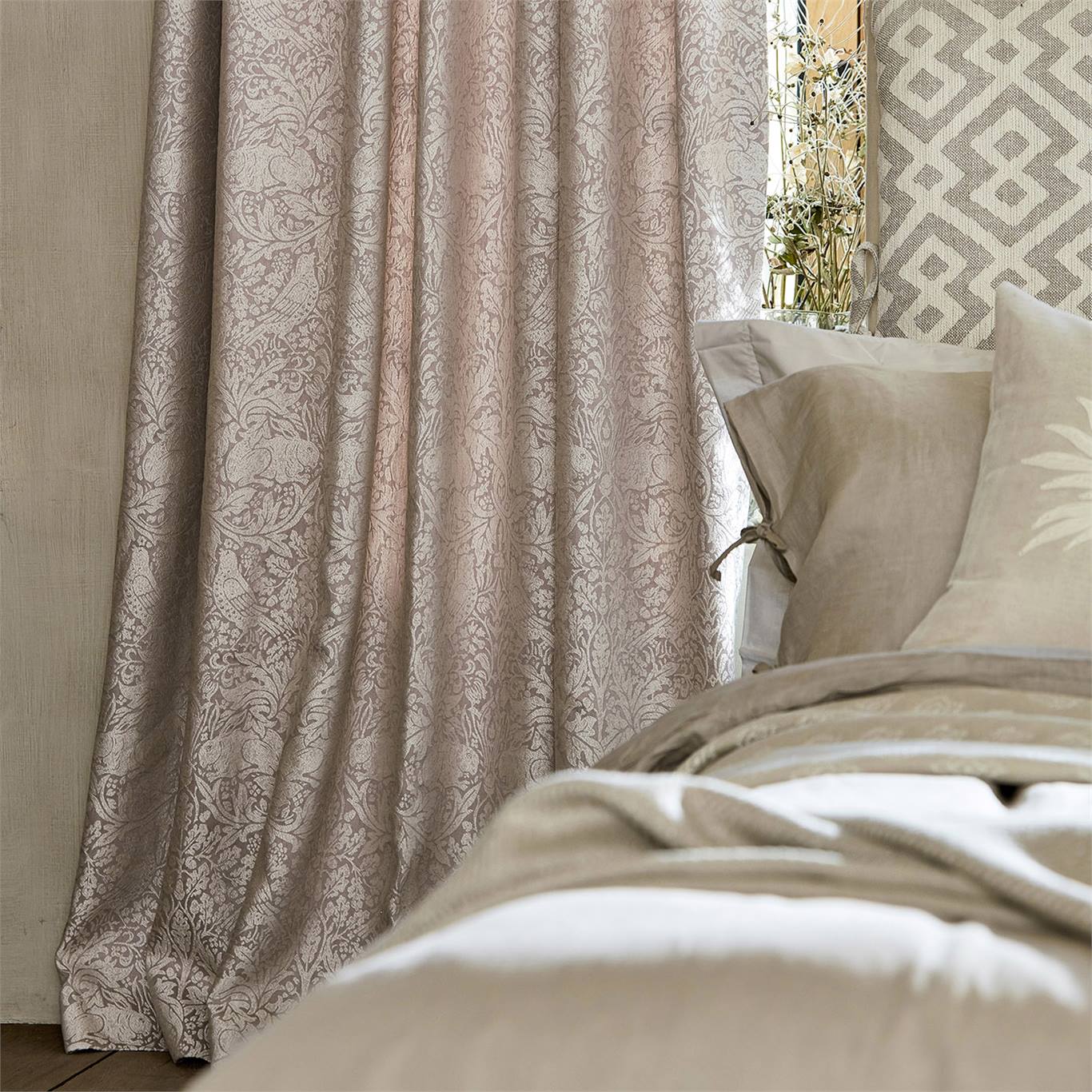
Now we have the Morris Pure North collection, an updated version of Pure, again based on popular archive designs revisited and reworked. This is a beautiful collection of embroideries, prints, weaves and wallpapers, all inspired by the 1871 and 1873 expeditions Morris made to Iceland. He kept journals where he wrote about his wonder and awe at the colours and drama of the landscapes he saw, and how he felt he had ‘come home’. |
 |
|
The colour palette is still neutral, with colours named ‘Linen’ and ‘Cloud Grey’, but there are stronger colours which add depth such as ‘Black Ink’, and the ‘Faded Sea Pink’ is a gorgeous and perfectly on trend update for modern interiors. These fabrics and wallpapers really could be used in any home or setting, and work particularly well when contrasted with rough textures such as sawn wood or exposed brick, and more industrial touches like Crittall windows. So, now we don’t have to choose between traditional and contemporary style! |
 |
|
To find out more about the collection, ore see the entire range of fabrics and wallpapers visit https://www.stylelibrary.com/shop/fabric/pure-morris-north-fabrics/ all images copyright Abaris Holdings Ltd. used with permission. |
Welcome to the design blog, where you'll see posts about anything from the projects we are working on, to the latest fabric and wallpaper collections, and all things interiors related. We love colour, pattern, architecture and old buildings, and we love to share our finds with you.
Happy reading!