
How to choose a builder
 |
|||
|
In July of 2019, I was given a referral by some great clients, who said that their friend might need some help with her home. When I went to meet her, she had clearly been thinking about what she needed and was ready to hit the ground running. She wanted to move her kitchen (which was currently in the smallest room on the ground floor) to the largest room, which was being used as the living room. She has a large extended family who spend a lot of time together, and she wanted the dream kitchen to entertain them all in. She had also just moved back from living abroad, and had come home to find that the house didn’t feel homely, and it just wasn’t working for her or her family. In her words at the time: I decided that I want to make my home somewhere I love - it’s never been the layout I want, or suitable for us as a family, and not really my style - but I didn’t actually know what my style was. Over the years I’d spent thousands buying furniture and furnishings and trying to make it all go, but I just felt stuck and it didn’t feel like a real home. |
|||
|
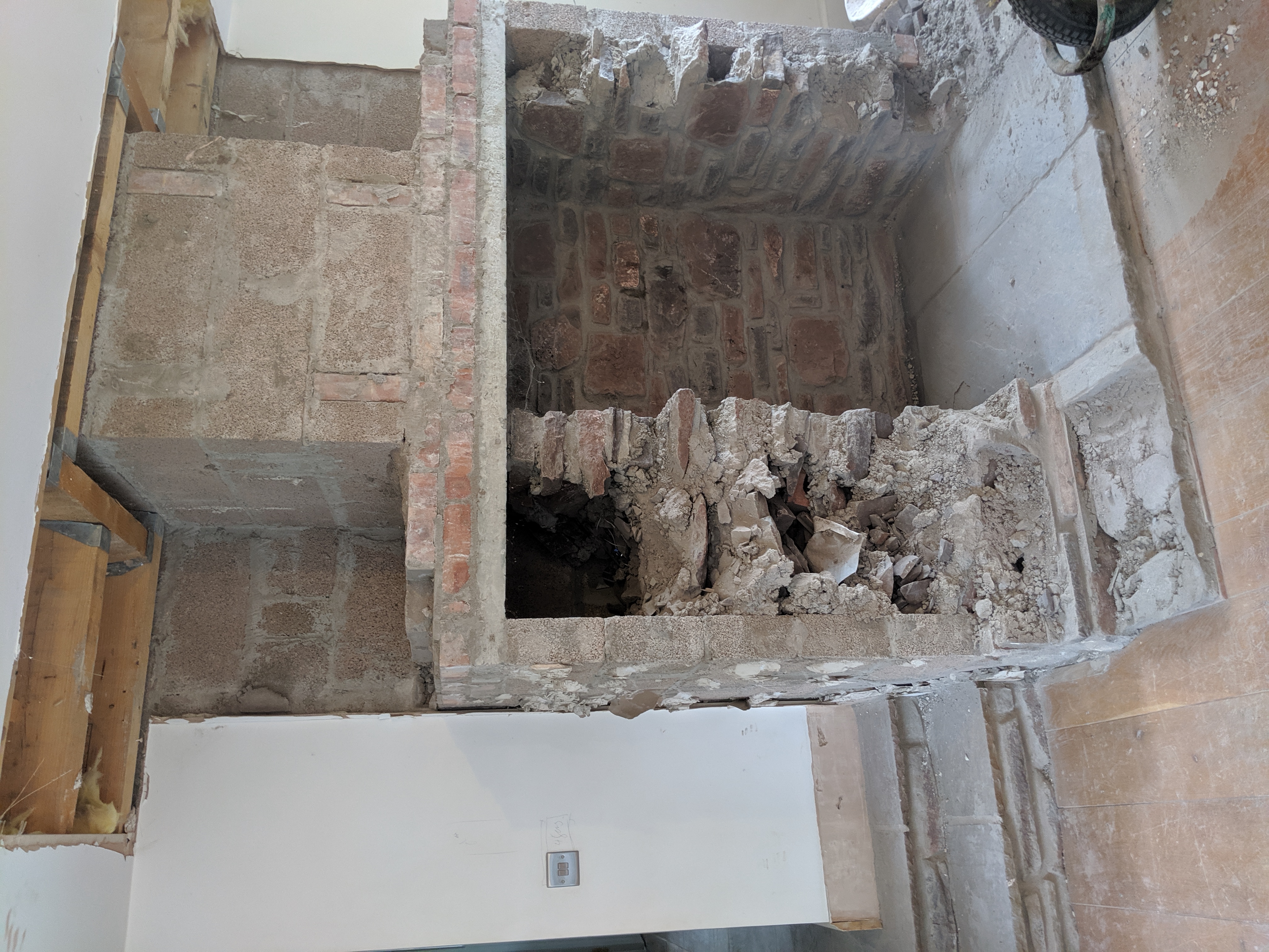
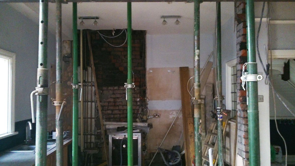
In that first meeting, we came up with a plan for what we would do with the whole ground floor. In the kitchen, the client’s wish list included a large island, an American style fridge freezer, a large cooking range, and somewhere to seat up to 14 people. So no pressure then. I thought moving the kitchen was a great idea, but the only way I could see it working in the available space was if we took out the huge stone chimney breast and fireplace, and I could then design some built in ‘banquette’ style seating in its place. Here’s a pic of how it looked on that first visit, so you can see what I mean: |
|||
 |
|||
|
I think the client thought I’d gone a bit crazy when I suggested this! But she quickly got on board and set about having the chimney taken out safely, whilst I got on with the design. I will say that once she decides to do something, she commits to it wholeheartedly, so things moved quickly. When we spoke about styles for the kitchen, she’d been thinking of one with pale grey shaker style units, with white tiles for the splashback. I felt that the grey would be more of what she already had in the house, and that wasn’t working for her, so I pushed her to look at some other options. She had said that she loved blue when we were going through my design questionnaire, but I noticed that she didn’t have any blue in the house, so I decided that adding some navy would make the house look both smart and classic. I’d need to persuade her to go for it though! We went to look at some kitchens together, and fell in love with crisp white units with a navy island (I did suggest a completely navy kitchen, but that was a step too far). I thought that adding some touches of brass would make the kitchen look more modern, and so the colour palette was set for the house - pale grey, white, navy and brass. Here’s the opposite end of the living room, where the main part of the kitchen would be going: |
|||
 |
|||
|
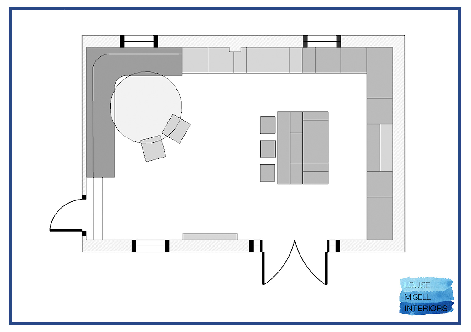
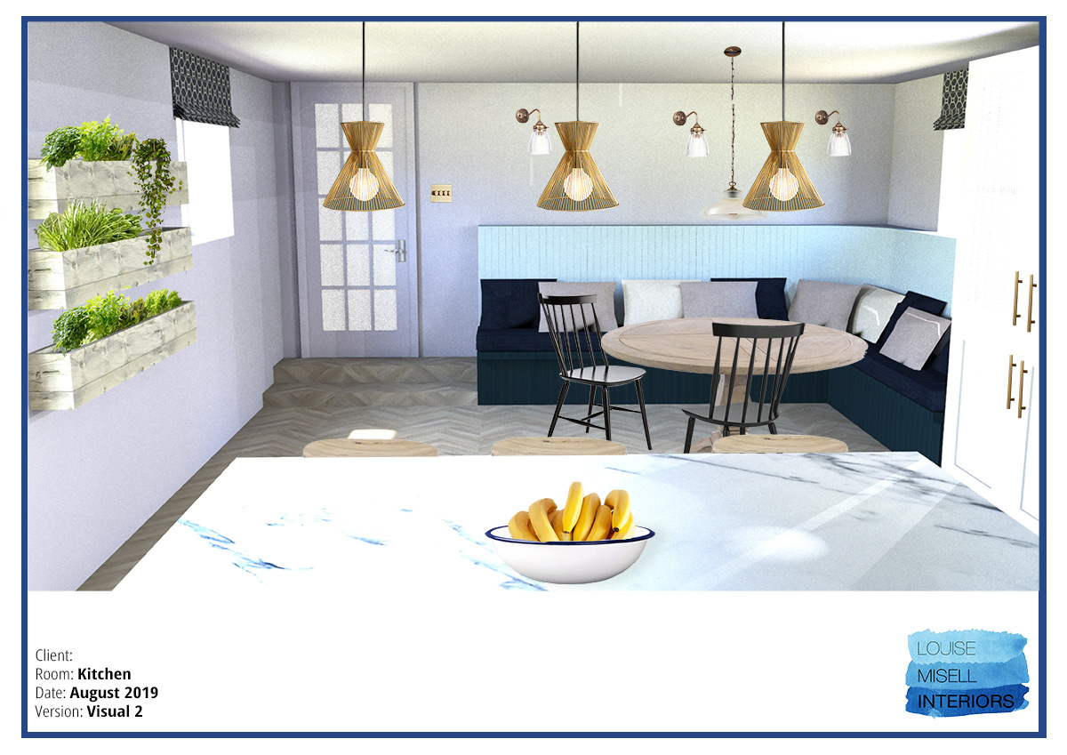
Below is the proposed new layout, with the chimney breast gone, the large area of built in seating in its place, the kitchen units along two walls, and the large island with bar stools. We were originally going to use the client’s existing round dining table to save costs, but we both realised that it wasn’t going to be big enough to seat her large family, so we switched to a long rectangular table instead. |
|||
 |
|||
|
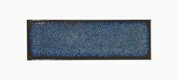
I then designed the built in seating to have storage underneath, accessed from the top, and with tongue and groove seat backs for a classic country look, but updated it with a soft blue paint colour. When it came to choosing the extractor fan, I just couldn’t find one that I liked (there are a lot of ugly extractor fans out there), so I designed one myself. Luckily for me and the client, her dad is a master carpenter and relished every design challenge we threw at him, so I knew that making the extractor would be fine if I sourced the inner workings. The next design challenge was the tile for the splashback. As I mentioned, the client had wanted white tiles, but I felt that white tiles with white units just wouldn’t cut it. I trusted my gut when I found some absolutely stunning navy tiles from Claybrook Studio. Here they are: |
|||
 |
|||
|
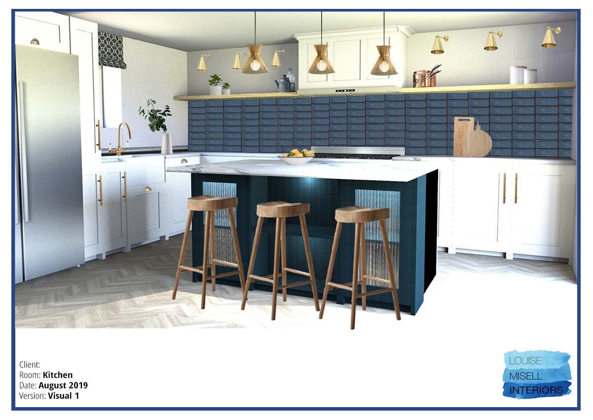
And here is what they look like in my design visualisation: |
|||
 |
|||
|
And here is the design for the opposite end of the room with the built in seating: |
|||
 |
|||
|
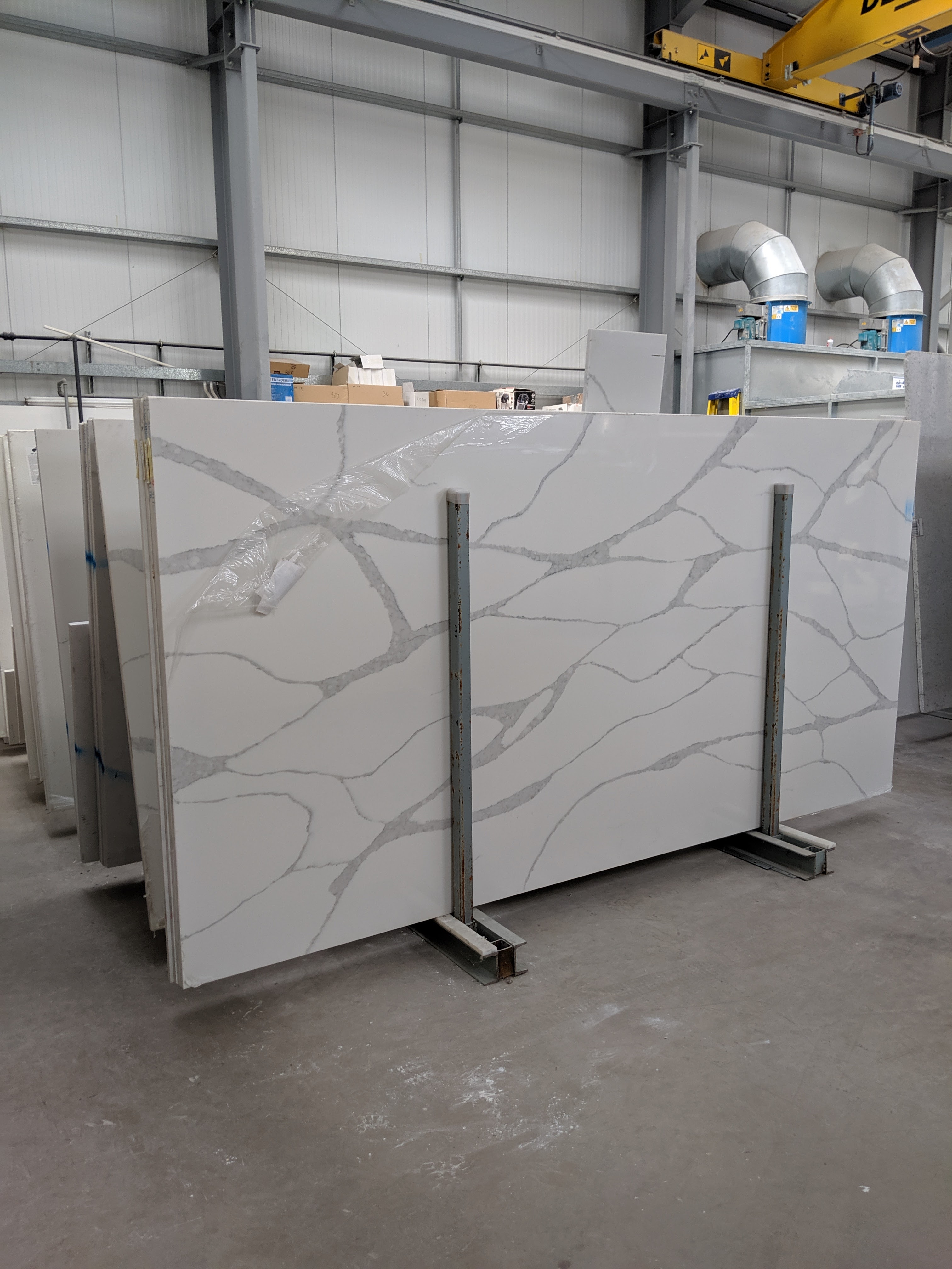
I knew that these tiles were a departure from the brief, but I also knew they were right for the kitchen and the client. I believe it’s a designer’s job to show you things you might not have thought of or seen before, and what’s the worst that could happen? If you don’t like something, it gets changed. When I showed the tiles to the client she said ‘they’re so dark!’ and her face was a picture, but when she looked at the design visuals, she could see the tiles in the context of the whole design, and loved them. The final pieces of the design jigsaw were the marble worktop and the flooring. The client knew she wanted marble, so off we went to the amazing Cardiff Marble to choose a slab. This is such an exciting thing to do - to wander around looking at all these beautiful, unique slabs of stone to choose one which will finish off the kitchen perfectly (even though it wasn’t for my kitchen, I was still ridiculously excited - my job is the best sometimes). Just look at this beauty! |
|||
 |
|||
|
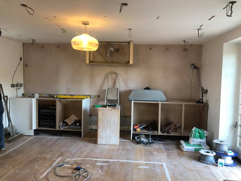
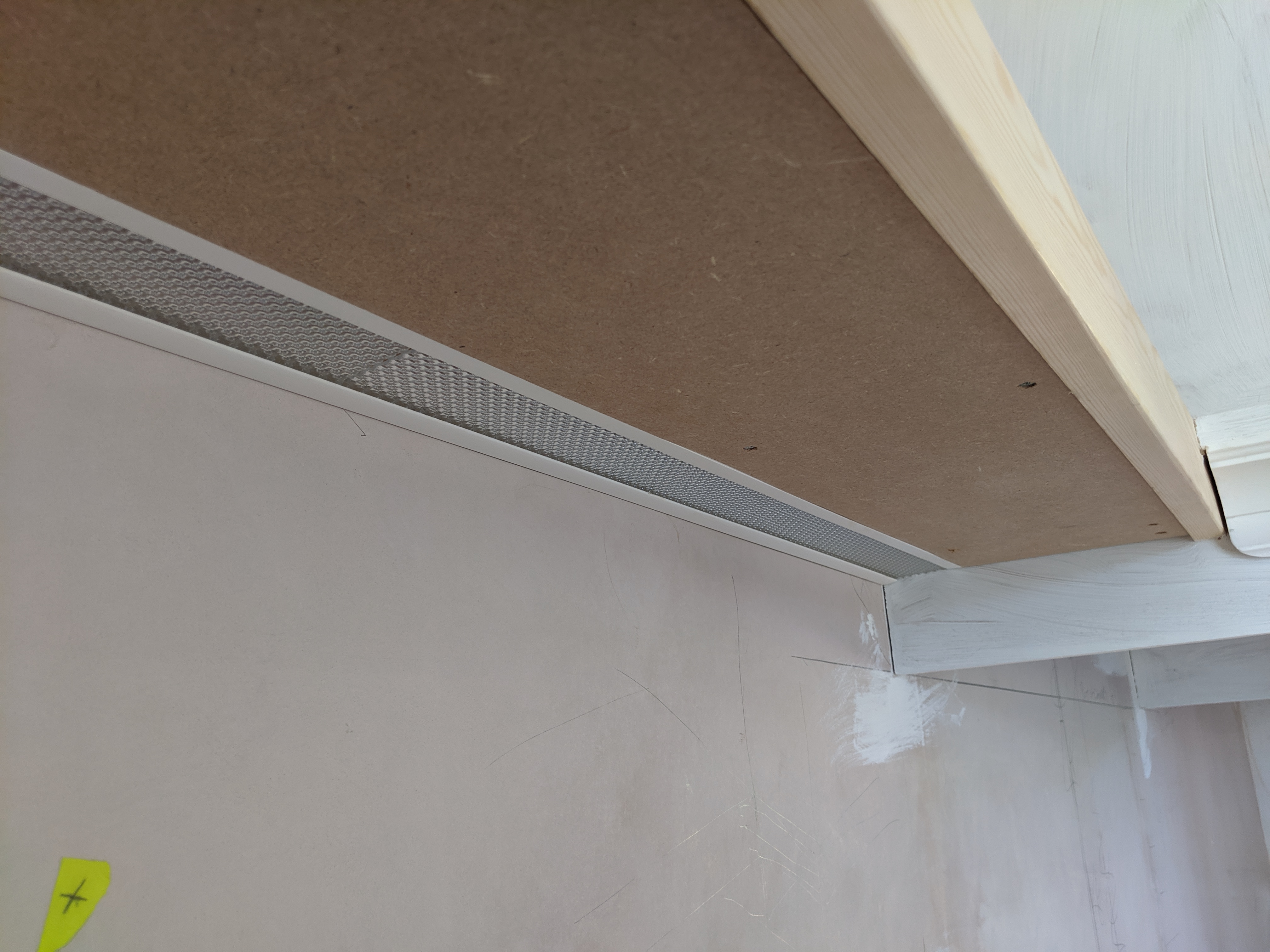
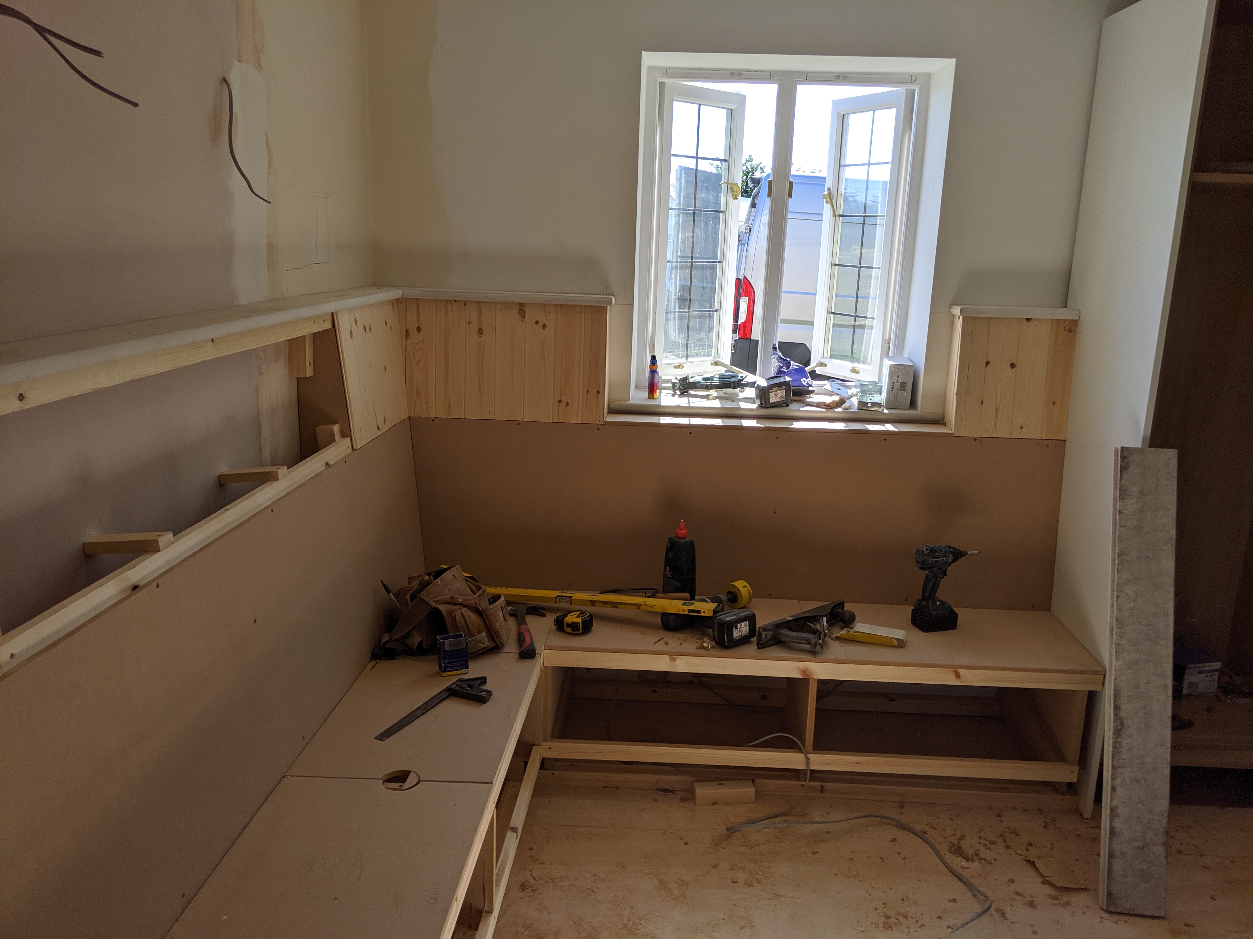
Between us, we decided that flooring laid in a ‘herringbone’ pattern would be the right mix of modern and country style, and that having the same flooring laid throughout the ground floor would add to the sense of flow through the house. We chose a luxury vinyl tile which looks like wood, as it’s waterproof, warm underfoot and won’t mark easily with the dogs and kids in the house. Here are some pictures of the work being done: |
|||
|
|||
|
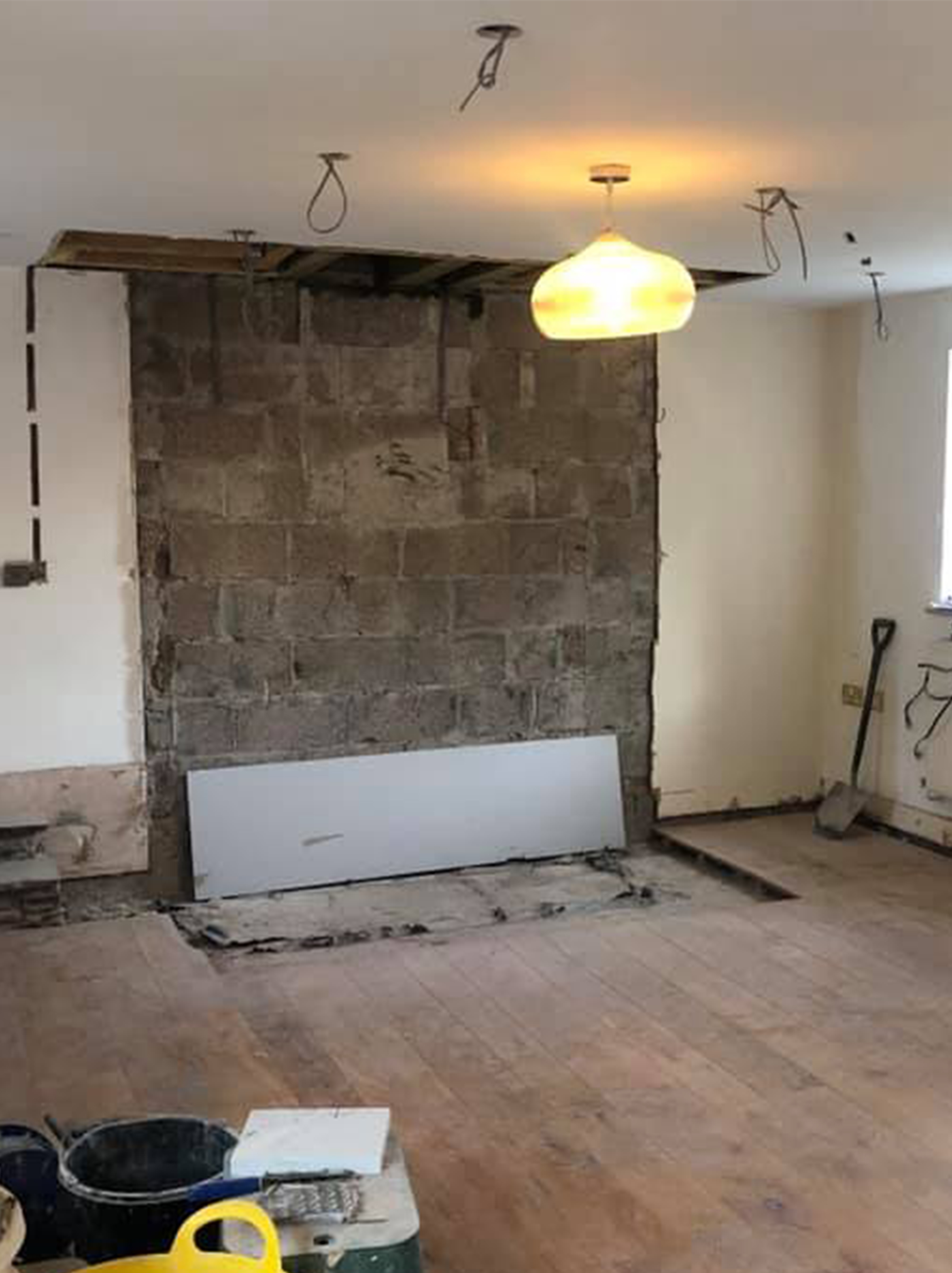
One, two, three and the chimney is gone! (it wasn't that easy in real life) |
|||
 |
|||
|
the extractor hood I designed being built |
|||
 |
|||
|
The extractor hood finished but not painted |
|||
 |
|||
|
The LED lighting we installed under the shelving, to highlight the navy tiles |
|||
 |
|||
|
Here's the built in seating going in, and you can see where the handles for the lift up storage are in the seating |
|||
|
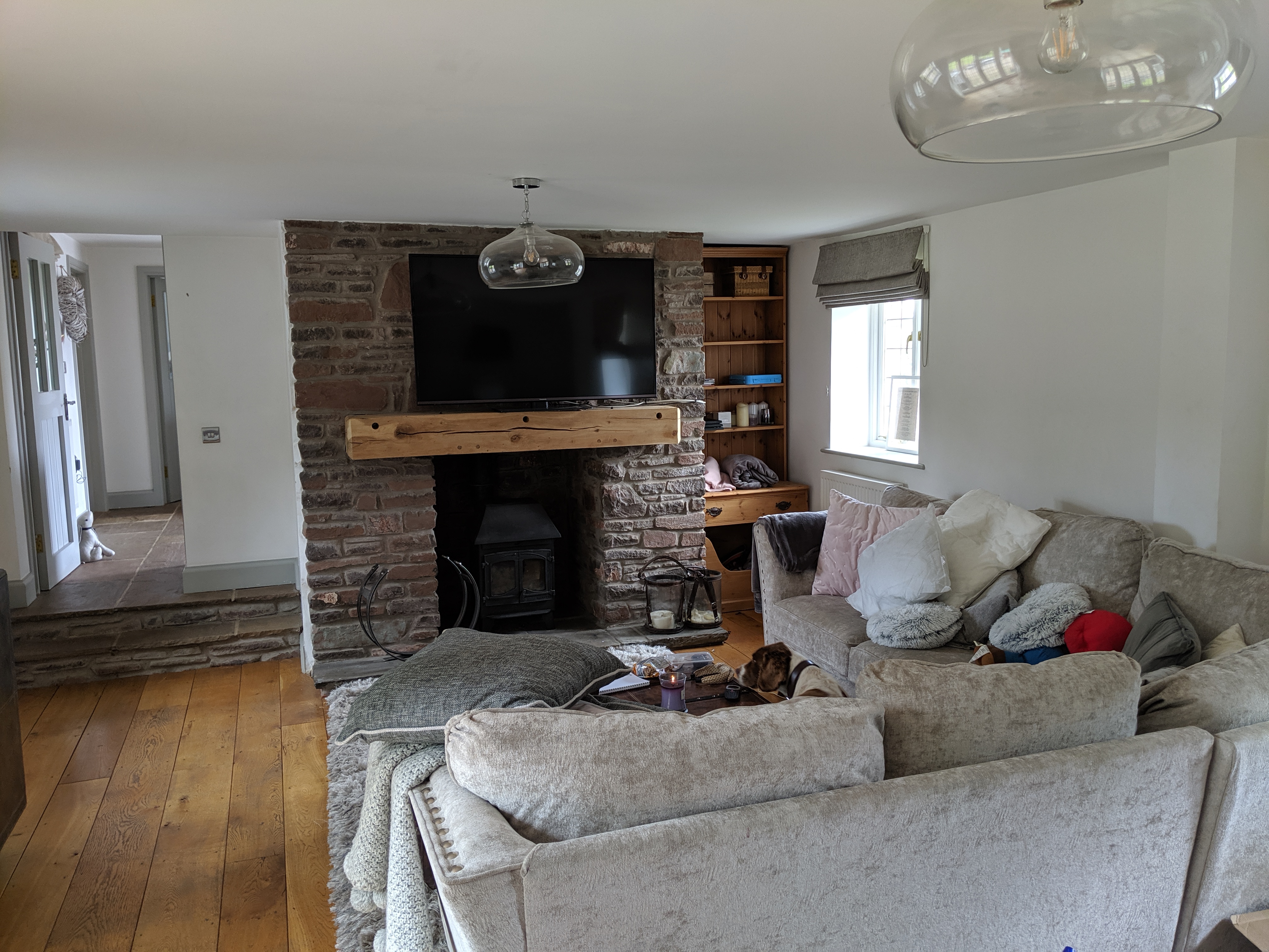
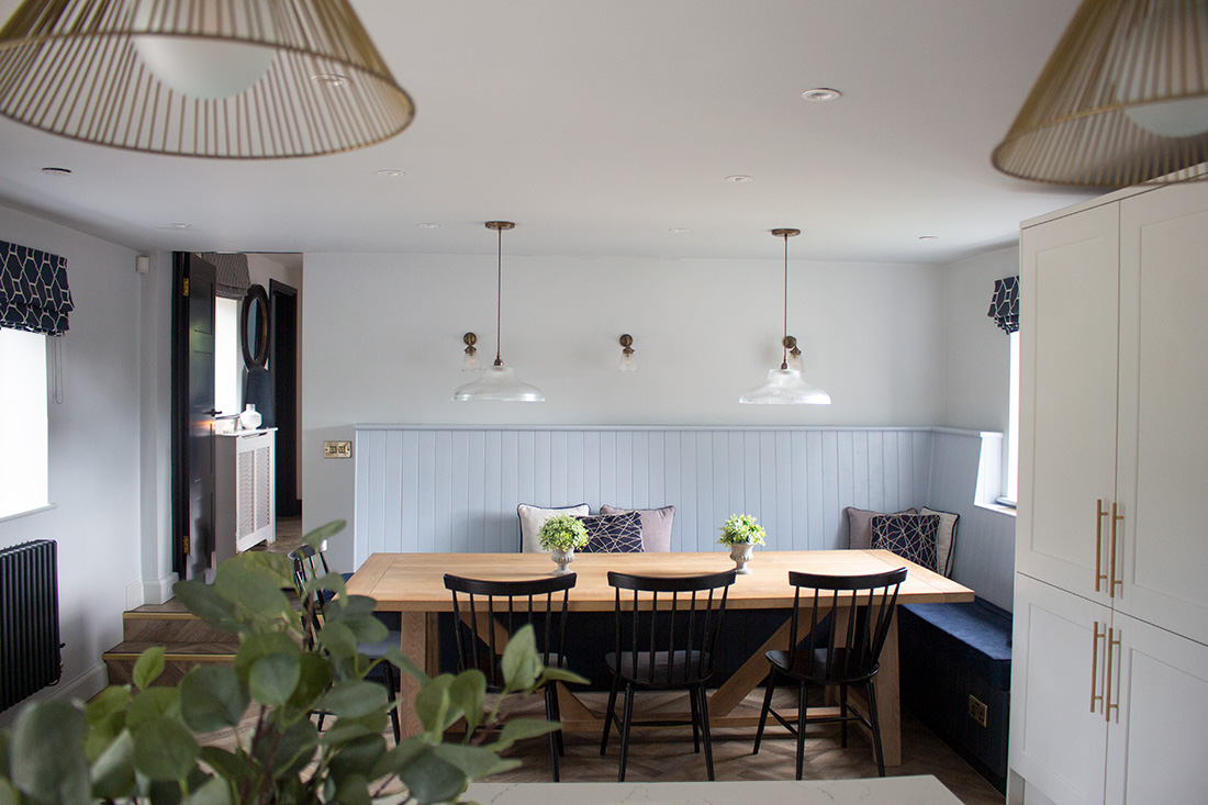
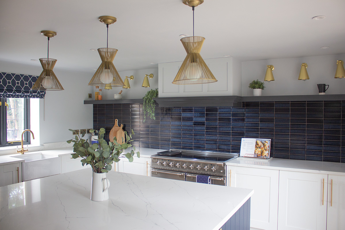
Here are a couple of pics of the finished kitchen: |
|||
 |
|||
 |
|||
|
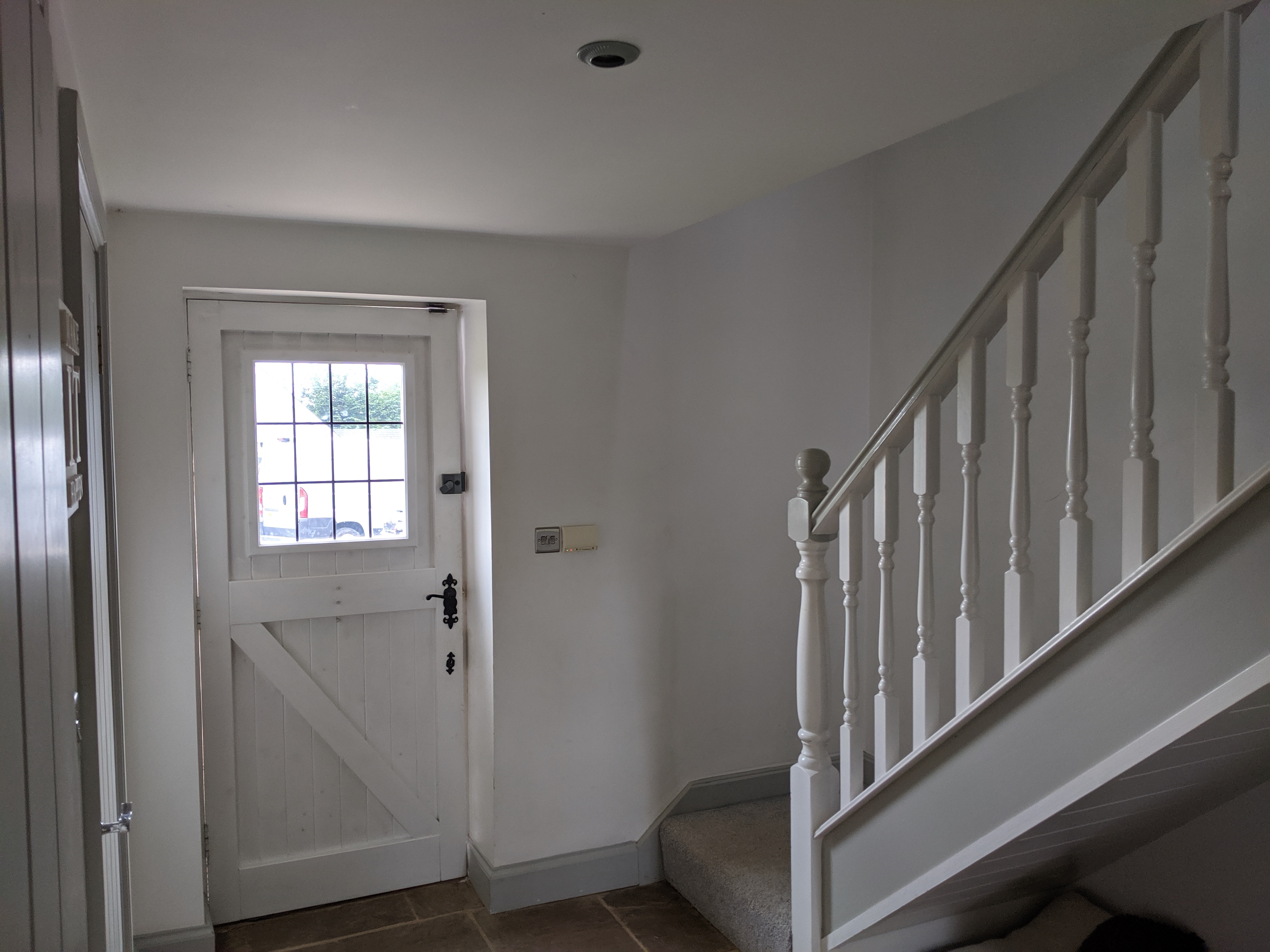
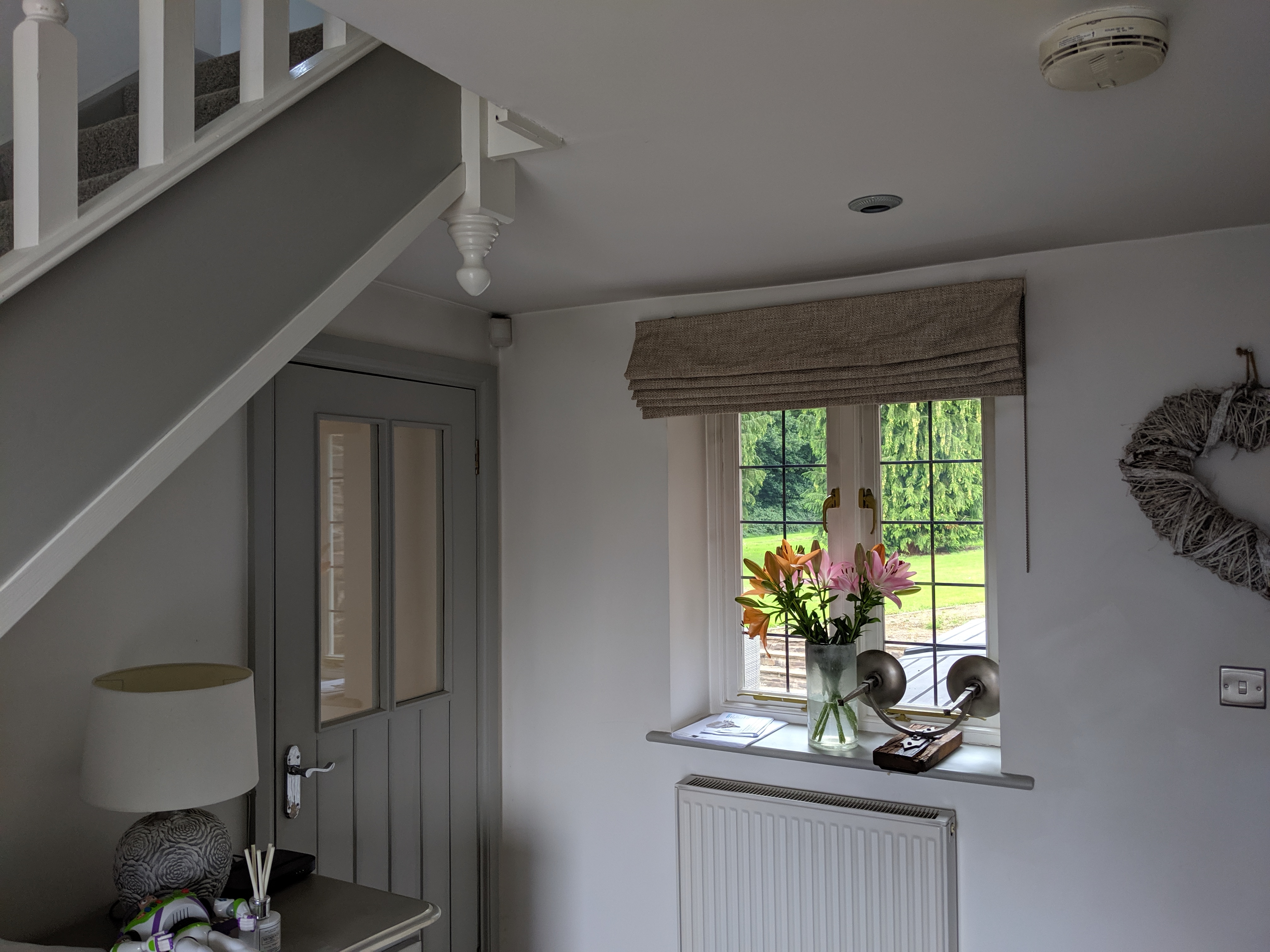
The next room to tackle was the hallway. We already had the colour scheme from the kitchen, but the space needed more storage and some seating. Here’s what it looked like before we started work: |
|||
 |
|||
 |
|||
|
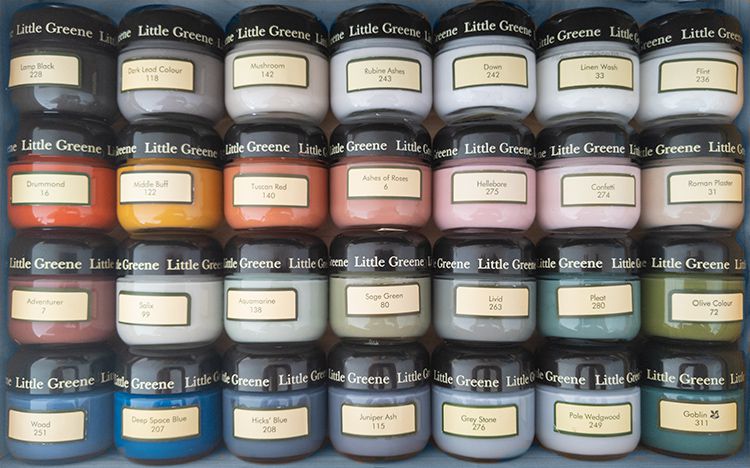
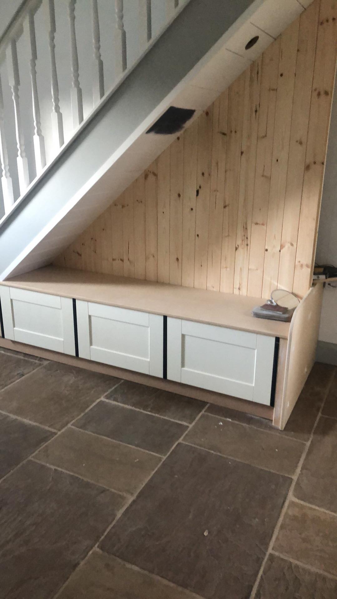
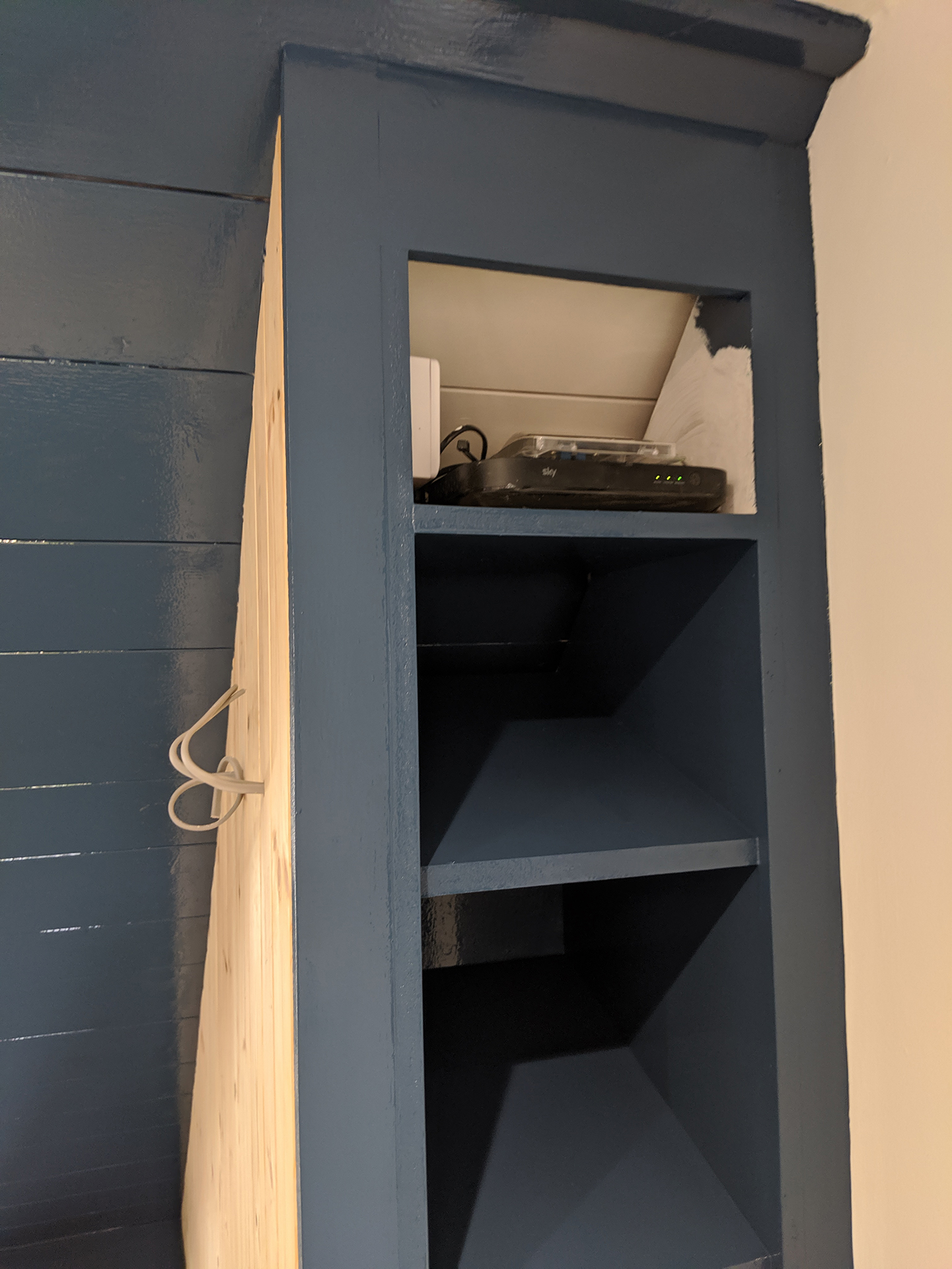
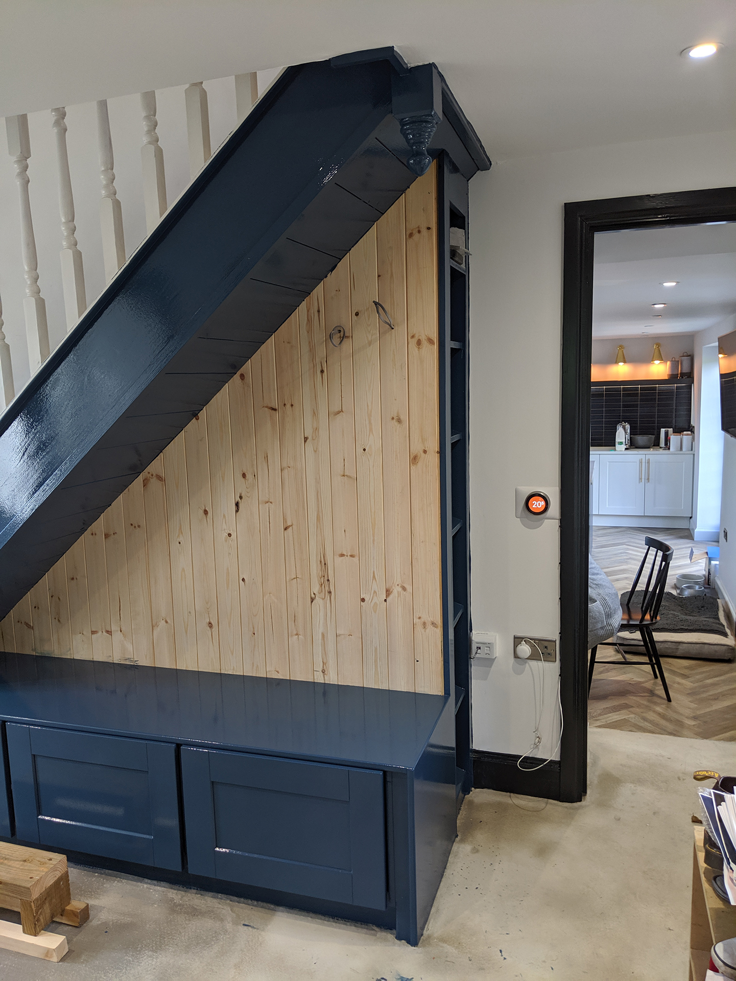
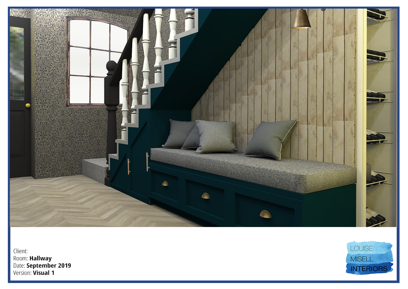
I designed some built in seating with storage underneath to make the most of the unused space under the stairs. When I was designing the seating area, I realised that if the seating was the full depth of the staircase, it would be too deep to sit on, and would be like climbing up onto a big mattress. So I had a think and decided to add a wine rack behind the seating, with a false wall in between to separate them. A bonus wine rack is always a good idea in my book! I also used the false wall to hide the cabling for a lovely brass light here, as it can often be dark in that area under the stairs in the evenings. It was at this point that I decided that the trims - the skirting boards, architraves and doors should be painted black. Again, the client thought that I’d gone mad - but she had said that she wasn’t happy with the internal doors and wanted to change them. I thought they looked too traditionally country cottage/rustic in style, and the whole space would benefit from a more classic look. So I chose some new doors from Howdens, and showed my client pictures of very classy looking entrance halls with black doors. After she’d calmed down, she got on board and we went for it, and painted the window frames black too - it's actually an off black from Little Greene called Lamp Black. I originally chose a beautiful William Morris wallpaper from the Pure collection (called Pure Acorn in Charcoal/Gilver) for the hallway, but the client was worried it might be too dark. Here’s the original design with that wallpaper in it: |
|||
 |
|||
|
I thought the William Morris wallpaper was another perfect mix of country and modern styling, and you know that I love a dark interior, but as I said, if the client really doesn’t like something, we change it. I did another search, and opted for a Zoffany wallpaper instead, called Ashlar Tile, in a pale blue/silver. As before, the client’s dad did all the building work, so he got on with building the seating etc to my design, and changing the doors and handles. Here are some pics of the work in progress: |
|||
|
|||
|
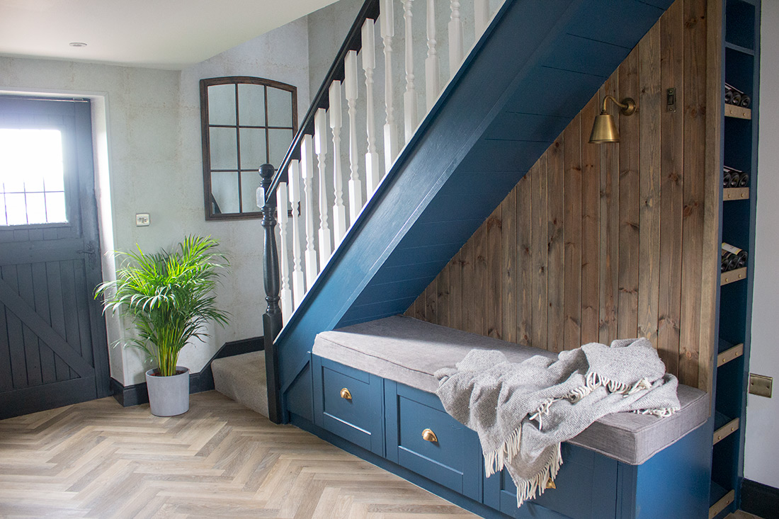
Here’s the finished hallway - I’m pretty pleased with it: |
|||
 |
|||
|
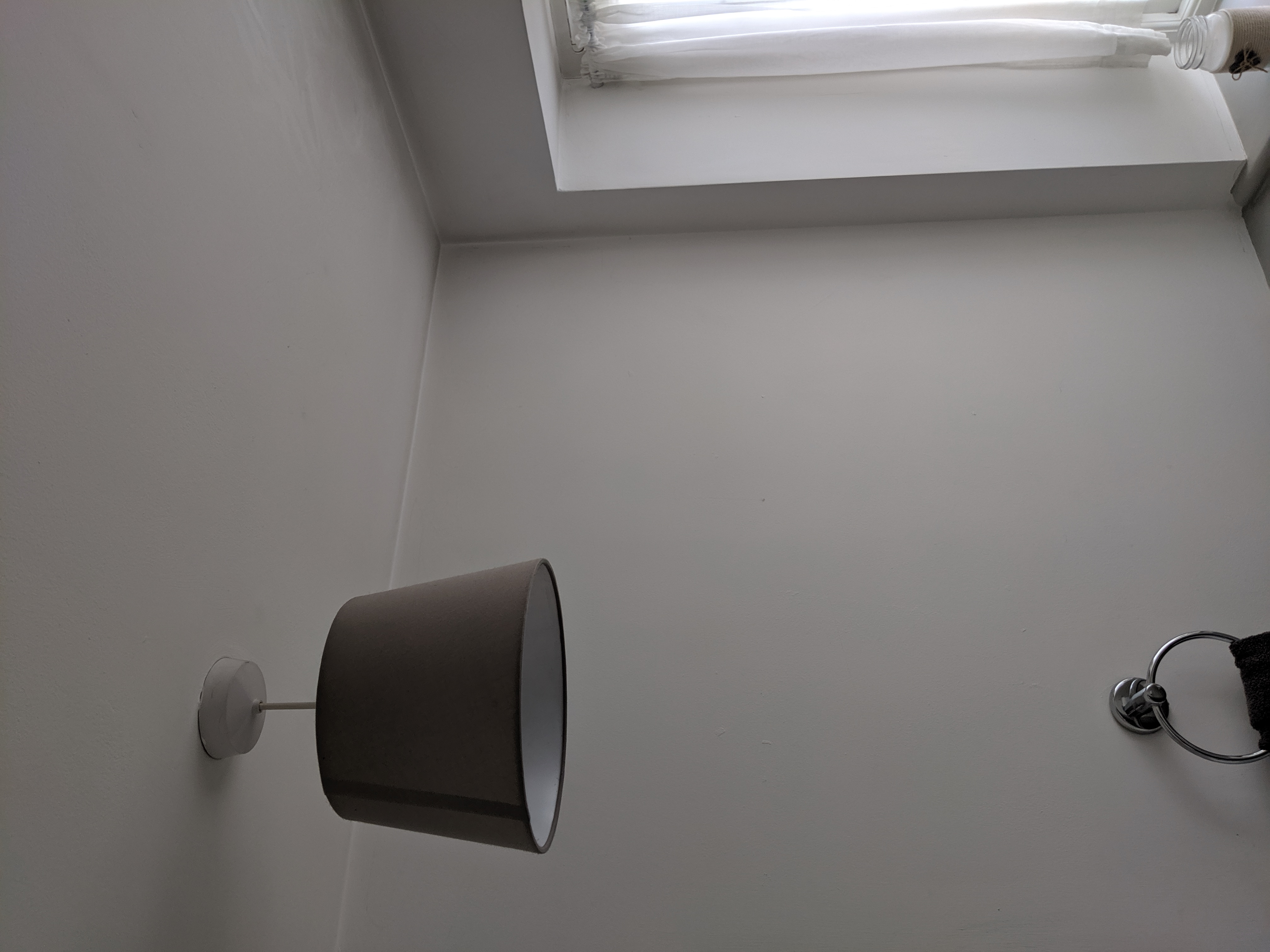
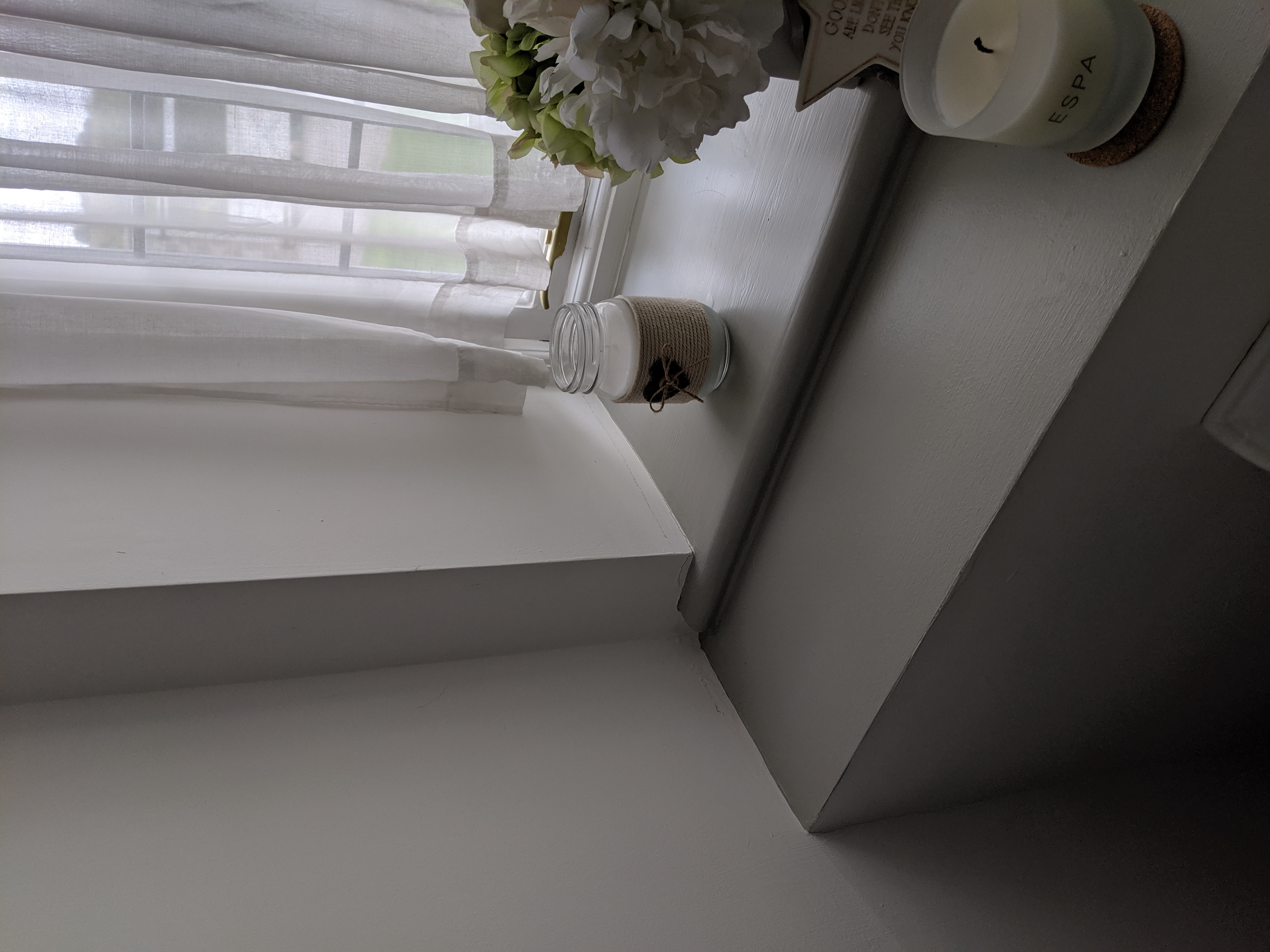
On to the next room - the downstairs loo. Now these rooms are usually small, and you don’t spend a lot of time in them, but that doesn’t mean that you shouldn’t give them some attention. Here’s the loo before: |
|||
|
|||
|
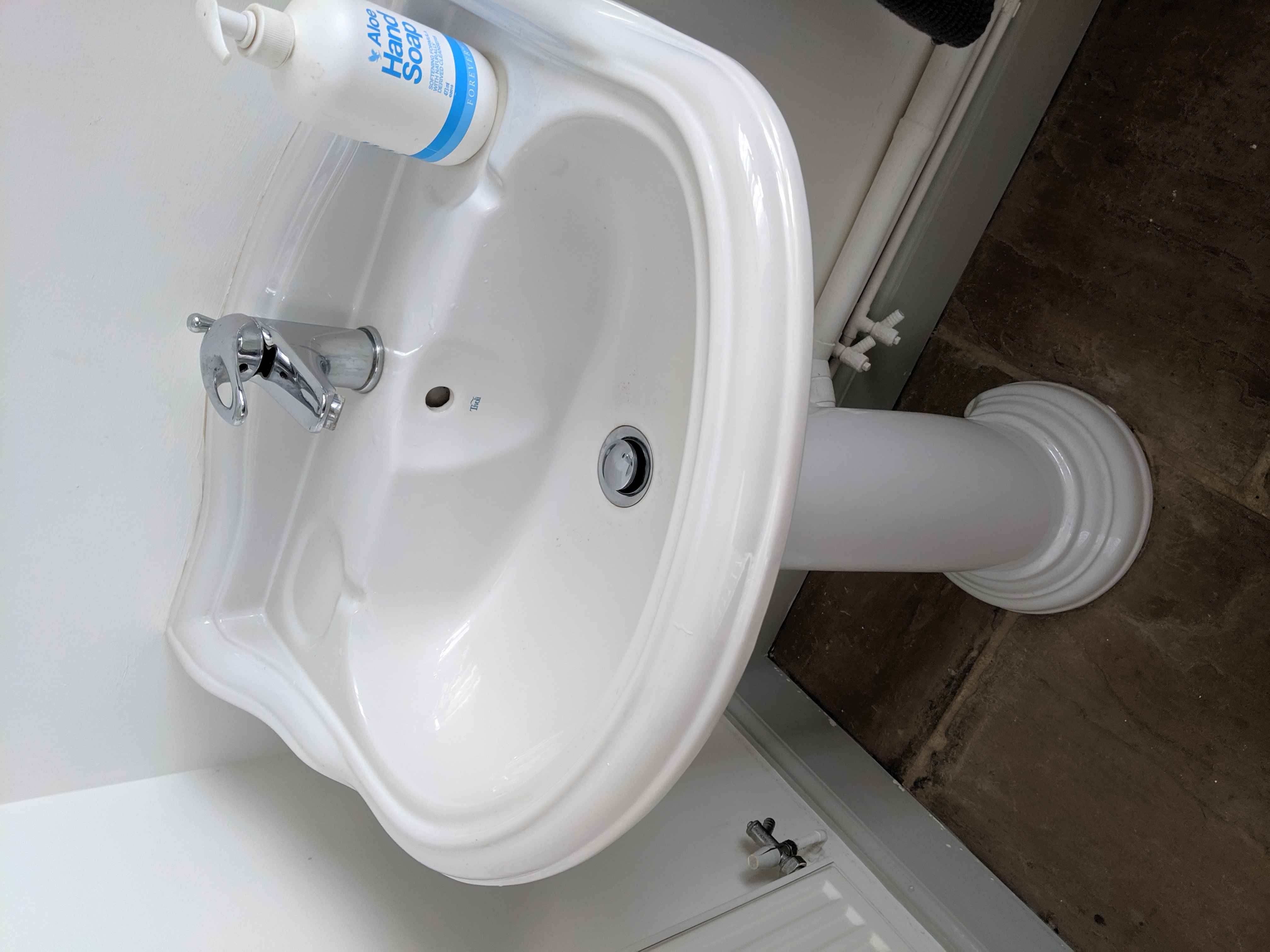
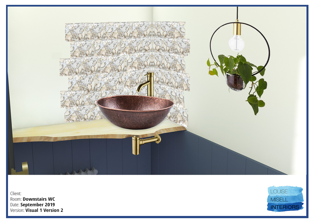
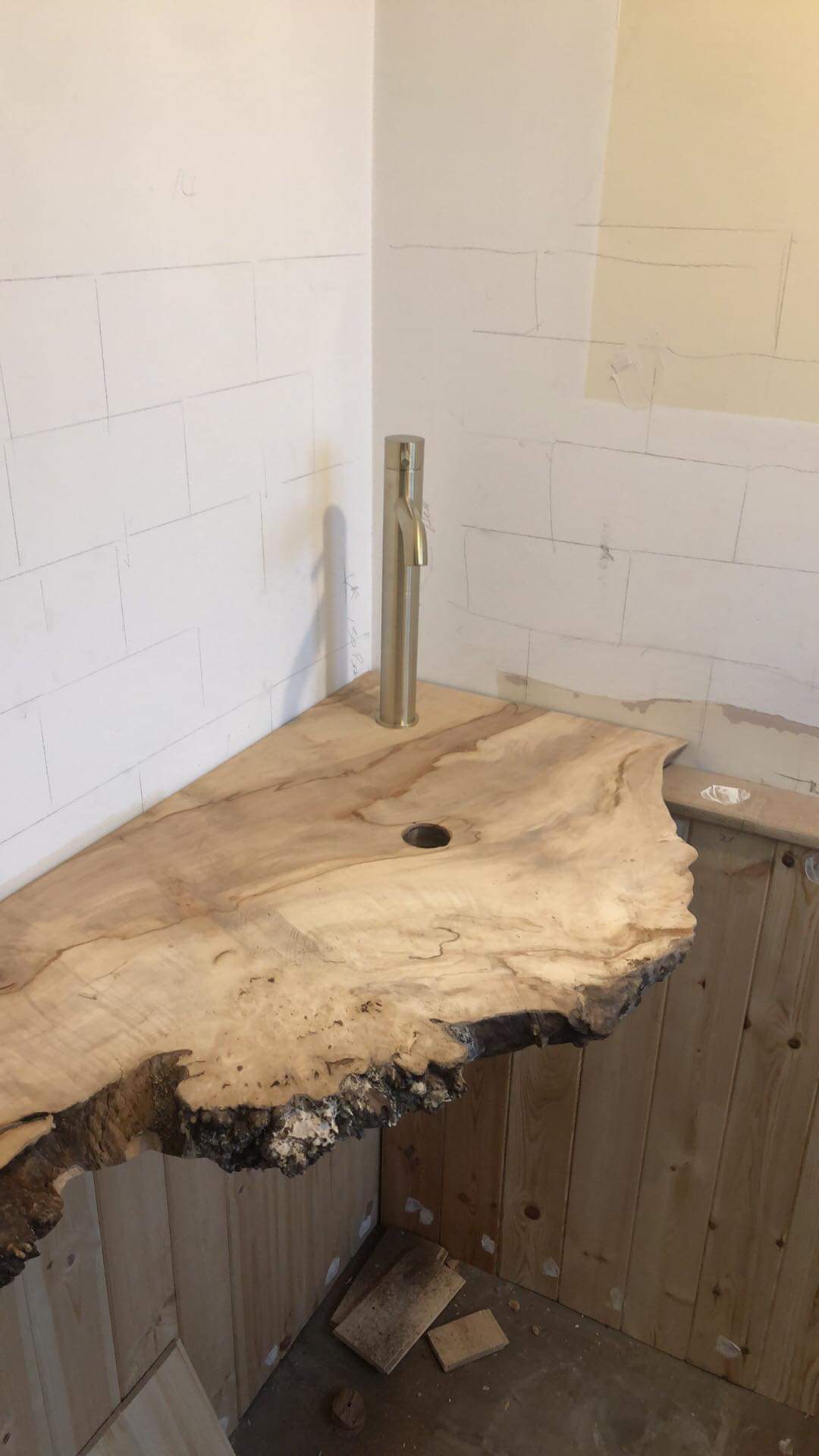
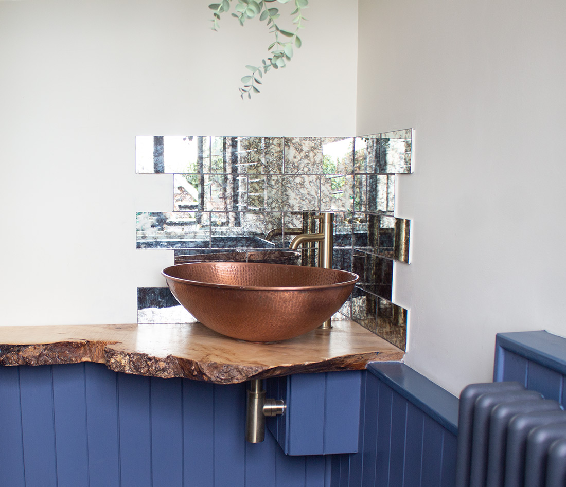
The loo itself was on a false wall to hide the plumbing, which makes sense, but then the loo and cistern were placed in front of it, making the room even smaller. The sink was too large for the space, and I didn’t think it was in the best place for using it easily. The lighting was a little bit dismal too, with a grey shade which cast an unnatural light around the room. So another design plan was needed. I thought we could be a bit braver here because it’s not a room that would be seen all the time. I decided to echo the tongue and groove panelling from the kitchen into this room, but to paint it in a dark blue to tie it in with the hallway. I also chose a funky blue tile for the floor which the client loved immediately (phew). I wanted to have a counter top basin on a shelf to save space, and whilst I was discussing this with the client she suggested a ‘living edge’ piece of wood, which would really be a fantastic take on the rustic look. We managed to find a seller online with lots of wood pieces sawn in this style, and so we measured and sent off the measurements to have it cut to size. I designed the tongue and groove panelling to hide the cistern for the new loo, so that we could have a ‘back to the wall’ loo to save even more space. The hammered copper sink and foxed mirror tiles I chose add more visual interest to this room, with the brass tap and waste picking up on the brass items in the other rooms. Finally, I chose a new graphite radiator and some new lighting, in the form of a light with a hanging plant to soften everything. Here’s the design of the loo: |
|||
 |
|||
|
And here’s that beautiful piece of wood in place: |
|||
 |
|||
|
Here’s the finished room: |
|||
 |
|||
|
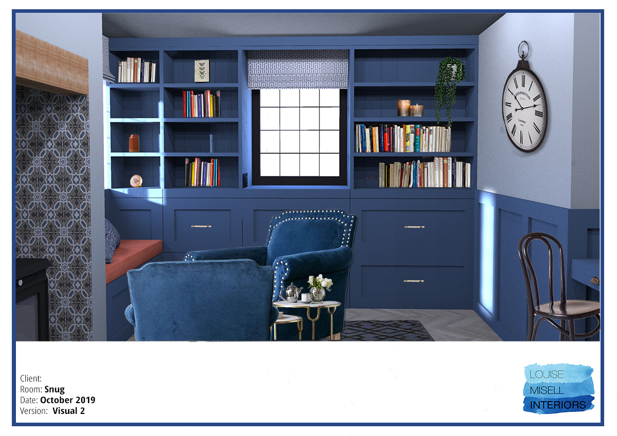
The last two rooms on the ground floor are the new study/snug (which was the old kitchen) and the living room. These rooms aren’t quite finished yet, so will have to be in another blog post later on. For now I can show you the before pics, and the designs for them, with the bespoke desk, shelving and window seating in the study, and a different style of dark blue panelling in the living room (are you spotting a theme here?) |
|||
|
Here's the snug as it was - the old kitchen (much smaller than the new one) |
|||
 |
|||
|
Here's the design for the snug with the built in desk, shelving and window seats |
|||
 |
|||
|
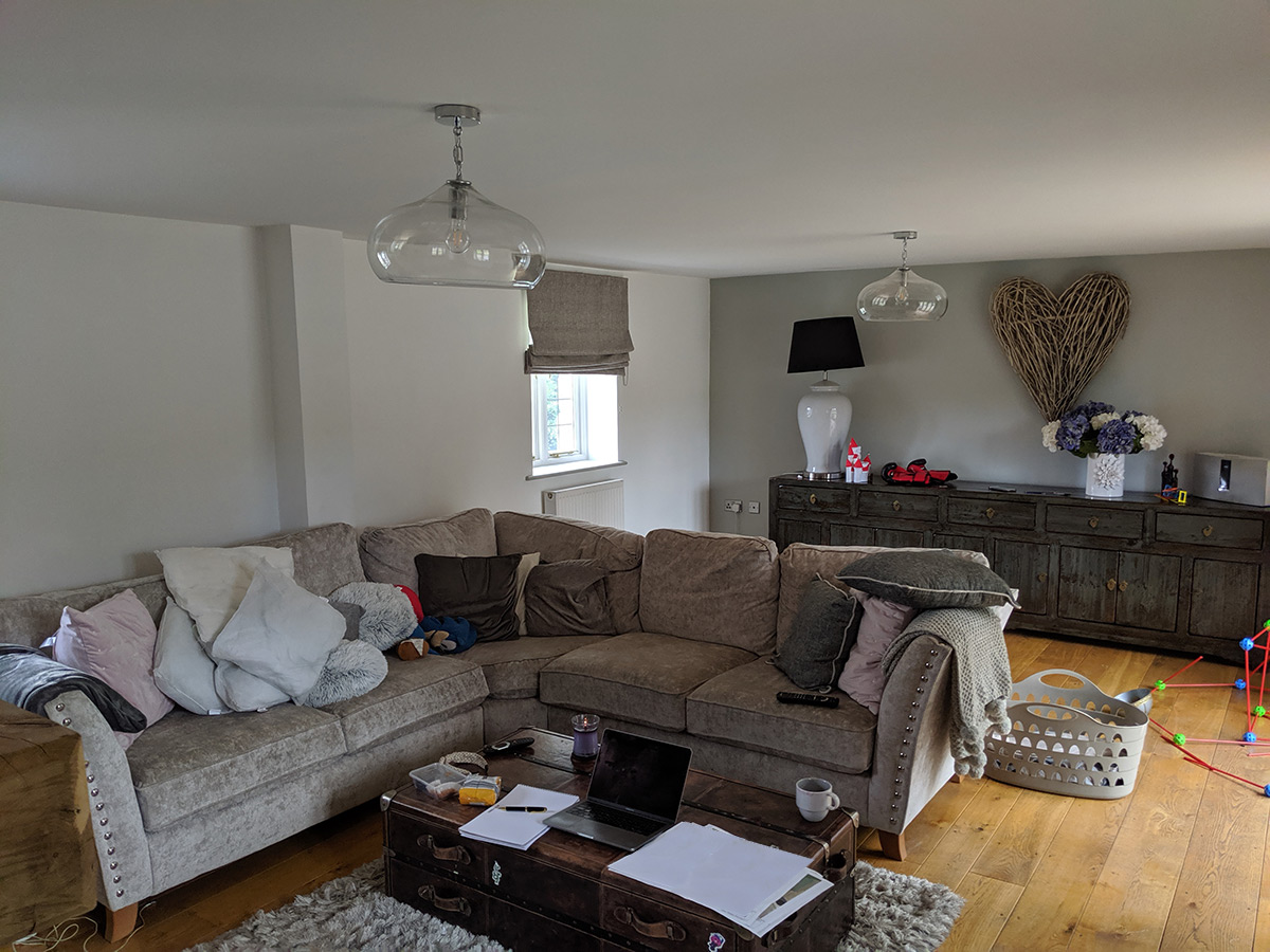
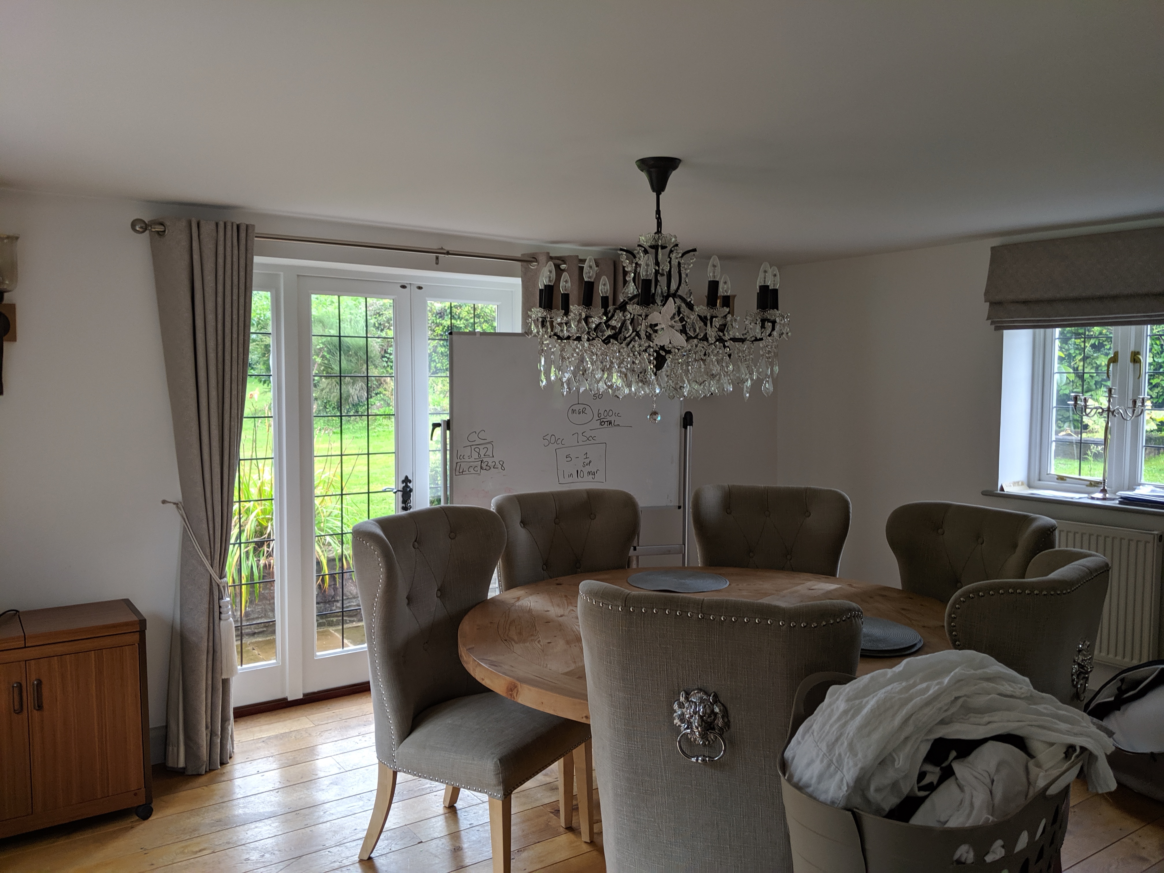
Here's what is now the living room, which was the old dining room (are you keeping up?) |
|||
 |
|||
|
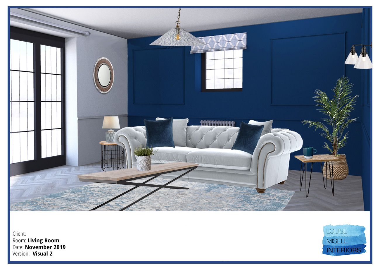
And here's the design for the living room |
|||
 |
|||
|
You might have noticed that it’s been a long time between designing these rooms and actually getting pictures of them finished, and you’d be right. A little thing called lockdown interrupted things for a while, but I did manage to get the photos in the end. The project will be on my website soon, so you’ll be able to see more of it there. Next, I’m designing a new bedroom for the client’s son, so watch this space for an update (I think it might involve more blue…) |
Welcome to the design blog, where you'll see posts about anything from the projects we are working on, to the latest fabric and wallpaper collections, and all things interiors related. We love colour, pattern, architecture and old buildings, and we love to share our finds with you.
Happy reading!