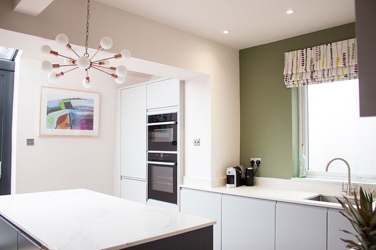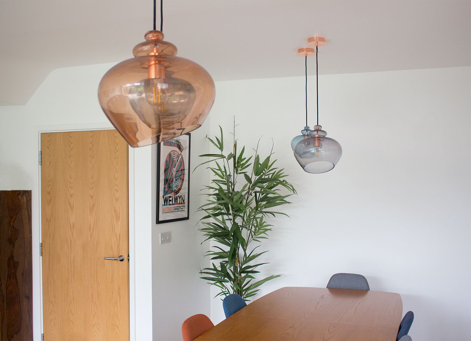
Work in Progress - The Law Centre
 |
|||
|
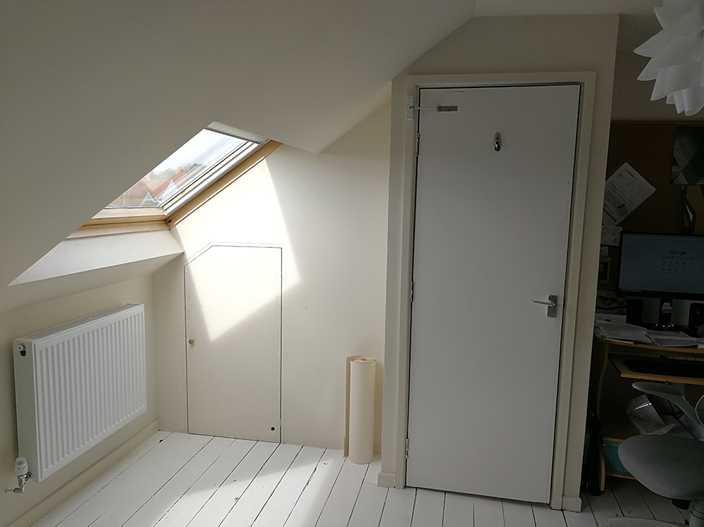
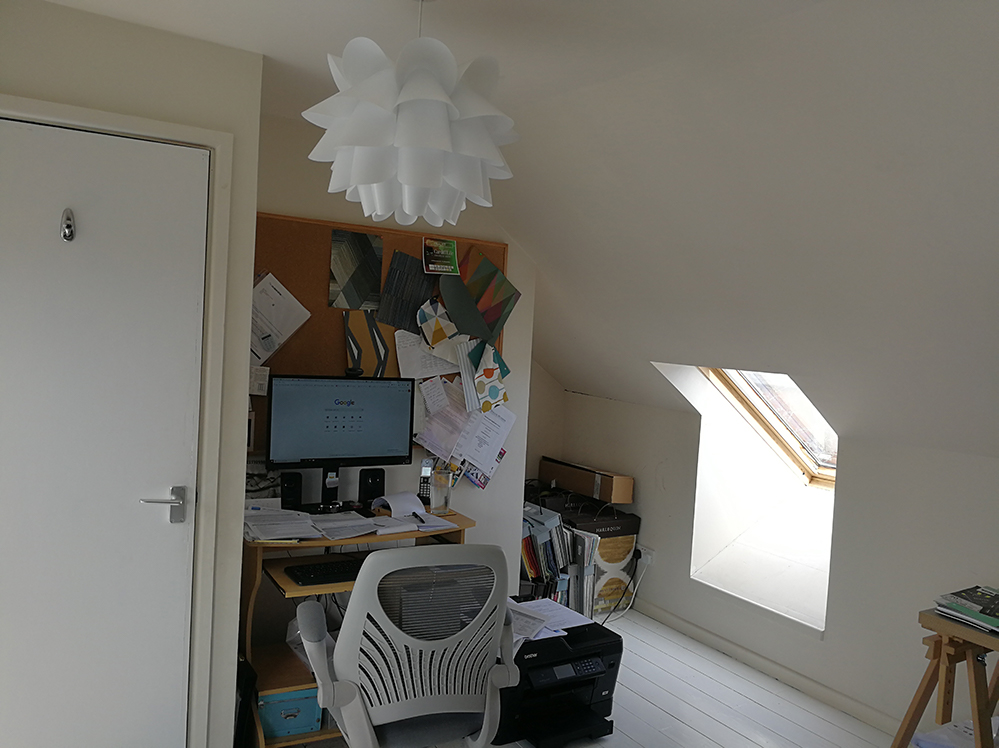
I’d thought I’d share a project of my own which I’ve been working on during lockdown - my office. I started running my business from this room as it’s the converted loft at the top of the house (so it’s nice and quiet). The only problem was that it hadn’t been decorated since we moved in and was a very boring shade of beige. And I was working on an old computer trolley type thing which was too small and was falling apart. It was definitely time for a change - have a look for yourself: |
|||
 |
|||
 |
|||
|
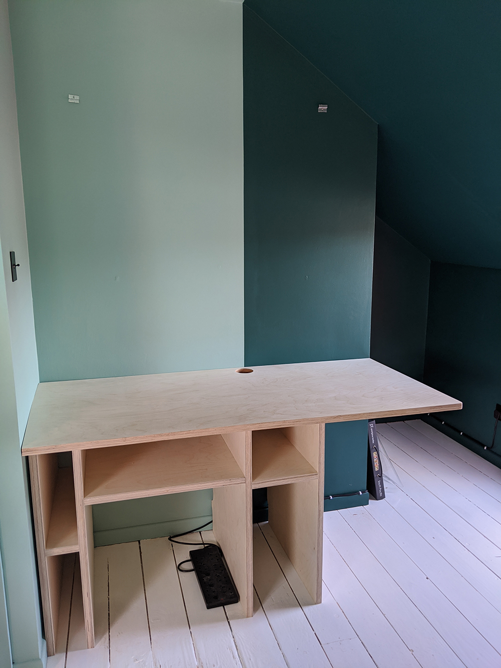
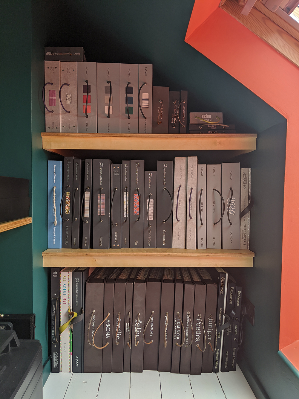
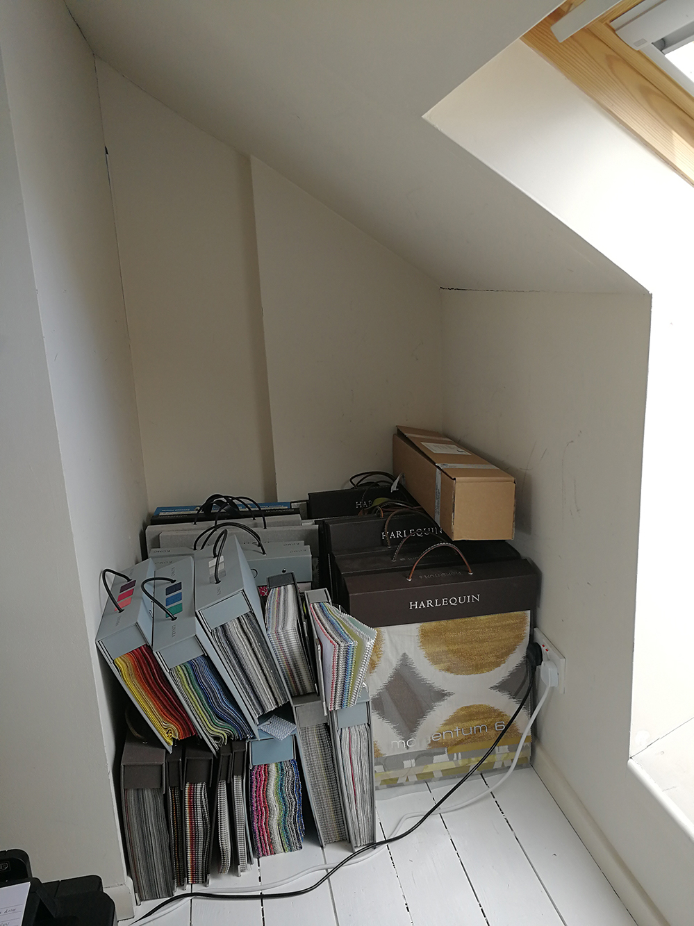
After around a year or so of working in this room, I started to have problems with my neck because the desk was too low, and the keyboard was on one of those pull out tray things beneath the desk, which was even lower. So, I decided to design a new built in desk, and also some extra storage as I was rapidly running out of space. Another issue was that all my fabric and wallpaper books were stacked up on the floor, and it was a huge effort to pull any out to source anything for a design. |
|||
 |
|||
|
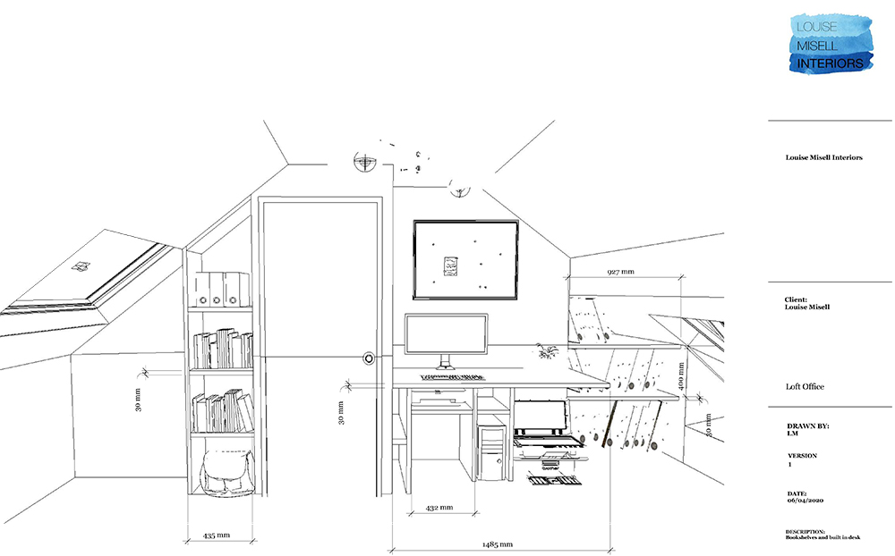
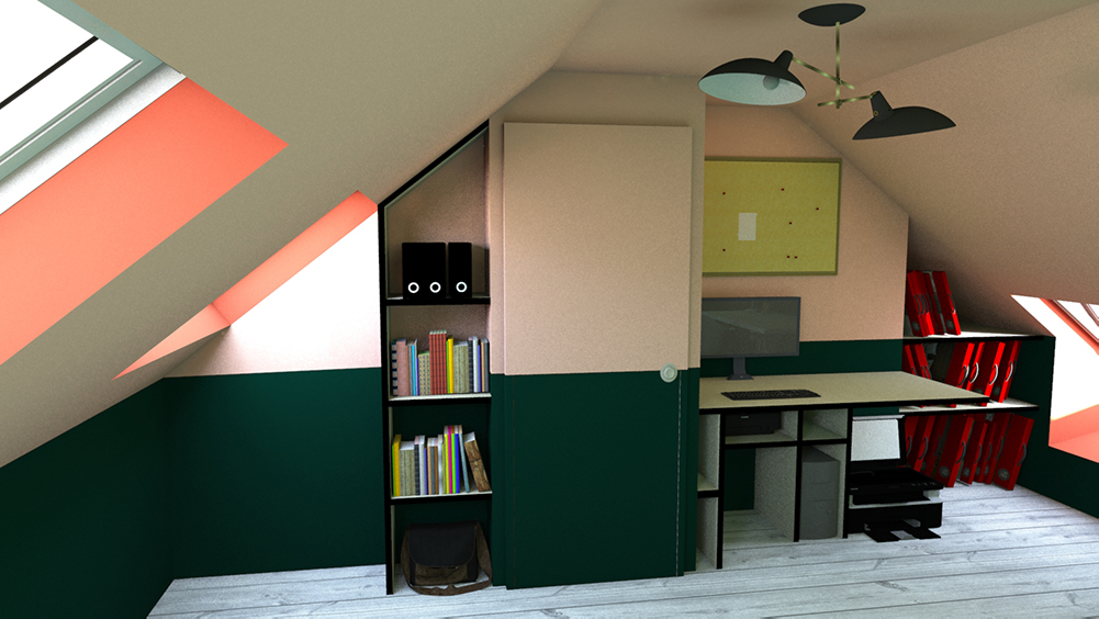
I decided to have the desk and storage made from plywood, as I like the slightly industrial way it looks, and also the contrast against a brightly painted wall. That part was the easy decision to make - I used my computer software to make a model of the room and design the built in parts within it. Here’s the line drawing of the desk and shelving: |
|||
 |
|||
|
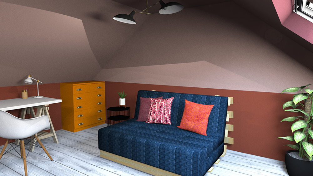
Next, I had to choose a colour scheme for the room. As I’m an interior designer, this should have been the easy part, right? Wrong. I know that I like a wide range of colours and am aware of all the different styles it could have been, making the choice harder. When I’m designing for a client, I work from their ideas, personality and style to come up with something which works for them. But when I’m the client, I can be soooo picky. Because I felt the world was my oyster, it was much harder to choose. I also know that I wanted to ‘colour block’ the room in some way, but as a loft room has so many angles and it could be divided up in lots of ways, and I needed to choose just one. I actually went through five colour schemes before I settled on one! Here are a couple of the rejected ones: |
|||
 |
|||
 |
|||
 |
|||
|
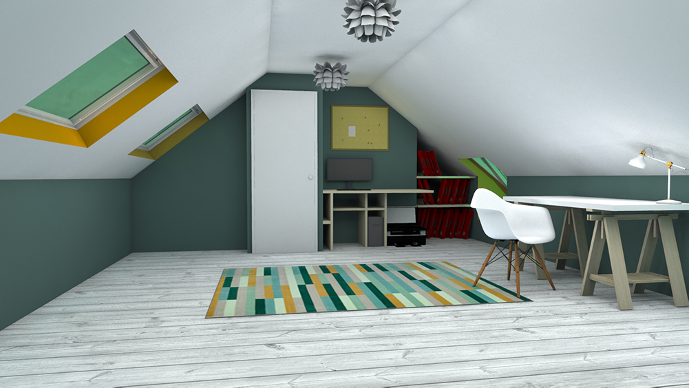
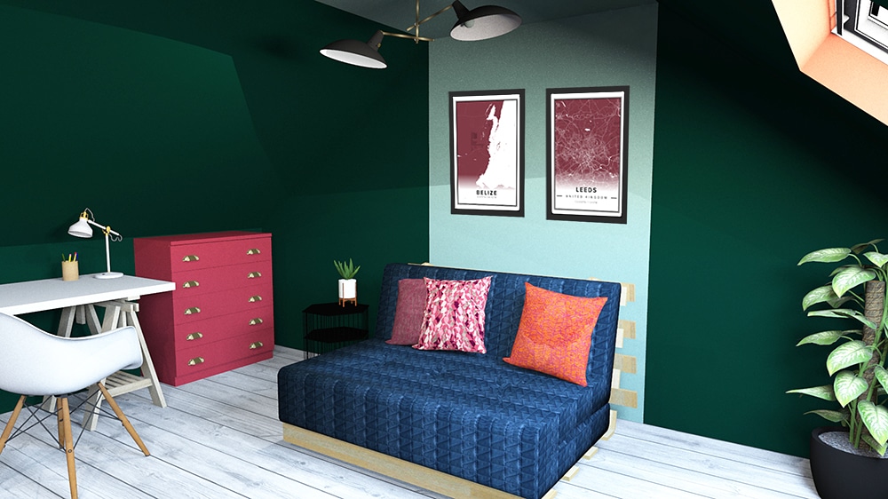
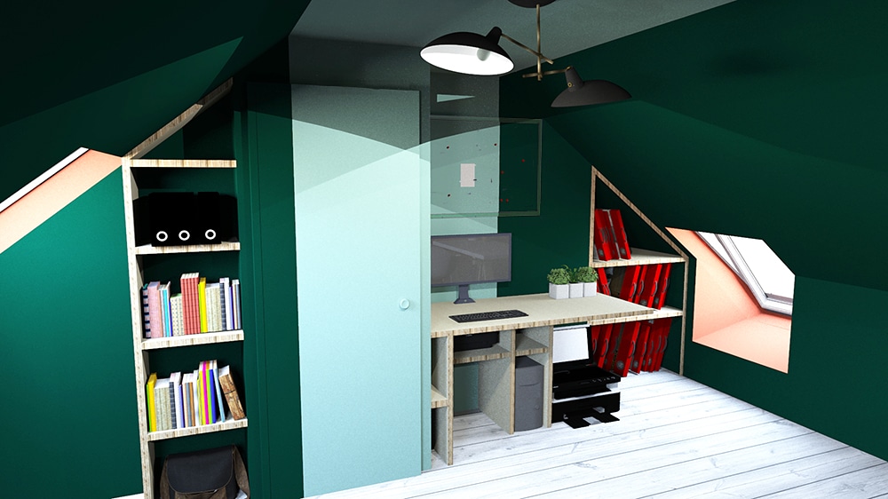
I finally settled on the perfect colour scheme for me by getting my paint charts out and just picking out anything which ‘spoke to me’ and putting them together. It sounds odd, but sometimes you have to go with what your gut tells you. I then off course checked that the colours worked together and bought sample pots to make sure, like a grown up. Here’s the final design in the two visuals I made: |
|||
 |
|||
 |
|||
|
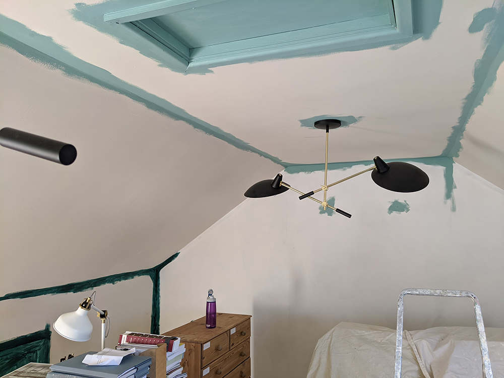
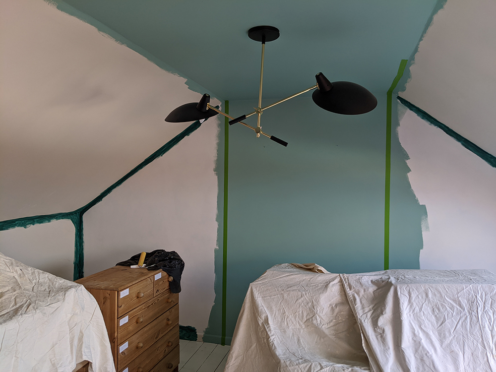
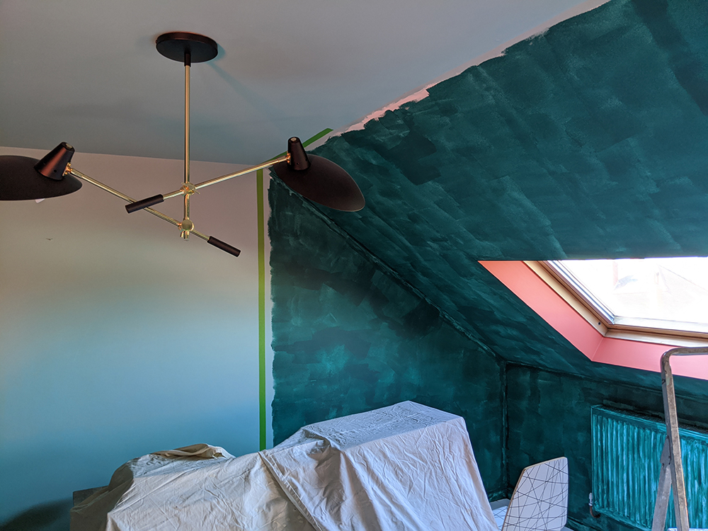
I was then of course too busy running my business and designing for my lovely clients to do anything about getting the desk built or to decorate the room, so nothing happened for over a year. The arrival of lockdown presented the ideal opportunity to get started, as I wasn’t going to see clients for a while and could turn my office upside down without too many consequences. So I got started. Here’s a few pics of the decorating in progress: |
|||
 |
|||
 |
|||
 |
|||
|
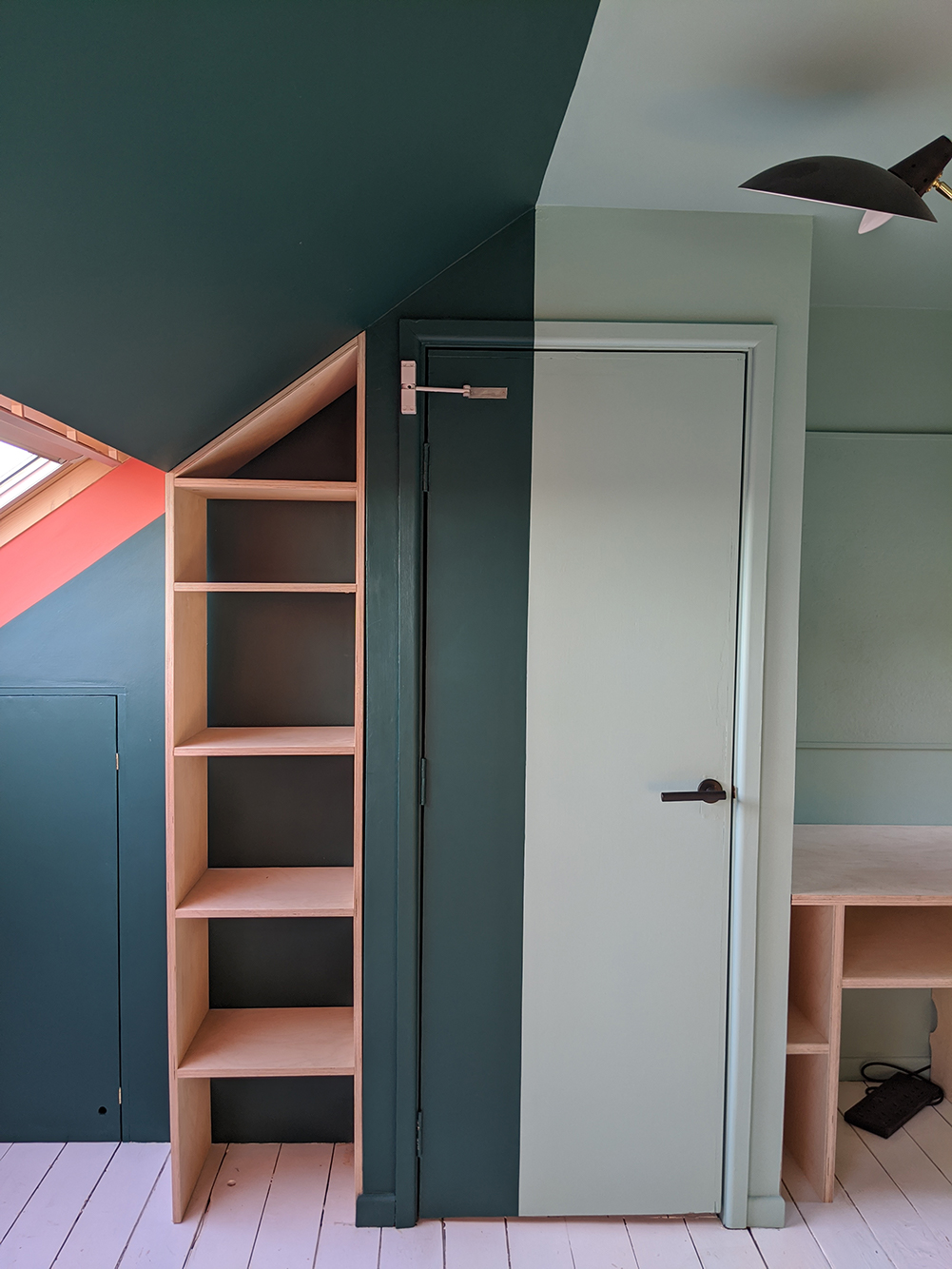
The straight lines which I’d decided to paint along the ceiling and down the walls were one of the things I had to work out as I went along. I’ve done a lot of decorating over the years and have steady hand, so usually paint any edges freehand. I knew this wouldn’t cut it with the sharp lies that this design called for, so I used Frog tape for the first time ever. I was very impressed - it gave me beautifully crisp edges - even down the middle of the door. |
|||
 |
|||
|
The next stage was to get the desk and shelving in. I sent the drawings to my very talented carpenter, who then constructed most of it at his home so that we could maintain social distancing. He then came to fit everything whilst I and the rest of the family stayed out of the way. Luckily, my measurements were accurate, but unfortunately the walls aren’t true, so he did have to make a few adjustments along the way (I think he’d say more than a few!) Here’s the desk and shelving going in: |
|||
|
|||
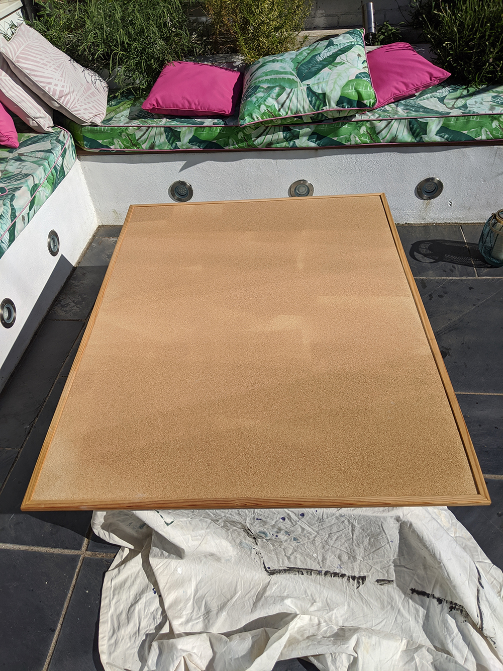
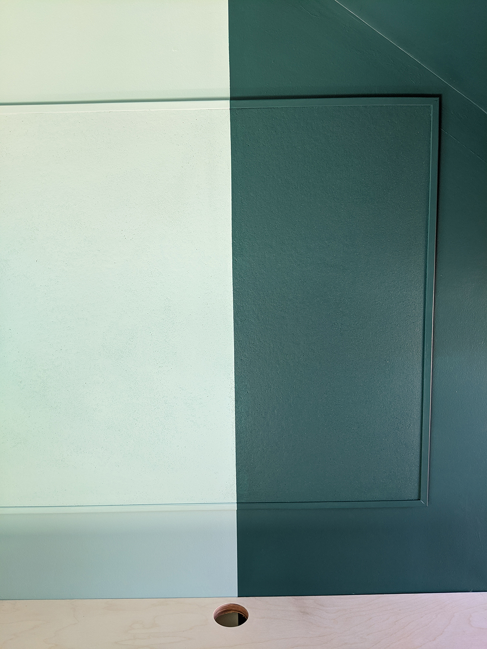
| Once the desk was in and protected with three coats of Danish oil (I chose this as I could apply this easily myself, and it darkens the wood slightly, bringing up the beautiful grain), it was time to start adding some decorative elements. I decided to paint my existing cork pinboard in the same colours as the walls, as it’s so large it would have covered up most of that section of the wall where the light colour meets the darker colour. Luckily the old Frog tape worked a charm here too, so I have a perfectly straight line which is the same as the line down the wall. Here’s how it looked before, and how it looks now that it’s up: | |||
|
|||
|
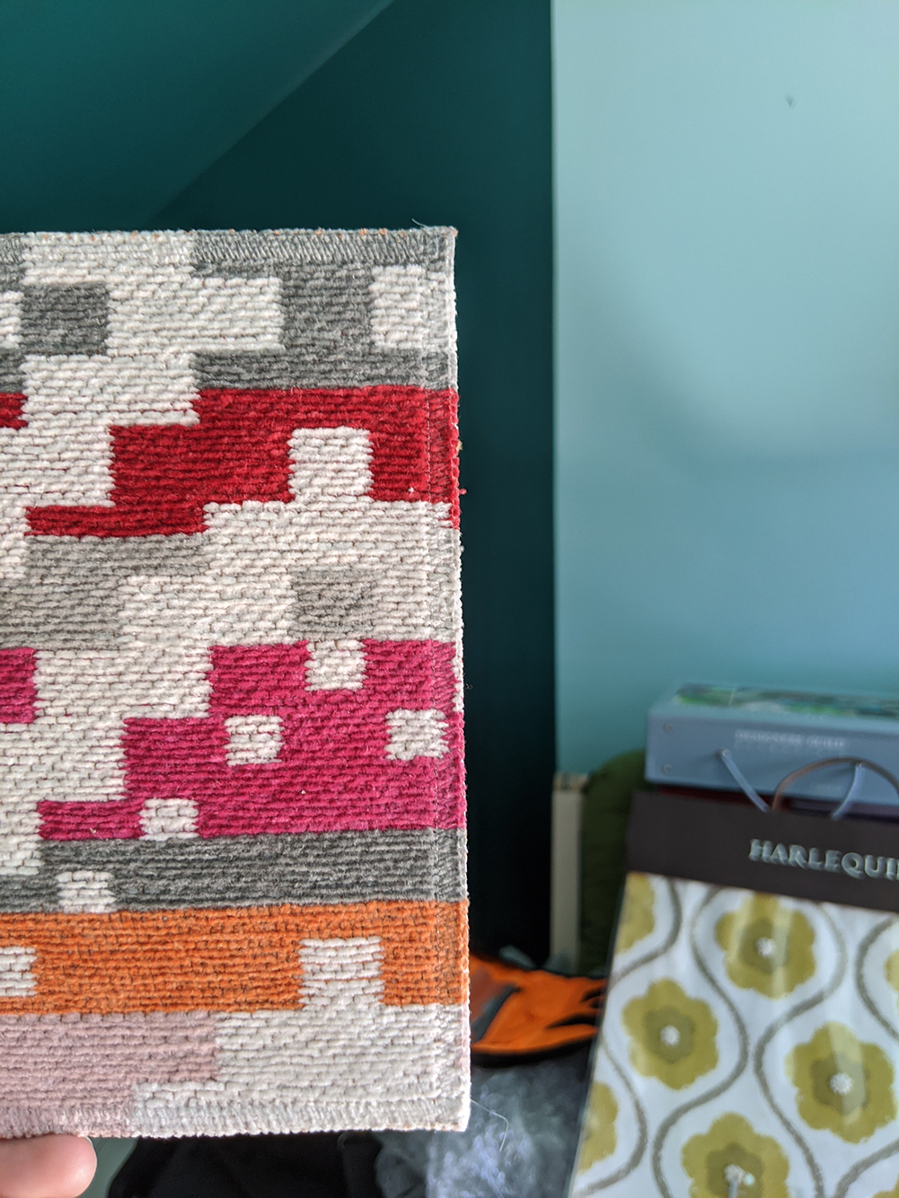
I really loved the orange colour which I’d chosen to paint around the window reveals, and wanted to add some more contrasting colours. I also wanted a little more pattern, as the walls were very plain. I added both colour and pattern with the rug and some cushions. Here’s a sample of the rug I chose, with me testing to see if I like it against the wall colour: |
|||
|
|||
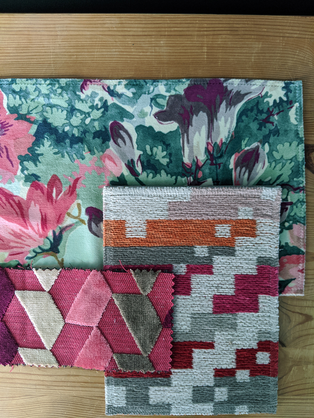
| And next to it are the two fabrics I chose to make some cushions from - I love how the floral and geometric patterns clash, but the overall effect is harmonious because the colours all compliment each other.
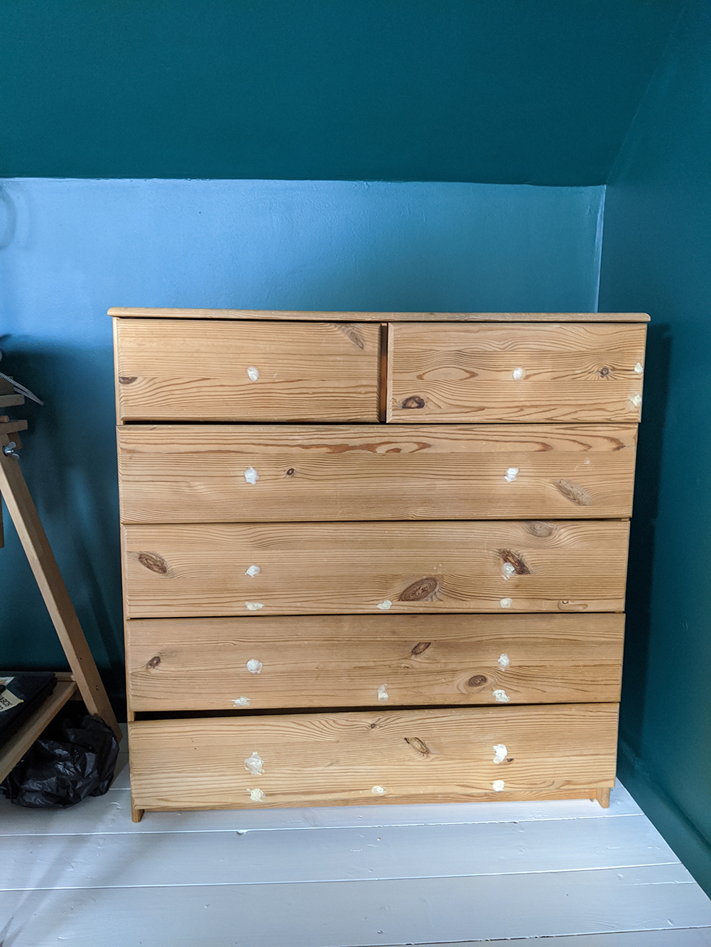
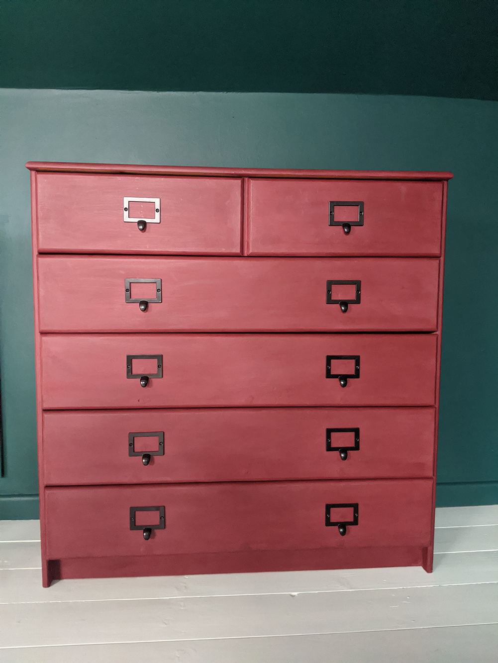
One final piece of the puzzle was changing the look of the chest of drawers I use to hold all my samples. This was a boring piece of orangey pine, and definitely needed a refresh. I chose to paint it in a purpley red to complement all the other pink/orange shades (it’s Annie Sloan Burgundy if you want to know). I also wanted to change the handles to something more industrial and practical. The ones I found are perfect because they have space for labels, so I can label the items in my drawers and stay organised. |
|||
|
|||
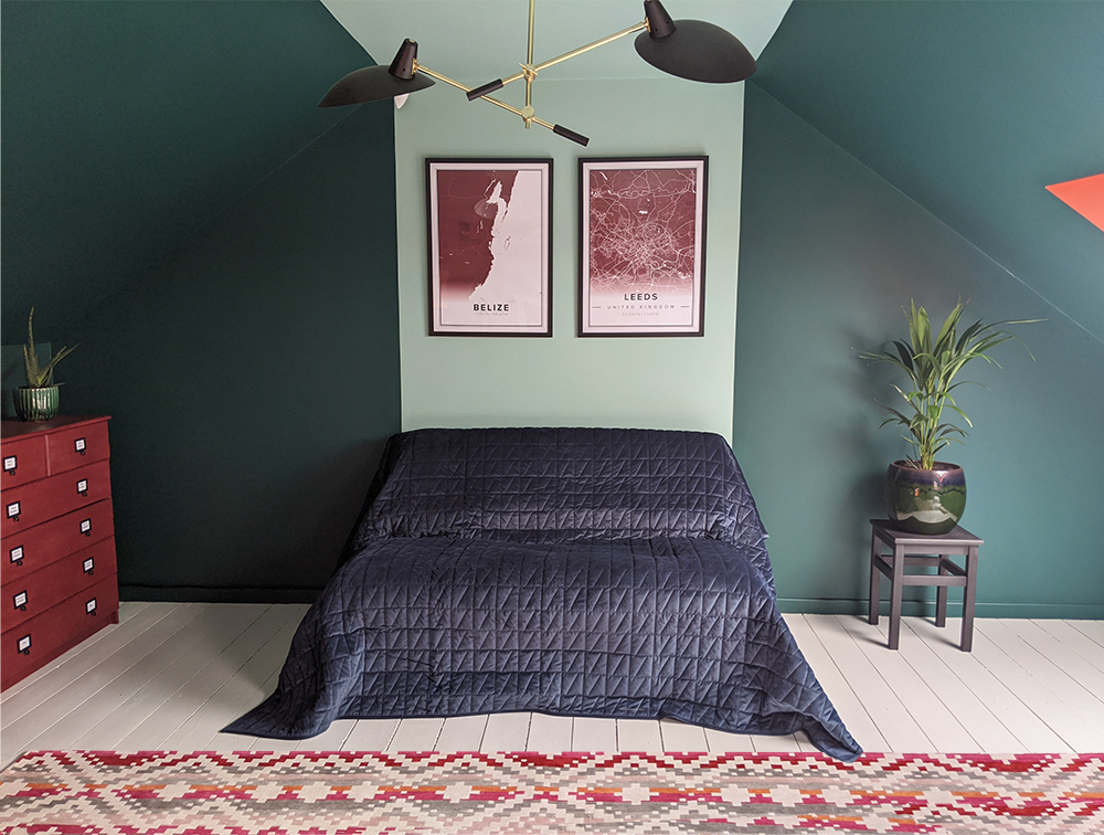
| I then added more burgundy in the form of these two framed maps. The first one is a map of the shoreline of Belize, the country where my dad is from, and the second one is the city of Leeds, where I did my real growing up. Both are places that make me feel happy when I think about them, so it made sense that I would have them in my office. Which brings me on to the most important reason for me undertaking this project - I wanted to feel happy and surrounded by colour. There were practical reasons, such as needing more storage and a better desk, but the beige walls were so uninspiring and boring, they made me feel nothing. Now I feel surrounded by the colours, like they are giving me a big hug. Isn’t that how a room should make you feel?
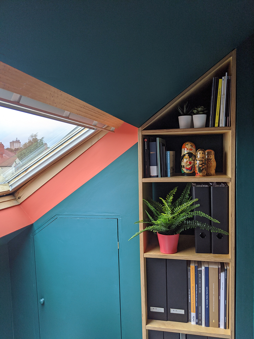
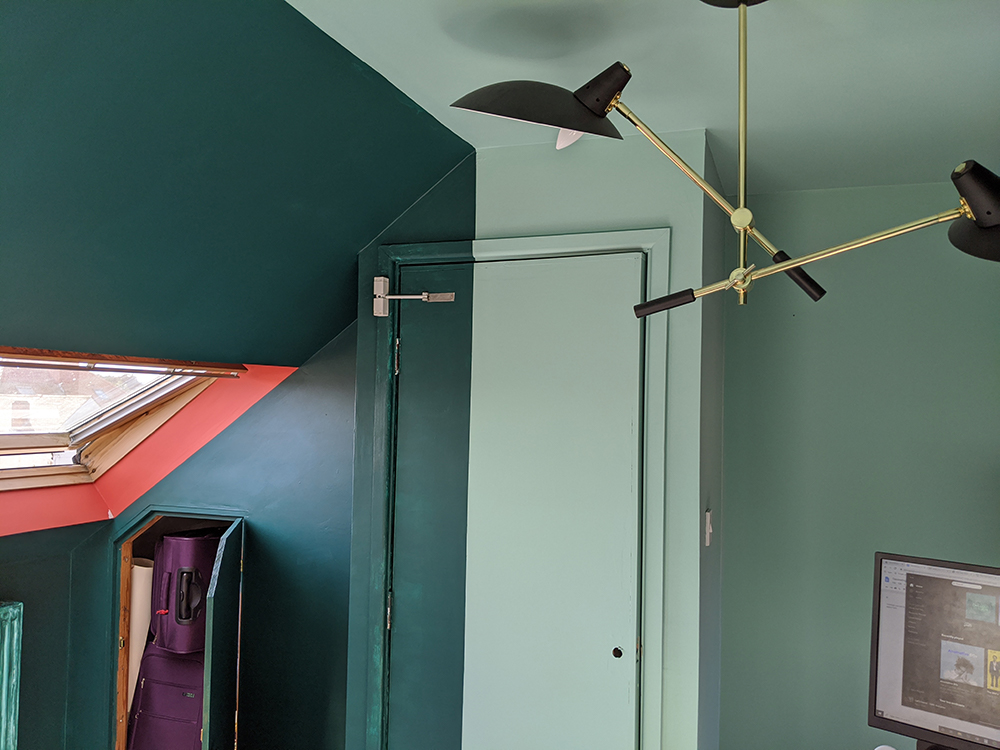
I’ll be posting the final shots of the finished room on my website, but for now, here are a couple of sneak peeks of the final result: |
|||
|
Welcome to the design blog, where you'll see posts about anything from the projects we are working on, to the latest fabric and wallpaper collections, and all things interiors related. We love colour, pattern, architecture and old buildings, and we love to share our finds with you.
Happy reading!