
Thank you for a great year!
 |
||
|
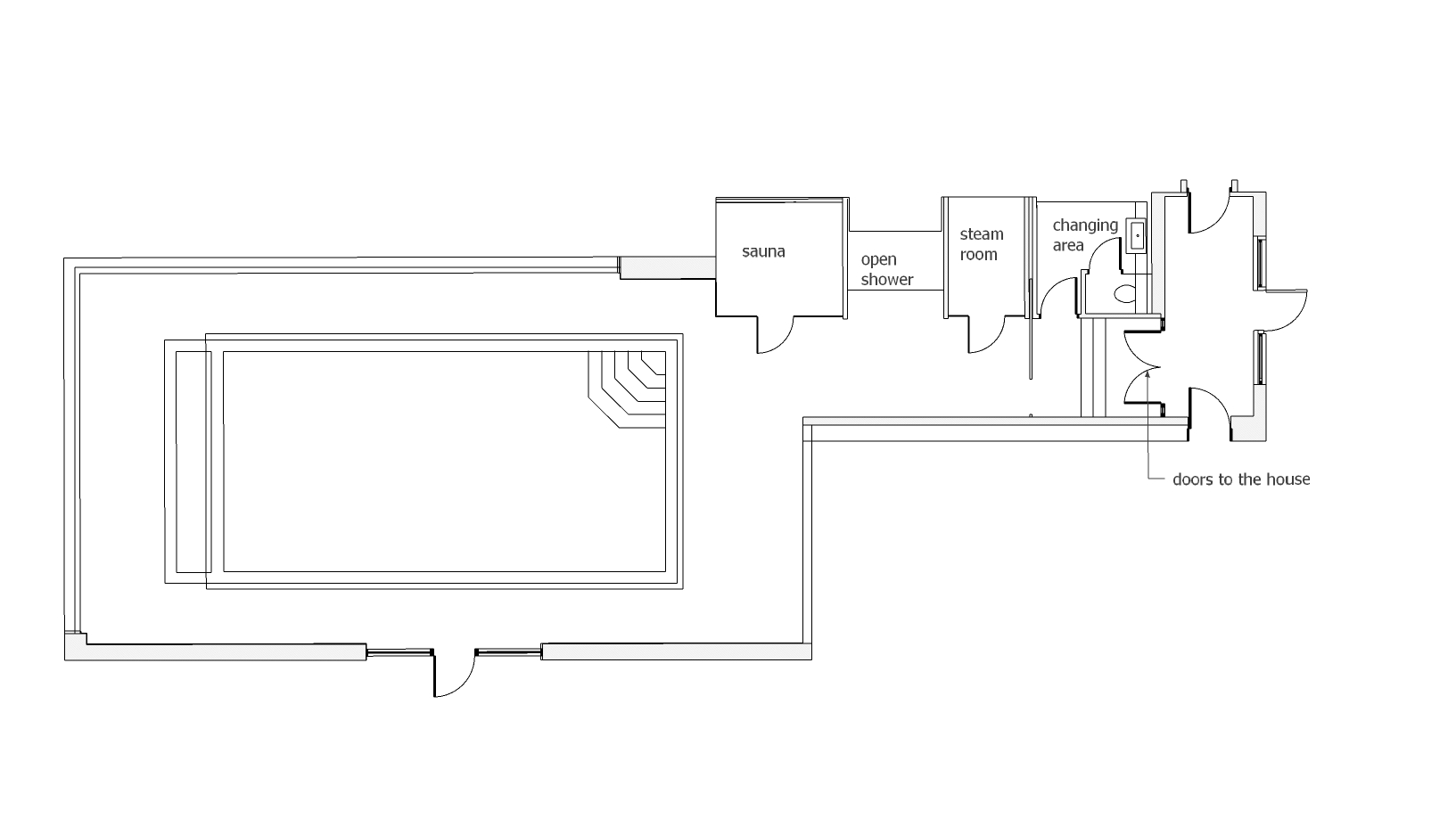
I think we might all be in need of a little escapism right now, and whilst actually going on an actual summer holiday might seem a distant dream, I thought I’d share something which makes me almost feel like I could be on that longed for holiday. Almost exactly two years ago, I was contacted by some absolutely lovely clients who I’d worked with before. They said they had ‘a couple of things you might be able to help us with’ so I popped along to their house to see what it might be - thinking it might be choosing a wall colour or a new sofa. When I arrived, I discovered they had decided to extend their house to include an indoor swimming pool and gym, and wanted my input! What a dream - to be able to help some lovely people with something as exciting as this! By my first visit, they'd had some plans drawn up had and started work already. Here’s the floorplan of the new extension, showing you the pool and the gym area. From the double doors which are the entrance from the house (on the right of the plan), there’s a changing room with WC, steam room, open shower, sauna, then the pool, with a gym leading off it. |
||
 |
||
| The proposed floor plan showing the pool and gym areas | ||
|
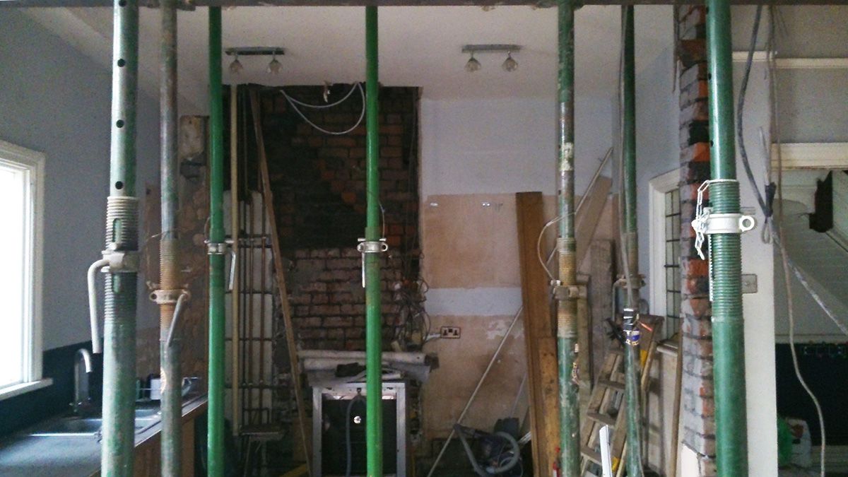
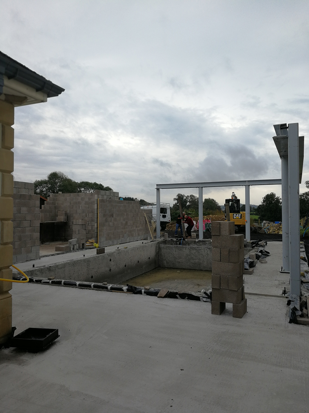
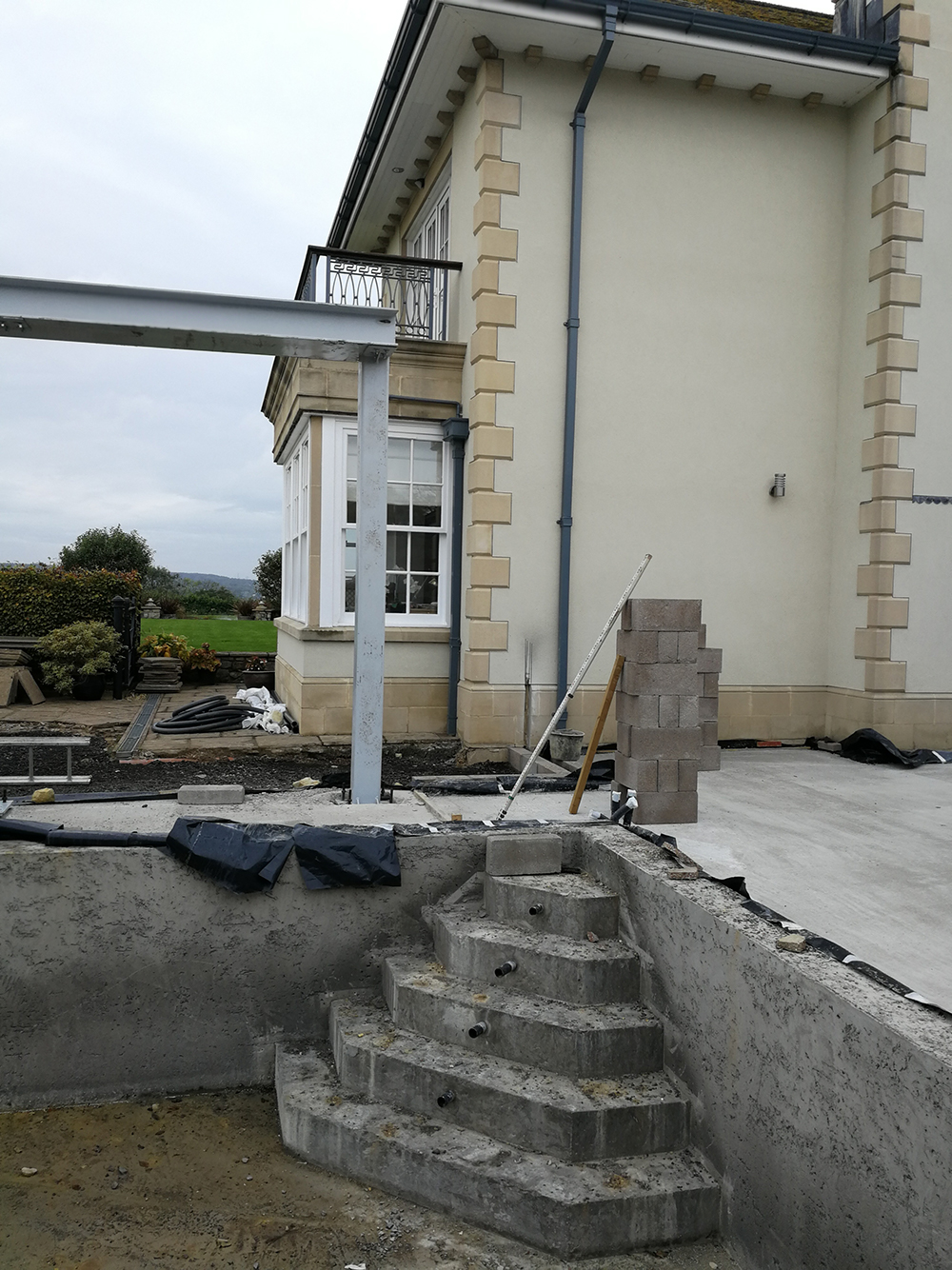
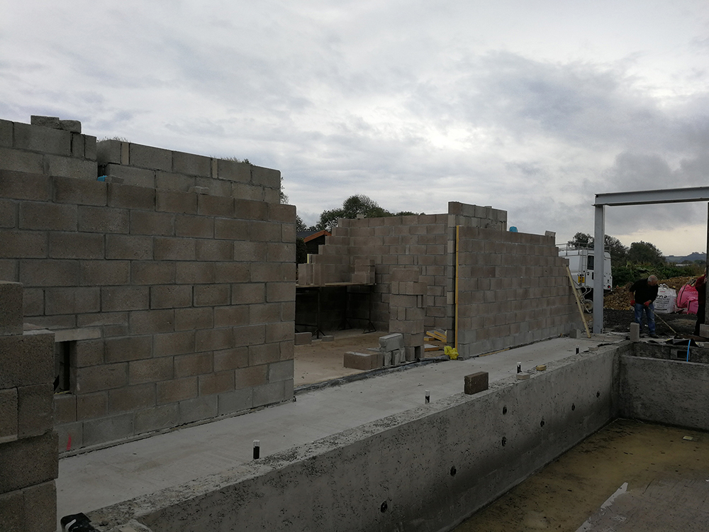
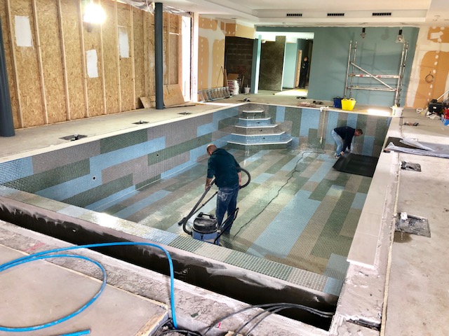
Here's what the site looked like on my first visit: |
||
|
||
 |
||
|
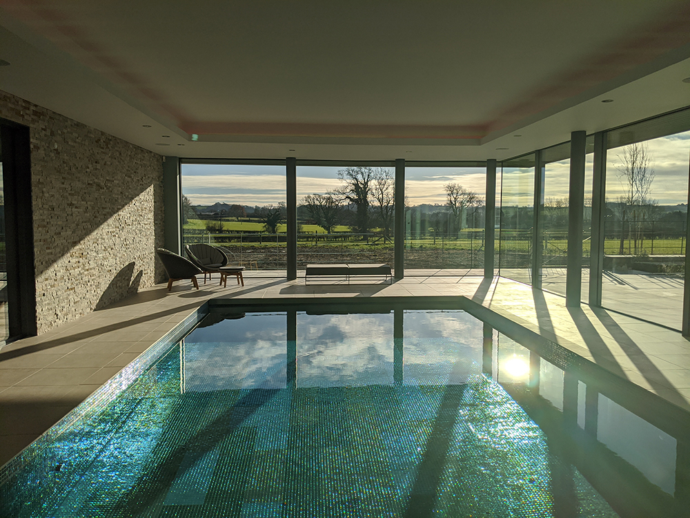
My role wasn’t what is traditionally thought of as an interior designer’s job - not so much choosing decorative items like cushions, but choosing the almost hidden finishes for things like ventilation grilles for the air conditioning. Getting the small details right in this build was key, so that the finished spaces look effortless, and work seamlessly with each other. We started by discussing inspirational ideas and colour palettes - and a colour palette of greens, blues and greys was quickly chosen. This might seem obvious for a pool because of the connection with water, but we actually started by choosing the main wall colour for the pool because the clients loved it, and it created a harmonious backdrop to show off the greenery outside. This is the paint colour we chose - Paint & Paper Library's Sea Nor Sky, which is exactly what the name suggests, a beautiful blend of sea/sky green/blue: |
||
 |
||
| From there, the rest of the colour scheme flowed. The grey colours came from a decision we made to match the guttering and soffit (the bit underneath where the guttering is attached) to the guttering in the existing part of the house, so that it would blend better with the whole exterior.
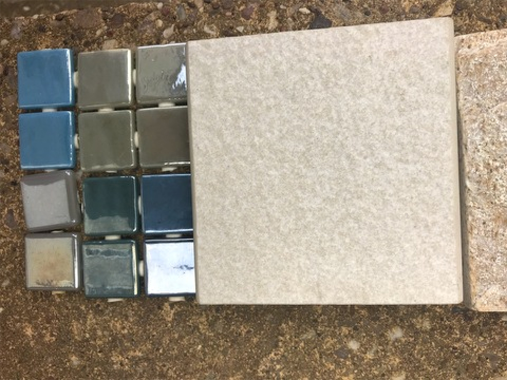
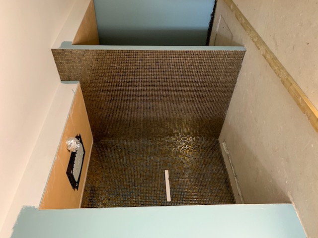
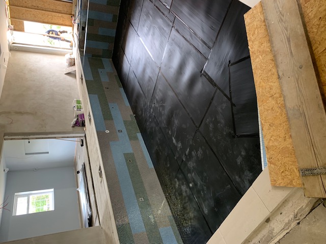
Then the tiles for the bottom and side walls of the pool were chosen - mosaics in a combination of blues and greens, with some brown based greys thrown in. The deeper browns and golds would go on the stunning open shower walls. |
||
 |
||
|
Here’s a sample of the mosaics chosen for the pool, with a sample of the floor tile which would go around the outside of the pool: |
||
 |
||
|
The clients chose a dramatic laying pattern for the pool tiles, going in offset stripes which would look great when the pool was filled with water. We had to choose the tiles knowing that the colours would intensify when the pool was full, so we did actually spend time pouring water on the samples until we were happy! Here’s the pattern in place on the pool walls: |
||
 |
||
|
This pattern caused some head scratching when we got to planning the steps, as there was no way to continue the stripe up the steps because of the shape of them. In the end, I thought it would be best to stick to one colour of tile per step, and decided that the riser of each step should continue the colour up to the next step, so that your eye wouldn’t notice the change in the colour too much. Here’s what I mean: |
||
 |
||
|
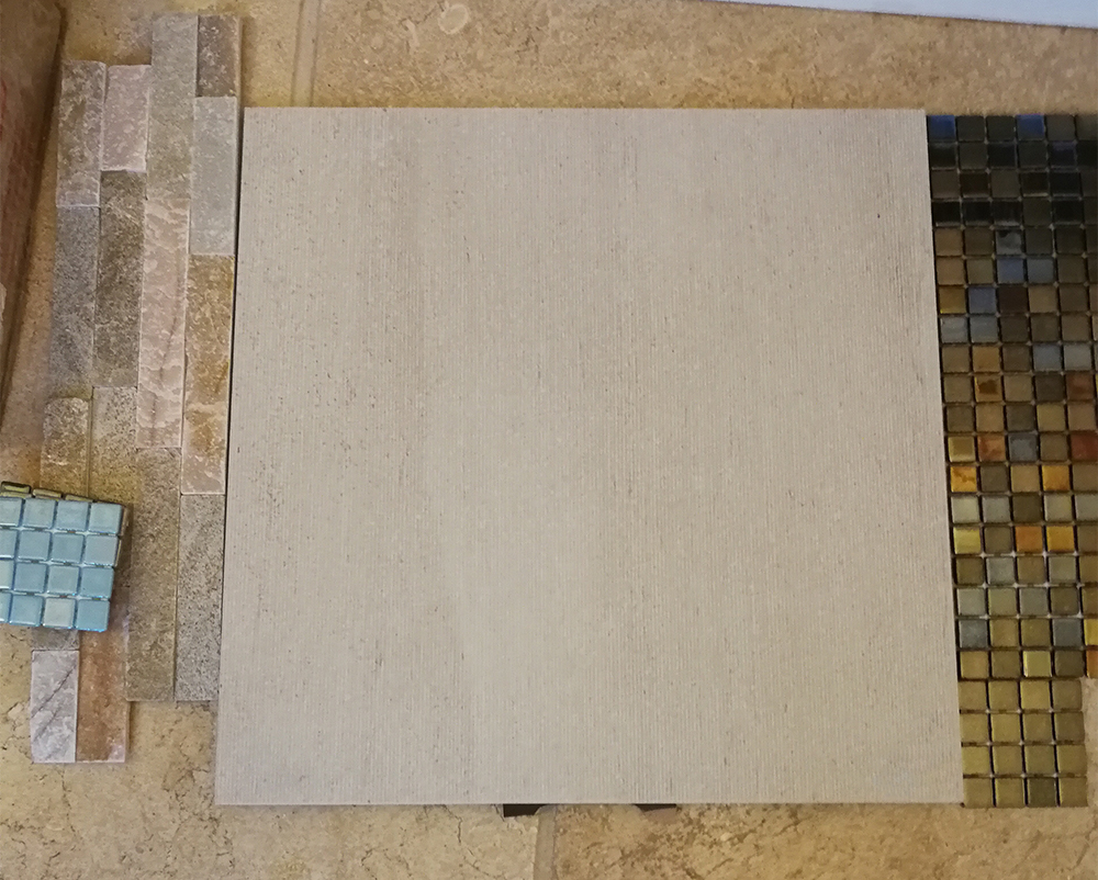
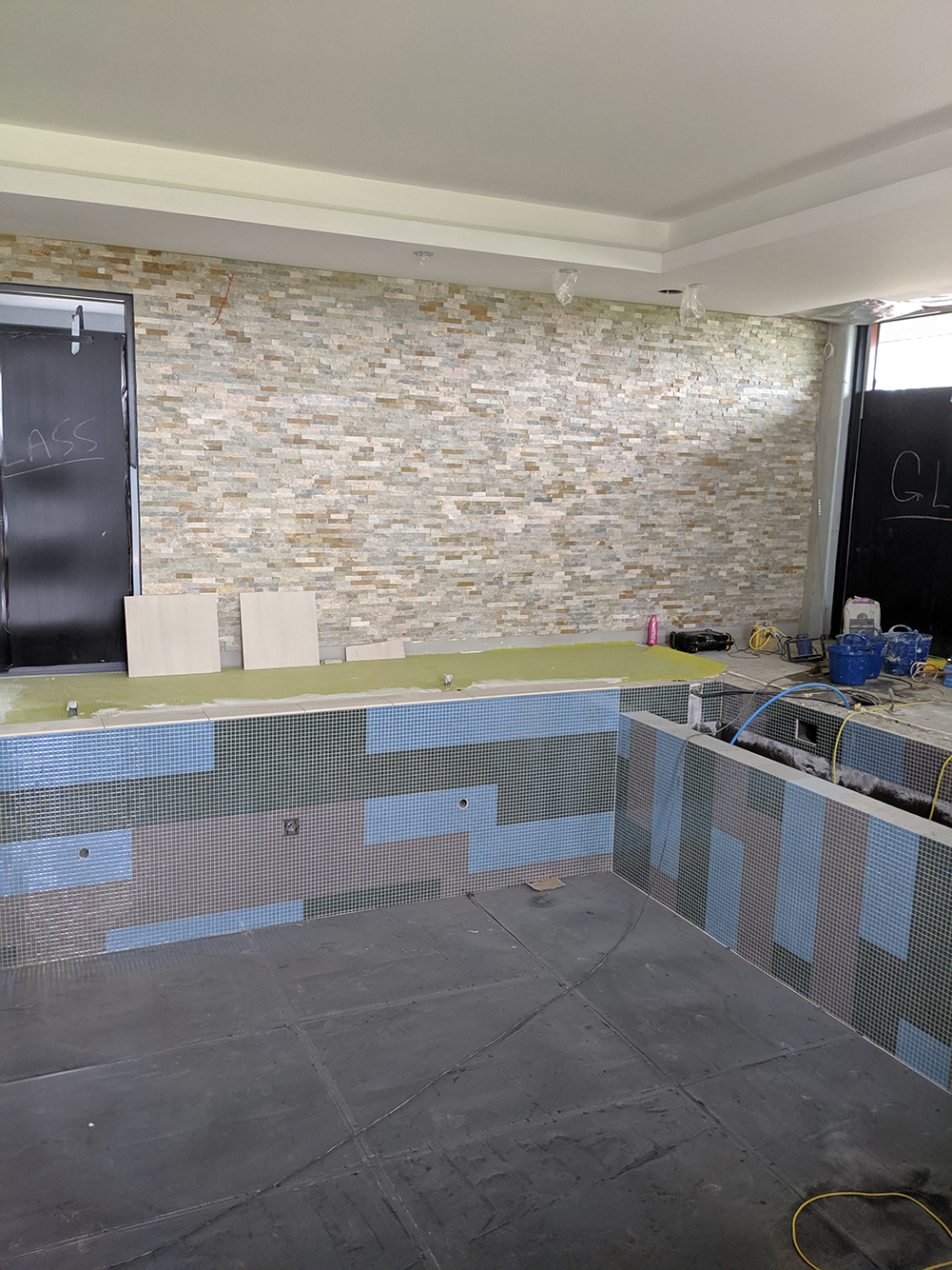
Continuing with the tile drama, the tiles which had originally been chosen for the rest of the flooring around the pool had been ordered, but when they arrived, they were a completely different tile! After the clients did a bit of digging, it turned out that the tiles they had originally chosen had been discontinued, so they faced having to choose all over again and delay the build. After an emergency phone call and visit from me (yes, a tile emergency can be a real emergency) we decided we preferred the new tiles. They were a better match in tone to those in the pool, and had a subtle ribbed effect on them which we all liked. I suggested that we lay these with the rib lines pointing lengthways towards the glazing, to draw your eye out towards the view. The differences in the tiles are subtle, but you can see them: |
||
The tile on the left is the original tile we chose, which has a bumpy surface, the new tile on the right has a ribbed surface |
||
|
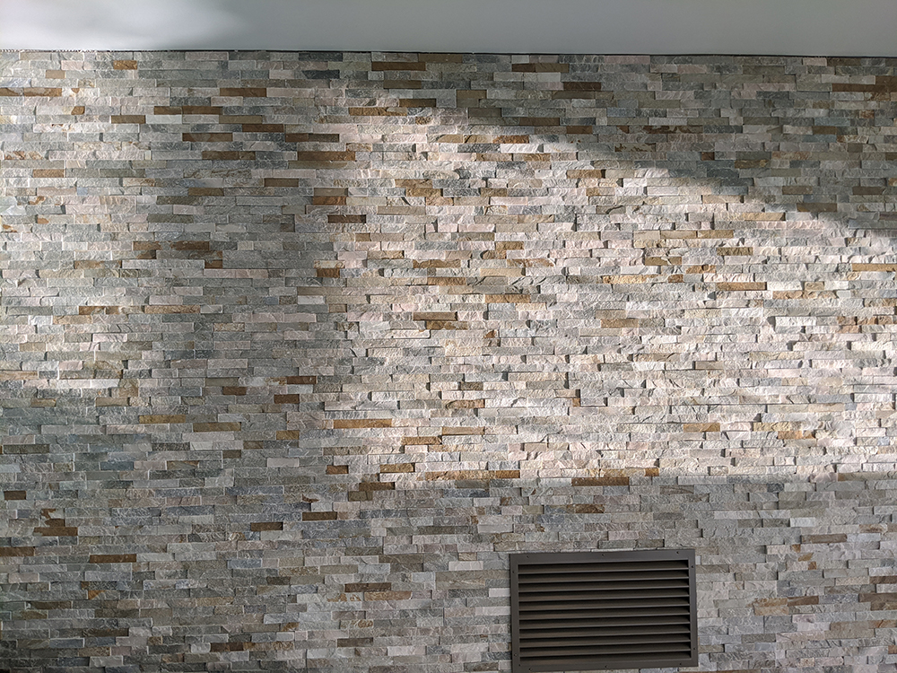
The final tile decision was for the wall which had the doors to the gym in it. The clients wanted something which would be more interesting than a flat wall, and would show off the concealed lighting they were having installed. They chose a gorgeous Splitface tile as the pink and beige colours in it were a nice contrast to the blues and greens used elsewhere. The uneven and interesting surface texture of the tiles would look great washed in both sunlight and the LED lighting coming from above. |
||
 |
||
|
There was going to be a large ventilation grille in this wall, which we wanted to disguise as much as possible, so I chose a colour from the RAL standard colours which can be mixed to be applied to any surface (it’s no. 9018 if you’re interested): |
||
 |
||
|
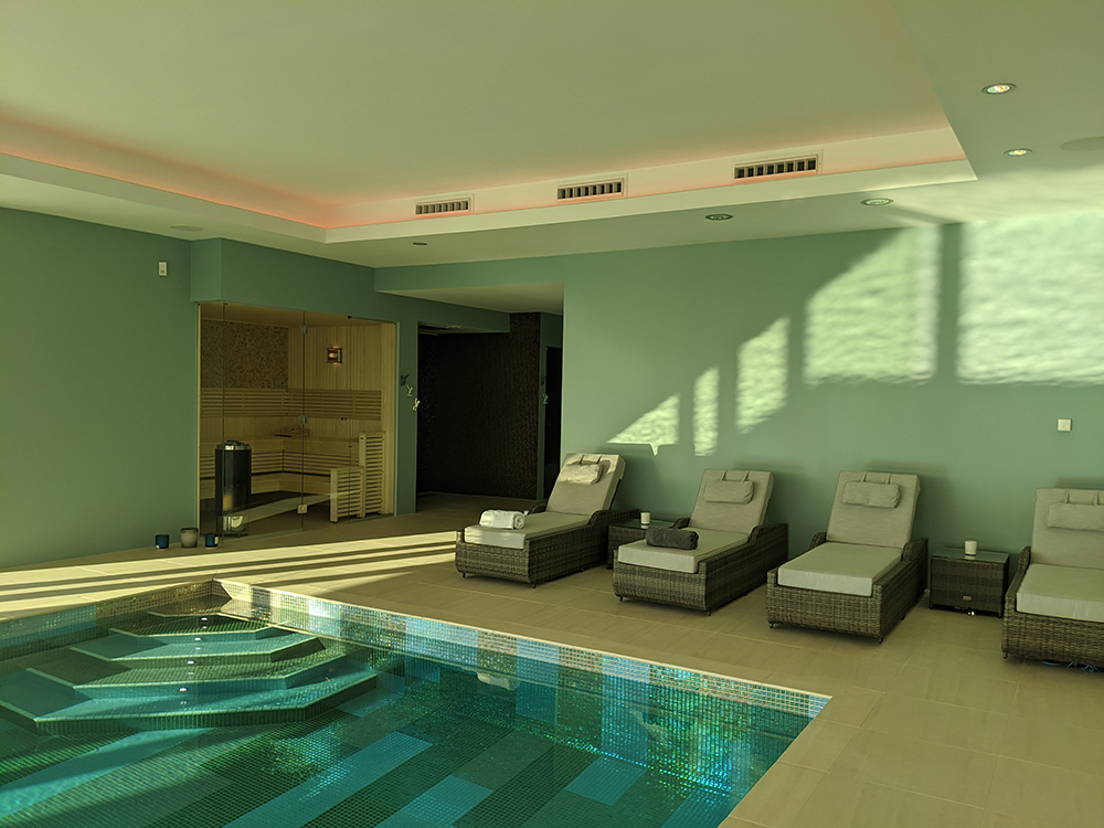
I also chose a RAL colour to paint the ceiling, which meant that the ventilation grilles and the spotlights in the ceiling could all be painted the same colour, to try to get them to blend into the ceiling. After all, you don’t want to be lying on a sunlounger or floating on your back in the pool and staring at the ceiling lights because they stick out like a sore thumb. These little details matter so much, especially when you’re trying to create a relaxing haven like this pool. Another small detail, but one which has a huge impact on the overall feel of the space, was the decision not to add any skirting boards in the pool. We were discussing which colour to paint them, and I suggested removing them all together for a cleaner, more streamlined look. My feeling was that the less you have to look at in the space, the more relaxing it will be. We then moved onto kitting out the gym area. The flooring had to be a specialist flooring made for gyms by Gerfloor, so we opted for a practical dark grey, which would also tie in with the dark greys of the guttering outside. The paint is an off white with a blue undertone, to link it to the other spaces, whilst the rest of the gym equipment is dark grey or black. We chose a bright red punch bag for a shot of colour, which would be picked up by the concealed LED lighting, and a mid jade green for the blinds. |
||
|
||
|
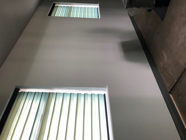
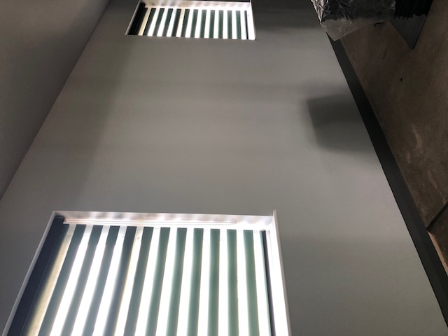
The clients wanted something simple at the gym windows, as fabric wouldn’t be practical, but they also wanted the blinds to provide privacy and to block strong sunlight from reflecting off the TV going on the wall. I suggested these Louvolite blinds, as they can be either all the way up or down, and the clever stripes of sheer and opaque fabrics mean that they can be adjusted to let light in but give privacy (like a net curtain) or can block out most of the light. I chose the Jade colour to tie in with the colours in the pool. |
||
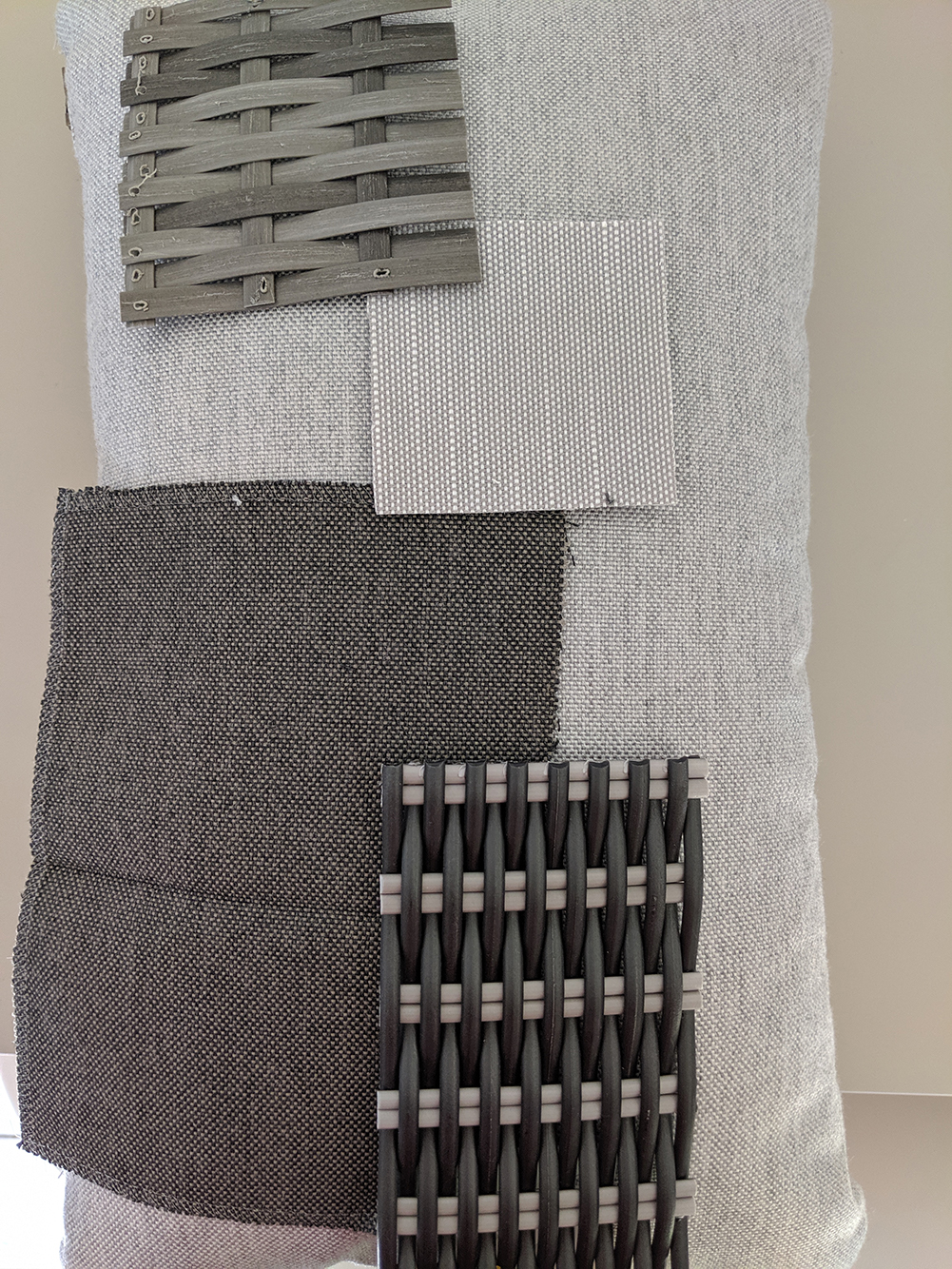
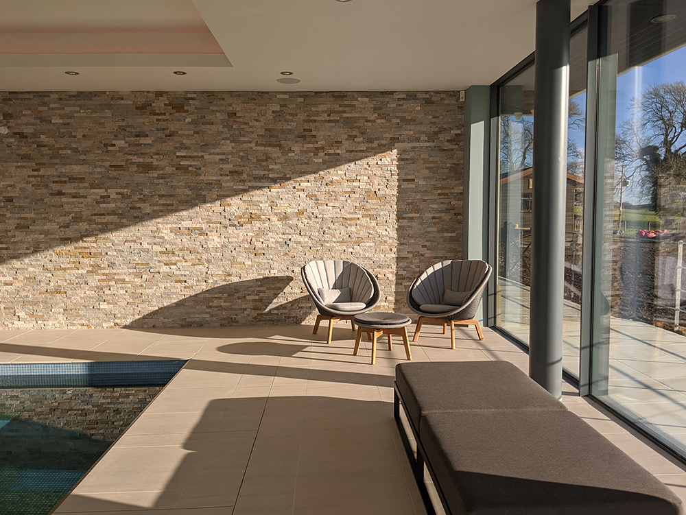
Once the gym was kitted out, we had to decide on the pool furniture. The clients had a great idea that there should be a low bench at the end of the pool, positioned between two of the support pillars - the perfect place to enjoy the view. It would be best if the bench had no back, so that the view wasn’t obscured by it when you were swimming in the pool, and it needed to be rustproof. Finding a stylish bench which fit the brief exactly took some searching, but we got there! I then decided on a layout for the rest of the furniture, and spent time getting samples of everything, including the rattan and the seat cushions to make sure that all the different shades of grey worked perfectly together. |
||
 |
||
|
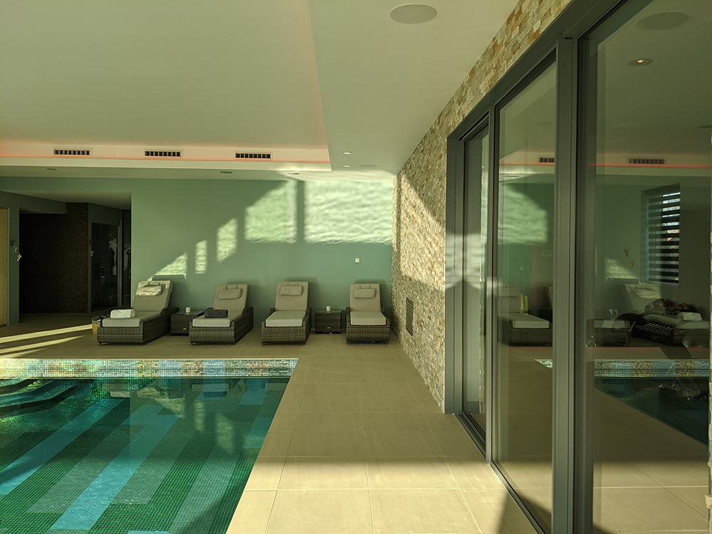
So here’s the finished result - it took nearly 18 months of hard work from the clients to get it finished, but boy is it worth it. The whole area is stunning, and it really does make the most of the views. The clients have deliberately kept the spaces clutter and accessory free to promote a feeling of calm and relaxation, and I think it really works. I’ll leave you with some photos I took on my last visit. Every time I look at them it makes me feel calm, and I can almost imagine that I’m staying at a luxury hotel in some far distant land. Enjoy! |
||
 |
||
 |
||
 |
||
Welcome to the design blog, where you'll see posts about anything from the projects we are working on, to the latest fabric and wallpaper collections, and all things interiors related. We love colour, pattern, architecture and old buildings, and we love to share our finds with you.
Happy reading!