The real cost of a renovation
 |
||
|
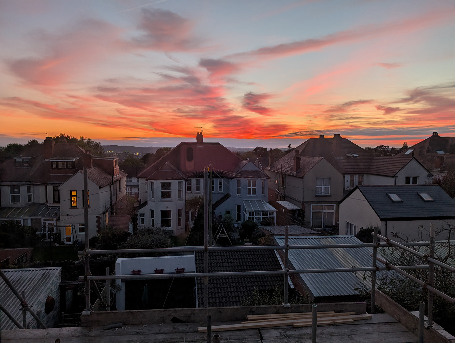
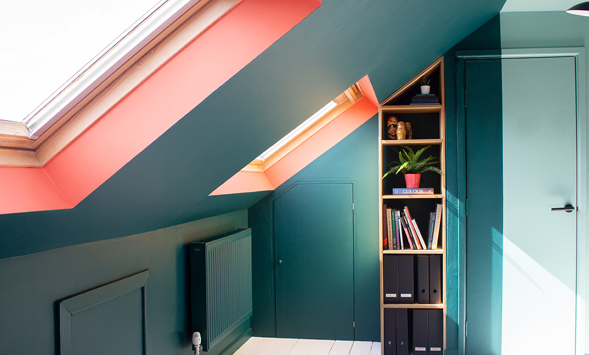
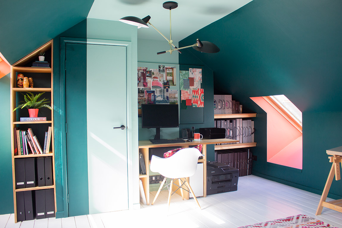
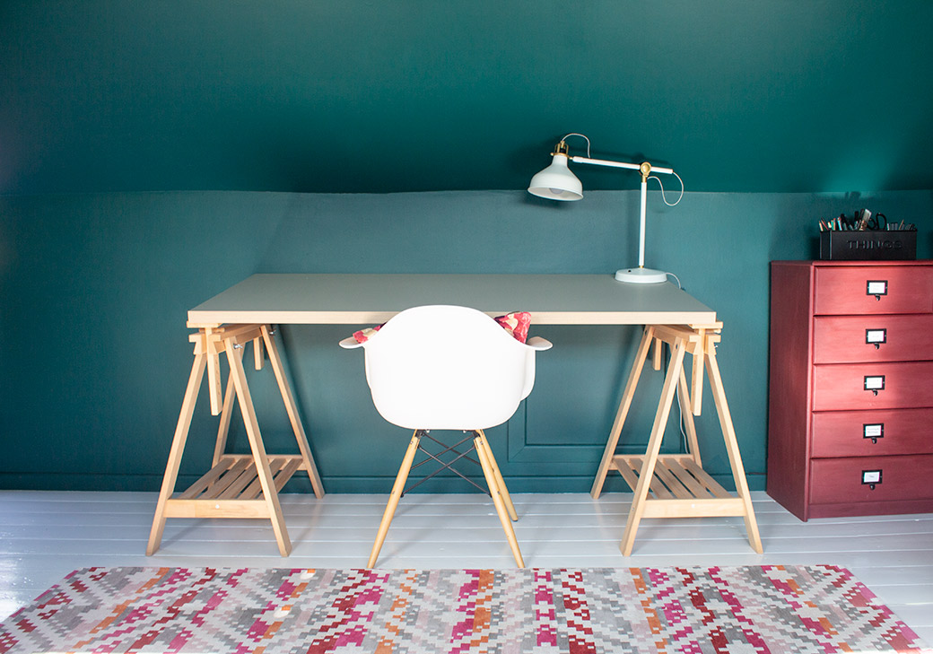
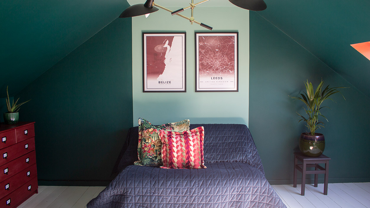
If you have been reading our newsletter recently, you will have seen me share some of the designs for my own loft project. If you haven’t seen them - to fill you in - the loft in my house was already converted when we bought it, and we had been using it as the headquarters of Louise Misell Interiors since I started the business. The space was great, and the views from the Velux windows were wonderful, sweeping views of the city, but the conversion itself had been done in the 1980s, meaning the insulation wasn’t up to scratch. It was cold in the winter and too hot in the summer, and the staircase wasn’t built to current building regs (never mind the fact that every stair creaked and squeaked, which drove me nuts). Here’s how it looked as our office: |
||
 |
||
 |
||
 |
||
 |
||
|
When we decided to move out of the loft and rent an office for the business, I saw this room as a great opportunity to make something special. My eldest child had left home by this point, but the youngest is still living with us and is showing no signs of moving out yet. This meant those morning bathroom fights looked like they would continue for some time. We briefly considered moving to a house with more than one bathroom, but we really like the area we live in, and most of the houses here have a very similar footprint to ours, and can’t easily fit in an extra bathroom. |
||
|
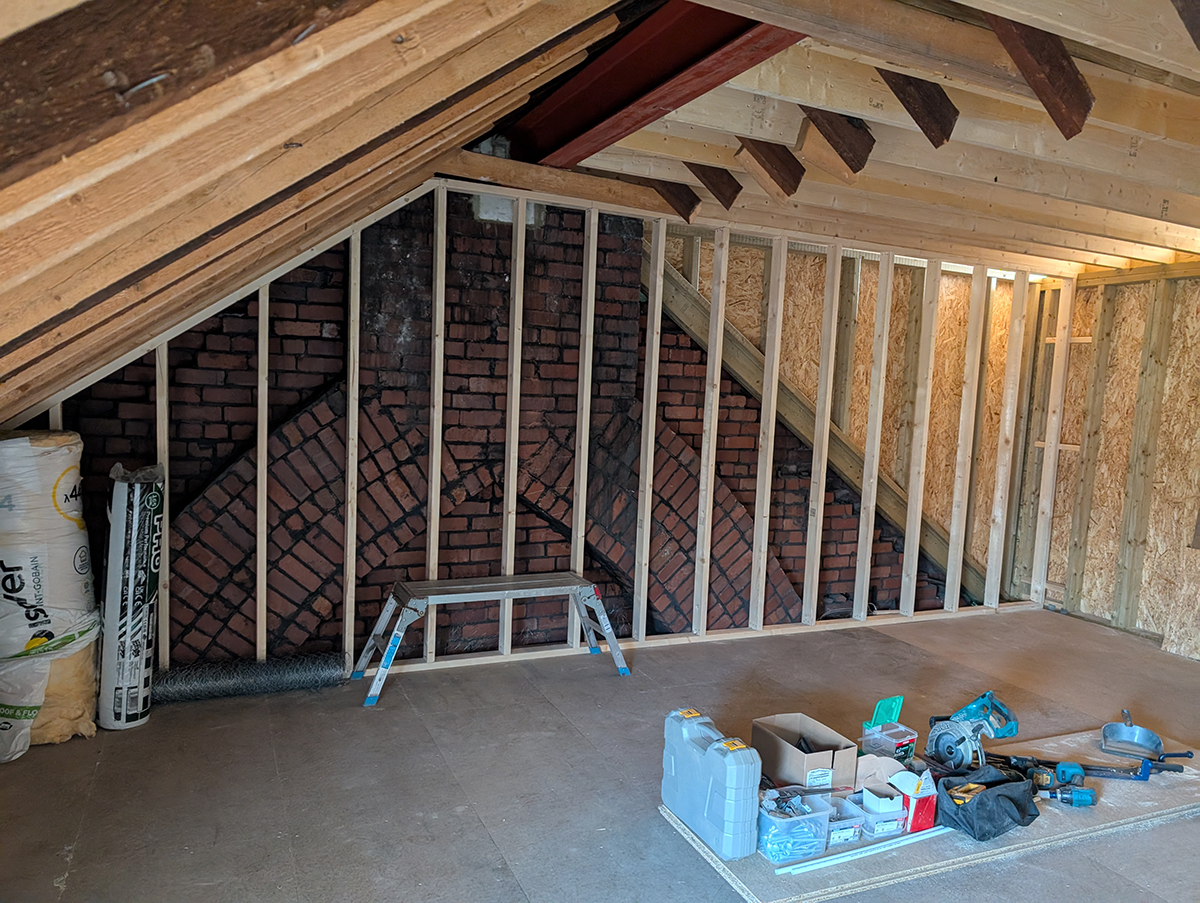
We decided to stay put, but there wasn’t an obvious way to configure the existing house so we could add another bathroom. The only conceivable way to do it would be to add a dormer to our existing loft to create the space for one. I consulted my builder, who had a look and told me we would gain around 2 metres in width across the house and two metres in length by adding a dormer, which is quite a lot of space. So I got to work designing the new loft, and fitted in a bathroom under the eaves at the back of the house (just behind where the built in bookcase is in the office pictures above). The new bathroom would be 1.8 metres wide by 2.9 metres - not a bad size for an en suite, and perfect for what we needed. The remaining space would be large enough to house a bed and some storage, with room for a dressing table and some seating. All I had to do next was work out how it would all fit together. |
||
 |
||
|
The studwork, once the dormer had been added, shows the extra space it has given us |
||
 |
||
|
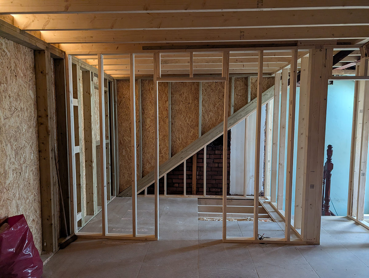
The studwork for the new en suite As you know, when starting a design, I always begin by thinking of the needs of homeowners. Even though the homeowners in this case were my husband and me, the process remained the same. An extra bathroom was a given, but what else was on the wishlist? I wanted to make the most of the views that we could currently only see properly by opening the Velux windows, and we desperately needed more storage. I liked the idea of us moving to the top of the house where it would be quieter (less noise from the street as the windows would be at the back) and be more private. I wanted the new, larger space with en suite to feel like a hotel, a little treat for ourselves to live in every day. First, I considered the best way to make the most of the views, and hit upon the idea of glazed doors. I considered bi-fold doors so we could really open up the space in the summer, but knew that they would eat into the available interior space when they were open. Instead, I settled on sliding doors with a Juliet balcony, which would give us the best views of the city laid out before us (we live at the top of a large hill), and the best chance to see nearby Penarth and the sea. |
||
 |
||
 |
||
|
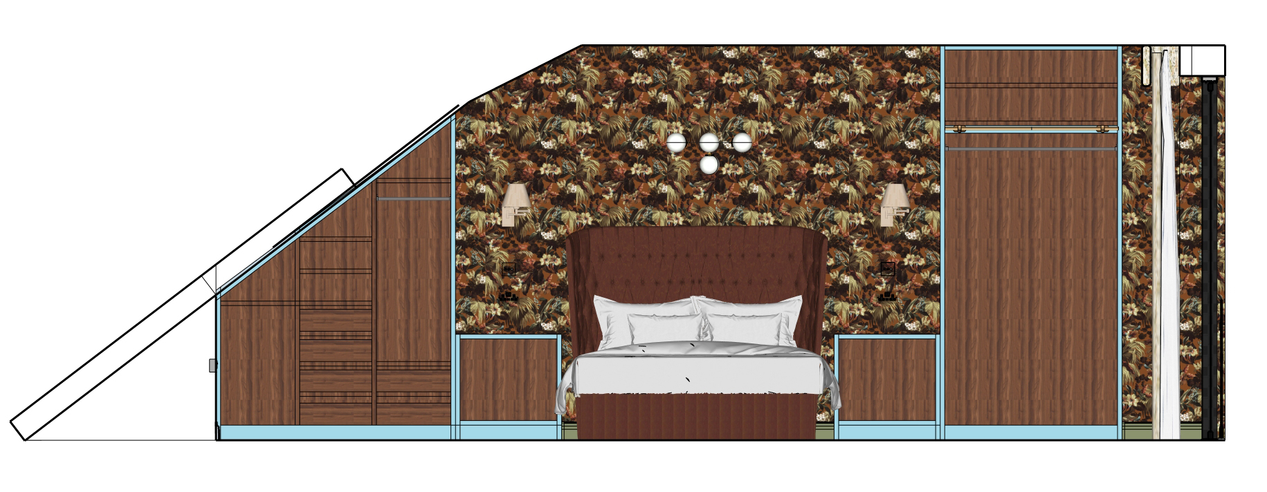
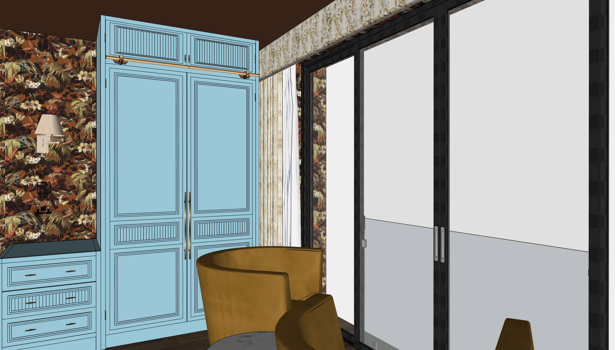
The next thing to do was configure the space inside. I knew we needed more storage - our current wardrobe situation is pretty dreadful, with one small wardrobe we’d brought from our last home, which certainly isn’t big enough. I believe that the best way to get the most storage space is to use built in furniture, as there are no wasted areas and you can configure it to fit the clothes and items you own. I considered many different ways of placing the storage, but eventually designed it along the back wall with the bed in the centre and bedsides either side, as this would give us maximum wardrobe space and make a feature of the bed. |
||
 |
||
|
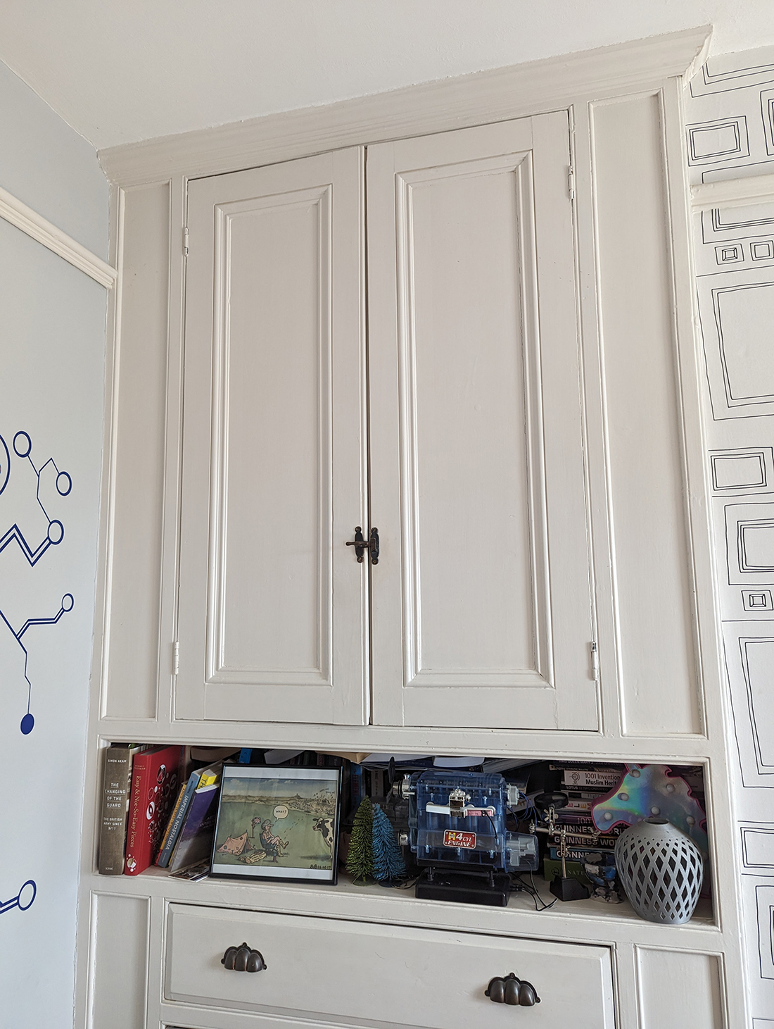
Once I’d designed the internal storage in the wardrobes and bedsides, I wanted the doors to have some interest and to reflect the original features in our Edwardian house, so I took inspiration from the original built in cupboards in my eldest child’s room. |
||
 |
||
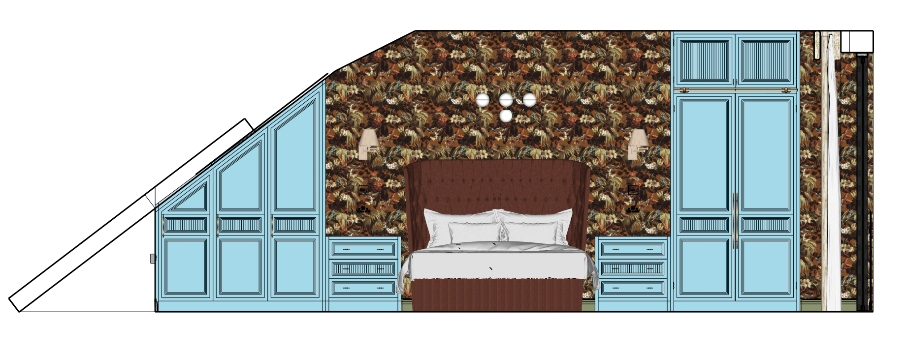
I used the central panel detail, which is also used on our original internal doors, and created doors with three panels - a larger top panel, a central slimmer one, and one at the bottom which is a third of the height. I wanted to add some detail to the central panel to create interest and prevent the door from looking flat, so I drew a squared off fluted design, where one part stands proud and the next one is in relief. I chose a rich walnut brown for the wardrobe internals, which would complement the wallpaper I was planning to use, and a pale blue for the doors, picked from a detail in the wallpaper. The final touch was to add LED lights on the inside of the wardrobes, which would switch on when the doors opened. |
||
 |
||
|
The standard depth for a wardrobe is between 600 mm and 700 mm, so I knew that the depth or side of the wardrobe would be seen from the outside if I designed the glazed doors to be the full width of the dormer. This wouldn’t necessarily be a problem, but I saw it as an opportunity to consider and create space for the window dressings. I’ve lost count of the times I’ve visited a client after they have had an extension with glazed doors built to the full width of the space, leaving no room for any kind of curtains or blinds, and we’re left trying to come up with a workaround. This can work in a kitchen, but we had to have some window dressings in a bedroom, where privacy is pretty important. I considered what I actually wanted and designed the opening for the glazing from there. I wanted blackout curtains to help me sleep, and also wanted a sheer or voile curtain which would provide privacy whilst letting light through during the day. The standard way to do this is to have two pairs of curtains, so there would be fabric on either side of the glazing. However, as I had at least 650mm of wardrobe depth on one side of the room, it made perfect sense to have two single curtains to cover the whole wall, stacked to the left, tucked in behind the wardrobe. I created a wall ‘nib’ here which was slightly bigger than the depth of the wardrobes so the curtains could stack when they were open. This also meant that the curtains could be pulled all the way back from the glazing to let in the maximum amount of light. |
||
 |
||
|
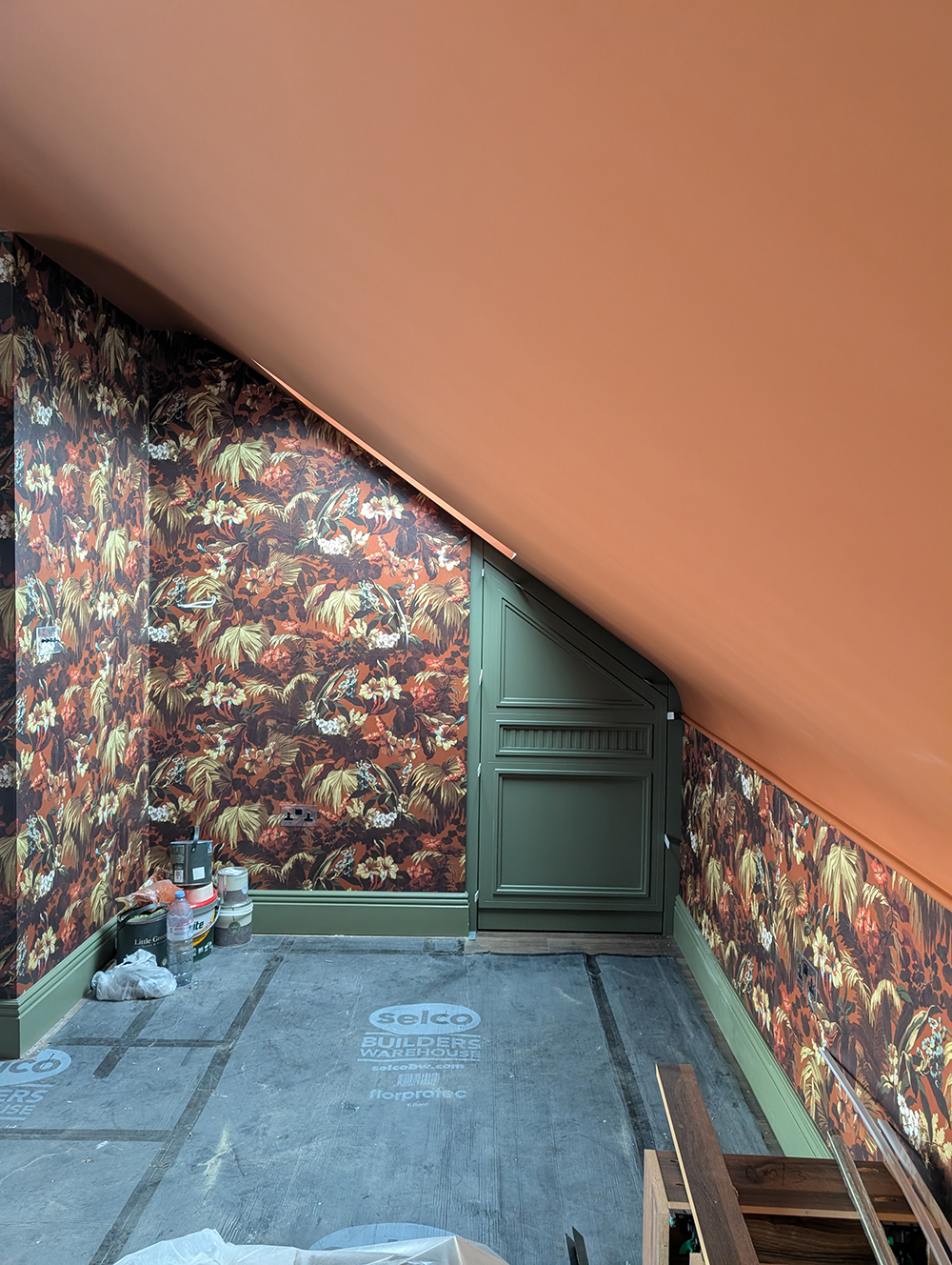
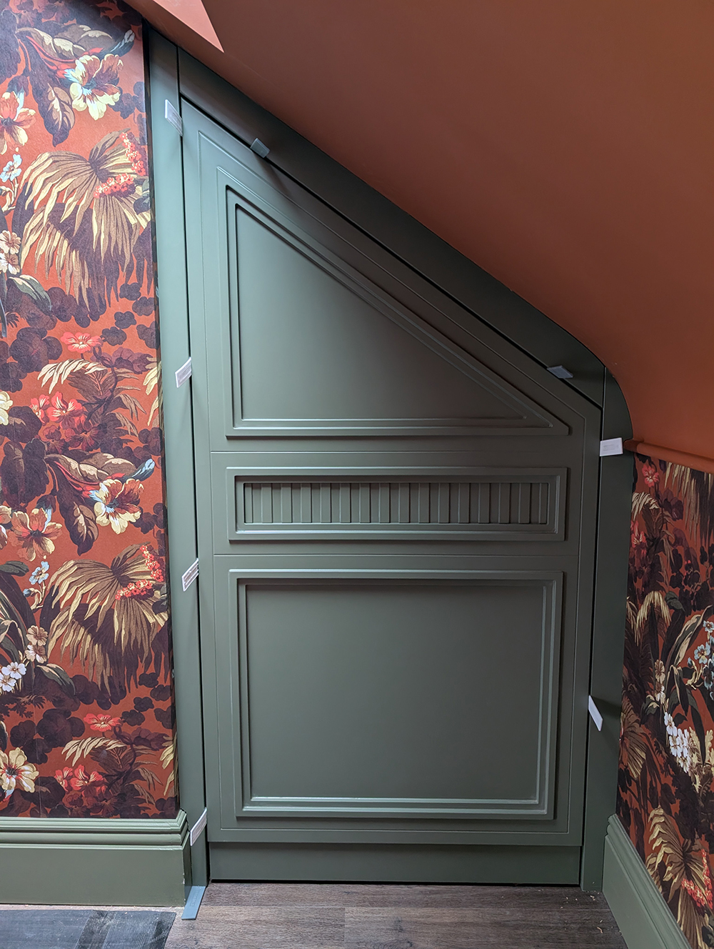
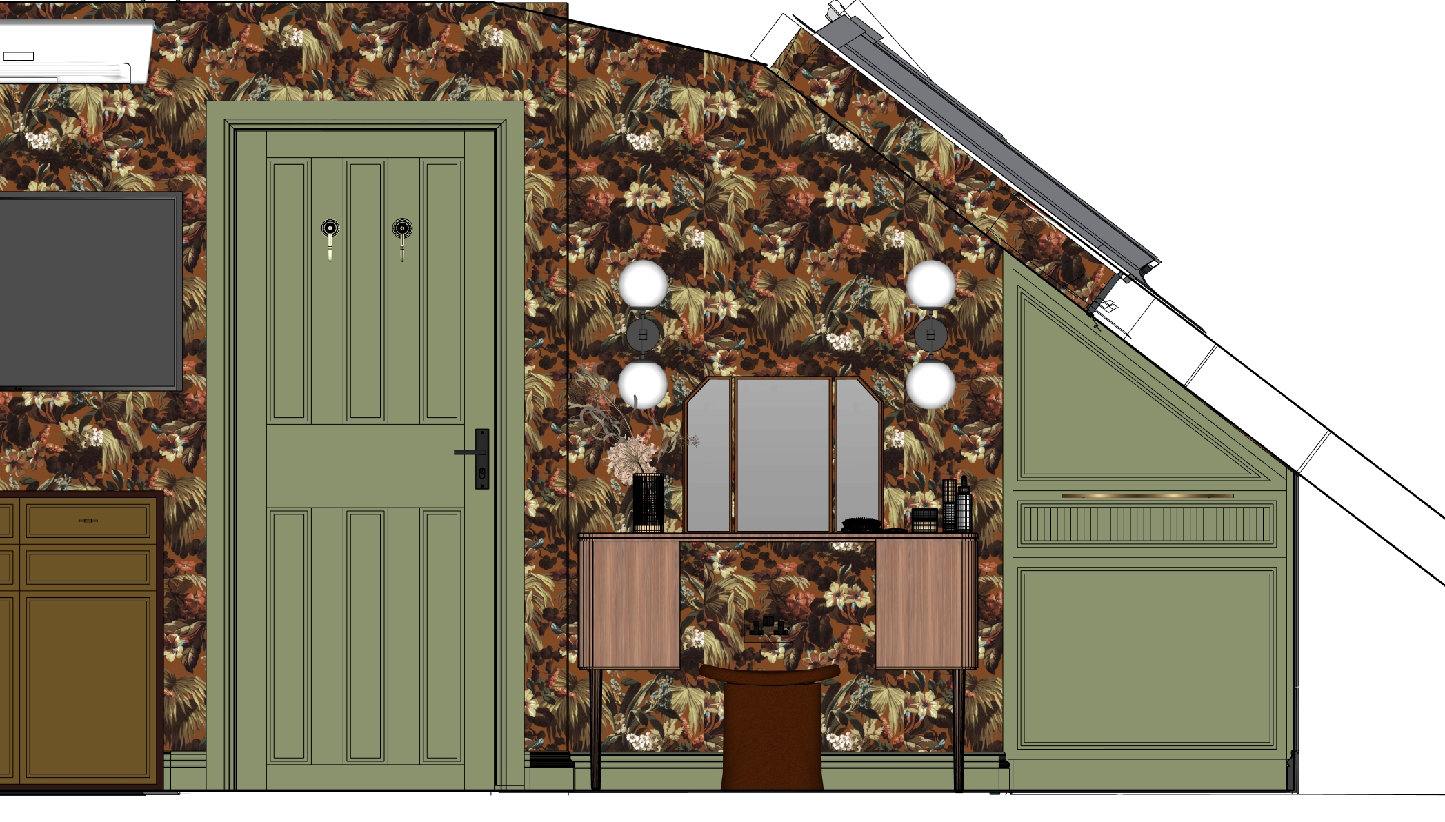
I indulged myself here and decided to have two ceiling fixed electric curtain tracks. Fixing them to the ceiling means we would have complete floor to ceiling coverage and a neat look. But the electric power to the tracks is the part I’m excited about - imagine being able to lie in bed and open or close the curtains with the remote? That feels like real luxury to me. I also designed some pull out shoe storage for a deep alcove in the corner where the eaves are at the front of the house. I used the same design as the doors for the wardrobes but changed the colour to match the colour I’d chosen for the internal doors, skirting boards and architraves. Here is the finished shoe storage: |
||
You can’t design a luxury bedroom without considering the lighting carefully. I knew I wanted wall lights by the bed for reading, and we would need a central pendant, but I also had to think about how else we would use the room. The dressing table would be going in a little nook by the shoe storage, and good lighting would be key here. I chose two long wall lights with globes on each end, which would sit on either side of the mirror - the best way to get a good light for applying make-up, as the light would fall on my face evenly from both sides. I also made sure to pick cool daylight bulbs, to mimic the light during the day so I could see what I was doing properly. |
||
 |
||
|
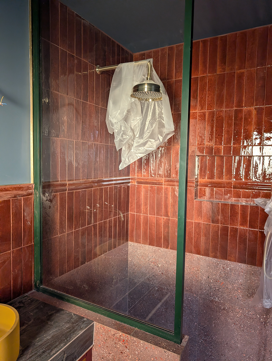
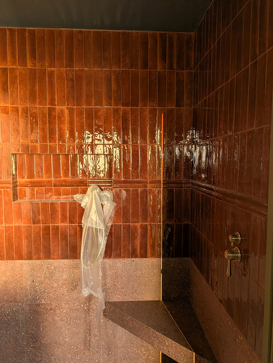
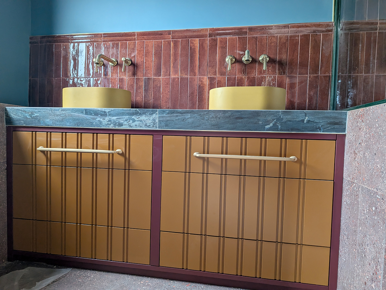
I planned to be able to control all the lighting from the switch by the main door and also from the bed - who wants to get out of bed to turn off a light when you’re ready to go to sleep? That meant a lot of cabling and complicated drawings for the electrician. Finally, I sourced clear sockets and switches to show off the beautiful wallpaper behind them, with bronze inserts which match the new door handles exactly. This left the bathroom to be designed. I knew I wanted a wetroom with underfloor heating (another little luxury, but it also helps to dry up any splashes quickly). Ideally, I wanted two sinks if we could fit them in, so we wouldn’t end up fighting over the sink (we have two sinks in the bathroom downstairs and have got used to that arrangement). My design solution was, you guessed it, more built in furniture with a dividing short wall to separate the shower from the sink area. I added a large rainfall shower head and a handheld shower for flexibility, and a small shower seat to use when shaving legs. Here’s the almost finished bathroom: |
||
There’s plenty of storage under the sinks, with another mirrored cabinet being made by my carpenter to go on the wall, so we won’t be short on space in here. There will also be wall lighting on either side of the cabinet, so again, we will have even light to see by. This compact room has managed to tick all the boxes, and along with the larger space next door, it's going to feel pretty fancy when it's finished. Everything has been carefully planned and considered, and I can’t wait to start living in it. |
Welcome to the design blog, where you'll see posts about anything from the projects we are working on, to the latest fabric and wallpaper collections, and all things interiors related. We love colour, pattern, architecture and old buildings, and we love to share our finds with you.
Happy reading!