Design Reveal - The welcoming lobby part one
 |
|
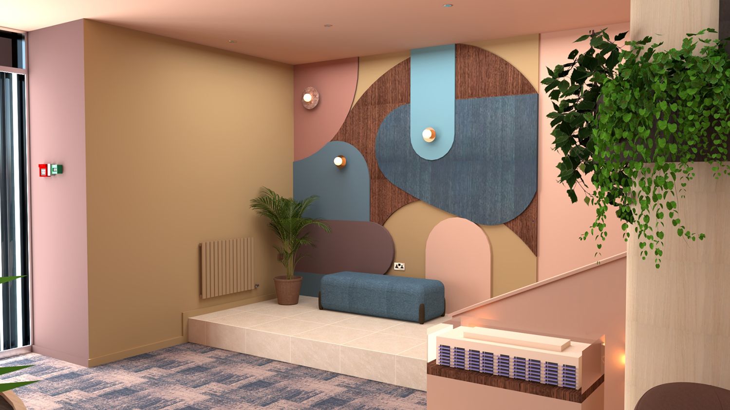
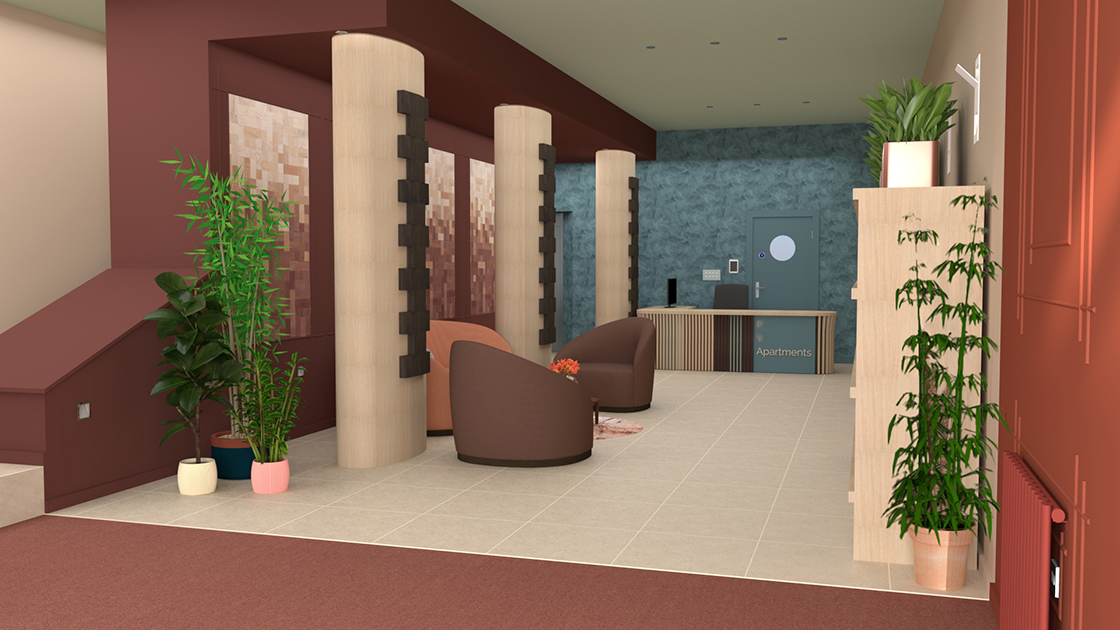
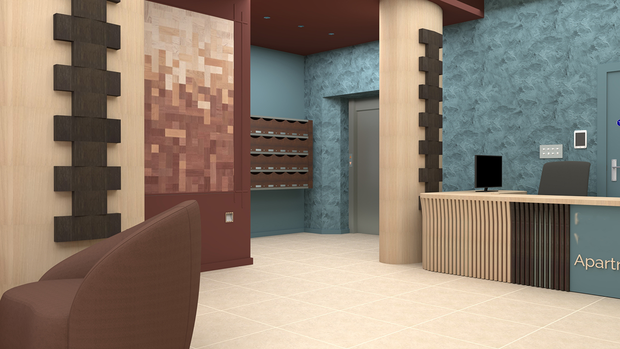
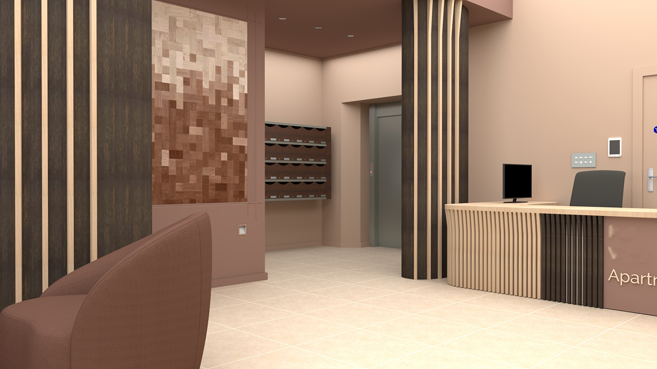
On the last blog, we discussed our designs for a large apartment block’s lobby, with all the opportunities and challenges it presented. You might remember that one resident had come to us wanting to brighten up this large entrance space and make it feel more homely, and we agreed we would produce three designs for all 30 of the residents to consider. Following on from our last blog piece, we are now showcasing the second and third designs we produced for this space. The first design was the ‘ideal world’ concept - designed as if we had free rein to add furniture, lighting and bespoke pieces, and make as many enhancements as we liked (which you can read about here). The remaining two designs would involve fewer bespoke pieces, no additional lighting and fewer pieces of furniture. This was to satisfy the desires of some of the residents to have as little disruption as possible when installing the design. The second design concept would be colourful but not as bold as the ‘ideal world’ one, and the third concept would essentially be the same as the second, but with a neutral palette. This would give the residents lots of options to choose from, with something to suit most tastes, while still providing a cohesive overall design for them. When designing concepts two and three, the first change from the ‘ideal world’ design was to remove the bespoke art wall at the bottom of the stairs, as this is quite a large piece which would take at least a week to install. Instead, I decided to add interest with moulded panelling, which breaks up the expanse of wall and gives the eye something to rest on. In concept two, the panelling and the whole corner are painted in a rich red to offer a warm welcome to visitors. In concept three, the panelling and corner are in an indulgent chocolate brown which also welcomes visitors in. |
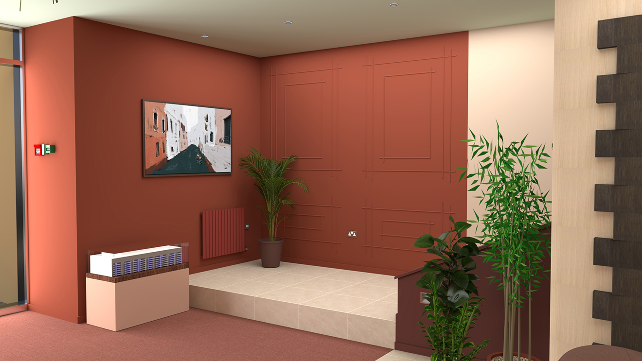 |
| Concept 2 - the area at the bottom of the stairs |
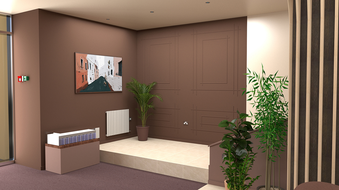 |
| Concept 3 - the area at the bottom of the stairs |
|
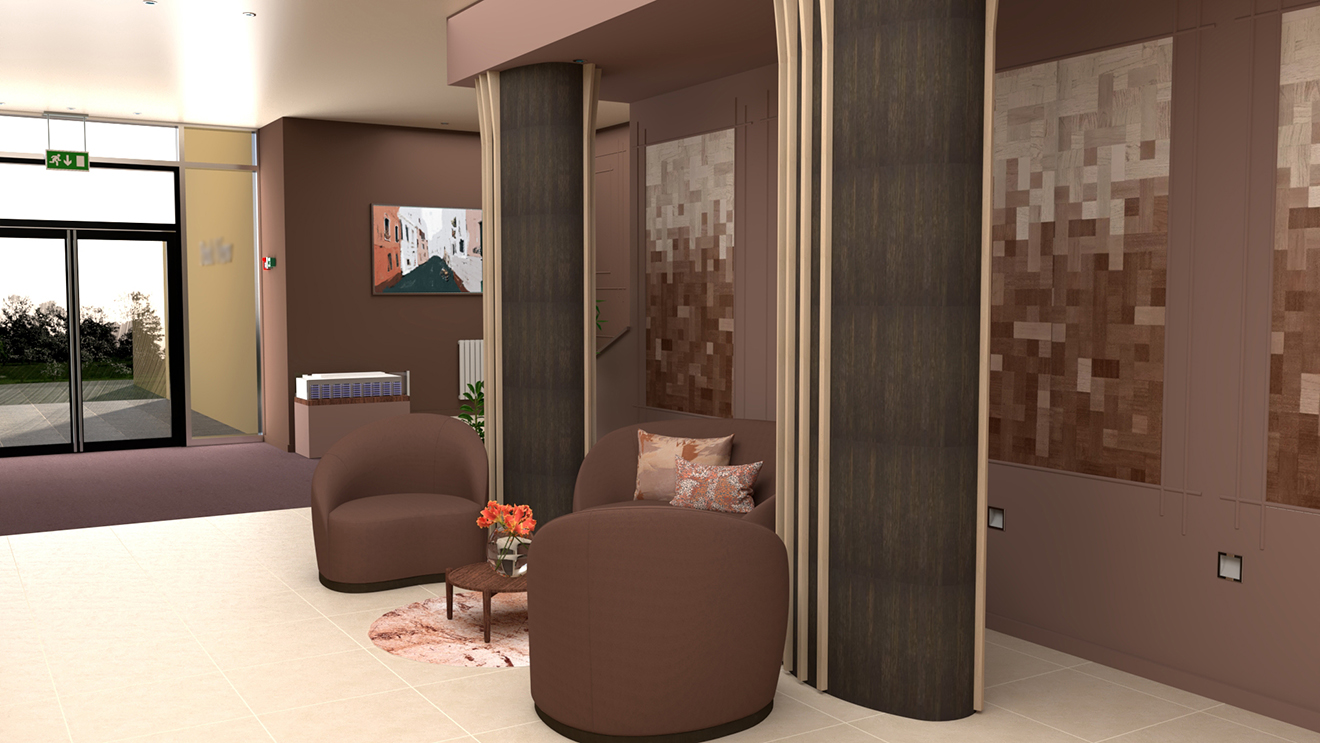
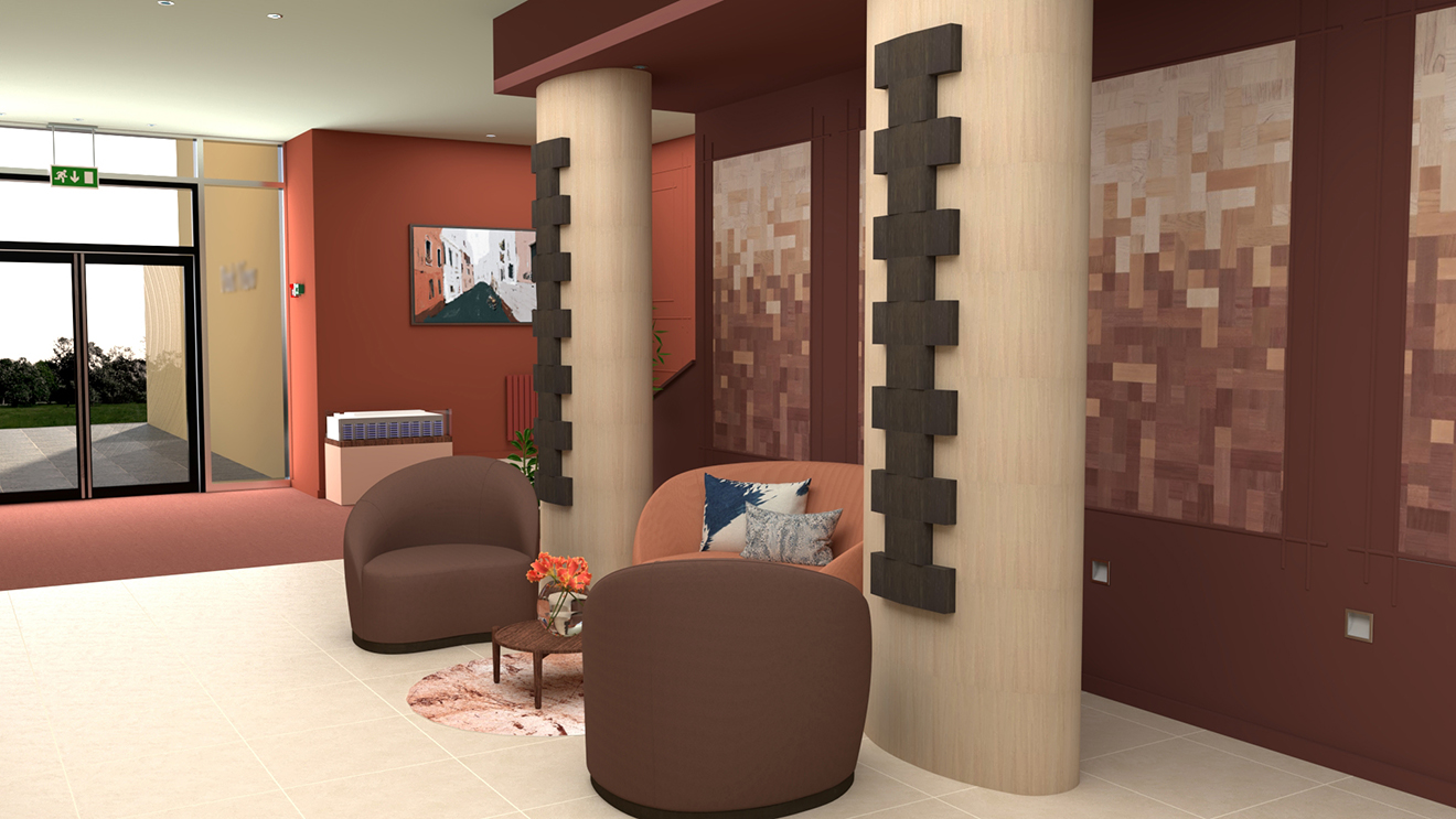
You can just see in the edge of these visuals that the pillars are both different to the first concept and each other. You might remember that the lobby currently has three large chrome pillars dividing up the space, and our client hated the shiny and cold look they had. Again, to give the residents some options to choose from, we decided to create three different pillar cladding designs so they could find something they liked. In each of our designs, we softened the pillars with wood in two finishes - a dark and a light to tie in with the existing mailbox and our client’s desire to lighten the lobby. In concept two, the pillars are clad in the lighter wood with a stepped design in the darker wood. This design was inspired by the decorative brickwork found on some of the Victorian houses near the apartment block, so it references the history of Cardiff and also ties this building to the ones surrounding it. In concept three, the pillars are clad in the darker toned wood to add depth and lightened with fluted strips of the lighter wood, in a design which flares out at the top. |
 |
| Concept 2 - the pillar cladding |
 |
| Concept 3 - the pillar cladding |
|
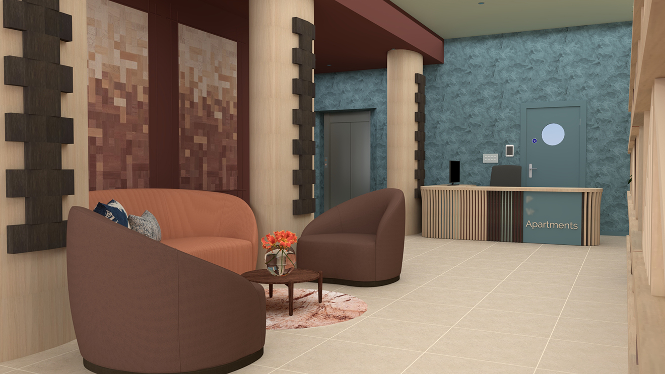
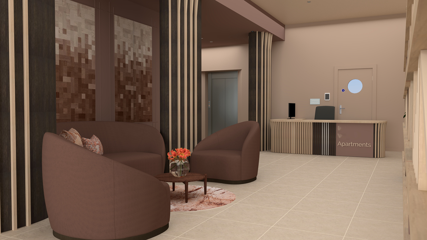
As you will see below, the fluted wood cladding used in concept three echoes the design of the new concierge desk in both concepts. The new desk design follows the footprint of the original as this would mean fewer changes at installation. You can see that there are many switches and controls behind the desk, such as those which open the underground garage doors, and it would require replastering the whole space to move these if the desk moved. So in these two concepts, the desk stays put, but gets a redesign. Here, I’ve mixed strips of light and dark toned wood with the same flare as the pillars at the top, backed with the two wood colours and a couple of the colours used elsewhere in the design. You can see that the large section of colour on the front of the desk lines up with the door behind the desk, and the name of the apartments is clearly stated at the front (blurred out for anonymity). The desk has also had the storage compartments at the back redesigned around the needs of the two concierges, so everything is at hand and they can see the security monitors easily. |
 |
| Concept 2 - the new desk design with a textured wall behind |
 |
| Concept 3 - the new desk design |
|
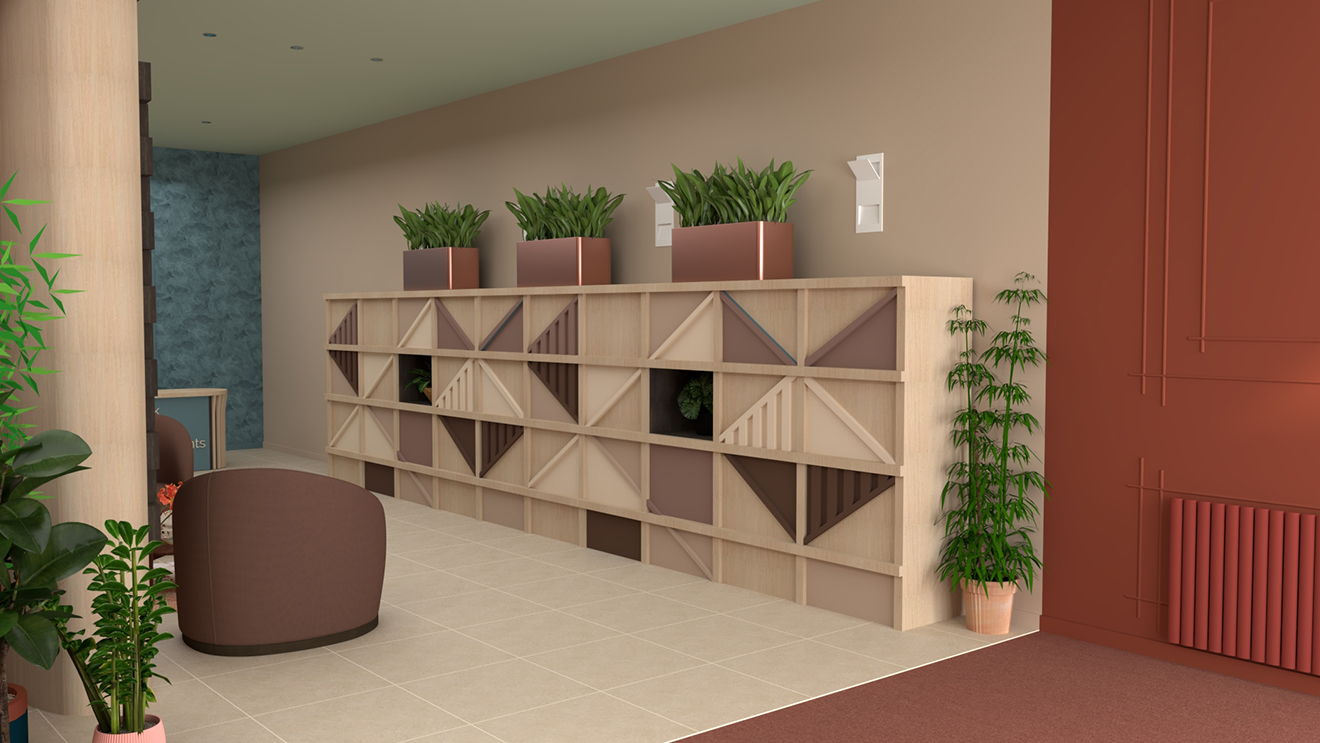
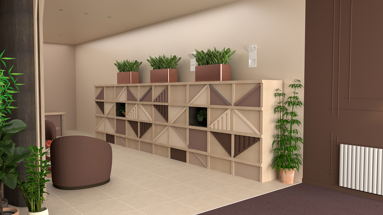
As we wouldn’t be moving or installing any lighting, the parcel storage cupboard would need to be shorter than in concept one so it didn’t cover the existing lights. This new design offers just as much storage as the one from concept one, with adjustable shelves and places for large and small parcels. It also has a similar geometric design, so it still fits the brief from our client. I decided to add planters on top of the storage to soften the rectangular look and help to break up the long wall, leaving gaps so the lights wouldn’t be obscured. |
 |
| Concept 2 - the new parcel storage |
 |
| Concept 3 - the new parcel storage |
|
You can see in these visuals that the panelling I added at the bottom of the stairs is echoed on the opposite wall, along with the paint colour. This is intended to create a welcoming cocoon as you enter the lobby, helping the residents to feel like they are home the moment they step through the door, before they move into the lighter, more sociable space. |
 |
| Concept 2 - the view towards the entrance doors |
 |
| Concept 3 - the view towards the entrance doors |
|
To replace the large piece of art which is currently hung on the wall behind the pillars that the residents find too dark and dominating, I opted to continue the panelling from the entrance, make it larger, and incorporate a large piece of geometric wallpaper in each section. This wallpaper is tactile and has a fabric look, which softens the overall feel of the space and breaks up the long wall. It makes a statement without being overwhelming, and isn’t a piece of art which could divide residents’ opinions. The seating area remains in the same position as in concept one, as I felt this was the most efficient use of space and created a moment for the residents to pause and chat to each other on their way through. |
 |
| Concept 2 - the wallpaper in moulded panelling |
 |
| Concept 3 - the wallpaper in moulded panelling |
|
These two designs, whilst having a more restrictive brief, successfully address the needs of the residents and brighten up the entrances to their homes. We are hoping that the ideal world design is the one the majority of residents will vote for, but if it isn’t, our second and third designs still make significant improvements and change the whole feel of the lobby. I actually surprised myself by finding that I prefer the neutral scheme to the colourful one, as the rich but muted tones envelop the space and create a very peaceful environment. Whichever scheme or combination of schemes the residents choose to implement, the result will be a vast improvement upon what they currently have. Our designs will help them to connect with their homes in a new way, and will allow them to feel that this part of the building belongs to them. |
Welcome to the design blog, where you'll see posts about anything from the projects we are working on, to the latest fabric and wallpaper collections, and all things interiors related. We love colour, pattern, architecture and old buildings, and we love to share our finds with you.
Happy reading!