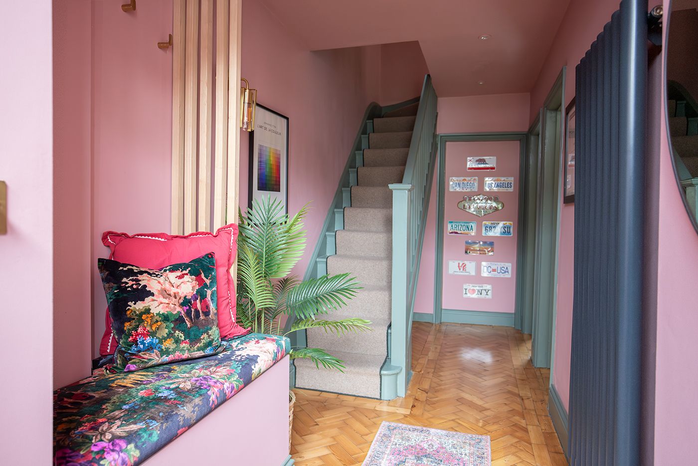
Design Reveal - The new build home
 |
||||
|
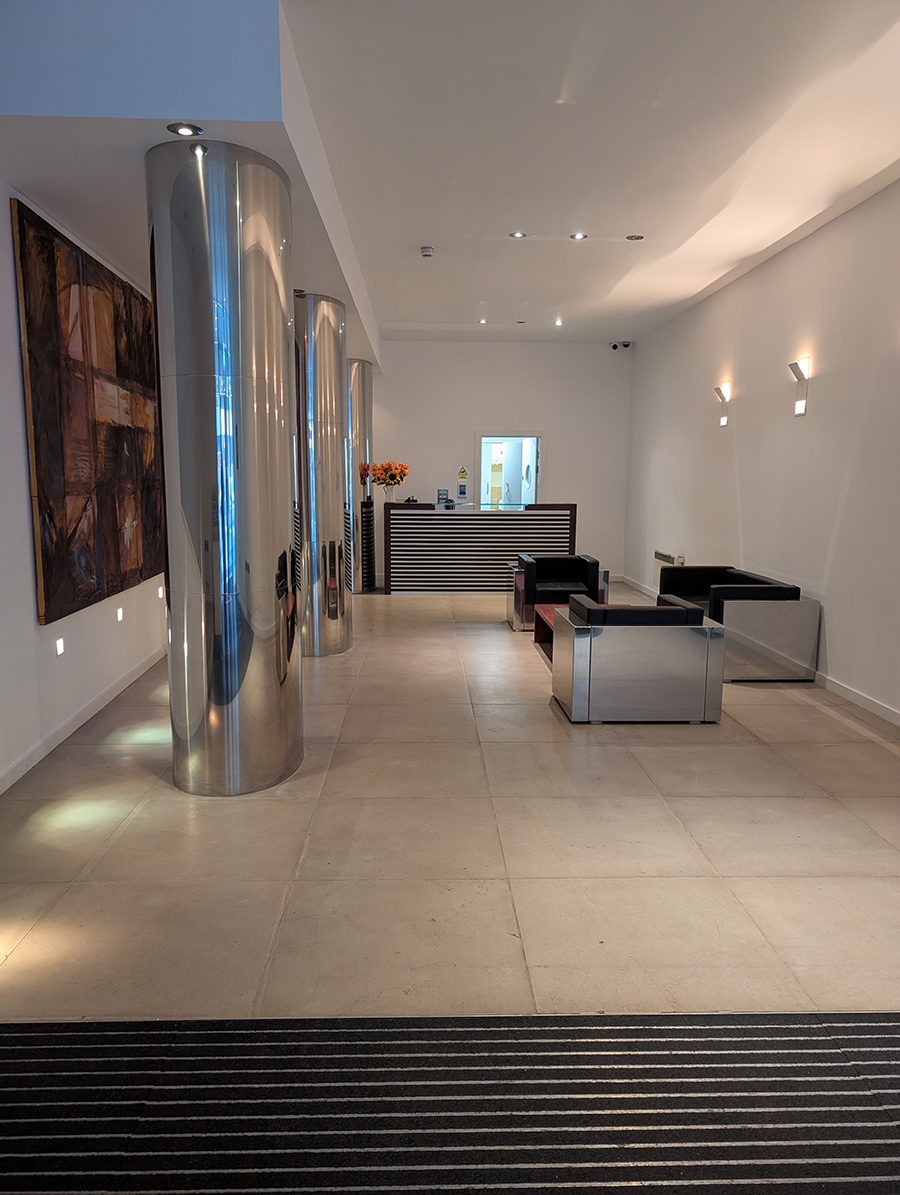
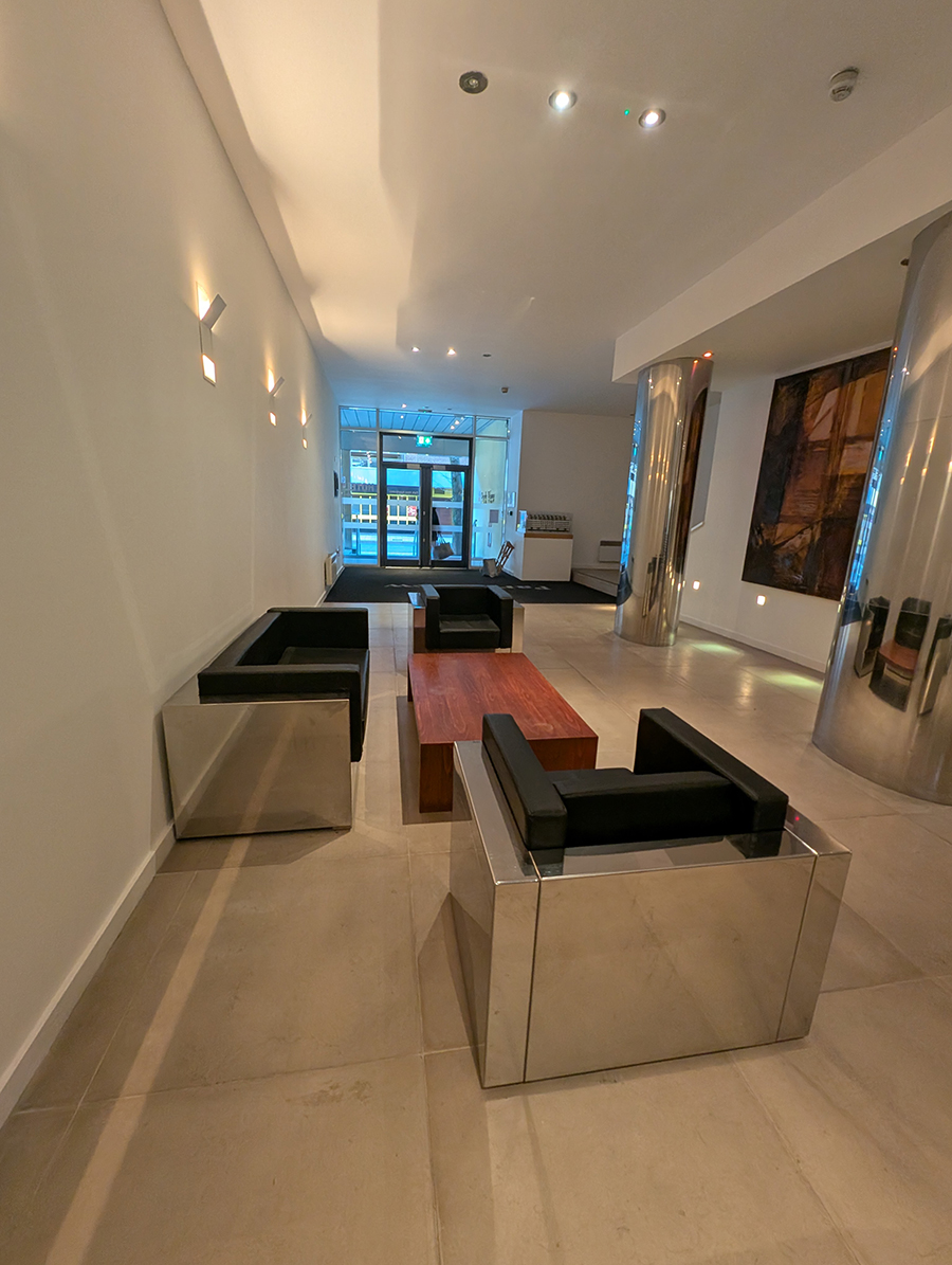
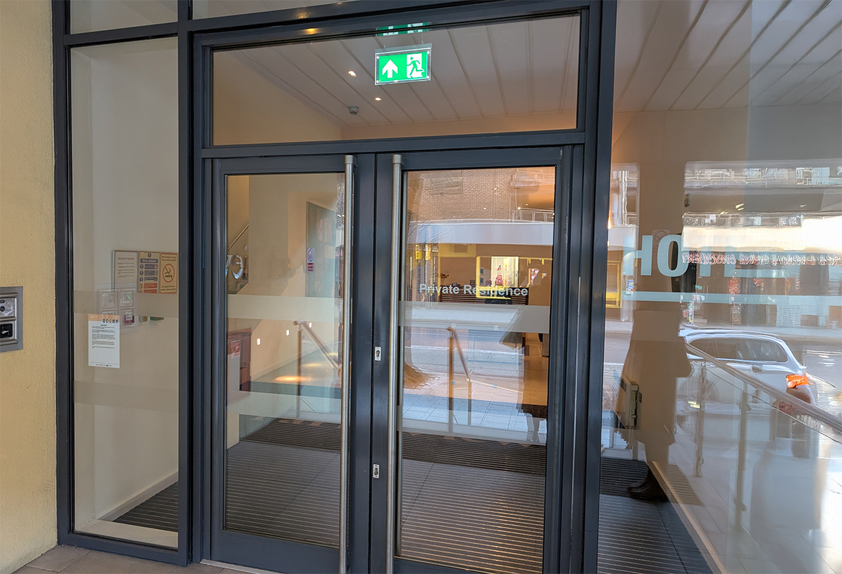
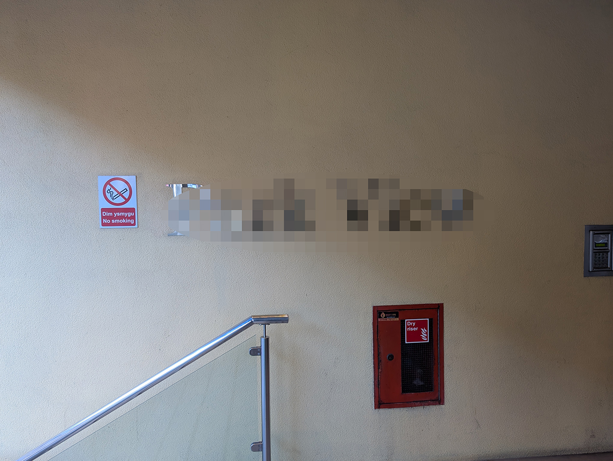
This month’s blog is another design reveal, this time for a new type of space for us - a lobby for a large apartment block in Cardiff. Although strictly speaking this is a residential project, current building regulations mean we have to treat it like a commercial project. With our design, we have followed all the rules on fire safety and materials suitability that we would have for a commercial space, and have relished the challenges presented by this approach. Although there are 30 residents living in the apartment block in total, we have only had one client and point of contact, as one resident is footing the bill for the whole build. That has made the client relationship easier for us to manage, but our client does have to get approval from all of the residents and also the director of the company who owns the freehold. The whole process will take some time, so it may be a while before we are installing this one, but for now, the design phase of the project is complete and ready to show you. When trying to determine the brief, our first question to our client was why does the lobby need to be changed? The main issue is that both she and many of the residents think that the entrance to their homes does not feel homely at all; in fact, it feels clinical and sterile. They would like a space which says ‘welcome home’ as soon as they walk in, and for it to feel like an extension of their own apartments upstairs. Another issue is that the building itself is part of a larger block which includes a hotel, with the hotel’s lobby next door. Many people confuse the apartment’s lobby with the hotel’s lobby, and wander in with their suitcases etc. on a daily basis. The lobby is also situated in the busy city centre next to many bars, so it suffers from drunk people coming in thinking it is a place where they can sit, or even sleep. The lobby has a concierge who is there most of the time, but the desk which the concierge uses is all the way at the back of the lobby, and is too far away for them to be able to intercept anyone wandering in. The residents have had a sign put up on the entrance doors which has the word ‘hotel’ and an arrow pointing to the hotel, but this sign is small so most people fail to see it. |
||||
 |
||||
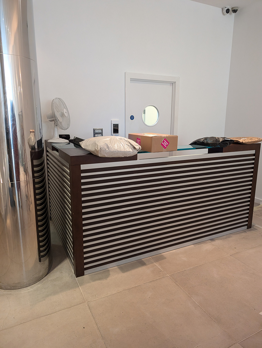
In our redesign we would need to make it clear that this is a private residential space and to try to discourage non residents from coming in. My first thought was to move the concierge’s desk to the front by the entrance doors. This would make the residents feel safer, as it would enable the concierge to speak to anyone coming into the building. I also planned to use zoning and colour to provide visual clues to the residential nature of the building, along with furniture and fabrics to create visual barriers to strangers. As you can imagine, a block of 30 residents receives many parcel deliveries a day, and they can’t all be kept behind the concierge desk, so the residents also wanted a safe place to store parcels. We agreed with our client that the parcel storage should be lockable, to keep the items safe until the residents can come to collect them. On top of these priorities, our client had gathered all the residents’ ideas and opinions before coming to us, and she gave us a wish list from them:
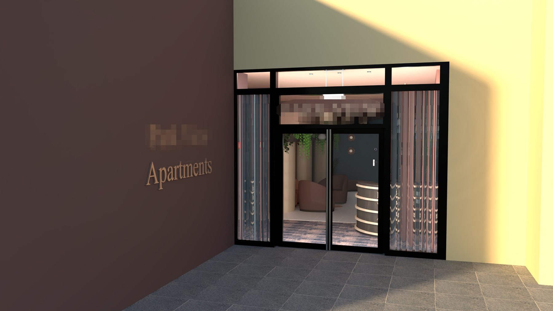
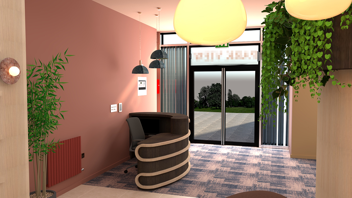
Additionally, our client loves both geometric and curved shapes and shades of blue, and she wanted these incorporated into the design somehow. She was also concerned that the director of the building wouldn’t be open to too many changes, and advised us that the residents would like to see a few options for the space before making any decisions. We agreed with her that we would produce three designs - one would be the ‘ideal world’ scenario if we could get everyone to agree to the changes, and two which would have as few changes as possible whilst meeting the brief. These two designs would be the same, but would have different colour schemes - one colourful and one neutral. I’ll cover the colourful and neutral designs in the next blog, and concentrate on the ‘ideal world’ concept in this blog. My thoughts began with the exterior of the building - the name of the apartments is written in chrome letters on the wall next to the entrance doors, but it's not clear what they refer to. The exterior is also painted in the same colour as the exterior of the hotel, making them look like the same building. Changing the colour of the wall and adding the word ‘apartments’ after the name would be an easy win to differentiate the two buildings, and changing the lettering from chrome to brass would make it feel instantly more homely. I also felt that adding curtains on the two long windows by the doors would soften the acoustics and make it feel more like a domestic space. The curtains would also provide a visual barrier so that the lobby looks private from the outside and not like a space that just anyone can walk into. |
||||
 |
||||
| we've blurred out the name to protect the anonimity of the residents | ||||
 |
||||
|
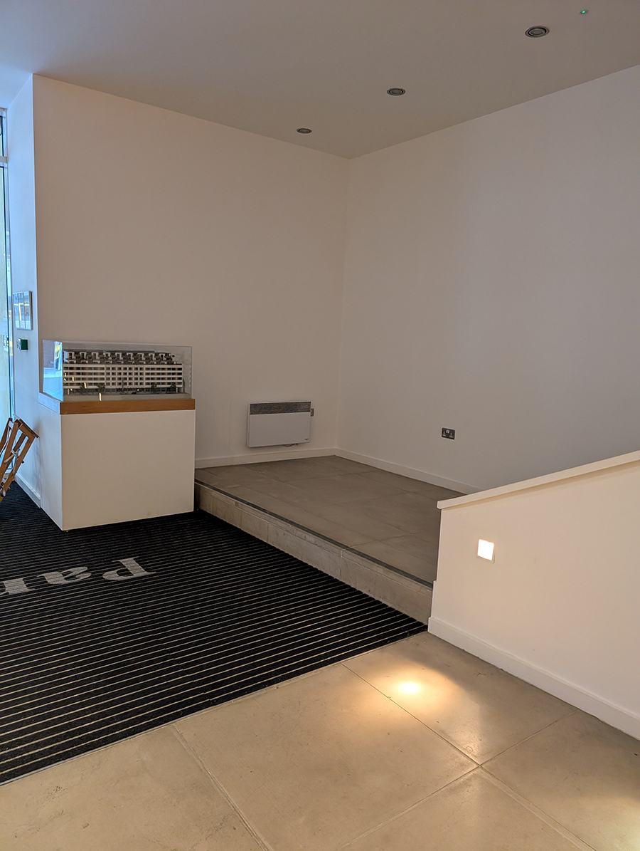
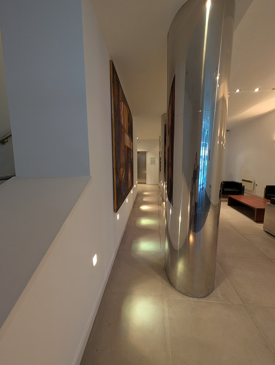
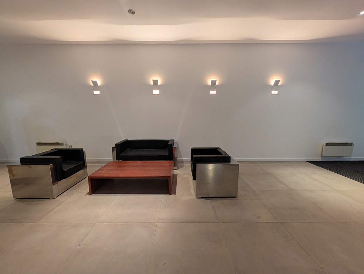
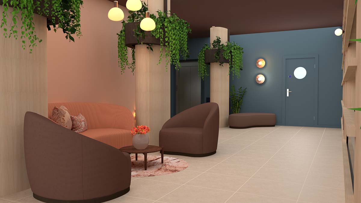
I then considered the layout of the space inside. As some of the residents are older and some have mobility issues, we would need to keep all walkways clear and wide enough to get a walker or wheelchair through. The current layout is divided by three large pillars which create a corridor behind them from the lift to the front door. This corridor isn’t wide enough for people to walk through comfortably, so it is never used. Instead, the residents walk past the area where the seating currently is, which makes the whole space feel like a corridor. No one uses the sofas as they have constant traffic from people walking by, so it doesn’t feel like a comfortable area to stop and pause. |
||||
 |
||||
 |
||||
| could this area look any more uninviting? | ||||
|
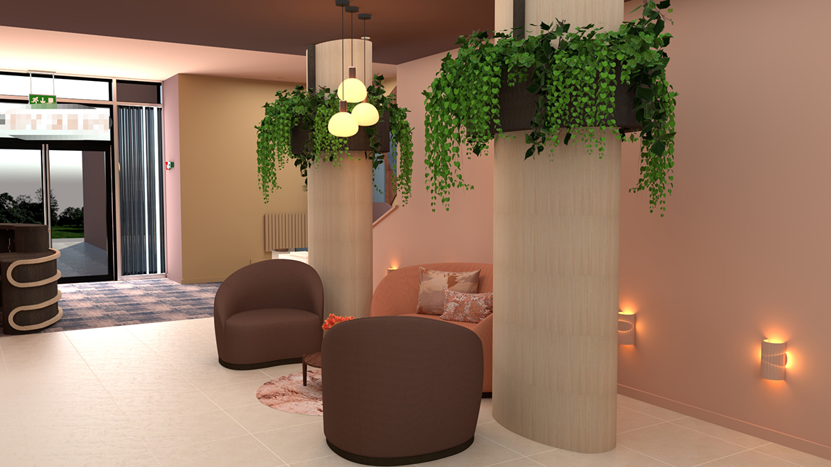
I decided to move the seating area across the room so that a sofa could nestle in between two of the pillars, with chairs flanking either side. This makes use of the dead space behind the pillars, and also widens the walkway from the lift to the front doors. The seating area created by the rug, new furniture and pendant lighting now feels like a destination, inviting residents to sit and chat to each other. I was careful to source a rug which is small enough not to be a trip hazard, and placed it so it isn’t in the walkway. |
||||
 |
||||
|
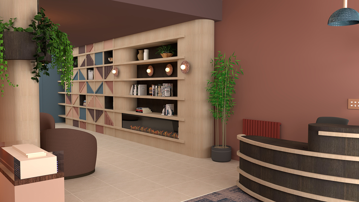
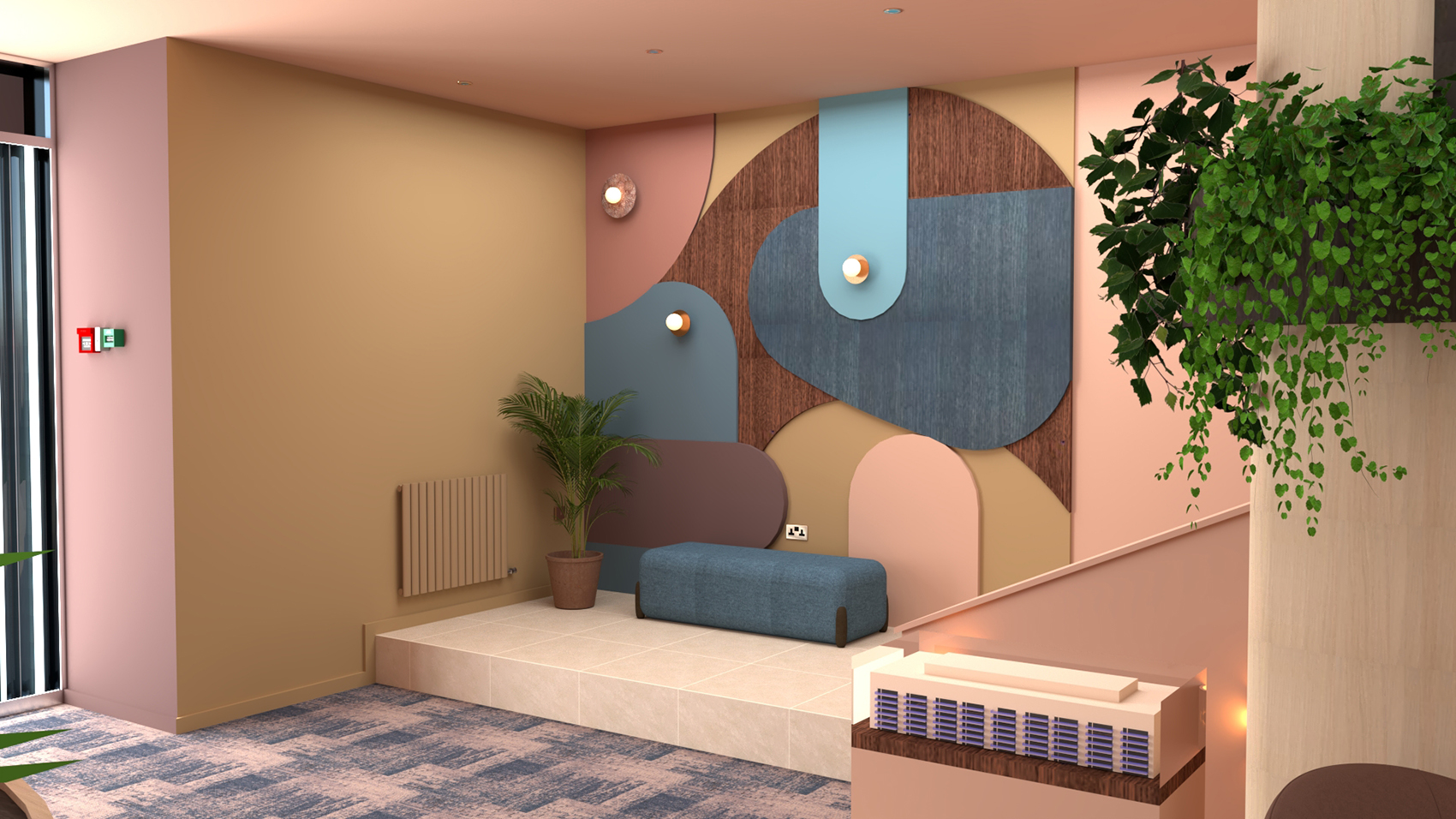
The wider walkway could now accommodate a piece of furniture for parcel storage, which I designed using a geometric design on the doors, which I knew our client would love. The shelves inside the parcel storage are designed to be removable and movable, so they can hold any size of parcel, and the whole piece is designed around standard parcel sizes. I extended this piece of furniture to include an electric fireplace, which would be positioned opposite the seating area and create a welcoming and cosy atmosphere. This large piece of furniture makes the lobby feel more like someone’s home (although on a grand scale), and it also breaks up the long wall, adding softness and warmth from the wood. I added shelving above the fireplace for the residents to store books on - this could become a book exchange if they wanted to use it this way, and it also allowed me to add some lighting to brighten the space whilst hiding the cables inside the unit. |
||||
 |
||||
|
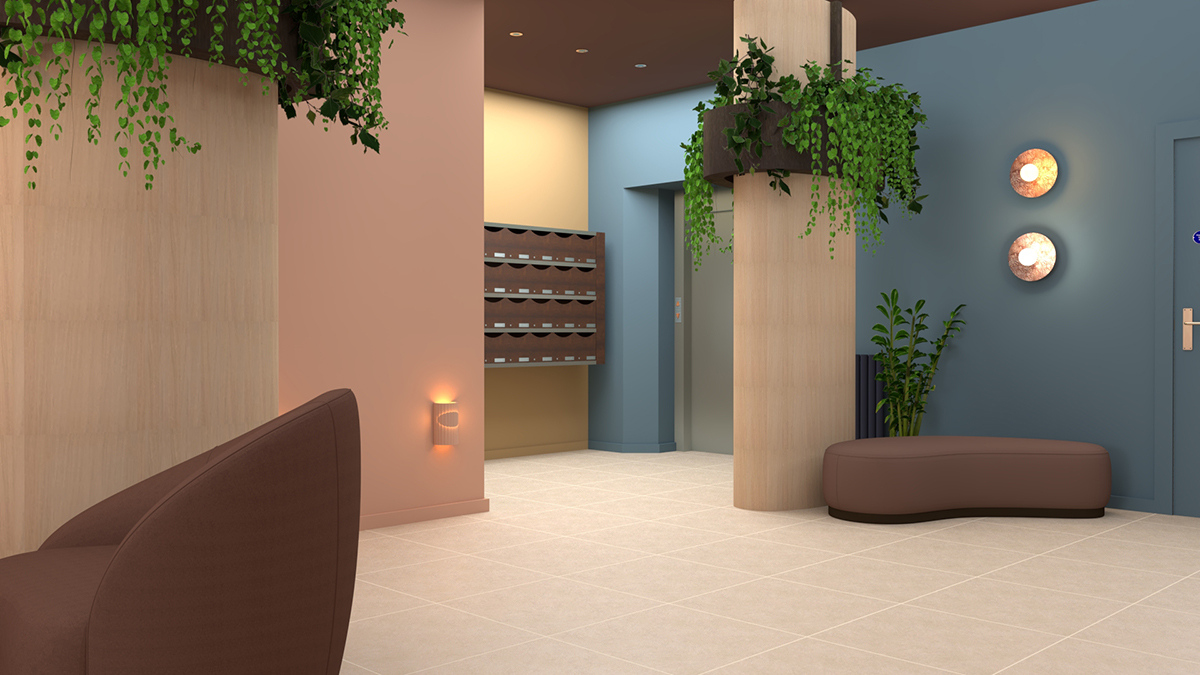
I also extended the lower part of the ceiling over the pillars to reach the opposite wall. I painted it in a warm aubergine colour, visually and physically lowering the height of the space to make it feel less expansive. Next, I designed the new concierge desk, using both the light and dark woods from the mailbox and parcel storage unit. I deliberately kept one side of the desk high so that the concierge could stand to greet people as they walk in, but lowered it on the other side so that the concierge can comfortably sit and work or view the security monitors. I designed a curved desk as it softens the space, is easier to walk around (for those with mobility issues), and it feels less intrusive as a piece of furniture. Adding three pendant lights above gives the concierge more light to work by, and provides a soft glow of light in the evening. |
||||
 |
||||
|
Moving the concierge desk from one end of the lobby to the other opened up a space for an additional piece of furniture by the pillars. I chose a curved pouffe, which would provide an area for residents to sit whilst they are waiting for the concierge to retrieve their parcels or waiting for the lift. The curve of this piece means it fits neatly into the space and is unobtrusive, whilst it satisfies our clients' love of curved shapes. I added two wall lights and a faux plant to make this area feel intentional, and not like an after thought. I also designed curved planters which would wrap around the pillars to soften them, whilst the planting would help to reduce echoes. By the way, all the faux plants in our designs for this space are fire retardant to comply with building regs. Who knew fire retardant faux plants were even a thing? |
||||
 |
||||
|
I decided to include a bench for visitors to sit on whilst waiting for residents to come downstairs to greet them. Positioning it opposite the desk means that the concierge can keep an eye on visitors, and delineates the public and private areas of this space, further reinforced by the change in flooring from carpet to tiling. The new carpet is tough enough to take the wear and tear of a busy lobby whilst the pattern, texture and colours are much more domestic in feel. I created a piece of wall art using stained and coloured woods to add interest and remove the need for a generic piece of art - finding one which would satisfy the tastes of 30 residents plus the building’s director would be a tall order. This piece projects slightly from the wall, allowing the cabling for the extra lighting to be hidden within the piece. |
||||
 |
||||
|
Mindful of wishing to avoid replastering as much as possible, I sourced wall lights which are wide enough to just cover the existing lights behind the pillars, so they can be installed over any holes left behind by their removal. I also added sensors to control all the additional lighting so that they would only come on when someone walks by, keeping additional running costs to a minimum. |
||||
 |
||||
|
Finally, I sourced brushed brass spotlights and plug sockets/switches to replace the existing chrome ones, instantly updating the space and toning down the shiny, clinical mood of the lobby. They match the new exterior wall sign and the lettering on the concierge desk, adding warmth and a sense of luxury. This design has been an interesting one to tackle, with all the varying needs and opinions of the residents, and the building regulations to follow, but I have really enjoyed it. Our client is over the moon with the design, and said she was very impressed with our presentation and how detailed it was. Fingers crossed the other residents fall equally in love with the plans and we can implement them soon. |
Welcome to the design blog, where you'll see posts about anything from the projects we are working on, to the latest fabric and wallpaper collections, and all things interiors related. We love colour, pattern, architecture and old buildings, and we love to share our finds with you.
Happy reading!