My current colour crush
|
Now that we’re really into October, and can officially say that it’s Autumn, I thought I’d write a little post about the colour trends for the coming year. Autumn is my favourite season (and not just because it happens to contain my birthday). I love it because it’s still warm enough to enjoy the outdoors, the air is crisp and clear, and the colours that nature combines for us to see are just stunning. |
 |
|
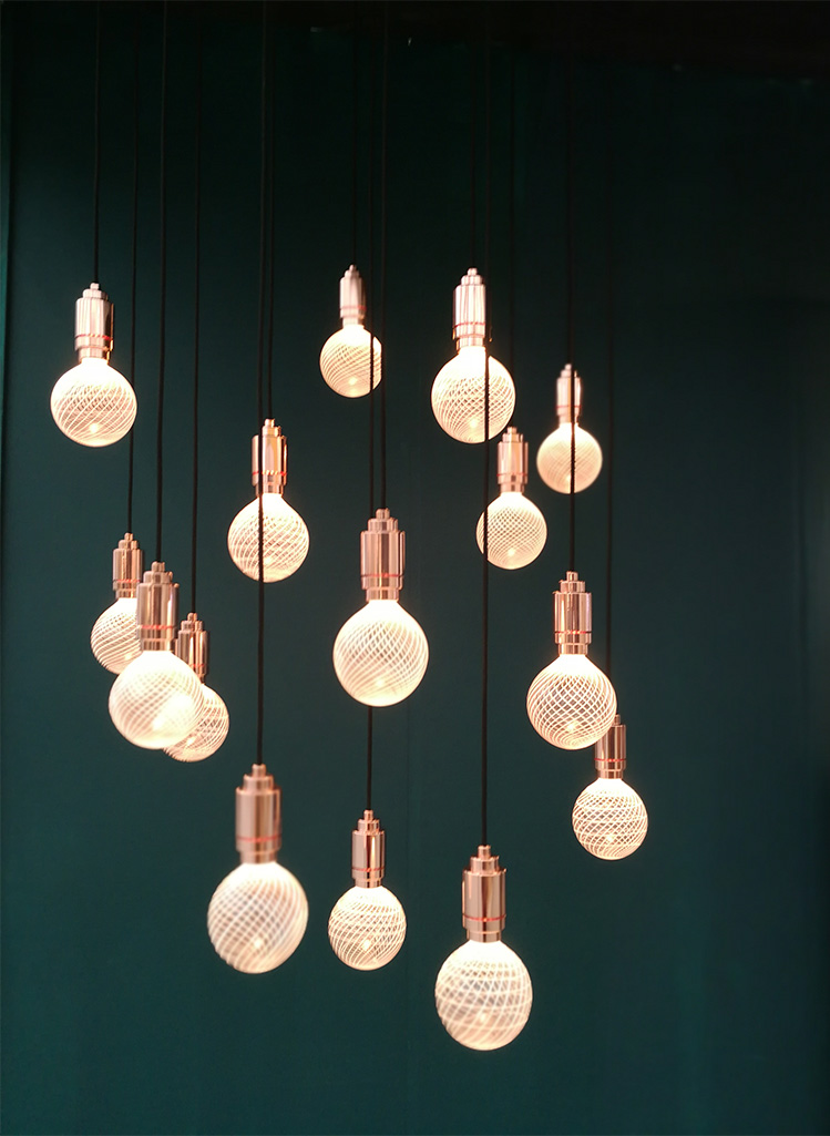
Colourwise, we’ve seen a lot of blues and greens over the past year, and many of the shades have been quite dark and moody. These saturated colours have provided a great backdrop for the Art Deco inspired furniture trend, and look great with brass and anything shiny, with strong architectural shapes such as palm leaves complementing them well. |
 |
|
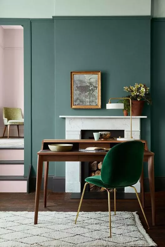
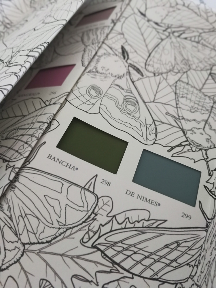
So, what will be different next year? Blues and greens will remain an enduring trend (particularly for kitchen cabinets) but we’ll see a shift towards softer greens such as sage and moss, and blues will contain more grey tones, giving them a more grounded feel. These two new colours from Farrow and Ball are an example - Bancha is described as a dark olive green, providing a feeling of security, and De Nimes is named after the French town famous for the cloth worn by its workers, down to earth and dependable denim. |
 |
|
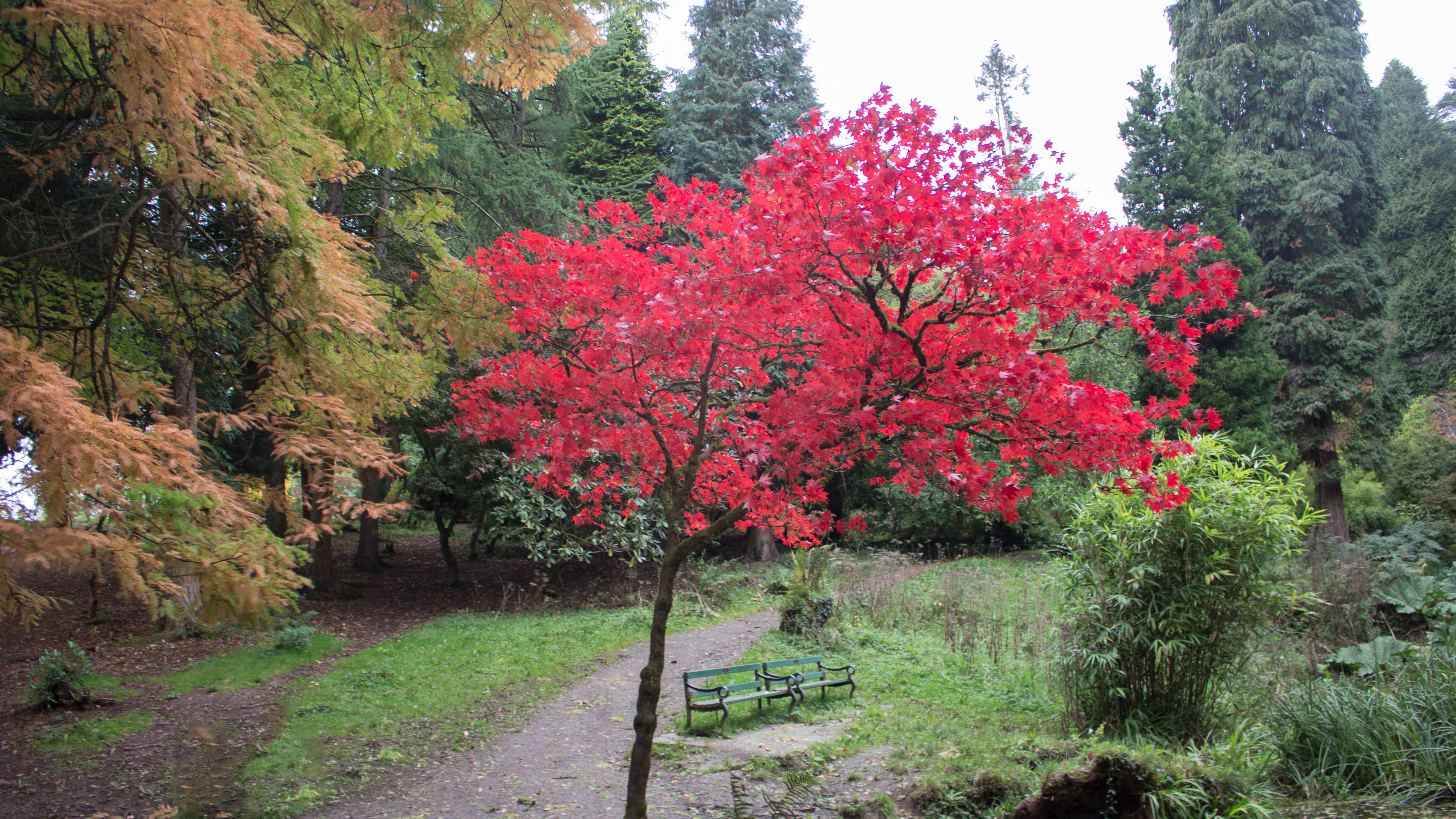
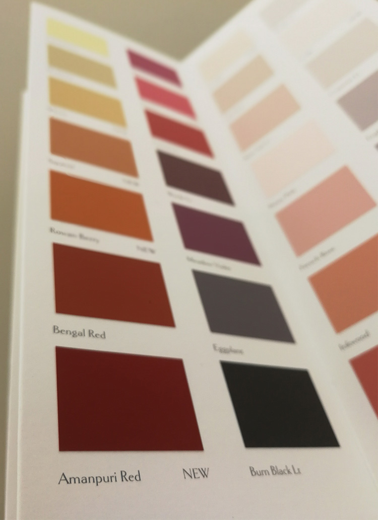
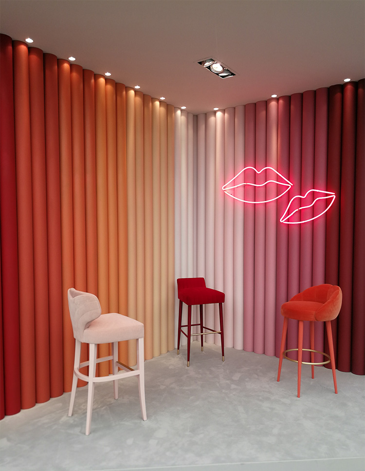
Reds will also come into their own, but not the bright reds we remember from the feature walls of the 90s (thankfully!). They’ll be more earthy, subtler tones of russets and terracottas, and deeper, muted reds, like Amanpuri Red, one of the new paint shades from Sanderson launched this Autumn. In fact, this whole page of their new colour card is very Autumnal, and very on trend for next year! |
 |
|
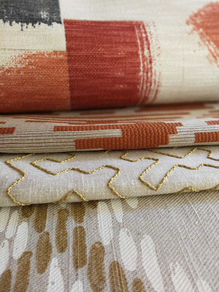
Mustards and ochres fit well into this new set of earthy tones for next year, and colours which could be described as ‘tobacco’ or ‘whiskey’ are going to be everywhere. These colours are supposed to help us switch off from the tech, and provide a warm, cosy, warm and solid base for us to recharge and feel more positive. This new collection of fabrics (called Huari) from Villa Nova contains all of these colours throughout, and here are some of my favourites - with gorgeous colour names like 'Tabasco', 'Russet' and 'Husk'. |
 |
|
Although not listed on any trend reports, I also think blush pink will continue to be popular, as this is a colour that can be used in most rooms and can either be traditional or contemporary, depending on the other pieces used in the scheme. The difference will be in the exact shade, as it will benefit from the other earthy tones around it, to become less pastel with slightly more brown added, producing a more settled colour. |
 |
|
Of course, we don’t have to follow the trends and I’m not suggesting that we all rush to paint our homes in shades of clay, as each person’s taste is as individual as they are. But I think it’s really interesting to see how the way we feel about what’s going on in the world around us can inform our choices when decorating our homes, as, after all, our homes are the places where we want to feel most safe and nurtured. |
Welcome to the design blog, where you'll see posts about anything from the projects we are working on, to the latest fabric and wallpaper collections, and all things interiors related. We love colour, pattern, architecture and old buildings, and we love to share our finds with you.
Happy reading!