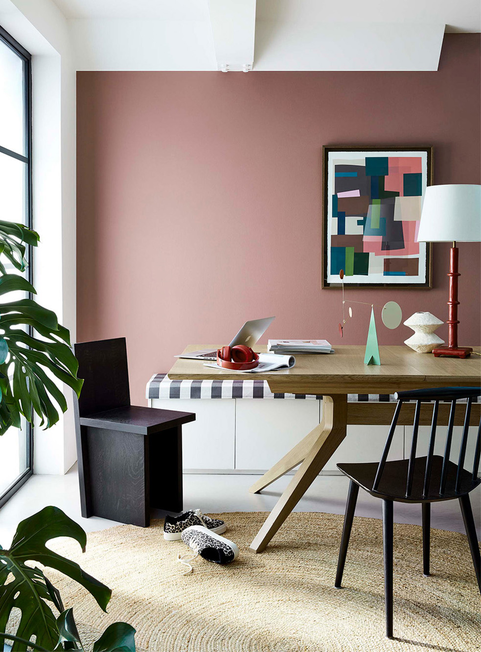
What colour should I paint my walls?
 |
||||||
|
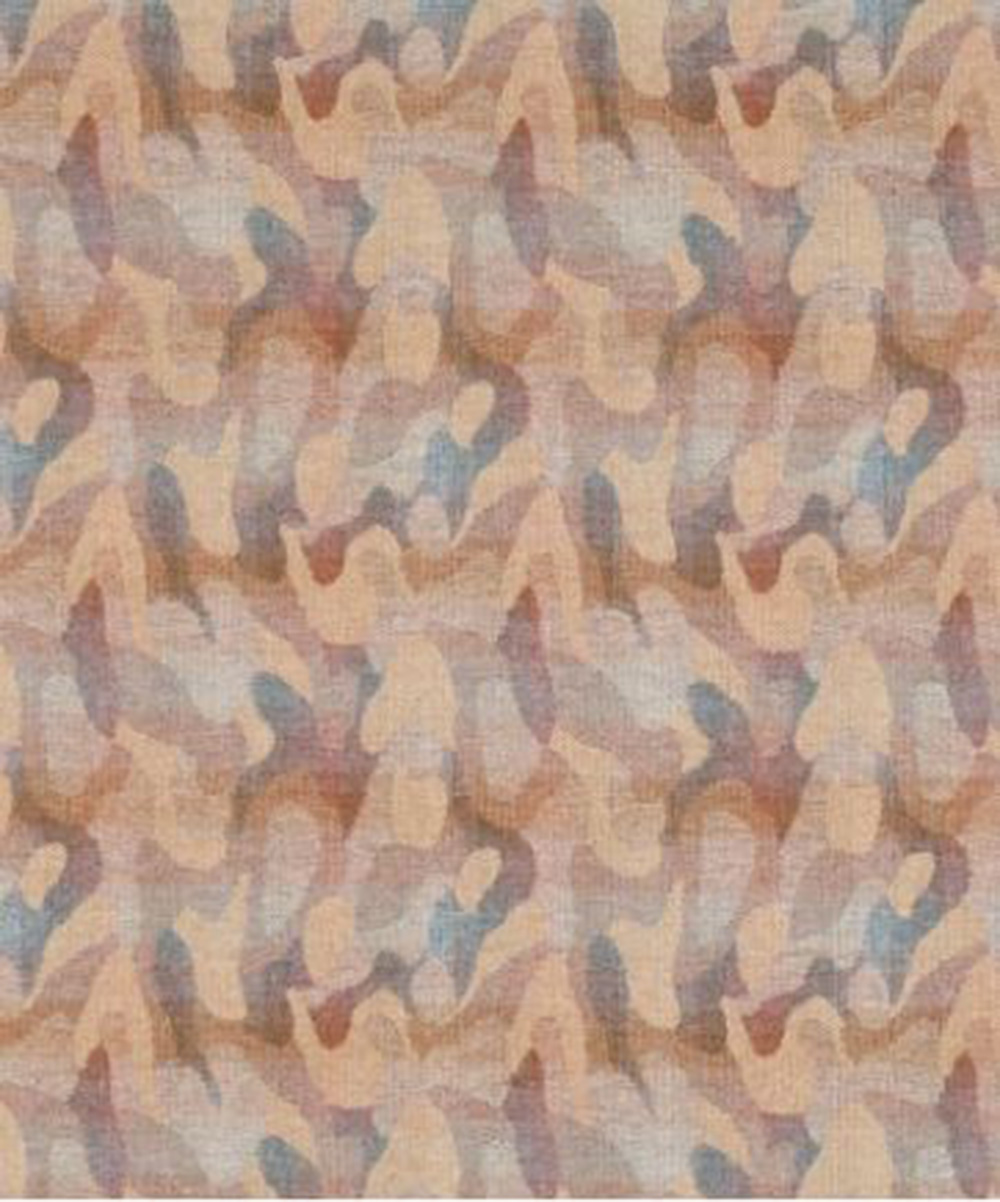
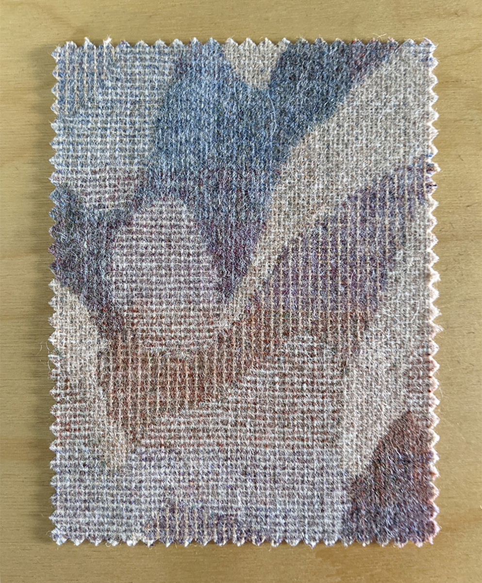
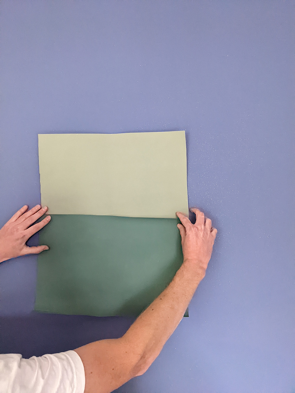
As we’ve been living life through the lens of an online world for some time now, partly because of the pandemic, and partly because of the way our shopping habits and high streets have changed, I have been thinking about the importance of the physical world versus the digital or online world. Many people (including me) love the convenience of shopping online for things, and that you can now buy literally anything you need easily and quickly. No more parking hassles. No more traipsing round the shops only to find that they all sell similar versions of the same thing, or that the item you wanted has been snapped up by somebody else and the store can’t get any more stock in. The advantages of online shopping are many. But what about the disadvantages? For me, the big downside is that you can’t see, touch, or really understand the item before you buy it. How many of us have bought something like a sofa online, and despite checking the dimensions, have found that when it arrives it just looks different - smaller or larger than we expected, or it just takes up more space than we thought it would? As a designer, I need to be able to see the colours and materials of the items I’m specifying for my clients, and I need to check that they all work together as a whole. But it’s not always possible to see every single item I choose before buying it, so this is where sampling comes in. A computer screen can never show you the way the textures in a fabric look and feel, or the way the fabric moves and reacts to the changing light. And when it comes to colour, the colour you see on your screen will depend on the way your computer monitor or phone screen is set up, and also the way the item was photographed and edited. There are so many variables with colour, that you really can’t tell what the item will look like until you see it in person. If there is also any pattern on your chosen fabric, it can be really hard to appreciate the scale or the repeat of the pattern on a screen. For example, I’ve often thought I’d found the perfect wallpaper for a client, only to have the sample arrive to see that the colour is way too strong, or that in real life the pattern would make my eyes go wonky if it’s repeated across a whole wall. Below, the picture on the left is the photo of a fabric from the supplier's website, on the right is the sample on my desk. The supplier's photo doesn't show the true colours or the texture of the fabric. |
||||||
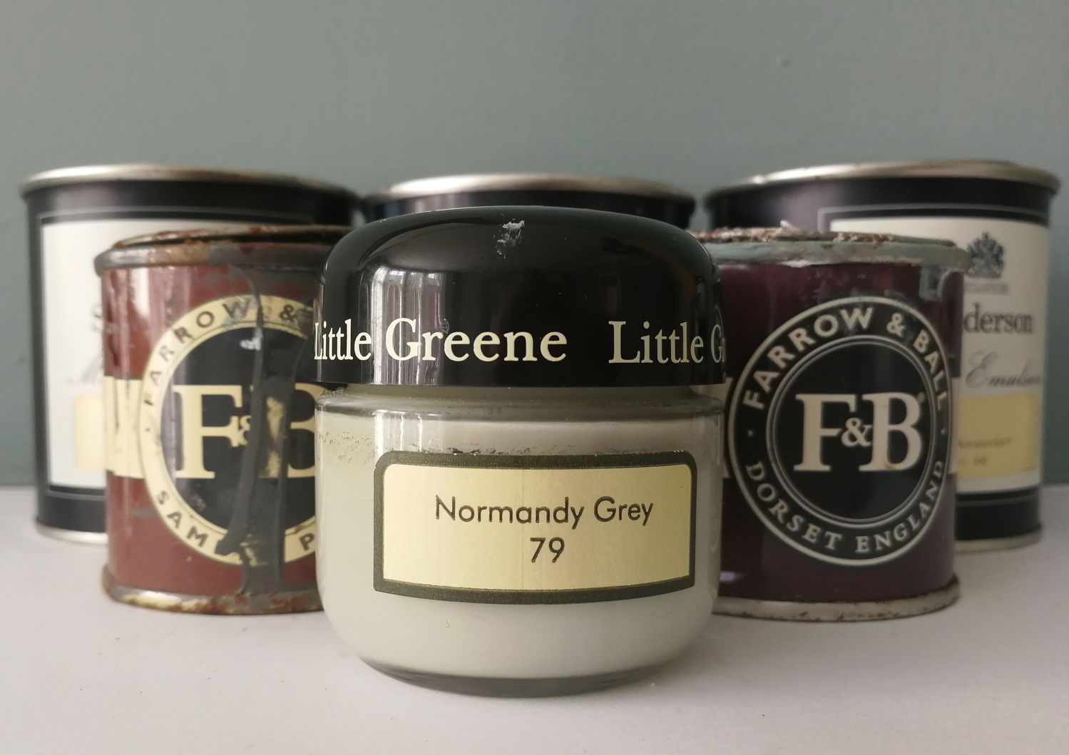
I appreciate that you can’t easily get a sample of a light fitting, but if you are buying fabrics, paints, wallpapers, flooring or furniture, you can and should get samples to see the colours and textures before you commit to buying. The colours and finishes of your samples will show you how these items will look and work together in your home, and will help you decide if you are going to be happy with the overall finished look. The most obvious case for the difference sampling can make is when you are buying paint. We’ve all fallen in love with a paint colour from a beautifully shot photo on the paint brand’s website, only to find that the colour looks completely different on the walls in our home. This can be annoying if we have just spent the weekend redecorating a room, or it can be expensive to fix if we have just paid a decorator to do it for us. If we don’t like the results, we often end up throwing away any left over paint (or we stick it in the shed and hope it disappears into the shed black hole). But paint does go off eventually and in a couple of years, those tins of paint will be useless to anyone. So wouldn’t it be better to get it right the first time? |
||||||
|
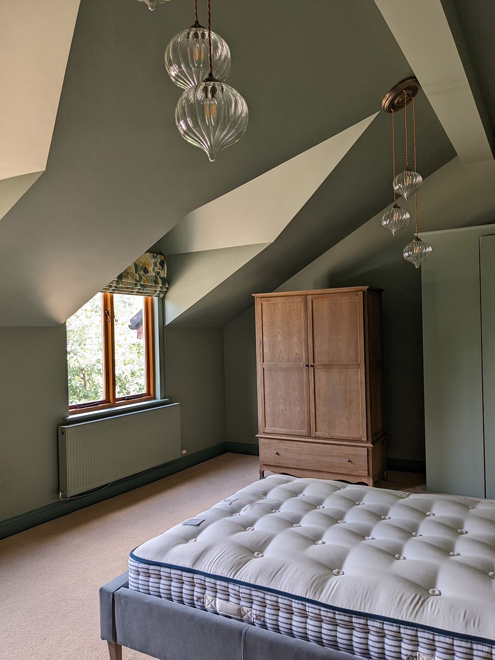
Here’s one of the photographs from Little Greene of their paint colour ‘Nether Red’, followed by an image from a Designer on Call client I worked with a few years ago. The first image is the studio photograph from Little Greene, the second is the paint colour in the client’s home. You can clearly see how the light in the studio photograph makes the paint look more red, and in my client’s home with lower light levels it looks more brown. |
||||||
You can see how important it was that the client tried out the colour on their walls before ordering and booking the decorator. The colour did look quite different in their home and they needed to be sure they were happy with it. Most suppliers will send out a few wallpaper and fabric samples for free, often with free postage. Some will even accept unwanted ones back, so they’re not wasted, but even if you have to pay a few pounds for some paint tester pots that’s still a better deal than buying a whole room’s worth in the wrong colour. So, once you have your samples, what next? It’s very important to view them in the light of your home, as that will be very different from seeing them on a computer screen or in the artificial lighting in a shop. I’d even go so far as to recommend checking samples in the room they will be used in and in the same lighting conditions you will have when using the room. For example, if you are buying an armchair for a room which you use mainly in the evenings, then check the fabric sample in the evening light, with the lamps that you usually have switched on, as well as in daylight. You might find that you like the fabric in daylight but not with the glow from your lamps and need to make another selection, which will save you from making an expensive mistake. Once you have chosen the samples you like the most, it’s also very important that you put them together and look at them all at the same time, and in the room they will be going into. This can be the tricky part - it means being organised and waiting until you have all the samples before buying anything, but I promise you that your patience will be rewarded. |
||||||
 |
||||||
|
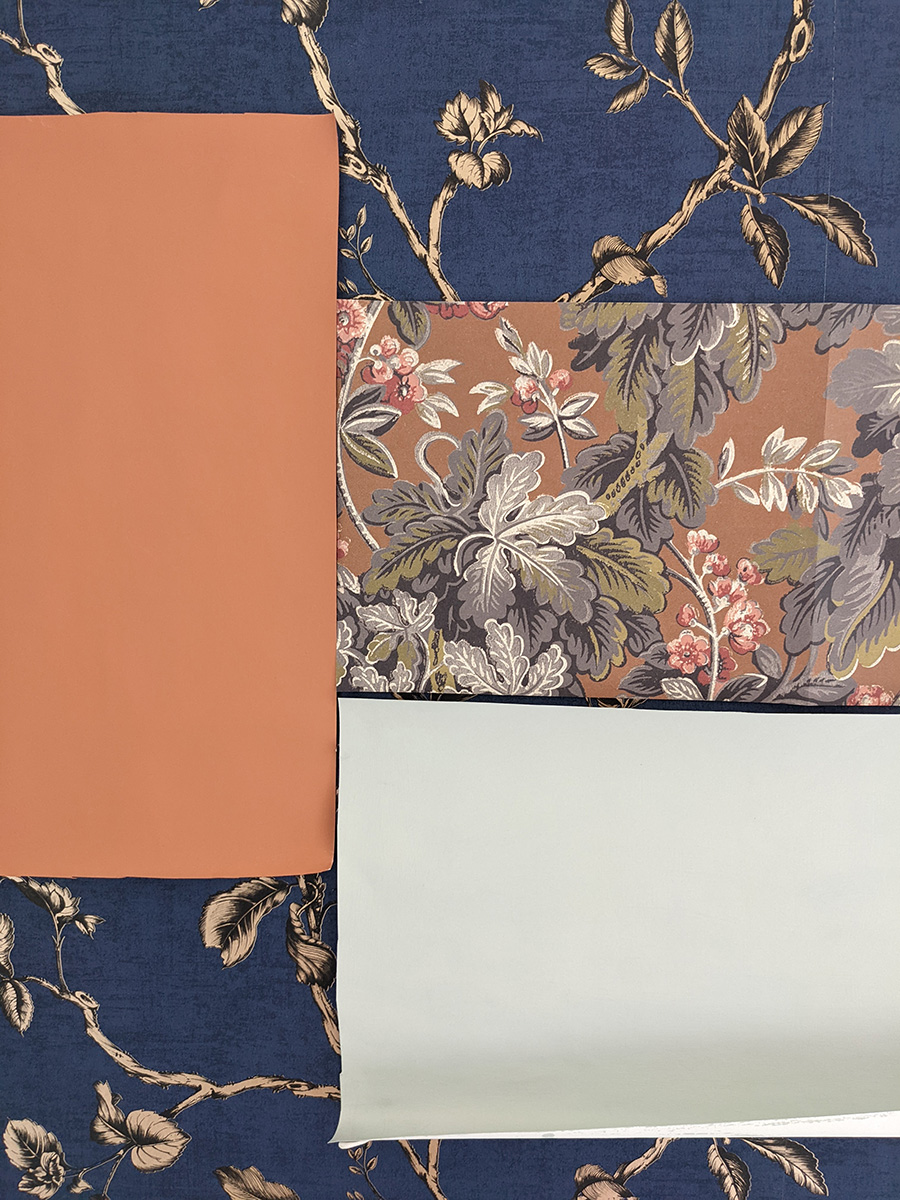
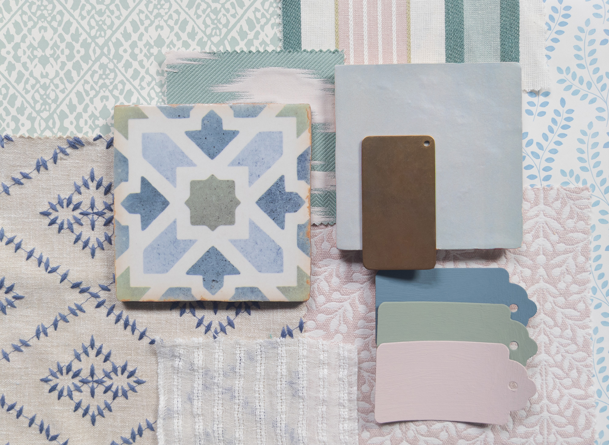
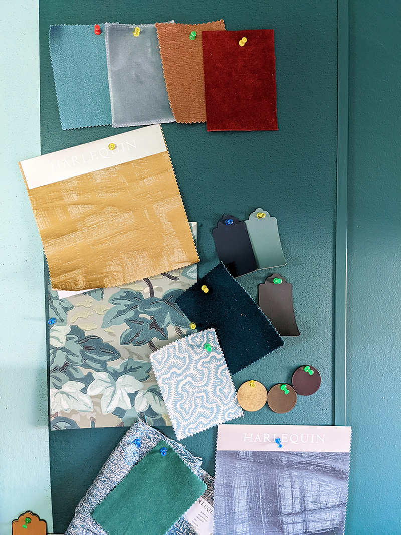
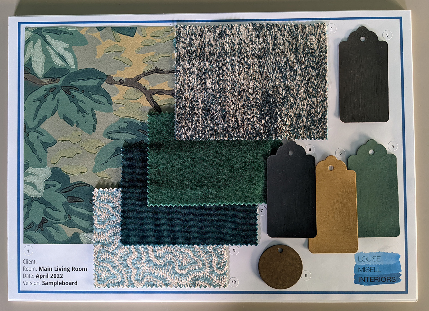
Here are some samples on our notice board in the studio, pinned up as we were working on a living room scheme for a client. Typically, we choose finishes and fabrics and order samples, and place them all together on the board as they arrive. Once they’re all here, we then look at them as a whole and weed out any which don’t work colour or texture wise, or don’t contribute to the look we are going for. It’s much easier to make these decisions when you have this overview of a project, and saves a lot of time and energy versus trying to decide as each one arrives. Of course, when we put a design together for clients we do it under the lighting conditions of the studio, but we always take the physical samples to clients’ homes when presenting the schemes to them. We need to show them to the clients so that they can see if they like them, so they can touch the samples to see how they feel, and we also need to check them in the lighting conditions of their home. Here’s the finished board which we made for the living room project: |
||||||
 |
||||||
|
Recently, we were working on a whole house project and had carefully chosen all the paint and wallpapers to go together, and as the clients lived overseas, we were working over email and sending photos of the items to them. In this case, the clients couldn’t see or touch the samples, so they had to trust us, but we still painted large cards of the paint and took photos of them with the wallpapers in the home to double check that the colour combinations worked. |
||||||
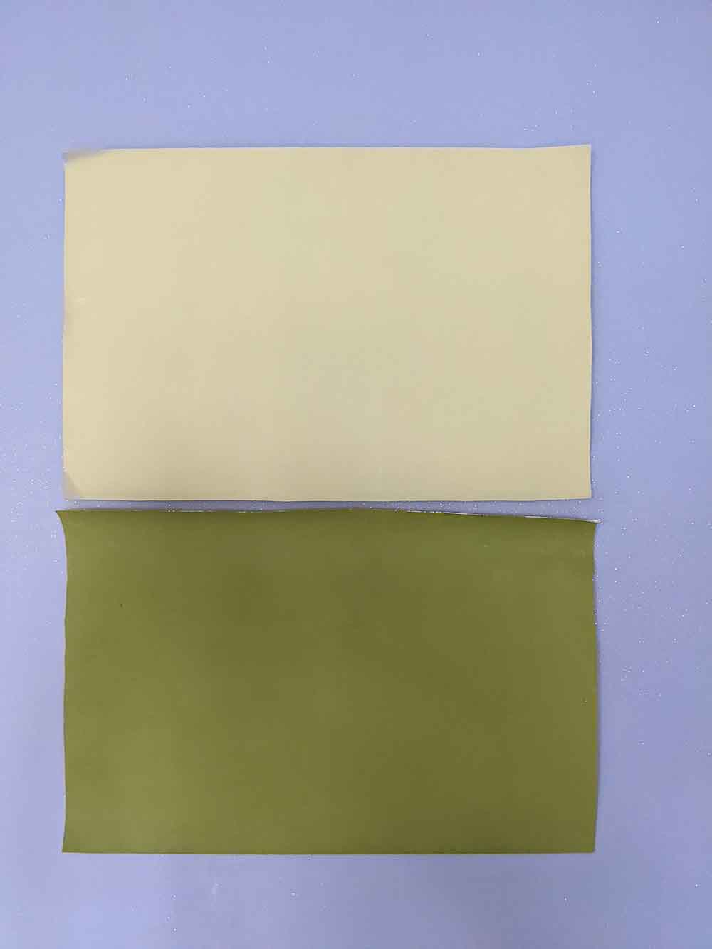
Almost all of the colours we’d chosen looked great in the home, but there was one room which we changed. The two colours, Sage Green and Jewel Beetle, just looked too harsh and the yellow undertones were too strong in the light from the North facing room. So we had a rethink and changed the colours to Windmill Lane and Pleat. Even though we were on a tight schedule with this project, we still took the time to paint these new samples on large cards and go back and check them once we’d chosen them. It’s always worth making sure you’ve made the right decision before committing to it - in this case it would have been an expensive mistake to fix, because we would have had to pay the decorator to paint the room a second time in the new colour choices and it would have caused a delay and thrown us off schedule. |
||||||
So, I hope this post has convinced you to get ordering those all important samples before buying anything for your home. It really is worth putting the time and effort in to get it right and avoid those expensive mistakes. Of course, if you don’t have the time to do it yourself, you could always hire a designer to do it for you! |
Welcome to the design blog, where you'll see posts about anything from the projects we are working on, to the latest fabric and wallpaper collections, and all things interiors related. We love colour, pattern, architecture and old buildings, and we love to share our finds with you.
Happy reading!