

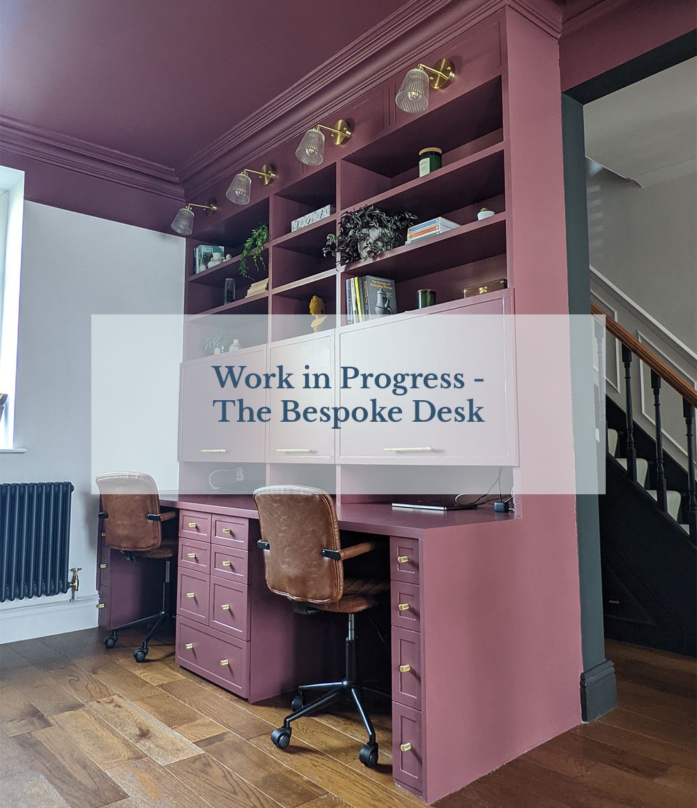
Work in Progress - The Bespoke Desk
 |
|||||
|
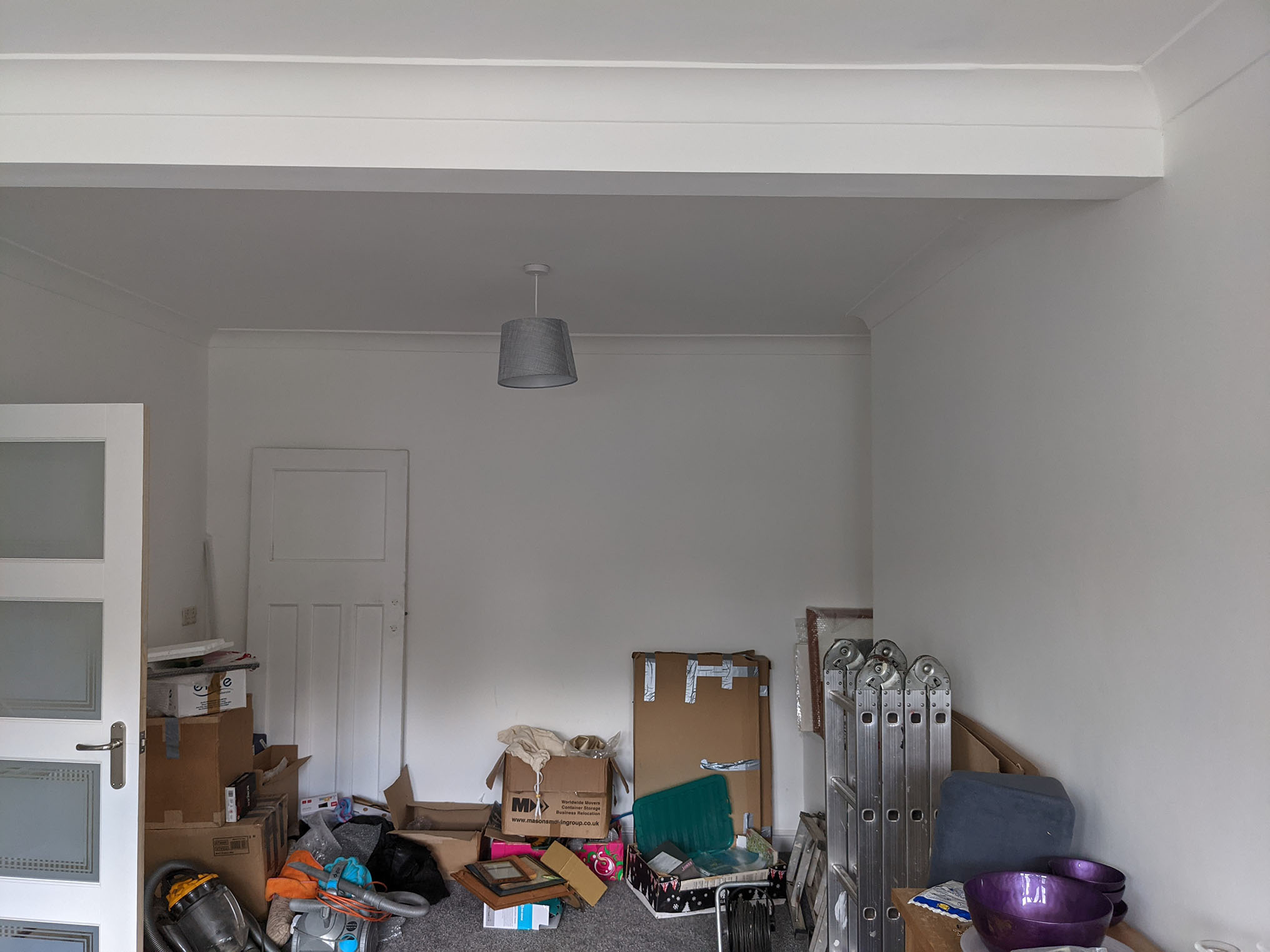
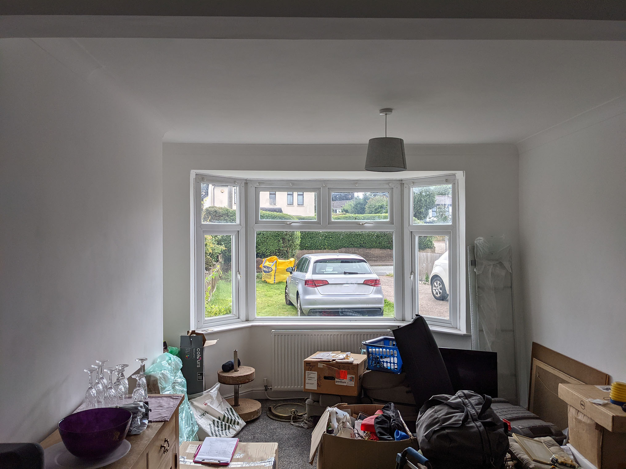
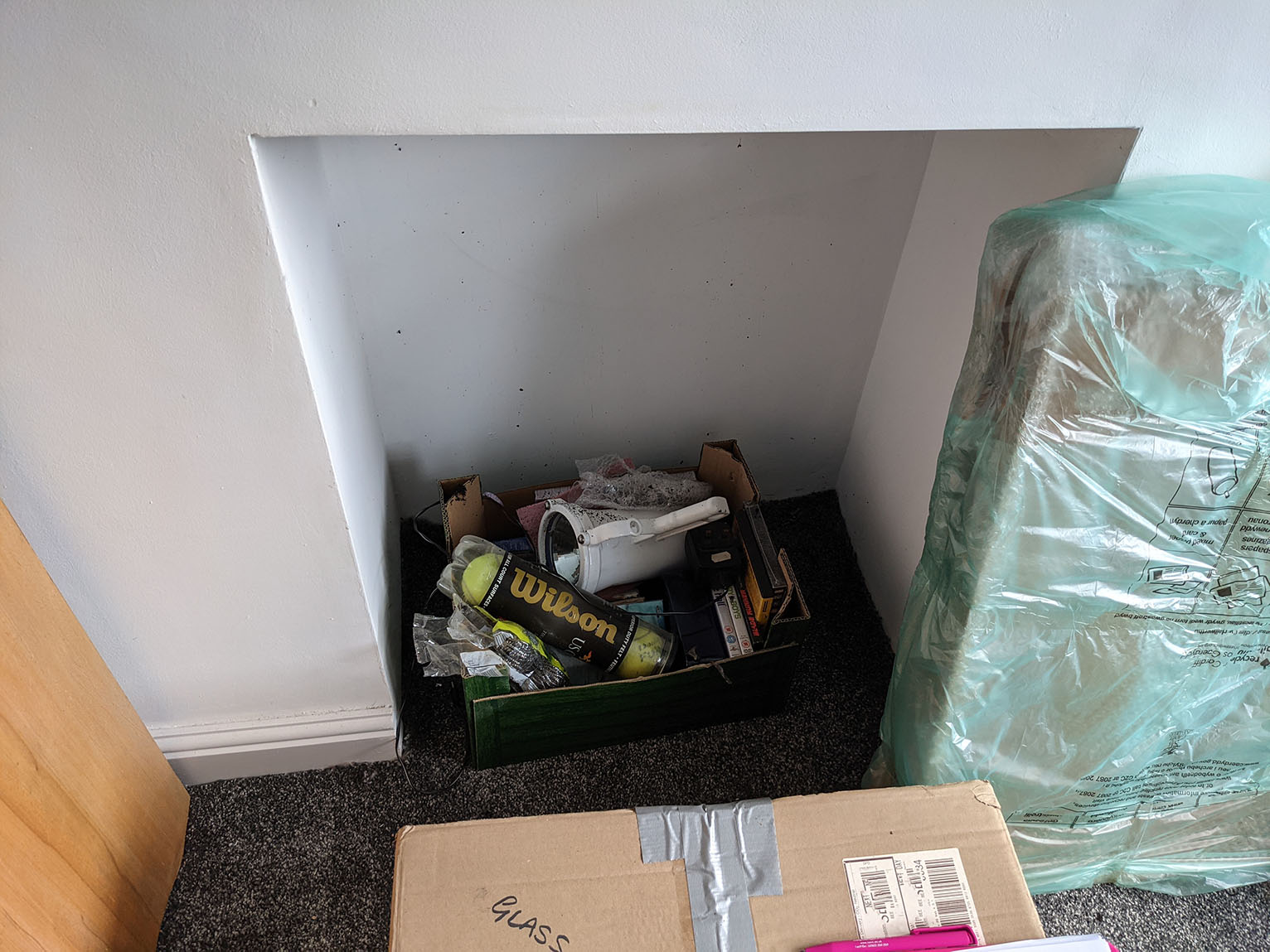
Back in July last year, I started a new project to transform a living room. The couple I was working with had recently moved into a new home, and were keen to make it feel right for them. The previous owners had done a lot of work to the house including building a kitchen extension, which the new owners loved, so there wasn’t a lot for me to do there. The separate living room was the main problem, and needed some work. The room is in the original part of the house (so not in the extension) and had previously been two rooms which were knocked into one, creating one long room. This room didn’t really have a purpose - in fact, when the couple viewed the house, it felt a bit sad and neglected, as it only had a pool table at one end and nothing else in it. The kitchen extension was large enough to have a living area with a sofa and TV in it, so this would become the more formal lounge. However, a proper formal reception room was the last thing the clients wanted - it needed to feel comfortable and livable, and the brief was for ‘nothing stuffy, starchy or too formal’. Here are some photos of the room when I first went to see it: |
|||||
 |
|||||
 |
|||||
 |
|||||
 |
|||||
|
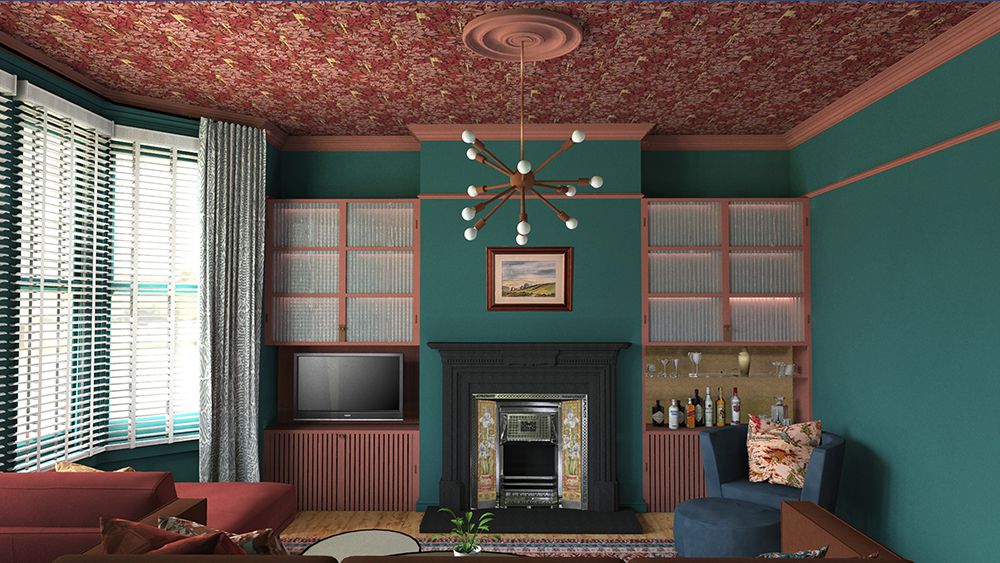
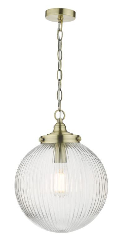
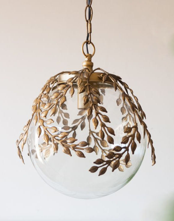
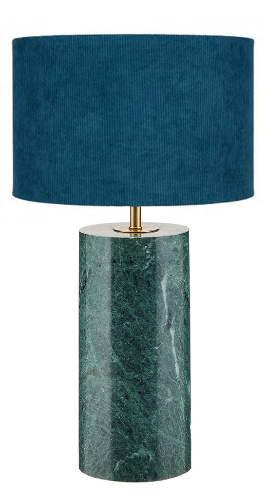
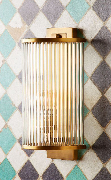
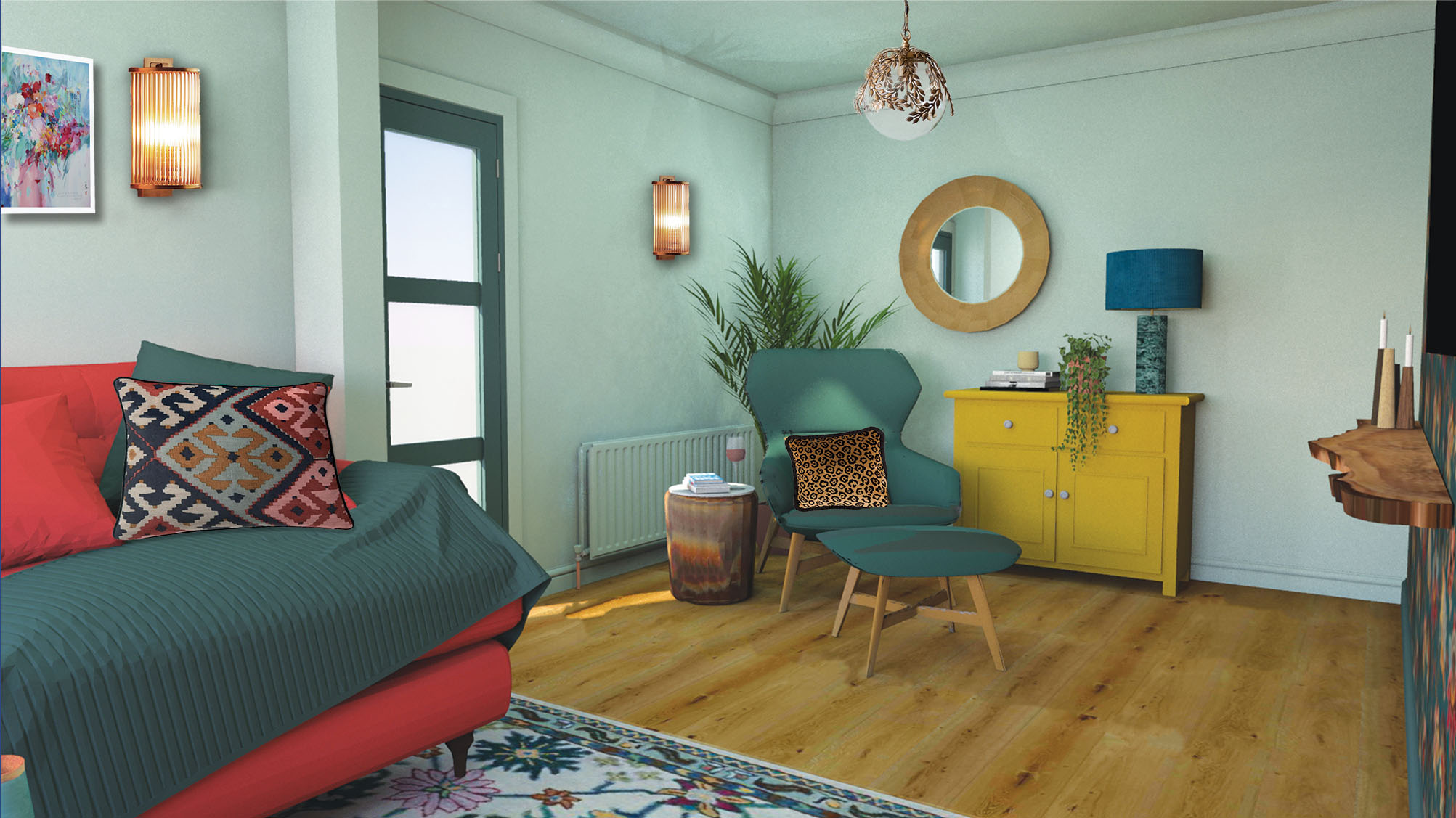
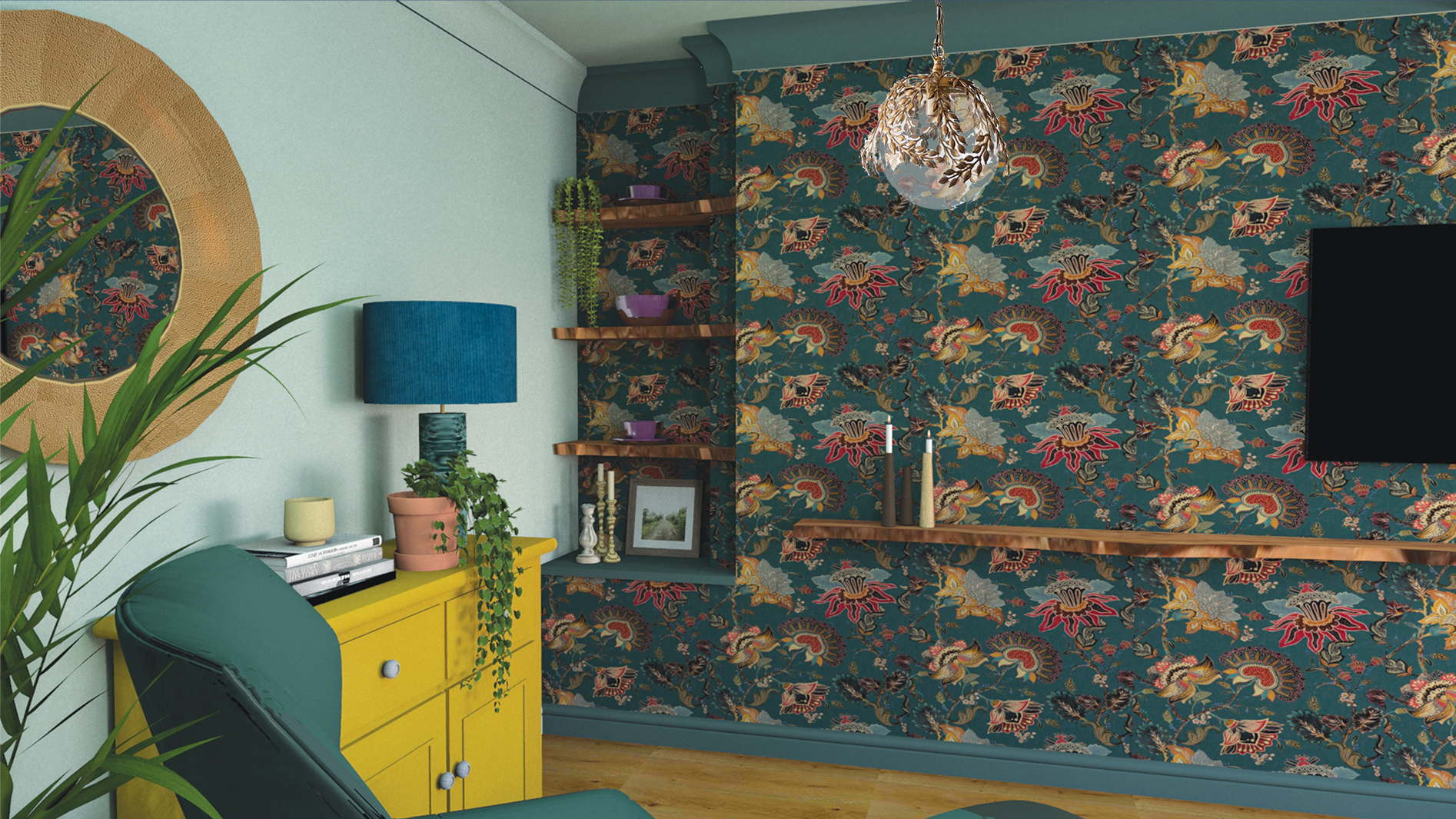
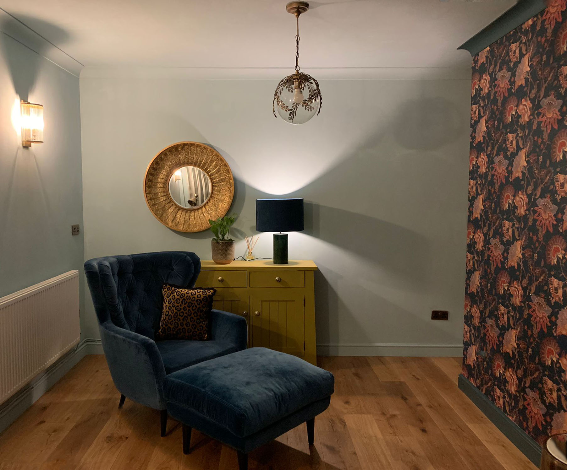
The clients wanted this room to feel more like a snug, somewhere to curl up in over the Autumn/Winter months, and somewhere to read and relax with the fire on. A reading corner or area was definitely on the wish list, but the clients weren’t sure how to create one with a long room like this, as there isn’t a natural space for one. As you can see from the before pics, there was an off centre hole for a fireplace (this would have been roughly in the centre of the first of the two rooms originally), so we decided to keep this and add a new fire to it. I suggested a wood burning or bioethanol stove, but the clients liked the look and practicality of a more contemporary shaped gas fire. The off centre oblong of the new gas fire would create a challenge with balancing shapes in the room, so I knew I’d have to tackle that during the design process. There were also two narrow alcoves at opposite ends of the room, and the clients and I agreed that we wanted to add something here too, again to make them feel like an intentional part of the room and to give them a purpose. So, we knew we needed to look at the layout (where to put the reading area, where to put the TV and the sofa?), but as I’ve mentioned before, one of the main starting points for my designs is the way the clients want the rooms to feel. When I was taking the brief, the key word that came up was ‘glow’. The clients wanted the room to glow, and to feel like it was emanating warmth and sparkle, but without being blingy (or resorting to painting the walls with glitter paint). We spoke a lot about colours and which ones would add warmth, and how we could use colour to achieve the cosy feeling and the ‘glow’ the clients wanted. They liked a whole host of colours (which made my heart sing!) including coral, navy, terracotta, teal, green, lime and other yellows. This gave me a lot of scope, and I felt we should incorporate many of these colours to make the room truly interesting. The right colours would help create the ‘glow’, but I also wanted to add lots of lighting (three wall lights, two pendant lights, a floor lamp and a table lamp), all with brass accents, and some ribbed glass to achieve a soft light coming from each fitting. I planned the lighting so that each light could be operated separately, and would also be on dimmer switches, so the light levels could be adjusted according to the client’s use of the room (reading or watching TV). The lighting would of course add an extra level of glow. |
|||||
|
|||||
|
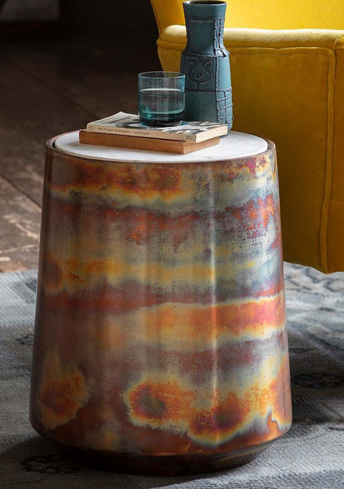
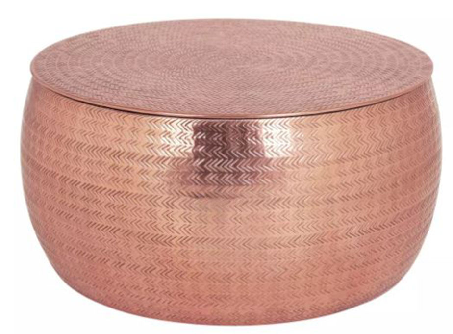
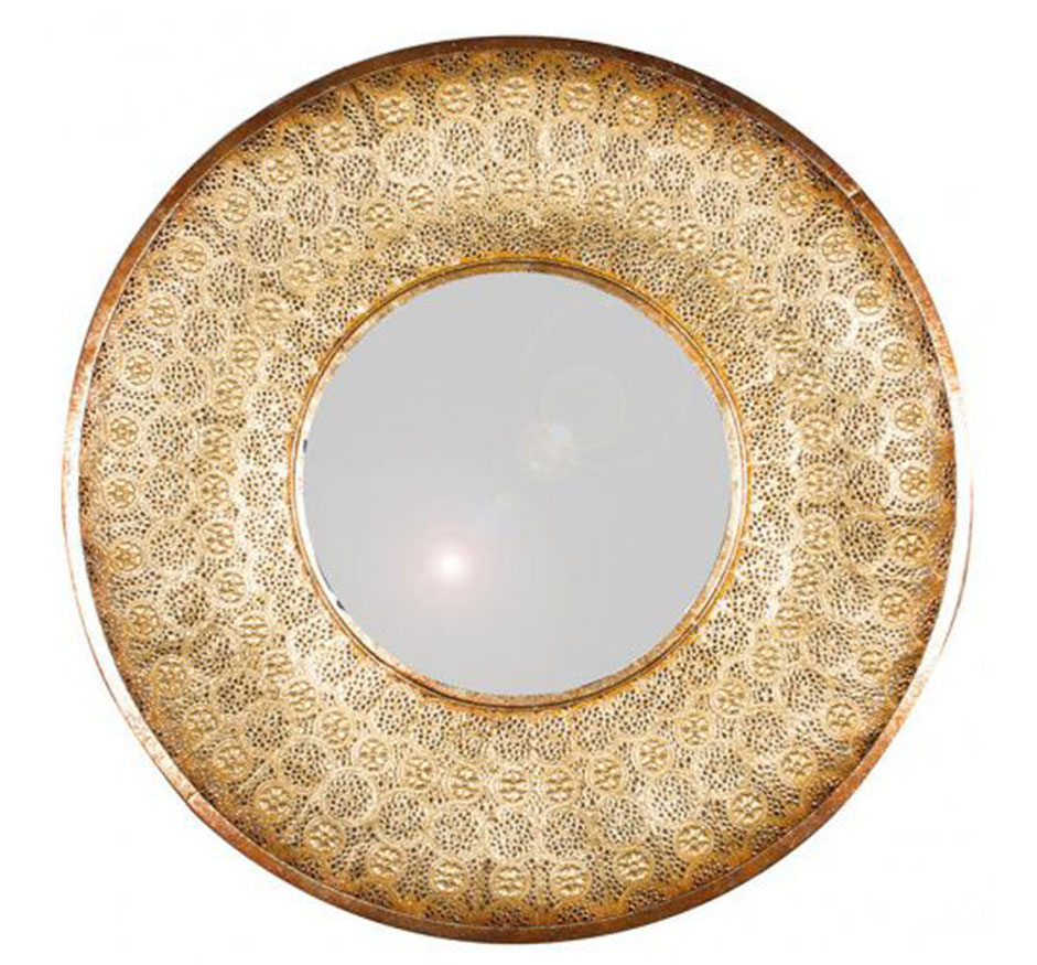
Sourcing furniture was also an opportunity to add to the overall feeling the clients wanted to create in this room. I chose to introduce some softer metal finishes in some pieces, like a hammered metal coffee table and large metal detailed statement mirror. The side table I found is made from burnished copper and it complements all the other brass tones in the room, such as the soft brass of the new curtain pole. |
|||||
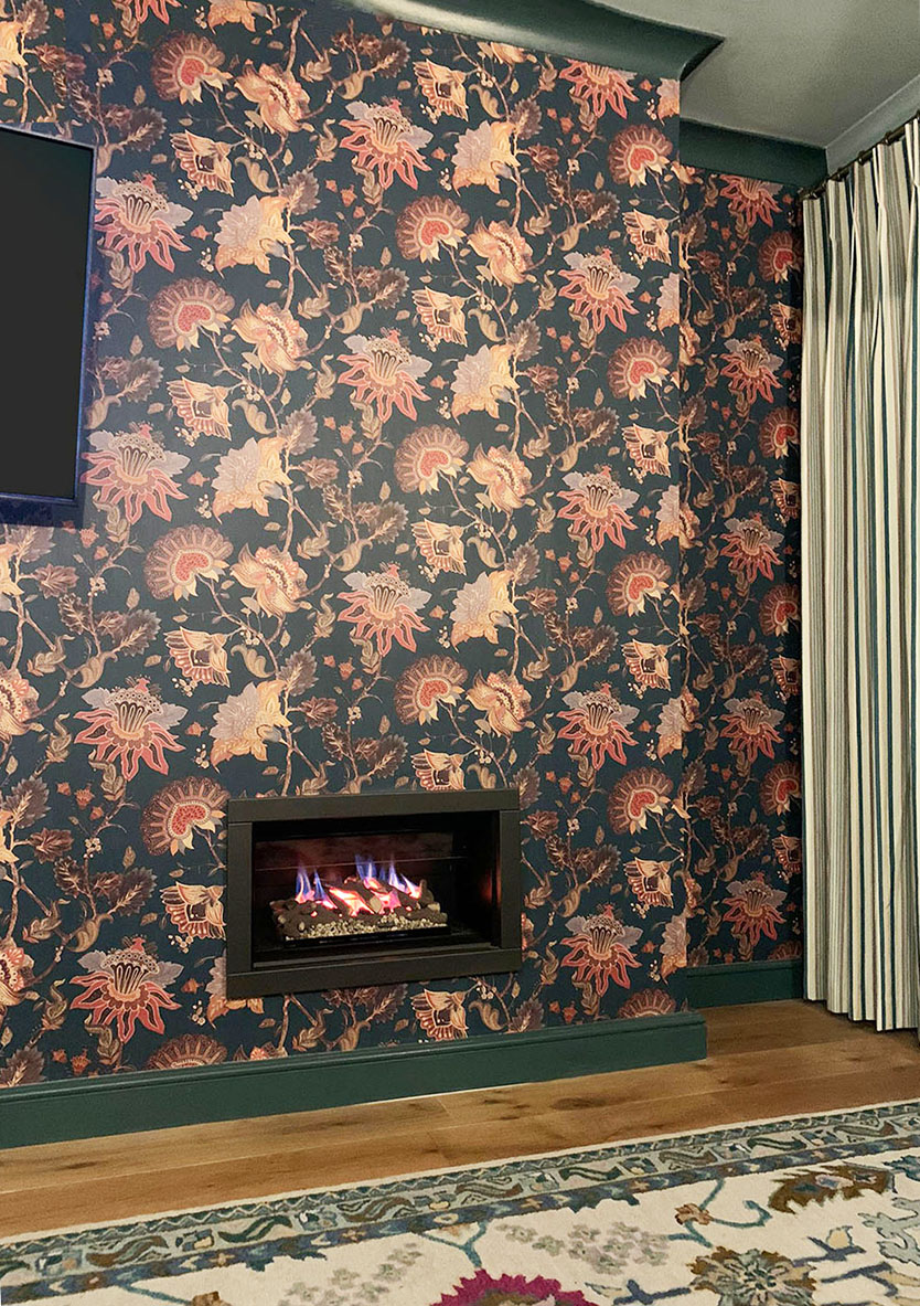
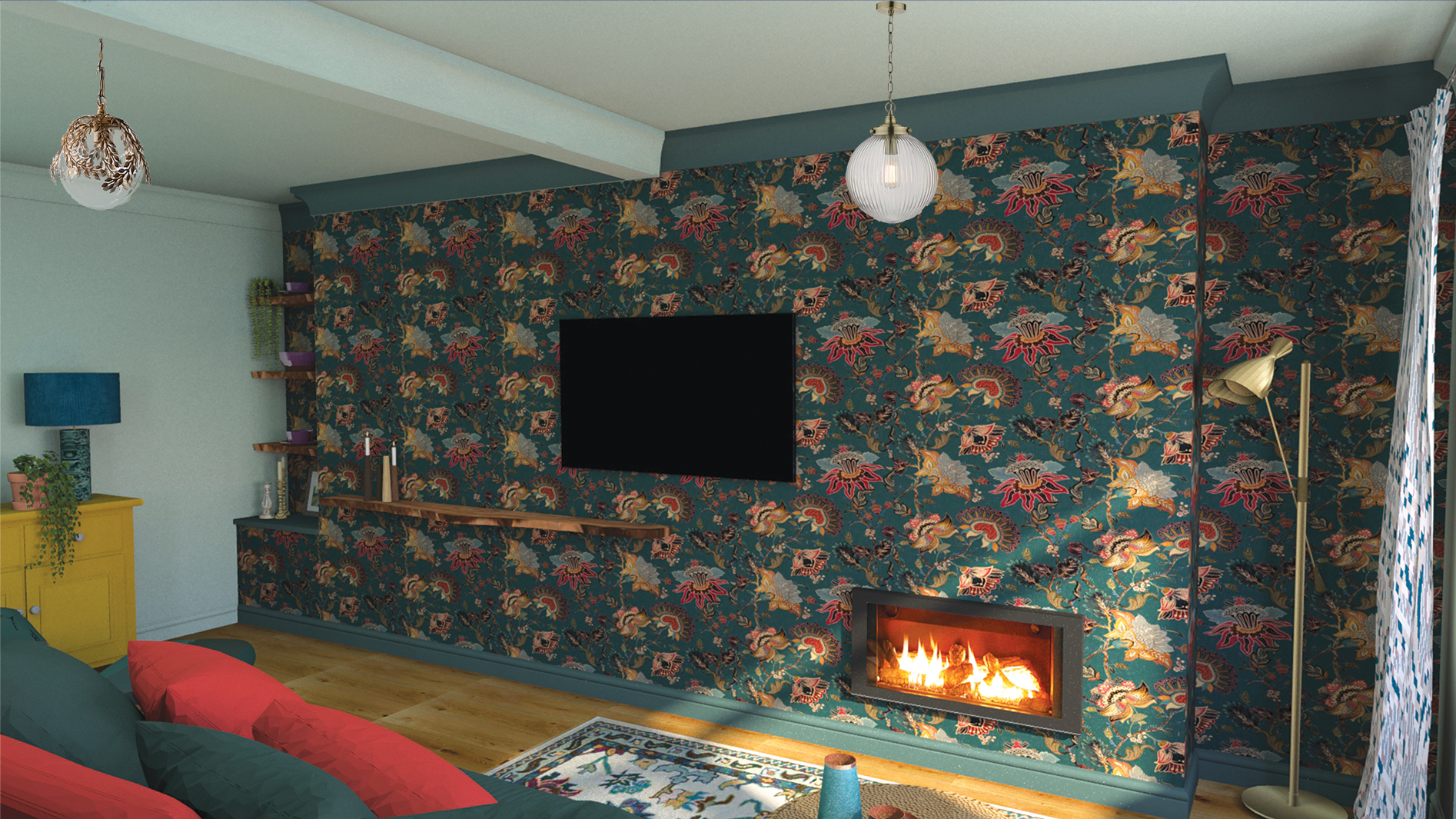
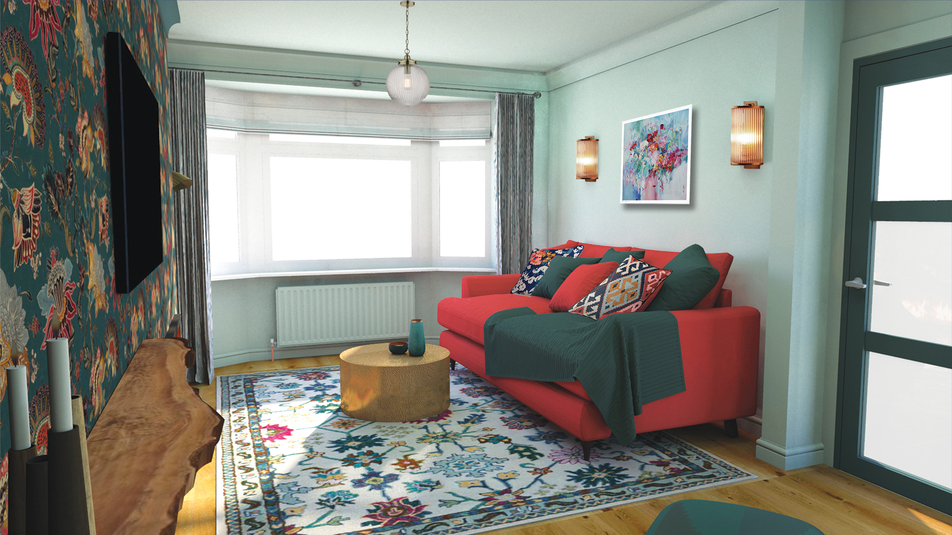
Of course the new fire would add its own shimmer from the flames, but the real glowing feeling comes from the amazing wallpaper we found almost by accident. The clients and I were looking for ideas and searching through images online during the consultation, when we came across a fabulous wallpaper from Paloma Home - a homeware collection from singer Paloma Faith. It was just perfect. It is in the rich colour palette my clients’ love, and some of the lighter colours in it reflect the light back into the room, almost making it glimmer. This kind of find almost never happens, as usually I leaf through my wallpaper books, search through the collections of my suppliers, and order many samples before settling on what’s just right for the project. But this time, I just googled and found the wallpaper that had all the elements we were looking for - teals and rich colours, and some florals that weren’t completely figurative (so were a little bit abstract). There was a slight sheen to the lighter areas of the pattern, which would shimmer when the lights were on and shining on it. More glow - it was perfect. I decided to use this wallpaper along one wall only, as I felt that placing it along the long wall opposite the door would bring the two rooms together, making a real statement, and making the most out of this long room created from two. So, essentially this was going to be a feature wall, and I’m not usually a fan of feature walls as they can look like you found a paint colour or wallpaper you love but were too scared to use it everywhere. But, if you use a feature wall intentionally, it can look stunning. The key to making it work is to design the rest of the room so that is speaking the same visual language as the wallpaper. I used a paint colour which matches the base colour of the wallpaper on the coving and skirting boards above and below the wallpaper, and made sure to use this colour in other items in the rest of the room, such as the armchair and footstool. The same colour is also picked up in the curtains and the rug, weaving the feature wall into the rest of the space in a balanced way. The remaining walls and ceiling were then painted in a much lighter tone of the same colour, meaning that the transition between the feature wall and the other walls wasn’t such a contrast. Here are some of the images I created to show the clients how the design would look: |
|||||
 |
|||||
 |
|||||
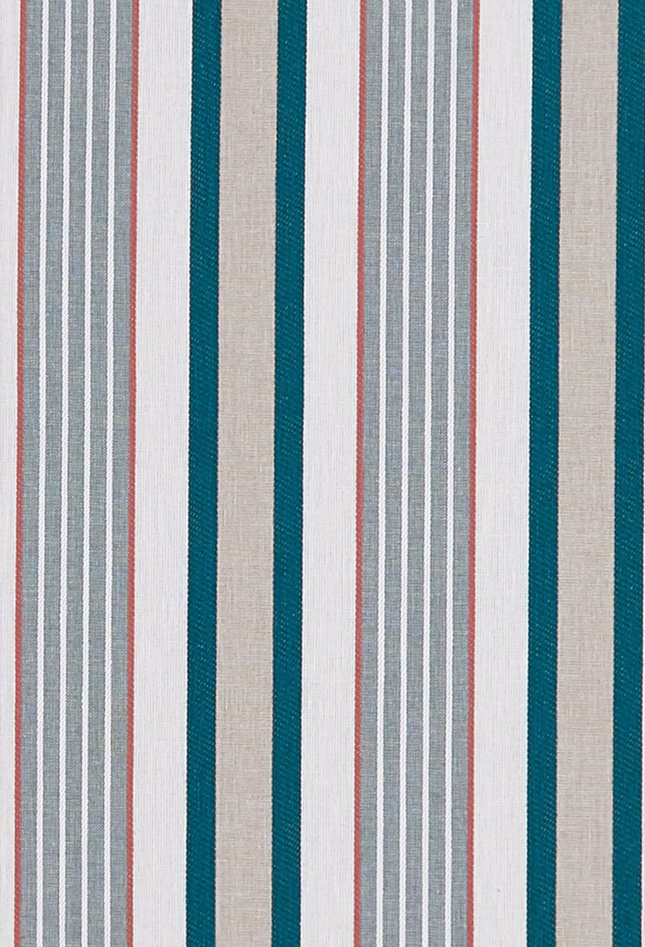
So, I had found ways to create the feeling the clients wanted, now I had to think about the practicalities and the layout. It made sense to me that the sofa would go in the part of the room where the new fire was to go, so that you could curl up in front of it. That meant the other half of the room would house the reading area. I deliberately chose a large armchair with a tall back for two reasons. One is that a high back is great for feeling supported when you are reading, and the other was because there wasn’t an obvious corner for the chair to go in, I decided a large chair, along with a large footstool, would look purposeful in this area of the room. Smaller pieces of furniture could easily look lost in this space, and the larger chair and stool give this area a purpose. The clients had an existing sideboard they wanted to keep, so we updated it with a new paint colour and new hardware. I placed this in the middle of the back wall, with the armchair and footstool in front, a new green marble lamp on the sideboard and the new mirror above, creating a little vignette or scene that could be viewed from the sofa in the other part of the room. Speaking of the new sofa, the clients were pretty clear on what they wanted and the practicalities of it. They didn’t like the Mid Century style sofas with angled legs and boxy arms, but did want the new sofa to have visible legs (so no sofa skirts here). It needed to have a deep seat for curling up on (more than 60cm, this one is 69cm), and gently shaped arms which were comfortable enough to lay your head on. The sofa needed to be squishy but supportive, and not have a low back. I managed to find a sofa with all of these details, and it came in a beautiful coral velvet (which echoes one of the colours in the wallpaper and the curtain fabric): |
|||||
 |
|||||
|
So, with nearly all of the furniture details sorted, it was time to tackle the fireplace and alcoves. As I mentioned, the fireplace would be going in the off centre hole on the right as you look at the wallpapered wall. I decided to put the TV in the middle of this wall, higher up than the fireplace so it was comfortable to watch and it would balance the rectangle of the fire underneath it. Being in the centre and placed on a pivoting arm also meant that it could be seen from both the armchair and the sofa. I had to do some research and choose a fire that could be placed under or near a TV without the heat damaging it, and found a great one from Nu Flame. The fireplace was now balanced with the TV, but the whole wall also needed something on the left hand side to complete the visual balance trick. |
|||||
 |
|||||
| The clients had mentioned that they liked waney edge or living wood, so I decided to add some of this wood into the room in the form of shelving in the alcoves. It would look more interesting and less rigid than standard wooden shelving with straight edges, and would soften a lot of the straight lines coming from the walls, beams, coving and skirting boards. I also decided to add a large piece of this wood across a long stretch of the wall on the left, going slightly under the TV. It balanced out the TV and fireplace perfectly, and also looked like a large, off centre mantle, but done in a more contemporary way. | |||||
|
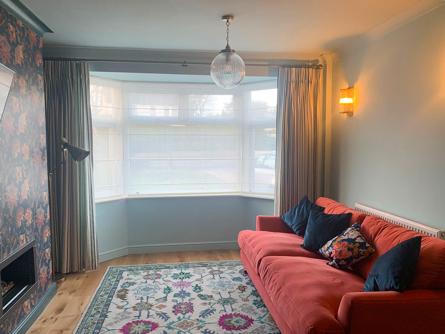
Most of the room is completed now, but there are still some vital things to be done. The waney edge shelving and the mantle need to go in, the radiators need painting, artwork needs to go up, the coffee table hasn’t been bought yet, and the styling needs to be done, so this is very much a work in progress. As these photos the clients have kindly sent to me show, they’ve done a huge amount of work to get it this far (including taking up sections of the concrete floor to install new wiring and pipework - very messy) and I’m very proud of what we’ve all managed to achieve. The clients had a clear view of how they wanted the room to feel, but were unsure how to get there. They asked me to be creative and show them my vision for the room, as they didn’t want to hamper the process by being too prescriptive. I took them at their word and really enjoyed the process, and the clients did too - this is a message I received when the furniture arrived: I have actually cried several times today! It’s just so beautiful! I’m sitting in my teal chair and the room really does glow! From outside it looks magical! Can never thank you enough |
|||||
|
I'll leave you with a photo of the almost completed reading area: |
|||||
 |
Welcome to the design blog, where you'll see posts about anything from the projects we are working on, to the latest fabric and wallpaper collections, and all things interiors related. We love colour, pattern, architecture and old buildings, and we love to share our finds with you.
Happy reading!