Do ceilings have to be white?
 |
||||
|
In my last newsletter, I asked you, my lovely readers, to share your design dilemmas with me, so I could offer up my thoughts and suggestions on how to solve them. I’ve gathered up a few of your questions, and will do my best to answer as many as I can in this post (there were a few I couldn't get to, so I'll do another post soon). The first one is probably something we’ve all come across and will have had us all scratching our heads at some point - How do I add interest to a room without adding a feature wall? |
||||
 |
||||
| Feature walls have got a bad reputation at the moment, as there’s a lot of talk about how they have become a ‘design crime’ and are just not the done thing anymore. I think feature walls can work when done well, and nothing is off limits if you truly love it, but a feature wall doesn't have to be your first or only choice when decorating a room. | ||||
|
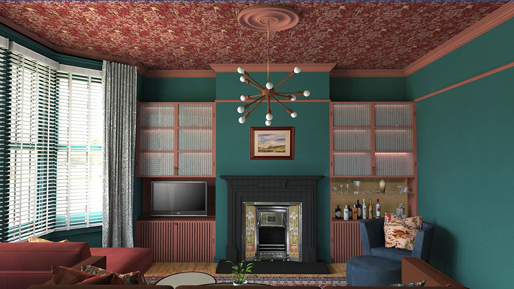
First of all, I’d suggest thinking about why you are tempted to add a feature wall - is it because you really love that paint colour or wallpaper you’ve found but are just worried about it being ‘too much’ if you use it all around the room? If that’s your concern, I would always say, if you love it, go for it, and use it on every wall. The results will be far more satisfying than if you had restricted your favourite pattern or colour to one wall only, and the room will feel more cohesive because of it. The trick is to balance the ‘busyness’ of the pattern or the strength of the colour with other calmer elements in the room, like a plain sofa or a beautiful wood floor. Don’t try to fill the room with too many different pieces and too much decor, as it will compete with the main element - that superstar wallpaper or wall colour. If you leave a calm corner empty of furniture, or the walls free of decorative pieces like art, it allows the room to breathe and the pattern or wall colour won’t feel so overwhelming. Of course, some people really love the maximalist look, where everything decorative is thrown into a room all together, but I personally don’t find these spaces relaxing or restful to use. It’s all about balance, and if the room is very visually busy, it won’t be comfortable to spend time in. But what do you do if you’ve fallen in love with a colour or pattern and really don’t want it all the way around the room? I’d suggest using it in small doses and dotted around the space, like a pattern in a lampshade, in a cushion or on a rug. I’d also suggest standing back and taking a good look at the room itself before doing anything to it. Look at all the surfaces which are available to you to add interest - it’s not just the walls. I’ve mentioned it before, but the ceiling and the floor are there for us to decorate and have fun with, and are often referred to as the fifth and sixth walls. Adding some colour and pattern here is an opportunity to give you the interest you’d like but without overwhelming the space. |
||||
 |
||||
|
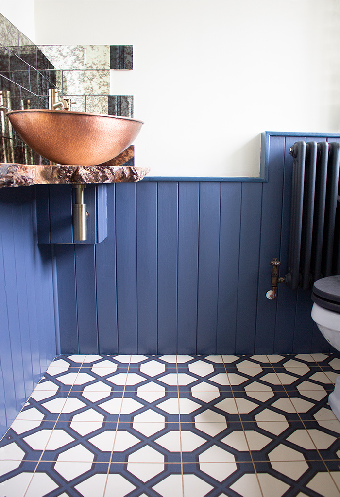
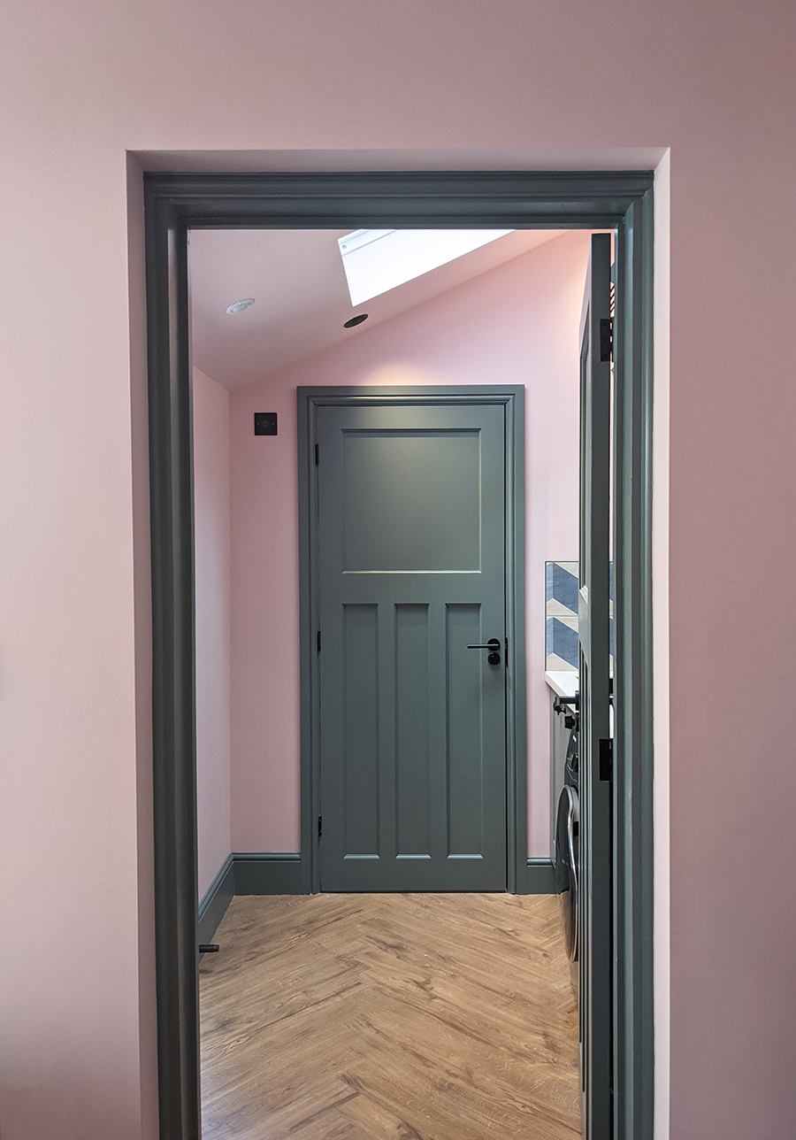
If you can’t change your flooring or aren’t keen on using the ceiling, then I would think about all the other surfaces in a room. We have the window frames, door frames, skirting boards, coving, and sometimes other trims like picture or dado rails to play with. These give us a chance to make the room unique to us, and there are lots of ways to decorate them. We often assume we need to decorate in a certain way, because that’s the way everyone else does it, but skirting boards and picture rails don’t have to be white. What if you painted the skirting boards and door frame in a lovely shade of blue, and kept your walls neutral? You can even add a second row of paint in another shade of blue (or a contrasting colour) above the skirting boards to emphasise the shape of them. Suddenly your walls have got life and are far from boring. |
||||
 |
||||
|
You can also divide up your walls with paint in interesting ways. There’s been a trend around for a few years now for painting the bottom half of your walls in one colour (usually a darker shade) and the top half in a lighter colour. It's not actually a new trend, as many institutions such as hospitals have been decorated in this way for decades. It's much easier and more cost effective to repaint the bottom half of a wall when the inevitable wear and tear starts to show, than having to redo the whole space. Aside from the practical benefits, this can work really well, as it gives you an opportunity to use more than one colour in a room without it being overbearing. If you choose to decorate in this way, bear in mind though that you will be visually cutting the walls in half, so if your ceilings are a bit on the low side, this might not be the effect you want. If that’s the case, I’d consider dividing your walls vertically, to elongate them instead. |
||||
 |
||||
|
Of course, you don’t have to use paint or wallpaper to add interest to a room. You can add any type of art to your walls, and you don’t have to stick to original paintings or prints. You can frame a piece of wallpaper or fabric which you love to look at, or hang a rug on the wall. You could hang a collection of clocks or plates, or any grouping of pieces which you like the look of together. Anything can be art, including the items which you might think of as more useful than decorative. Some well chosen wall lights with an interesting shape can look like art, or adding some shelves can make an artistic statement. You could also choose to dress and style the built in shelving in your alcoves to add colour and pattern, which then feels like a more subtle feature wall in itself. |
||||
 |
||||
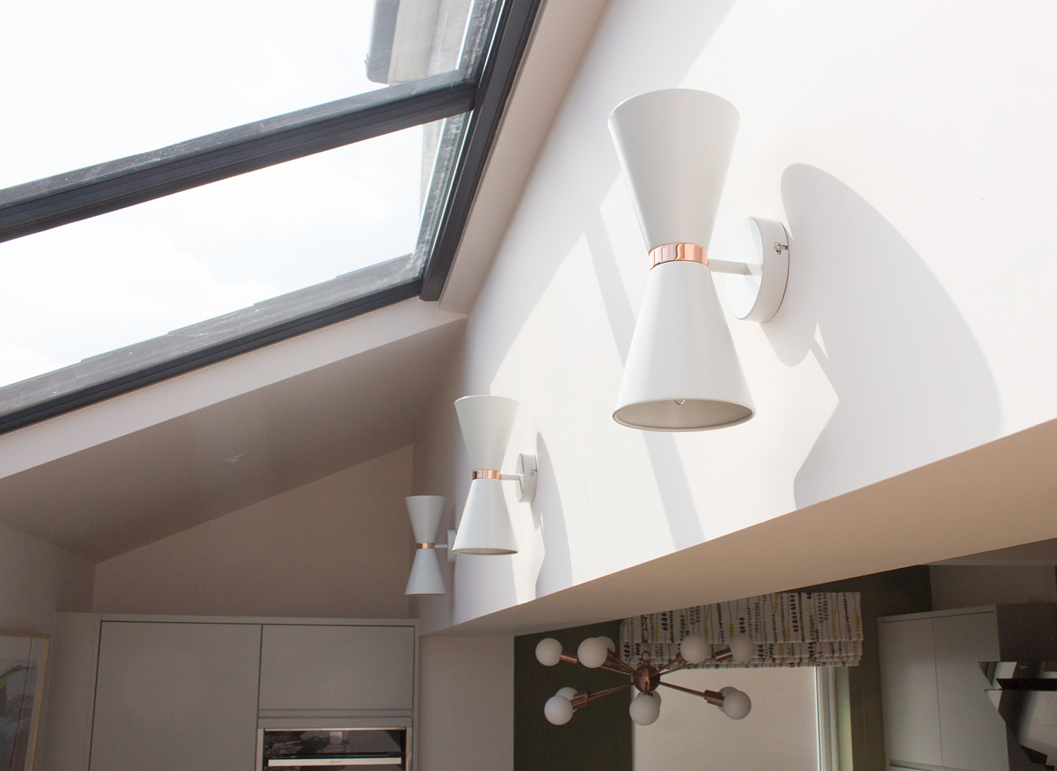
| these sculptural lights add interest to this blank wall, and will also create a different type of wall art when it's dark and they are switched on | ||||
|
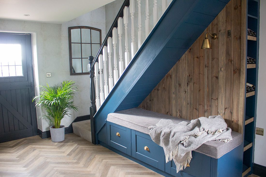
If you feel that your bare room needs that something extra, but you don’t want to add interest with paint, you can do it with texture instead. A neutral space can be livened up with a sisal rug, a rattan sideboard, a velvet sofa, or by using some lovely rich wood tones in your furniture pieces. If you fill a room with plenty of items which feel nice to the touch it will never look boring, as the textural and physical elements in a room create a contrast and tension with each other, making it visually exciting to look at. Which brings me onto the next one of your design dilemmas - How do you mix different types of wood in a room, and if you have a wooden floor, should you ignore it or make it part of the design? If you are lucky enough to have original wooden floorboards or an original parquet floor, then you already have a large amount of wood in your room before you even begin adding furniture. I would try to work with it, rather than ignore it, as a floor will always be seen as part of the whole room (less so than a high ceiling for example) and it’s pretty hard to hide it. I’d begin by looking at the underlying tones of the wood (or wood stain) colour, and start by deciding if those tones look cool or warm. If you have a warm rich wood like oak for your floor, then I would choose other wooden pieces for the room which share the same warm tones, such as pine, mango wood, mahogany, or walnut. For example, you could add a Mid Century chest of drawers made from warm toned eucalyptus to a room scheme decorated in warmer colours like ochre and aubergine. The tone of the oak flooring will work in harmony with your new furniture, even if you are mixing up the woods used, and will add to the overall feeling of cohesion. On the opposite side of the coin, if you have flooring made with cool toned wood such as ash, or any wood that has been washed with a grey or white stain, then I’d suggest going for lighter woods such as maple, poplar, untreated pine, or even plywood. Beech is a classic wood used in Scandinavian design, as it is widely grown in the Nordic countries - just think of the typical lighter, cooler toned woods used in Ikea furniture. Any type of cool toned wood can be mixed in my opinion, and can be grounded by using some black or darker tones such as forest greens in the scheme. |
||||
 |
||||
|
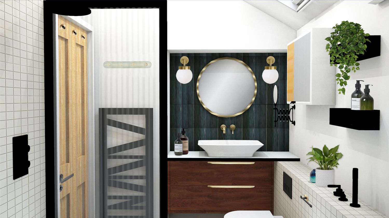
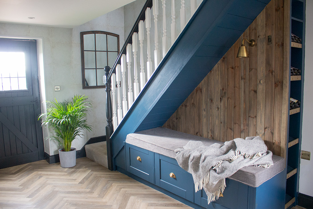
the ash grey (cool) tones of the herringbone flooring are mixed with untreated pine at the back of the seating, which was washed with a grey based stain |
||||
|
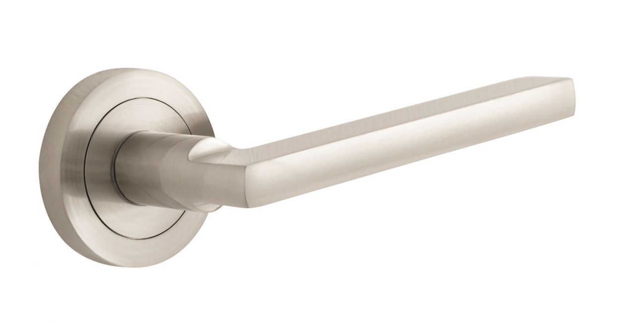
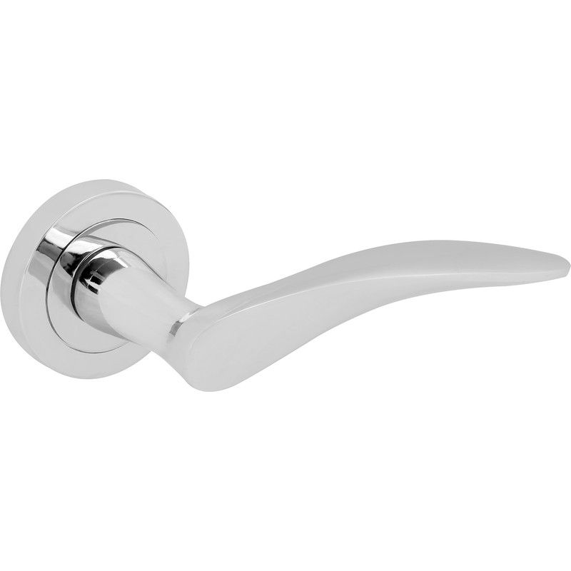
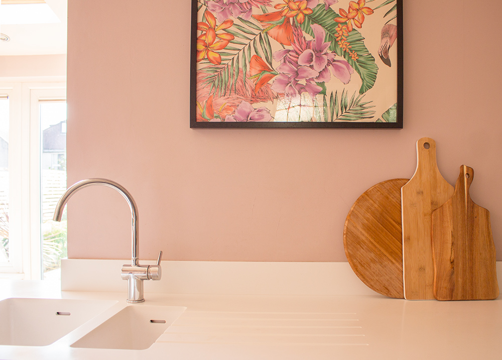
Mixing woods seems to be less of a worry for us than mixing metals. This is another question I received, and it's one I get asked a lot by my clients - How can you mix hardware metals in a home (such as door handles, metals in a bathroom or kitchen, plug sockets and switches etc)? I remember watching a home renovation show (I can’t remember which one it was) several years ago. The presenter and architect was telling us how he hated to see a mix of chrome and brass metals used in a home, and how we should all be changing everything over so that it matched. I wasn’t so sure about that, as I’m not keen on the matchy matchy look, and it can also be very expensive to change all your door handles and sockets and switches over in one go. Fast forward to today, and it's become cool and acceptable to mix metals in a space again. We see photos of bathrooms and kitchens with mixed fixtures and fittings all over Instagram, but exactly which metals we can mix still seems to cause confusion. The first thing to consider when choosing metal finishes for a room is the style of the fixtures themselves, which is more important than the colour of the metal. If you go for a traditional shaker look for your kitchen, and choose a curved, streamlined tap like the one in the picture below, then the styles are already getting confused. If you then add in sleek stainless steel appliances, a black sink and chrome LED pendant lighting , you can see why it would start to look messy quite quickly. |
||||
 |
||||
|
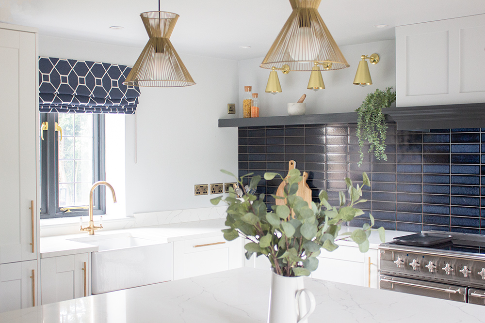
A painted wooden shaker style kitchen is not a sleek contemporary look, so an aga style oven with a traditional swan neck tap is more in keeping with the style. If you look at the picture of one of my kitchen projects below, you can see how the style of the units is reflected in the tap, the Belfast sink, the large cooking range and even the plug sockets. I didn’t stick with completely traditional style lighting when designing this kitchen, but that’s because I wanted to mix it up a little bit to add interest, which is perfectly fine to do - the trick is to start with a solid base and then not take the mixing too far. |
||||
 |
||||
|
Once you have considered the styles of the pieces you are choosing, then the undertone of the metals is also important, just like it is with mixing woods. Warm based metals like brass and bronze will always look good together, whilst cooler based metals such as stainless steel and aluminium work well. But if you want to mix up your metals a la Instagram, or to create a timeless interior that isn’t following the trends, then the key is to consider the finish of the metal (i.e. how shiny or polished it is). Shiny brass mixes well with shiny steel, polished chrome is a friend of polished copper, and satin brass (somewhere between shiny and matt) loves being with satin nickel. When you are searching for your hardware, look at the names and descriptions of the finishes. If you buy brushed brass taps with brushed steel handles, the finishes are similar enough to look good next to each other, even though the colours are different. My rule of thumb is that if the metals are similar in undertone (i.e. both cool toned) and the finishes are not the same, the mix will look accidental rather than an intentional design decision. Think of brushed nickel (cool undertone, a more matt finish) paired with chrome (cool undertone but a polished or shiny finish), and you can see that they don’t create enough of a contrast to look great together. |
||||
Looking back over the design dilemmas you sent to me, the one thing that seems to be a common thread is that people are scared to make a mistake with their design choices. They are looking for a set of design rules to avoid getting it ‘wrong’. As I’ve said before, there really is no wrong - if you want a feature wall then have one, and if you love the way you’ve decorated your home, it can never be wrong. Don’t be afraid - as one of the neighbours interviewed on George Clarke’s Ugly House to Lovely House said - It’s better to be brave than bashful. |
Welcome to the design blog, where you'll see posts about anything from the projects we are working on, to the latest fabric and wallpaper collections, and all things interiors related. We love colour, pattern, architecture and old buildings, and we love to share our finds with you.
Happy reading!