My round up of the colour trends for 2019

 |
|
As you can imagine, this is a question I get asked a lot. You might have recently moved into your new home, or maybe you feel like you need a change. We’re all spending a lot more time staring at our walls during the current situation, and paint is one of the easiest and least expensive ways to really make a room feel like your own. Painting your room can have a big impact on your mood, so it’s a natural starting point for any makeover. But what colour should you choose? There are literally thousands of paint shades out there, and no one wants to choose one, take the time to decorate, and then hate the end result. To avoid that happening, I’ve put together a guide with lots of ways to help you narrow down the perfect shade for you. Which colours are you drawn to? Have a look around your home - are there a few colours that keep popping up, in say a cushion, or a rug, or a bedspread? Or even in the artwork on your walls, or your coffee mugs? You’ve probably unconsciously bought some things for your home that have a few colours in common, because you find them attractive and they sit well with you. This is a good place to start choosing colour, as it’s something you’ve done instinctively and naturally. Say you have a few items with mustard yellow in them - you don’t have to use that mustard yellow throughout your home, but you could use versions or shades of that colour in different rooms to visually link them. |
|
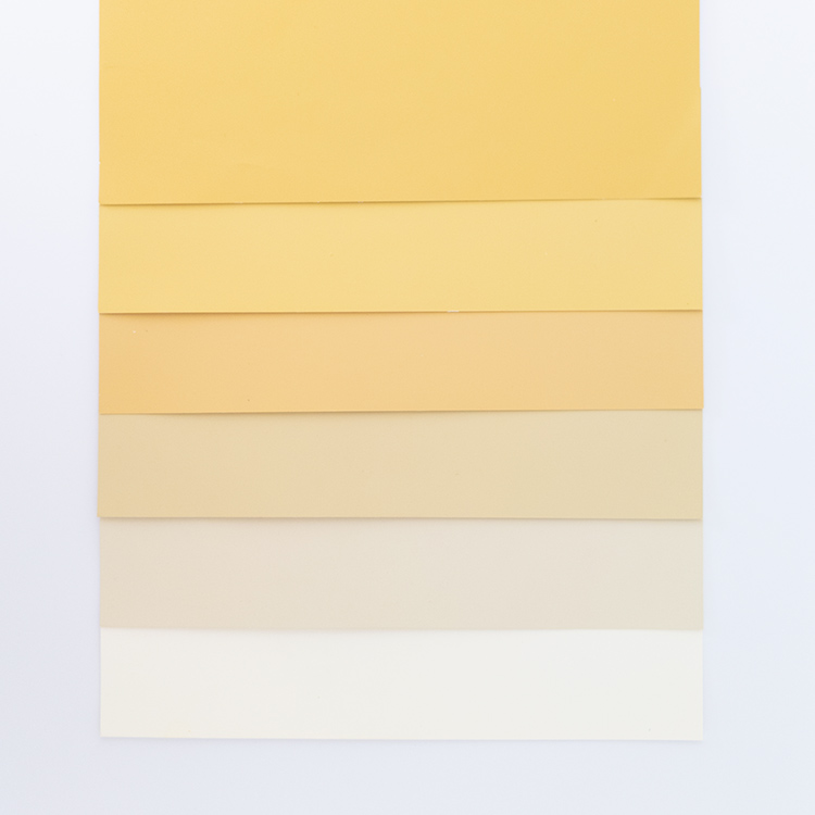
From top to bottom: Little Greene Yellow Pink 46, Light Gold 53, Mortlake Yellow 265, Oak Apple 63, Stone Pale Cool 65, First Light 49 |
|
The second place I would look for inspiration is inside your wardrobe. If you open it up, unless you exclusively wear black for work and play, then there will be some colour in there. I would look at the range of colours you have, and see if there are any colours that you’ve bought more of. You might just feel comfortable in the enveloping feel of navy blue, or you might be happiest wearing red. These colours can be your starting point - you might not want dark navy walls, but some navy in your colour scheme would work well for you. You might prefer to go for a brighter blue for example, so I would choose one which works well with navy as it will have the same undertones and feel comfortable to you. |
|
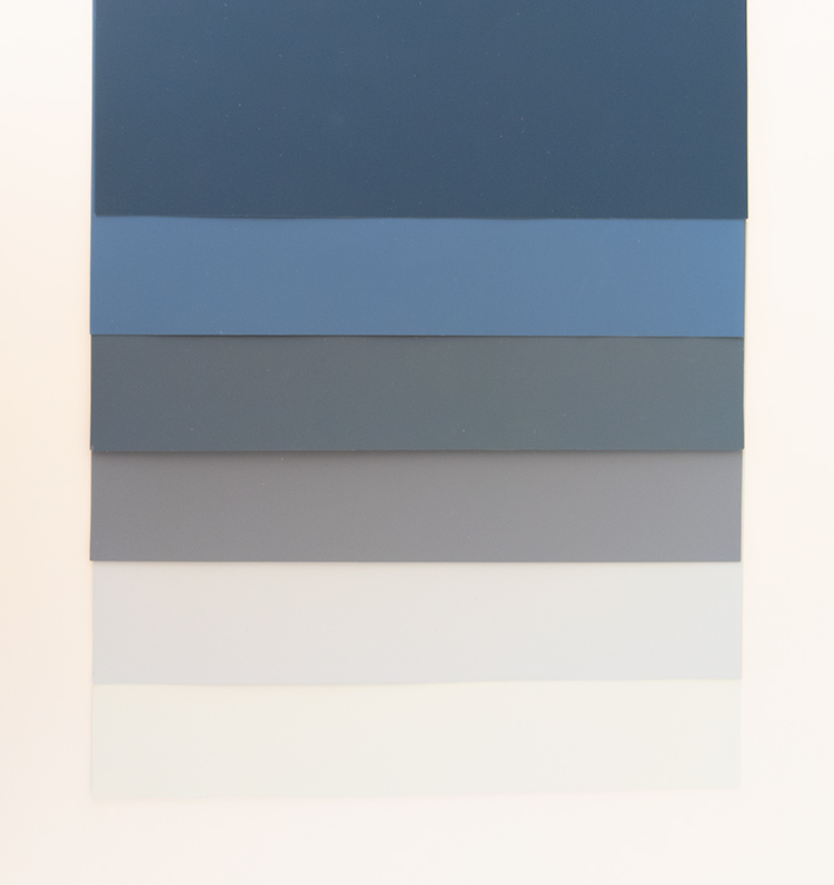
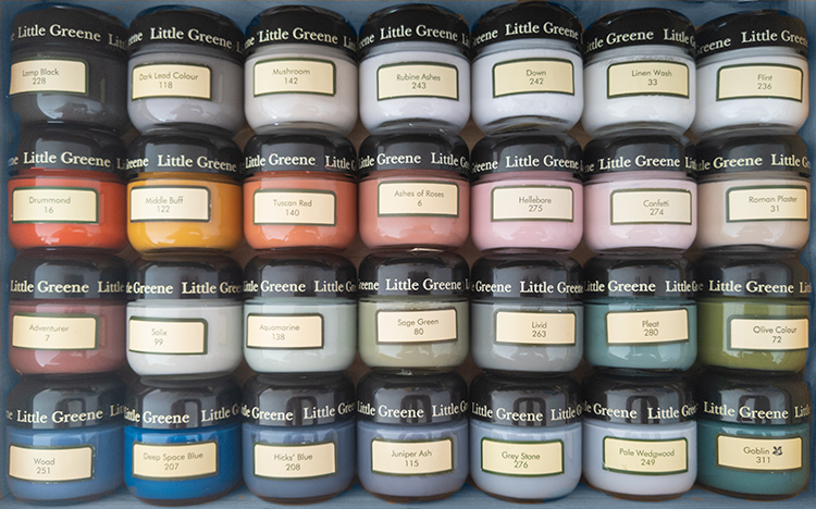
From top to bottom: Little Greene Royal Navy 257, Woad 251, Hicks Blue 208, Juniper Ash 115, Pale Wedgwood 249, Delicate Blue 248 |
|
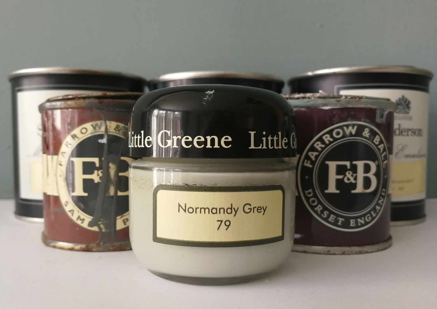
Another good place to look for inspiration is the architecture and period style of your home. If you live in a 1960s maisonette, then the muted olive greens and ochres from the Mid Century period would work well with your home, and invoke the spirit of the period whilst still feeling modern. Or if you live in a Victorian terrace, the dark reds, greens and blues used typically during that period could compliment the tall ceilings and large windows. Lots of paint manufacturers (such as Farrow & Ball and Little Greene) have guides on their colour cards or websites to indicate which colours were used in which period, and these can be really helpful. I’m not suggesting that if you live in a Georgian house that you can only paint it in authentically Georgian colours, but seeking out colours which would have been used to decorate the house when it was built is a good way to narrow down the choices. Whilst you’re looking, you might just come across a paint shade that you fall in love with. |
|
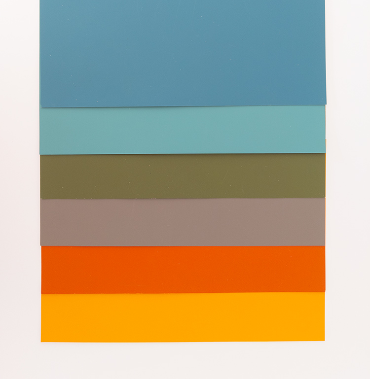
From top to bottom: Little Greene Marine Blue 95, Canton 94, Olive Colour 72, Knightsbridge 215, Heat 24, Marigold 209 |
|
Something that people are increasingly talking about is colour psychology. At a basic level, we generally feel a certain emotion when we look at a colour. Some of this is cultural, and some of it is our centuries old response to our environment. For example, red is a confident, stimulating colour and we associate it with danger, but also excitement. It’s the colour of stop signs as it stands out amongst other colours, and it’s also the colour we choose for a bright lipstick when we want to feel confident and say ‘look at me’. As red is a stimulant, it’s a good colour to paint a dining room (it encourages feelings of hunger), but could also be used in the hallway as it’s warm and inviting. Blue invokes the opposite feeling - it makes us feel calm and safe. Lots of businesses use blue for their logos as it represents loyalty and stability - have you looked at my logo?. When asked, most of us say that our favourite colour is blue, which might be because it’s the colour of a perfect sky. But when I speak to clients about using blue on their walls, they worry that it will make their rooms feel cold. This can be avoided by choosing a blue with warm undertones - i.e. it has some red or yellow in it. |
|
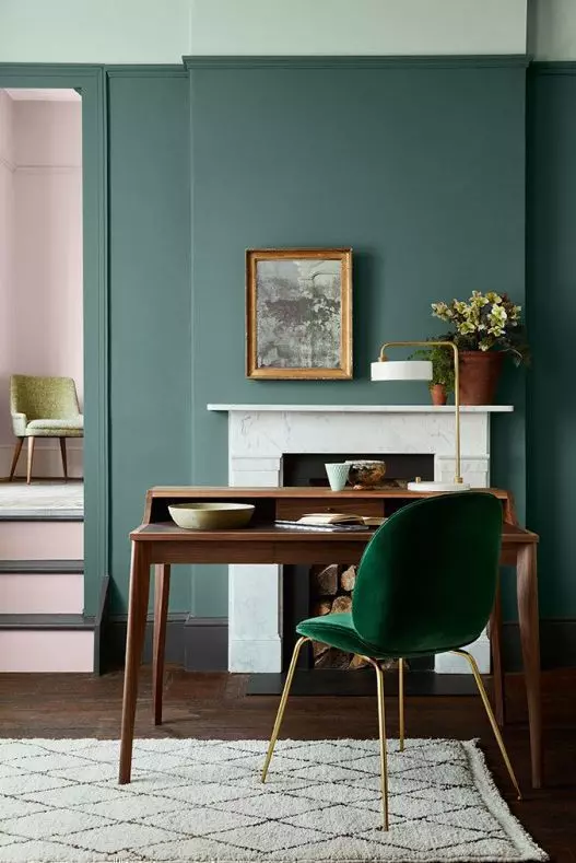
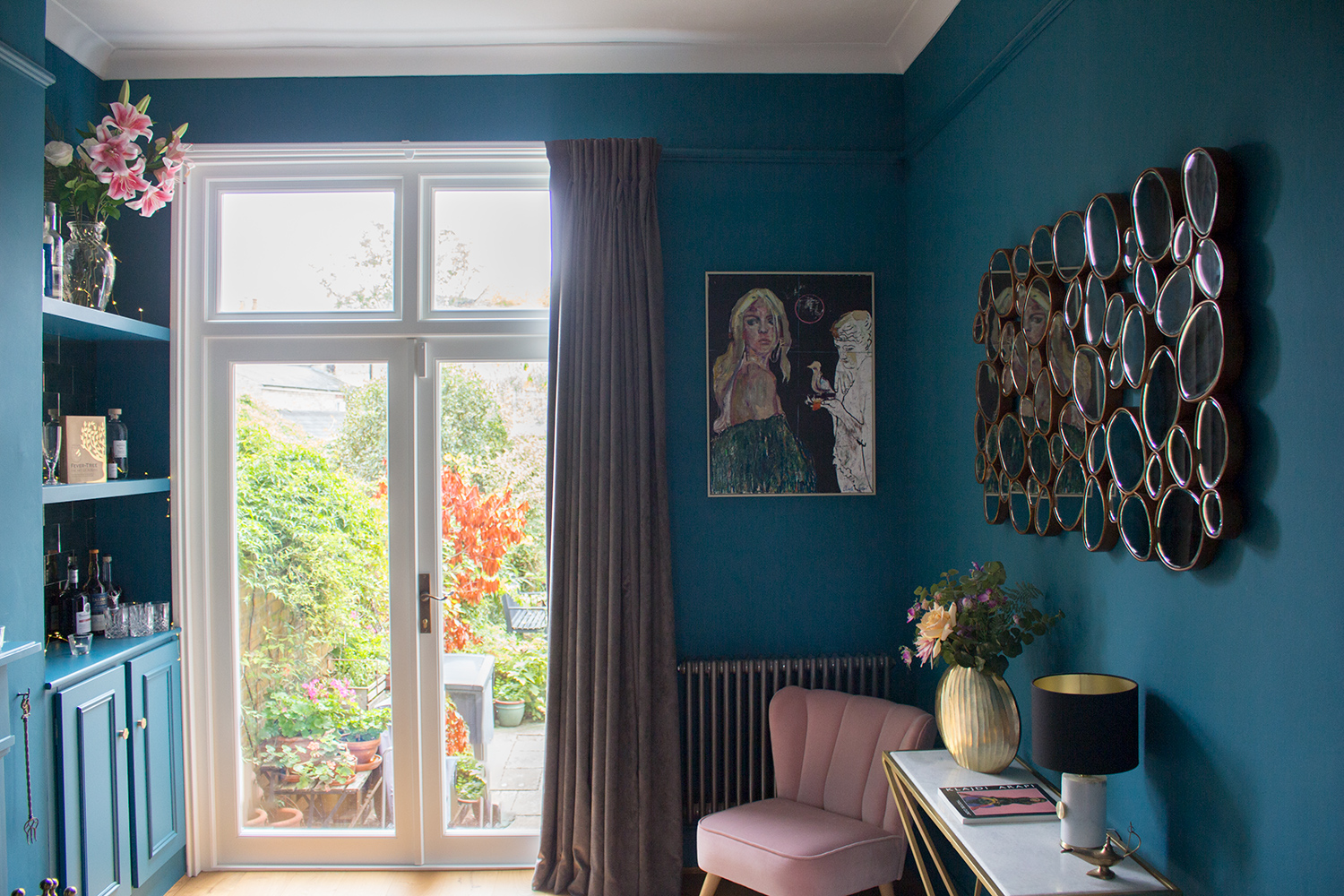
I chose this shade of blue because it has a strong green undertone, which keeps the room feeling warm and welcoming |
| Green, as you might expect, has a calming effect on us because it’s the colour of nature. Depending on the shade you choose, it can be energising (think lime green), harmonious (forest green) or relaxing (a soothing pale green). Green is great for all living spaces, and can be used in the living room, bathroom, bedroom or home office. |
|
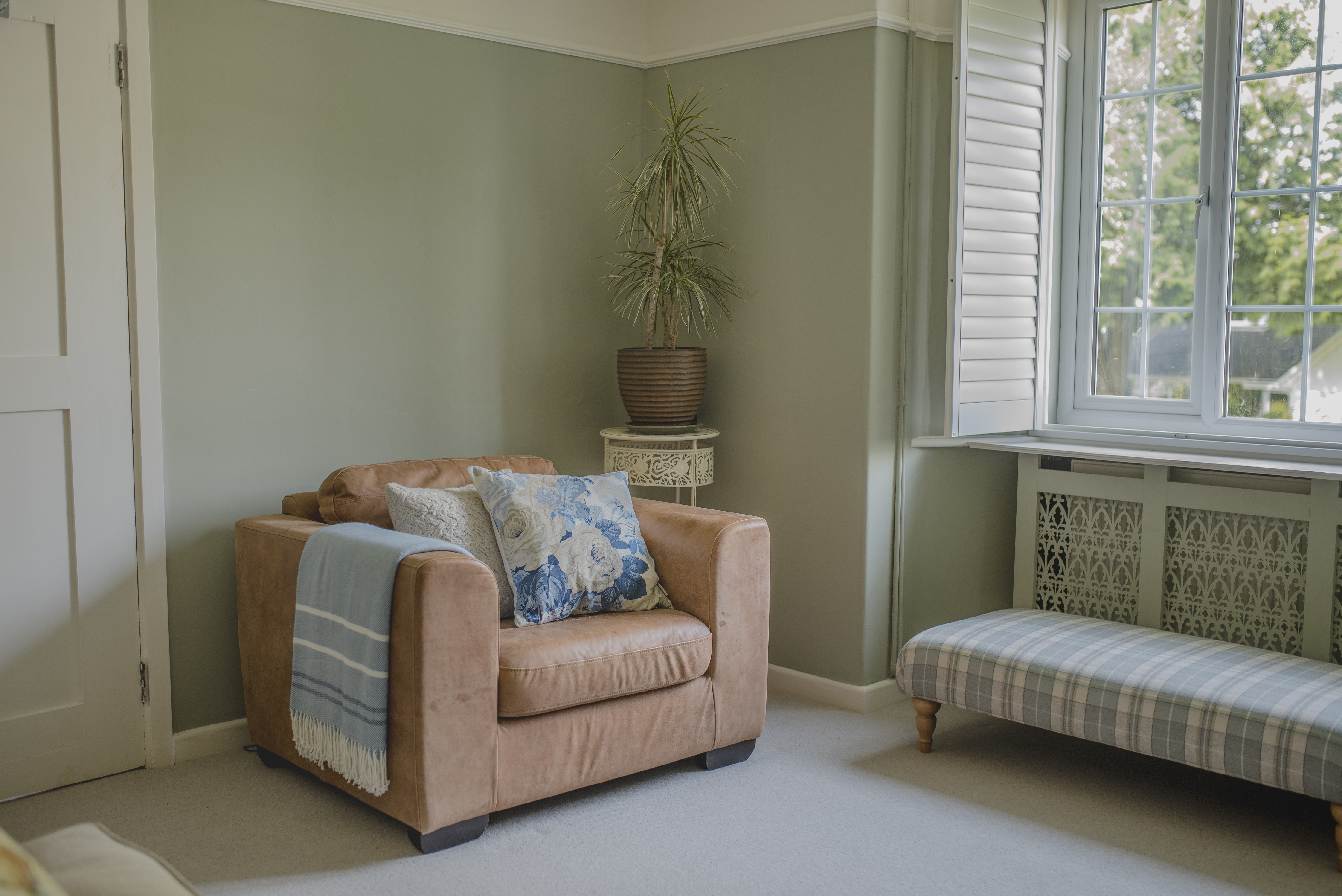
I chose this calming soft green colour for the walls of this room to create a space where you can sit and think |
|
When you start mixing colours together (or use the ones that the paint companies have handily mixed for us) you can create exactly the feeling you’d like in your space. Perhaps you don’t like bright pink (maybe it feels too brash or girly) but a dusky pink could be perfect for your bedroom? Which brings me on to what I think is the most important thing to consider when choosing colour - how you use the room and how you’d like to feel when in it. One of the first questions I ask my clients during a consultation is ‘how would you like the room to feel?’ If you use the room for relaxing, such as a living room, then choose a colour which feels calm and cosy to you. This is why I think darker colours such as teals and navy blues work so well in a living room. If the room is a kitchen or open plan space it needs to feel inviting but also stimulating, as this is the room we prepare meals and eat our breakfast in. Some form of uplifting yellow would look great and bring a touch of sunshine in. One final thing to mention which has a huge impact on colour, is the light coming into the room. Light has a dramatic effect on the way we see colour, in fact the colours we see aren’t in the objects we’re looking at all, but in the light which is reflected back from them to our eyes. You’ve probably noticed that a colour will change as the daylight shifts throughout the day, and the direction the light is coming from (e.g. West, East, South, North) also affects it. South facing rooms will make colours look more yellow, whilst North facing rooms tend to make colours flatter and cooler. East facing rooms get the strong morning light so can take stronger colours, and West facing rooms will have less light in the morning but strong yellow light in the afternoon, so need cooler colours to balance this. |
|
The type of light which is shone on the paint will also greatly change the way we see the colour. This becomes really important when decorating a room - have you ever chosen a paint colour in the DIY store and then got it home and it looks completely different? It’s because the lighting in the shop is mostly artificial, and tends to be bright so we can see what we’re doing. Shop lighting is harsher on colour and will often make it looked washed out, whereas the light in your home is a lot more gentle and will allow you to see the depth or strength of a colour, giving you a truer representation of the shade. But, if you are going to be using your room mostly in the evening (like a living room) then I suggest looking at your chosen colour with the lamps switched on, to see if you still like it. |
|
I chose a pink paint colour with a blue undertone for this kitchen, which balances the yellow light coming from in the South West facing windows |
|
Everyone has a personal response to colour, and one person’s perfect colour would irritate another - there are no right or wrong ways to decorate a room. It’s important to think about shades which you really like, and to try not to get too confused by pictures of gorgeous rooms from Instagram or Pinterest (or by helpful suggestions from our friends and family). As I often say to my clients, it’s your home and you need to enjoy living there. |
Welcome to the design blog, where you'll see posts about anything from the projects we are working on, to the latest fabric and wallpaper collections, and all things interiors related. We love colour, pattern, architecture and old buildings, and we love to share our finds with you.
Happy reading!